"The graffiti rather improves the aesthetics" says commenter
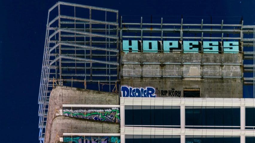
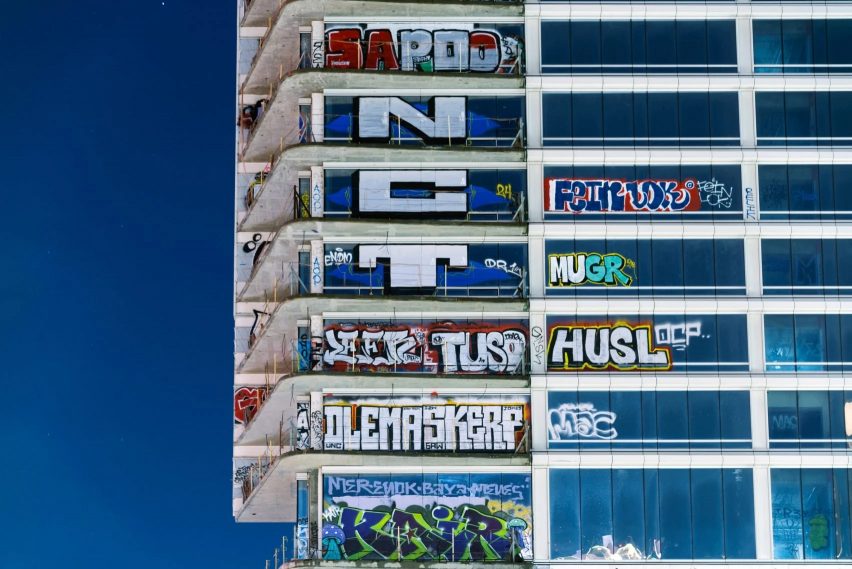
In this week's comments update, readers are discussing a trio of incomplete skyscrapers in downtown Los Angeles that have been covered in graffiti.
Graffiti artists began covering the Oceanwide Plaza development with tags in January, sparking debate about the development that has been abandoned since 2019.

"The graffiti rather improves the aesthetics"
Commenters were largely in favour of the graffiti covering the towers.
"The graffiti rather improves the aesthetics, doesn't it?" asked Johan in a comment that was upvoted seven times. "Rather than remove it they should let the artists complete their work," they suggested.
This sentiment was echoed by Tony365 who thought "the graffiti is very much an improvement".
Nominalis agreed, writing "I think it's beautiful – the artist Christo would be loving it if he was still around".
However, Gaugi put forward that the city "should give a developer concessions to finish the construction".
What do you make of the graffiti? Join the discussion ›

"Lots to like about this aesthetically and spatially"
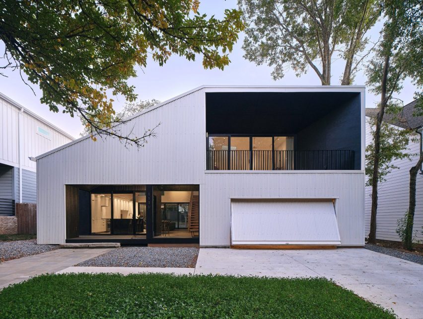
Another project that caught readers' attention this week was a sculptural, metal-clad home in North Carolina created by US studio SILO, which is intended to break away from the "suburban-type" development emerging in the area.
Some commenters were impressed, with Leo calling it a "beautiful house" and Whateverandeveramen arguing there was "lots to like about this aesthetically and spatially".
However, Butnotreally was underwhelmed, writing "not much to say other than 'meh'".
Others felt more strongly, with Tom Roberts suggesting that "it tries too hard and is confusing instead of spatial".
JZ was similarly unconvinced and questioned "how this bucks suburban trends, other than making the entire living space visible from the street".
What are your thoughts on the metal-clad house? Join the discussion ›

"Another Insta-archi backdrop for selfies"
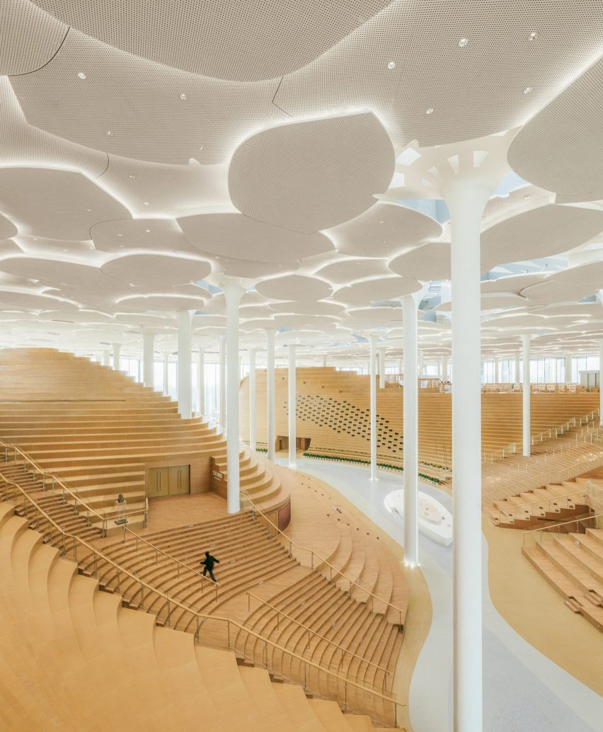
Also sparking debate in the comments section was the news that Snøhetta has completed Beijing City Library in China, a glass-lined building filled with towering tree-like columns.
"Sure doesn't feel cosy to me to be able to sit there in peace and read a book," concluded Apsco Radiales. "I would be distracted by all the 'architecture'," they added.
For Anthony Sully, the library represented "yet another example of a building not expressing its function, but rather an example of Hollywood-type excess beyond actual need".
They went on to suggest that "there is such an extravagant waste of space and unnecessary use of many steps that the books appear to be the least important item".
Ralph Kent offered a similar critique – "looks more like yet another Insta-archi backdrop for selfies than a functional library," they suggested.
However, HeywoodFloyd was slightly more positive, writing "interesting at first, but I think the ceiling should have more sectional development".
What do you make of Snøhetta's latest project? Join the discussion ›
Comments Update
Dezeen is the world's most commented architecture and design magazine, receiving thousands of comments each month from readers. Keep up to date on the latest discussions on our comments page and subscribe to our weekly Debate newsletter, where we feature stories in the last seven days.