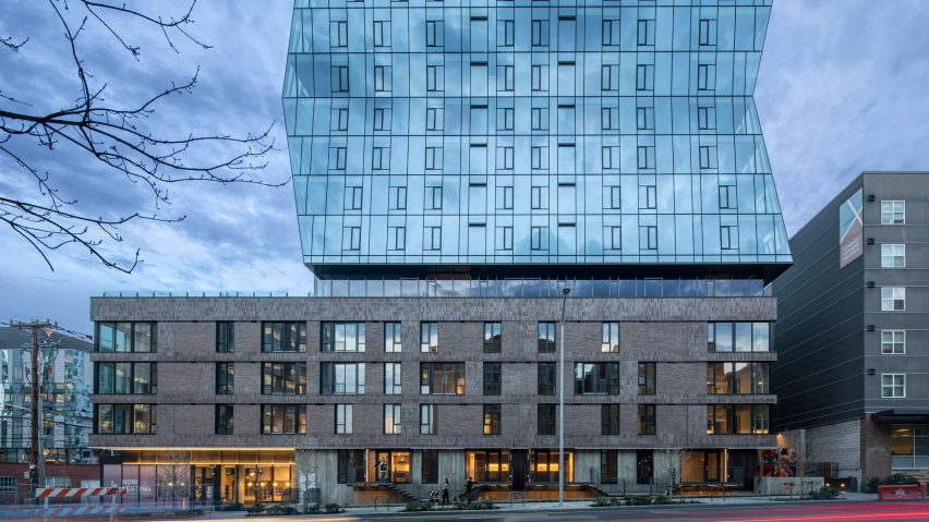
Hewitt creates residential tower in Seattle informed by stack of magazines
Local architecture studio Hewitt has unveiled the 33-storey-high Skyglass residential block in downtown Seattle, which was informed by an offset stack of magazines.
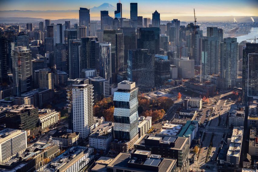
Called Skyglass, the 335-foot-high (102 metre) tower is located just east of the Space Needle, which was recently renovated by Olson Kundig Architects, and contains apartments with shops on its lower floors.
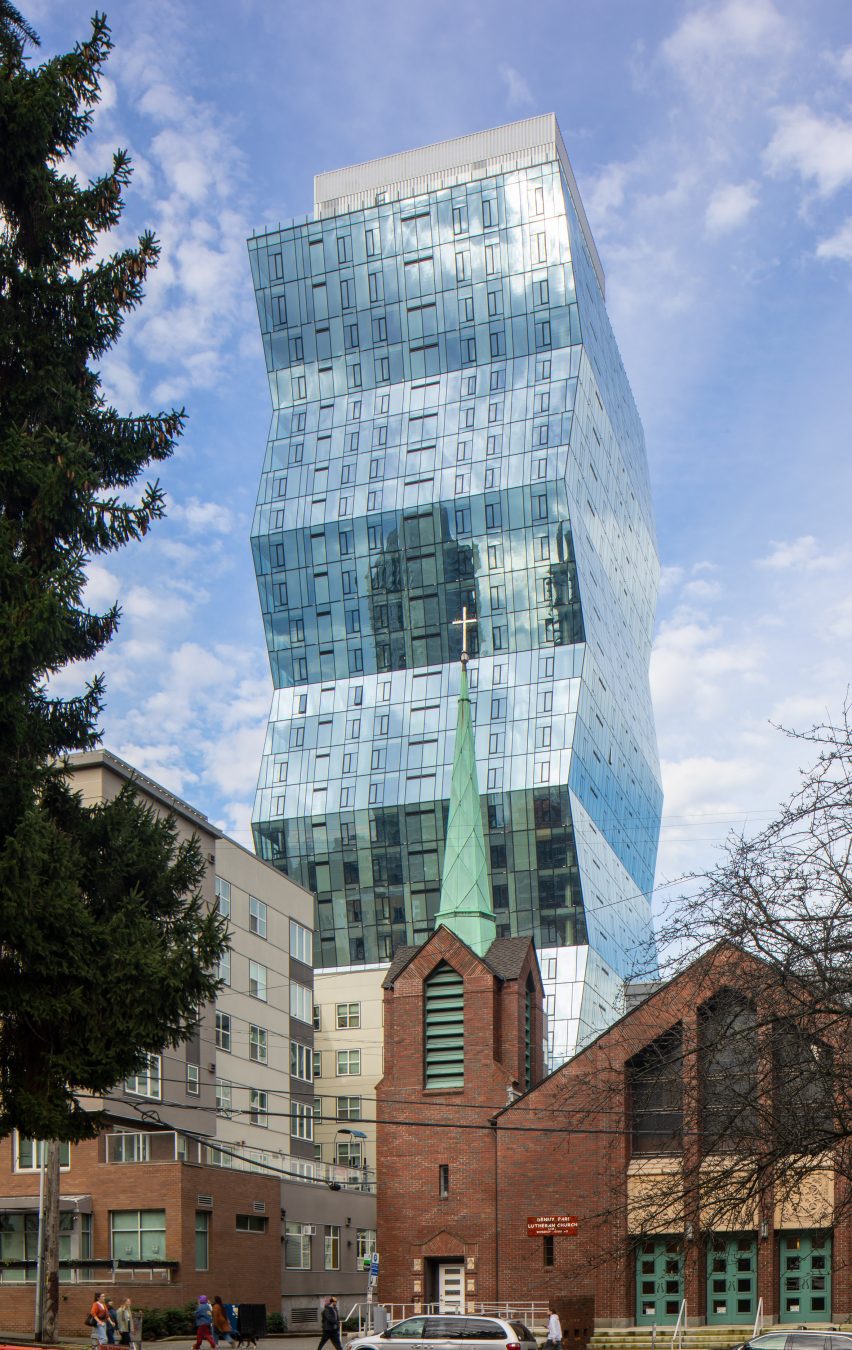
The 33-storey-high building consists of a glazed tower with four facades of angled planes that rises from a rectangular base clad in brick.
The tower's distinctive, offset facades were created in the pursuit of "enhancing the residential experience" and were ultimately created after Hewitt senior principal Julia Nagele and principal Sean Ludviksen spotted an offset stack of brochures.
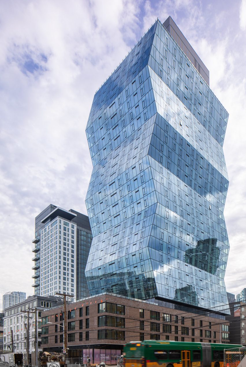
"I looked at the profile and stopped seeing a lot of floorplates twisting but just saw a basic shift," said Nagele.
"I wanted to study what it would mean to shift a tower plate and what would be the value of that," she explained. "In that giving the occupants a lot more than what you might get in a more conventional design."
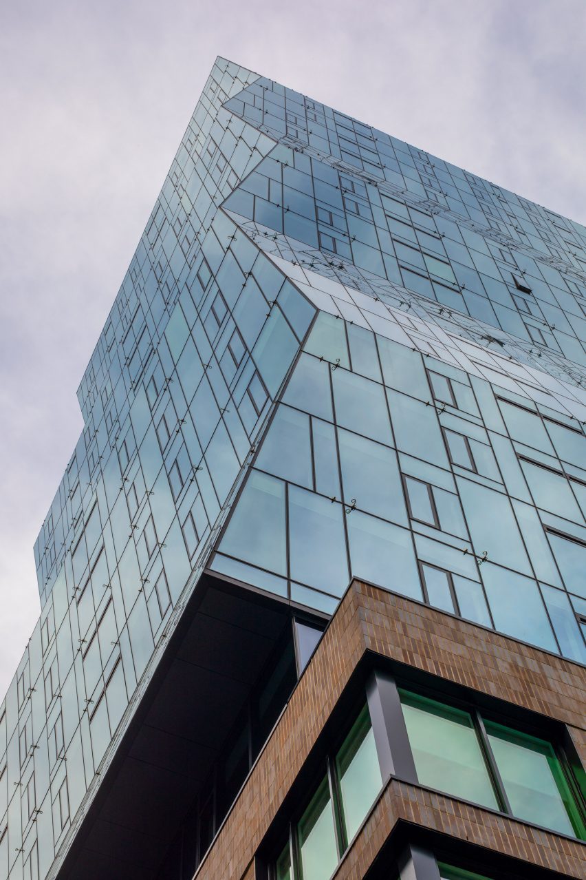
The interior floors are defined by the tilted glass facades, which angle upwards or down depending on the unit.
"All the floors are identical," explained Nagele. "This is not an accordion. They just shift along a diagonal trajectory so nothing changes but its position relative to the columns."
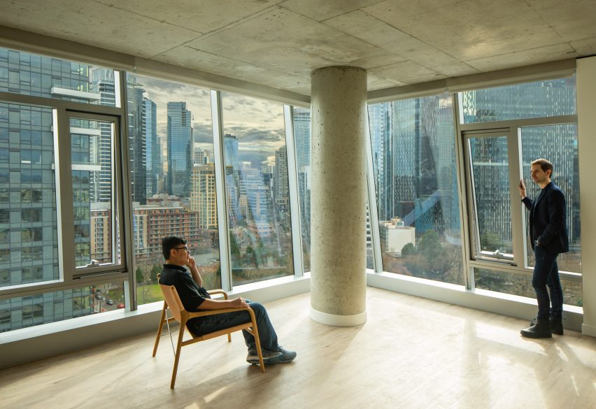
According to the studio, the design created interior spaces similar to an attic or an apartment in a mansard roof.
"On one corner of the building, the units are being more compressed and on the opposite corner, they're expanding and then vice versa as it shifts up through the floor plates," said Nagele.
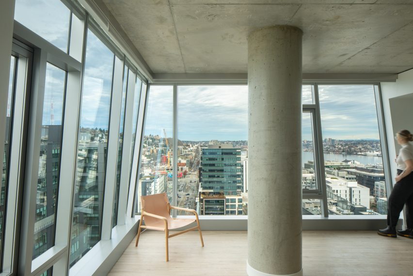
Its form also creates views of the surrounding natural landscape of Seattle, which she describes as an important influence.
"We wanted to respond to these bigger broader ideas of an ever-changing maritime climate," she said. "We wanted the tower to continually change as the sun came out and the clouds came in and there's these pockets of blue sky and dark clouds."
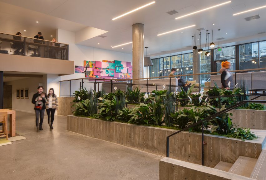
While the tower has a contemporary appearance, the studio designed the base building to have a smaller scale and more traditional appearance.
"It has a base of the building that relates to the pedestrian, the street and the block in this smaller scale, immediate context," said Nagele. "And then there's the tower that relates to this larger scale, yet also natural context."
The tower's ground level will contain a lobby, a small public retail area and first-floor apartments with public and private outdoor areas surrounding the building.
Hewitt clad the base in "earthy, familiar materials" like brick, wood, and board-formed concrete as an homage to both the site's history and the use of brick in the surrounding South Lake Union neighbourhood.
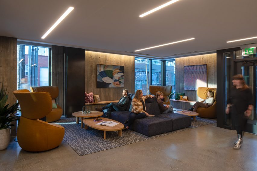
Greetings such as "hey" and "hello" were also embedded into the concrete to indicate more public versus private entrances.
The studio incorporated several points of access to the building for residents, including an alleyway entrance at the back of the building as a way to "reclaim urban space" and a higher percentage of bike parking than car to encourage connection to the surrounding bike lines.
Mechanical elements were encased in a two-level block on top of the building.
"We have the base of the building, which is a rational block of a building that responds to the human scale," said Nagele. "We have the top of the building that is more of a background element. And then the tower is the thing that enhances the building."
"It's not enough to simply make space," continued Nagele. "We have to add poetry to the spaces that we make and we have to make spaces where people truly want to be. And we're very excited about Skyglass because we think it moves in that direction."
Other projects recently completed in downtown Seattle include a metal-wrapped university building by Miller Hull and a pediatric clinic by NBBJ.
The photography is by Lara Swimmer / Esto unless stated otherwise.
Project credits:
Client: Gemdale
Architect: Hewitt
General contractor: Venture
Structural engineer: KPFF
Landscape architect: Hewitt Landscape Architects
Energy and Sustainability: Rushing