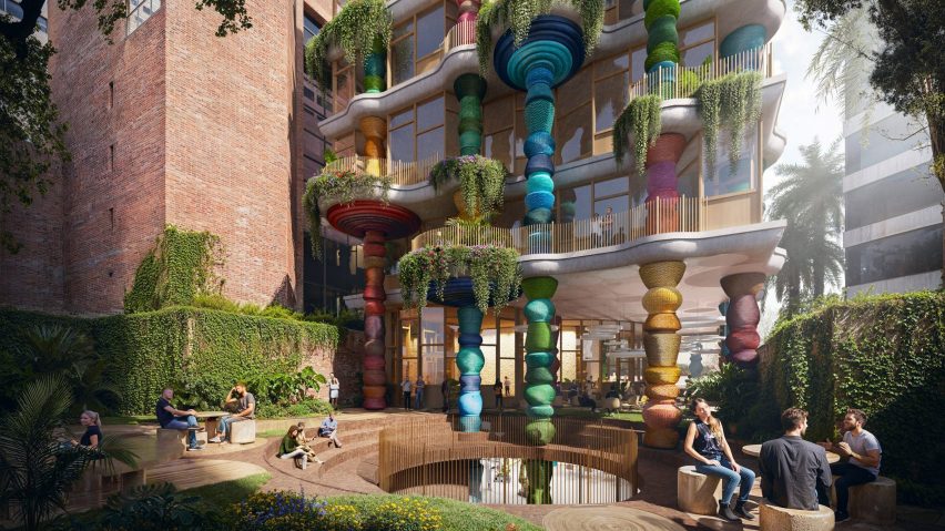
In this week's comments update, readers are discussing Heatherwick Studio's design for its first building in South America, which was informed by indigenous weaving practices.
Renderings of the seven-storey building planned for Bogotá in Colombia show a facade made of a series of colourful, undulating columns.
Several readers were shocked by the cultural reference points the studio cited.
"A crazy bit of architecture"
"This is beyond silly – it is a cultural misappropriation of the very lowest, even most offensive sort," scorned The Truth in a comment that was upvoted 10 times.
"Would Heatherwick design a green building in the shape of a shamrock for an Irish site?" they asked.
"This actually leaves me kind of speechless," wrote Franc Lea, adding: "genuinely shocked, even! Like, how?? They should be embarrassed."
Meanwhile, Supplicem wondered "why do Anglo architects always think design for Hispanic countries must be kitsch?"
However, on the other side of the argument, Z-dog called it "a crazy bit of architecture" before admitting "but I'd be happy to see it built."
Carlos Gris also responded positively towards Heatherwick's design, arguing that "Dezeen readers will probably get the daggers out, but this makes me happy."
What are your thoughts on Heatherwick Studio's design? Join the discussion ›
"Tech Art Nouveau – more please!"
Another story causing a stir in the comments section was the news that Pelli Clarke & Partners has completed Japan's tallest skyscraper, the Mori JP Tower, as part of the Azabudai Hills development in Tokyo.
Felix Tannenbaum put forward "well, I think it's very very lovely". They went on to call it "understated, organic Tech Art Nouveau – more please!"
Commenter AM praised the skyscraper as "such an amazing project!" and thought it was "great to see such a great firm leave a meaningful, timeless impact on the Tokyo skyline!"
However, the project had as many detractors as admirers. "There is something about its proportions that just isn't right," mused Sharad Majumdar.
"It might be the tallest tower in Japan, but because it's also one of the fattest, it actually looks rather dumpy and squat," criticised Alfred Hitchcock. "Not elegant at all," they concluded.
Do you think it rises to the occasion? Join the discussion ›
"Very bland and uninteresting"
Another story that got readers talking this week was Foster + Partners renderings of an office tower to be built in Hollywood with a series of spiralling plant-covered terraces wrapped around its exterior.
"Looks delicious – yum!" wrote Design Junkie. However, it wasn't to everyone's tastes, with Jeff Daniel calling it "very bland and uninteresting".
Others raised concerns about what the planting would look like in reality. "Sadly the green swirl in this Twister ice lolly will look nothing like the colourful abundance in these renders," lamented Franc Lea.
The Truth agreed, writing "the high intensity of the plantings graphic colour scheme will never be achieved in reality".
"Nowadays if you're building an office that's as unsustainable as ever, just make sure it looks like a big garden in the project design," mocked commenter Felix.
Delicious or bland? Join the discussion ›
Comments update
Dezeen is the world's most commented architecture and design magazine, receiving thousands of comments each month from readers. Keep up to date on the latest discussions on our comments page and subscribe to our weekly Debate newsletter, where we feature the best reader comments from stories in the last seven days.

