
Margine draws on Salento's vernacular architecture for minimalist Italian villa
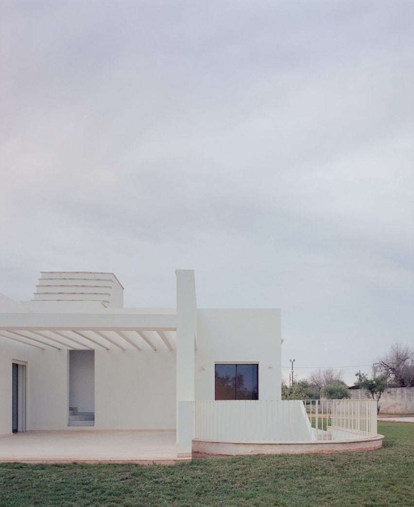
A minimalist exterior of white render and local stone paving reference the traditional architecture of Italy's Salento region at Casa Ulìa, a villa by local architecture studio Margine.
Named Casa Ulìa, or Olive House, after the trees on the site, the 480-square-metre dwelling near Lecce was completed for a couple who wanted an "oasis of peace" away from city life.
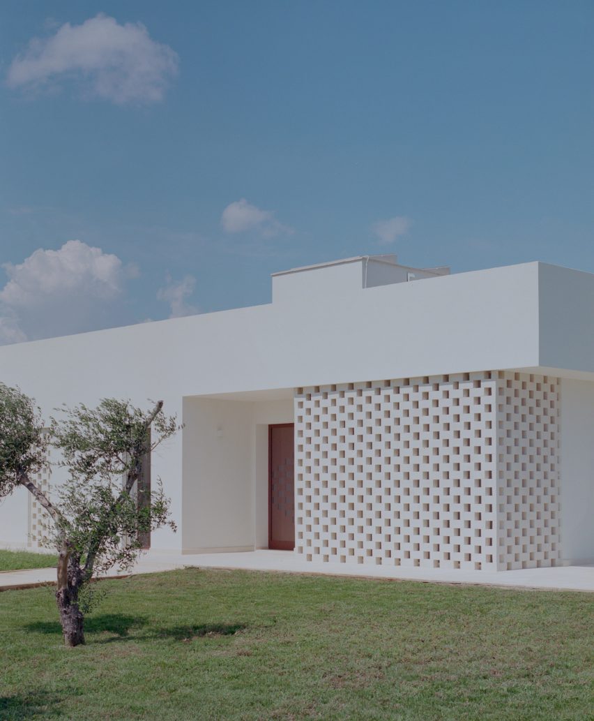
To reduce the home's visual impact on the site, Margine limited it to a single storey above ground containing the living spaces and bedrooms and created a basement for an events space, spa and garage.
Carefully positioned openings in its pared-back exterior frame the rural landscape, while perforated brick screens filter light down into the home's lower level.
"Discreetly, as if hiding behind centuries-old olive trees, Casa Ulìa leverages an underground space to maintain a purely horizontal development on two levels," explained Margine.
Casa Ulìa is divided into two blocks. To the east, a rectilinear volume contains a living, dining and kitchen space and to the west, a square block has three bedrooms and bathrooms.
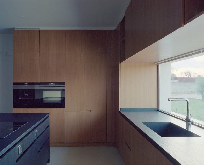
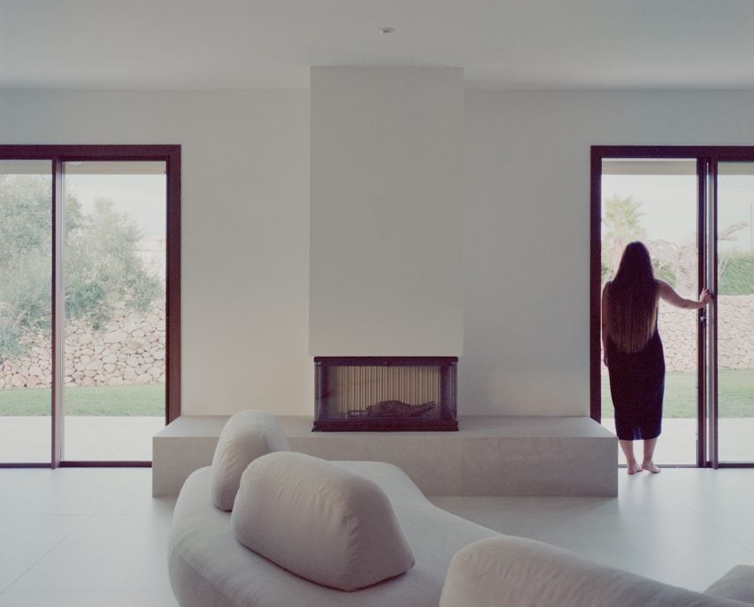
A fireplace raised on a marble-tiled plinth provides a focal point for the living area, which sits between a wood-lined kitchen and a separate study space.
Above the kitchen counter, a horizontal window frames a view of the landscape, while in the living area, a sliding glass door opens onto a patio sheltered beneath a concrete pergola.
For the paving of this terrace, Margine used local Leccese stone. Along with the minimalist white exterior, this "echoes the region's vernacular tradition" the studio said.
"A large central fireplace, the beating heart of the villa, unites the dining and living areas, completing the living room by enveloping guests in a cosy and convivial atmosphere," said the studio.
"A glass window etched into the panelling, framing the landscape, giving the feeling of cooking outdoors," it added.
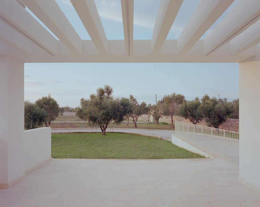
Three routes lead to the basement level spaces – a ramp and garage for vehicle access at the rear of the home, a curved external stair and an internal stair at the centre of the plan.
The minimal, clean lines of the exterior are carried through to Casa Ulìa's interiors, with plain white walls and grooved wooden panelling in the bedrooms.
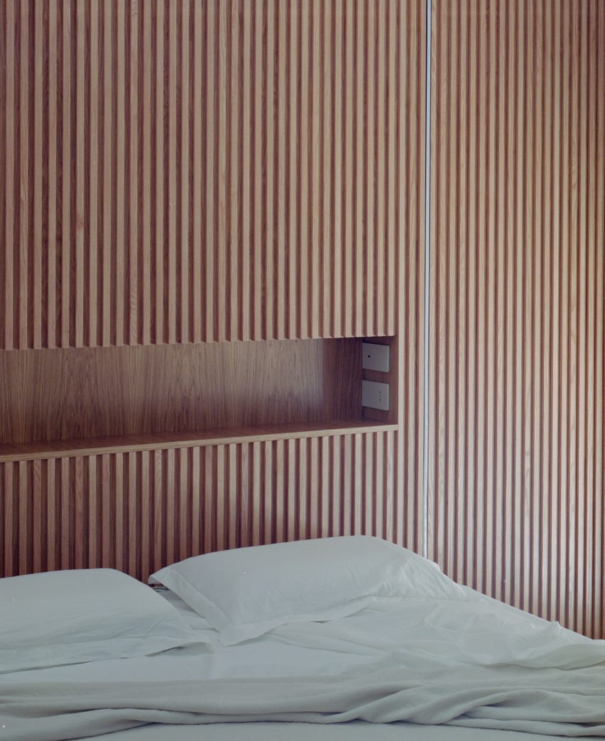
"The house stands out for its essential lines and refined use of materials, with white plaster and stone-effect stoneware floors that also cover the bathroom," said the studio.
"The use of large formats brings continuity to the surfaces, fueling the overall minimalism of the design."
Elsewhere in Italy, UK studio Jonathan Tuckey Design recently restored and extended a historic farmhouse to create a family home and JM Architecture used glossy white-concrete panels to clad a holiday home with a pentagonal plan.
The photography is by Marcello Mariana.