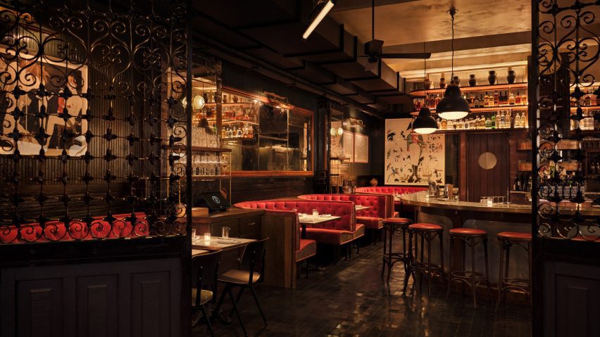
Dim lighting and dark tones define the interiors of the second Smith & Mills restaurant in New York, recently completed by architecture studio Woods Bagot.
Situated in New York's Rockefeller Center, the restaurant's interiors were designed by Woods Bagot in collaboration with New York City-based hospitality management consultancy Neighborhood Projects.
To enter the space, guests walk through a snug hallway covered with vintage elevator-cab panels.
"It was very important to us that we created a transition zone off the concourse before you enter the main dining room," explained Wood Bagot's Krista Ninivaggi.
"This would act as a buffer to feel the buzz of the heart of Rock Center diminish, and then be enveloped in our warm amber glow."
"We achieved this by using old wrought iron elevator cab screens to partition off the entry and lowering the ceiling for a classic design move of compression before being 'released' into the carefully crafted atmosphere of the restaurant," she continued.
Columns clad in zellige tiles and mirrors divide the space, while antique-style mirrors on the walls and reclaimed wood panelling were used to create a vintage feel in the restaurant, which is the second Smith & Mills to open in the city.
"We used the reclaimed panelling and zellige tile to 'paint' all of the wall surfaces," Ninivaggi explained. "We alternated them in key locations by deciding what should feel 'warm' with the wood or 'hard' with the tile."
An oval bar made of zinc and walnut, which sits on a tiled black stone floor, functions as the restaurant's focal point.
In the dining area, the studio chose banquette seating dressed in oxblood velvet in a nod to the restaurant's original location in New York's Tribeca neighbourhood. Marble tables with brass accents and bistro chairs complement the design.
The interior of the restaurant's private dining room features a transition from handmade red zellige tiles sourced from Morocco on one wall to a botanical print wall covering above.
Lighting fixtures, such as pendants and sconces, cast ambient lighting throughout the space. Artwork by Ukrainian artist Yelena Yemchuk hangs on the walls.
"The lighting was very carefully considered both in its design and light quality, to give the appropriate hue to the space," Neighborhood Projects' Matt Abramcyk told Dezeen.
"We went so far as to undertake tests to find the right vinyl to veil the light from the concourse to give a warm backdrop," he continued.
The location of the new restaurant also had a big influence on the design.
"At both locations, Smith & Mills strives for simple, rustic design, with materials that nod to the past," Abramcyk concluded. "Because of the new location's iconic surroundings, the Rockefeller Center design also nods to art deco, in particular."
Other restaurant interiors recently featured on Dezeeen include a Korean fried chicken restaurant in New York designed by Rockwell Group and a cocktail lounge in Las Vegas created by musician Bruno Mars in collaboration with design studio Yabu Pushelberg.
The photography is by David Mitchell

