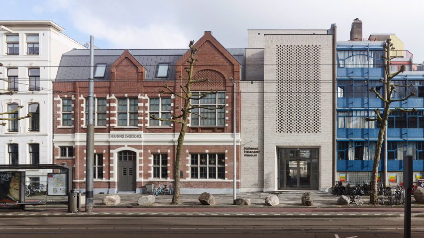
Local studio Office Winhov has completed the sensitive restoration of two historic local buildings, converting them into a museum and memorial for the Dutch victims of the Holocaust.
Located on Amsterdam's Plantage Middenlaan, the National Holocaust Museum by Office Winhov was designed to commemorate the Dutch Jews who were persecuted and killed during the war.
Its facilities are spread across two existing buildings on opposite sides of a street, including an updated 1950s extension, which are nestled between rows of terraced houses.
The museum features educational facilities as well as restored spaces from the existing buildings. These were already established memorial sites, due to their past uses – one as a deportation centre and the other as an escape route through which Jewish children were able to flee to safety.
"The former theatre Hollandsche Schouwburg was the assembly point from which tens of thousands of Jews were deported to the camps – and as such is already established as a memorial site since 1962," the studio explained.
"The story of the Hervormde Kweekschool [nursery school], which will be expanded to form the basis of the permanent exhibition of the museum, is less well known," it continued.
"Next door to the Hervormde Kweekschool was a day-care where the children of the captured Jews were housed, and over several months, around 600 of these children were smuggled via the nursery school to relative safety."
Prior to Office Winhov's work, a number of interventions had been made to both buildings following the war, including the conversion of the nursery into an office.
"Post-world war two transformations significantly altered the original buildings," the studio told Dezeen. "The theatre, the Hollandsche Schouwburg, was turned into a memorial in 1962, while the nursery school was converted into office space."
Aiming to bring back the site's original character, the studio preserved existing features while replacing a number of 1950s elements with new additions intended to reflect the nursery's original design.
The largest changes were made to the existing Hervormde Kweekschool, which was updated to house the main portion of the museum.
Made from red brick with lighter-coloured detailing, the nursery's original facade was preserved, while the 1950s extension – which could be viewed from the streetside – was replaced with a new pale brick facade.
This features a checkerboard-like design created to resemble the detailing found on the existing building with a modern twist.
"In the museum's renovation, the nursery school's original facade was preserved," the studio explained. "Despite extensive interior modifications over the years, the original classroom layout and the escape route hallway were restored."
The replaced extension features the main entrance, which leads to the reception space. Inside, timber joinery and a tiled floor combine with the neutrally toned walls to create a minimalist colour scheme.
The minimalist design continues throughout the rest of the interior, which was rearranged to better resemble its original layout as a school.
"The museum has an overall light colour scheme, derived from the intention to tell a story that occurred in daylight," the studio explained. "This contrasts with other Holocaust museums, where dark tones and grim spaces are used to create a sense of discomfort in visitors."
"The chosen light colours echo the original hues of the school, reinforcing the connection to local history and thus enriching the visitor's imagination by affirming that these events happened here," it continued.
Old classrooms now contain a number of exhibition spaces, finished with neutral paint and wooden flooring.
In other spaces, including a yellow-painted stairwell, Office Winhov added colour back into the design, aiming to call upon the building's original school-like essence, which had been lost during its past renovation.
"As a part of the story, it was important that the school was again perceived as a former school building," said the studio. "However, very little remained of this essence after the building was radically altered during a renovation in 1952."
Other spaces in the transformed school building include a lecture hall with exposed brick walls and timber columns. At the back of the space, a large glass door and floor-to-ceiling windows offer views of the back garden, which was used as part of the escape route for Jewish children during the war.
While the brick garden wall was previously hidden, the studio re-exposed it, adding a courtyard dotted with planting and a photographic installation.
"By making it visible and introducing the new pavilion in front of it, visitors can reflect on the personal stories of these children and their rescuers," said the studio.
Across the street, the existing Hollandsche Schouwburg was also sensitively refurbished to meet visitor and safety requirements, with light-painted brick walls and a renovated memorial courtyard.
Originally a theatre before being used as a deportation centre during the war, the building became a memorial site paying tribute to the 104,000 Dutch victims of the Holocaust.
"The design approach toward the memorial at The Hollandsche Schouwburg was restorative in nature," the studio explained. "The goal was to restore the unique qualities of the original memorial, to bring back the fundamental spatial values and inherent dignity of the design."
Other museums recently featured on Dezeen include a blocky museum with a layered sandstone facade and a circular Chinese museum designed to resemble the yin-yang symbol.
The photography is by Max Hart Nibbrig unless stated otherwise.

