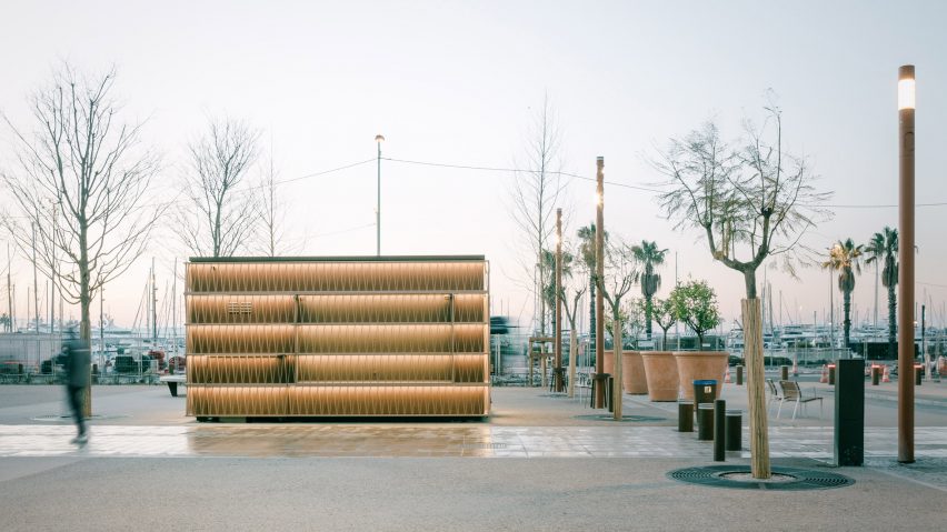
Heams & Michel Architectes shrouds prefabricated pavilions in geometric lattices
French studio Heams & Michel Architectes has updated a public square in Cannes with seven prefabricated aluminium kiosks that can be adapted to various uses.
Named 7 Kiosks, the project forms part of a wider effort to renovate the Allées de la Liberté, a street between the port and the old town that holds local markets.
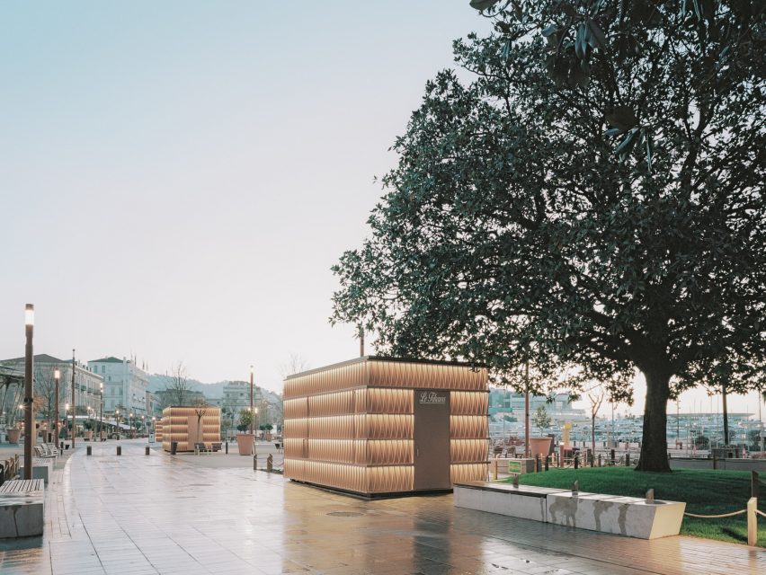
Heams & Michel Architectes designed the seven independent kiosks with identical boxy aluminium structures, each wrapped in powder-coated aluminium panels. These are then shrouded in a net-like facade made from a repeating triangular pattern.
To minimise disruption to the busy site during construction, each structure was prefabricated in a local workshop before being transported to the street.
"The aim was to create small-scale buildings whose design is between art and architecture," studio co-founder Benjamin Michel told Dezeen.
"We wanted objects with a simple, clean shape that take place silently in the complex urban space."
Also made from powder-coated aluminium, the latticed facade is supported by a thicker horizontal grid and designed to cast playful shadows across each kiosk.
"The elevations are made up of a double skin formed by lattices that rest on a horizontal line grid," Michel explained. "The triangle-based design plays with the Mediterranean light that casts contrasting shadows and brings depth to the facade."
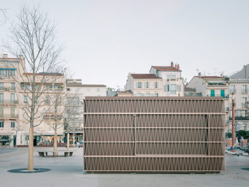
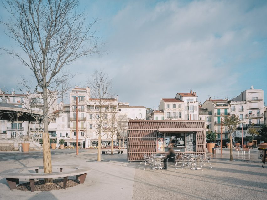
Despite their identical design, the pavilions have a range of uses, with three currently being used as fast food kiosks, one as services storage and one holding public toilets.
Two other pavilions will be used by bowlers, who frequently play the sport in the public space around the structures.
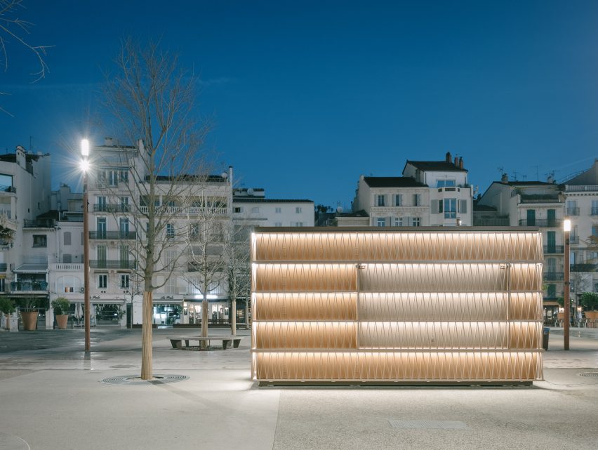
Inside, each structure has a rectangular plan divided into two, creating separate areas for equipment storage and service.
A door is located on both short sides of each kiosk, while each of the longer facades features an openable panel that can be pulled up and outwards to form an awning.
The awnings are also topped with the triangular lattice, helping them blend in with the rest of the beige-toned structure when closed.
"When the kiosks are open, the facades are raised to form a canopy and welcome the public sheltered from the weather," said Michel. When the kiosks are closed, the awnings fold into the thickness of the facade."
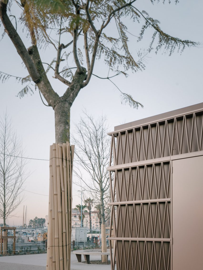
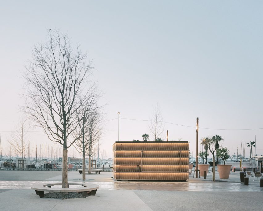
Around the street, Heams & Michel Architectes arranged the pavilions to mark a public route. The structures are closed when not in use and are fitted with lighting strips to illuminate the public area at night.
During the day, the beige tone of their aluminium structures is hoped to help the kiosks blend "into the cityscape like a mysterious art object".
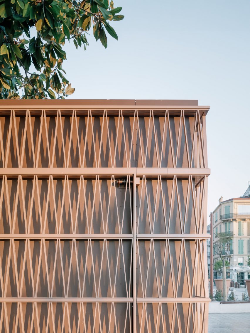
"During the day, their colour changes with the light, the shadows outline the facade and give it depth," said Michel.
"At night they become 'lanterns', illuminated by luminous ribbons which run around the entire perimeter of the kiosk."
Other kiosks featured on Dezeen include a Kyoto coffee stand clad in oxidised copper and a modular bamboo pavilion for a Nigerian skateboarding brand.
The photography is by Aldo Amoretti.