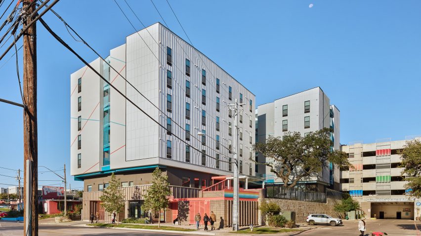
Local studio Forge Craft Architecture + Design has created affordable apartments for people transitioning out of homelessness in Austin that feature a breezeway to encourage rest and preserve heritage trees on the site.
Called Zilker Studios, the structure includes 110 affordable permanent apartments operated by local housing organisation Foundation Communities.
The mid-rise housing complex consists of a long volume on a narrow site, flanked by outdoor public spaces with a breezeway and an open-air staircase on the far end.
The building sits on top of a storage podium clad in iron-spot brick and has an entrance directly to the podium, as well as a sloped staircase that gives access to a gated outdoor courtyard at the back of the lot.
The upper levels are for the residential units and were clad in an exterior insulation finishing system (EIFS) to protect from sun and street sounds on two sides, while the lower levels hold communal areas.
The area facing the courtyard was clad in Hardie board and a batten system, with the studio using the similar diagonal lines in the patterning of both cladding systems to unite them visually.
Forge Craft Architecture + Design positioned a walkway between two large oak trees on the site – one in the primary courtyard space and another adjacent to a balcony in the back of the building.
When entering the building, residents walk into an atrium space with an oculus framed by blue-painted metal at its centre of circulation. Balconies painted in the same hue on either side look over the outdoor areas oriented around the oak trees.
"A breezeway that catches the prevailing breezes links the two live oaks like the vernacular dog-trot house in Texas," Forge Craft Architecture + Design principal Jon Hagar told Dezeen.
"The breezeway connects the common spaces to foster social interaction and relaxation. The space for relaxing between the two trees was then called the 'hammock' to further highlight its role as a place of rest."
Elevated outdoor areas frame the entrance to the atrium space. The internal common areas on the ground floor have surfaces painted with bright colours and internal windows to help spread light.
Hagar said that rest was an essential principle for the design, and explained that the studio took a "trauma-informed" approach to the arrangement of the living spaces.
"Recognizing that individuals transitioning out of homelessness may have certain anxieties associated with feeling unwelcome in public, we sought to support a sense of security, comfort, and choice through the design and organization of the property," he said.
"We intentionally designed open sightlines throughout the building, utilizing an open-air interior courtyard riding through the center of the structure and a layout that allows residents to observe what’s happening on floors below them before choosing to leave their units and join the communal environment downstairs."
A semi-enclosed hallway ends with balconies that allow residents to look out over the street.
Creating an environmentally friendly building while keeping costs low was also a priority for the team.
The building is all-electric, and windows have been placed strategically based on positioning to handle the intense Texas sun. At one end, they are smaller and have overhangs that jut out and feature lettering spelling the apartment's name.
Large windows were used for the common areas and in areas shaded by the building above to help reduce the need for artificial light.
"In our climate, using large openings such as these is always a careful balance between achieving the above while minimizing unwanted solar heat gain, which is why our windows are primarily oriented towards areas covered by the building above or sheltered by the heritage live oaks," said Hagar.
Beyond helping to finance the project, Foundation Communities has pledged to pay the energy bills for the building.
Affordable housing and solutions to homelessness have seen a resurgence. Early this year, Dezeen launched a series that looked at various examples of social housing across the world.
Other examples of architecture geared towards housing the un-housed is Kadre Architect's generous use in colour during their renovation of a motel used for supportive housing in LA.
The photography is by Casey Dunn.
Project credits:
Architecture: Forge Craft Architecture + Design
Interior design: Studio Ferme
General contractor: Barlett Cocke
Civil engineer: Civilitude
Structural engineer: DCI Engineers
MEP engineer: Aptus Engineering
Landscape architecture: Asakura Robinson
Envelope consultant: Acton Partners
Accessibility consultant: Contour Collective

