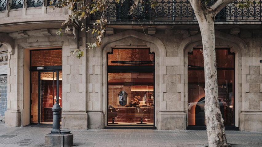
Barcelona-based Miriam Barrio Studios has transformed the interiors of a modernist building into Curly Lab, a curly hair salon incorporating curved shapes and copper-toned surfaces.
Located at the base of a gothic and modernist building designed by Catalan architect Enric Sagnier in 1895, Curly Lab is situated at Diputación in the Eixample district of Barcelona.
Miriam Barrio Studios designed Curly Lab's 65-square-metre-interior to convey an "organic and natural language". The space, previously occupied by a real estate agency, now features rich textures that contrast the surrounding architecture.
Continuous microcement surfacing was used across the salon's light-toned floors and its terracotta-toned wall to create a distinct backdrop. This microcement was locally sourced and manufactured within the vicinity of Barcelona.
New elements include curved shapes that form the structure of salon countertops, furnishings and lighting fixtures, creating pathways and routes across various workstations.
"The organic shapes were a match because in the modernist world they symbolised beauty and were entirely aligned with the DNA of curly hair," designer Miriam Barrio told Dezeen.
Polished copper tiles decorate these countertop bases, coexisting with historical features also on display.
Remnants of the previous interior are still visible throughout the renovated space. They include exposed brick walls and a Catalan vault ceiling with original floral paintings, which the studio preserved in their current state.
This process involved a thorough cleaning. The studio then unified the ceiling backgrounds using plain colours, followed by a matte and transparent patina application.
"The colour of the original ceiling drawings, they were pure inspiration!" Barrio said.
"A great find and a stroke of luck since there is nothing more natural and special than copper tones," she added.
"We wanted to choose a colour derived from the tones of the ceiling and make it the protagonist. It needed to be warm and deep at the same time, neither too feminine nor too masculine. Based on that colour, all the materials for the project were chosen."
The lighting in the space was arranged to highlight the interior's key architecture and design components, creating an eye-catching display at night when viewing the salon from outside.
"The lighting in the main space with high ceilings needed to serve two functions: technical lighting for work and decorative lighting to set the atmosphere and enhance the architecture," Barrio said.
"They were positioned at mid-height to illuminate the ceilings from the same element. Curved track lights were designed to flow in the space in the same way as the other elements," she added.
Barrio used black metal for the majority of the fixtures besides lighting, including oval-shaped mirrors on dressing tables and Color Bar furniture. Other notable accessories include ceramic lamps and velvet sofas.
"I think it is important to feel beautiful in a salon, for the space to be a fitting companion," Barrio expressed.
"We want [consumers] to feel welcomed and inspired, close to feeling like they are in a special temple. In a place of care on all levels."
Other innovative salon interiors across the globe include the Buller and Rice in London designed by Anita Rice and Stephen Buller, Koda in Sydney by Arent & Pyke and Treadwell by Gin Design Group.
The photography is by Salva López.

