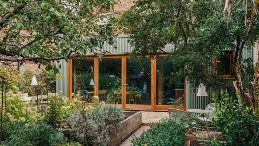
London studio Westerdahl has renovated a house in Cambridge, reorganising an existing extension and cladding it in green zinc panels that blend in with the surrounding planting.
Westerdahl was tasked with better connecting the home, named Folded House, to its large garden after it had been blocked by utility spaces in its extension.
The studio reorganised the home's utility areas into a strip along one edge of the site, freeing up room for social spaces that overlook the garden.
Inside, the former extension now contains a living, dining and kitchen area that looks outside through large bifold doors. Alongside it, a matching side extension containing a larder has been added.
"The core concept was a minimal intervention to increase living and entertaining space and to better connect it to the lovely mature garden outside," founder Viktor Westerdahl told Dezeen.
"This reorganisation created a new, direct view from the entrance hallway out towards the garden through generous double patio doors," he added.
As Folded House's extension is not visible from the street, Westerdahl was able to diverge from the pale brick finish of the existing home, despite it being located in a conservation area.
Both the existing extension and new larder are clad in green, folded panels made of zinc, chosen to blend in with the garden.
"Externally, the folded zinc facade strikes a balance between contrast with the existing Victorian house and camouflage," said Westerdahl.
"The folded zinc facade in green acts as a subtle backdrop to the lush foliage, and also unifies the new larder extension by over-cladding the old rear extension," he continued.
Outside, a shaded seating area has been created under a tree next to the larder, while the main patio space sits beneath a bespoke "lamp post" light that is finished in pale pink.
Folded House's interior palette is drawn from the main home and where possible reuses existing materials. Wooden accents, such as columns and a fluted counter topped with marble, also feature throughout.
"Existing walnut shelving was recut into a wall-mounted bookshelf, a marble kitchen sink and fittings were reused in the utility room, and marble shelving in the existing larder was recut for the new larder," explained Westerdahl.
"The most significant addition – the kitchen – is designed in detail with stone and wood to bring out natural texture," he added.
Other recent home renovations animated by facades of green metal cladding include The Saddlery by Studio Octopi and AR Residence by DeDraft.
The photography is by Funto King.

