Our latest lookbook rounds up eight projects where handmade Moroccan tiles cover everything from chimney breasts to mini-bars, adding a sense of traditional craftsmanship to otherwise modern interiors.
Zellige tiles are traditional glazed terracotta tiles, originating from the 10th century in Morocco, that are made using unrefined local clay that is kneaded, shaped and cut by hand.
As a result, every tile is unique, with slight variations in shape and colour that reveal the hands of their maker.
In recent years, interior designers have liberated zellige tiles from the confines of the kitchen or the bathroom and used them to bring depth and texture to modern interiors.
Among the projects featured below are a members' club in Nashville, the renovation of Ibiza's first hotel and a Sydney penthouse belonging to a couple of empty nesters.
This is the latest in our lookbooks series, which provides visual inspiration from Dezeen's archive. For more inspiration, see previous lookbooks featuring platform beds, living rooms with 70s furnishings and bathrooms that combine colours and patterns.
Montesol Experimental, Spain, by Chzon
French interiors studio Chzon aimed to bring "a bohemian overtone" to her renovation of the 1933 Montesol Experimental in Ibiza, widely credited as being the island's first hotel.
A hand-made theme threads throughout the rooms, as seen in the irregular Moroccan tiles that wrap the mini-bars and the shell-patterned walls, created by pressing individual seashells into fresh lime plaster.
Find out more about the Montesol Experimental ›
Design House, UK, by 2LG Studio
Pastel hues were mixed with whimsical details such as scallop-edged doors and a pale-pink tiled chimney in the London home and workspace of 2LG Studio, founded by Russell Whitehead and Jordan Cluroe.
"The glaze is uneven and so the tiles create a stunning dappled light bouncing off them," the duo said.
Find out more about Design House ›
Conde Duque apartment, Spain, by Sierra + De La Higuera
With many of the dividing walls in this apartment removed to usher in more natural light, Spanish architecture studio Sierra + De La Higuera relied instead on emerald, ruby and mustard-yellow tiles to define different spaces.
The home in Madrid's bohemian Conde Duque neighbourhood belongs to a well-travelled couple that wanted to fuse its Galician and Mexican heritage in the interior.
Find out more about this Conde Duque apartment ›
Dream Weaver penthouse, Australia, by YSG
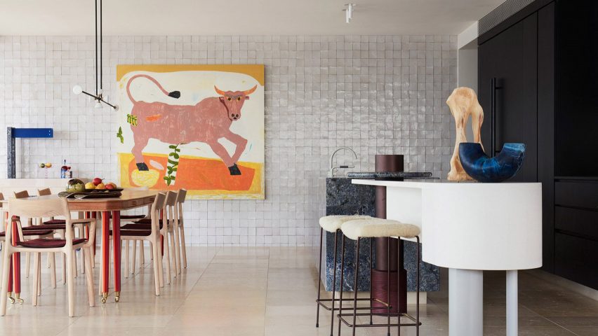
Glossy off-white zellige tiles cover an entire wall inside this Sydney penthouse, helping to bounce light around the home belonging to a couple of empty nesters.
Local studio YSG was brought on board to reflect the owners' post-lockdown joie de vivre in the interior, incorporating an eclectic mix of references from surrealist artworks to tiled Spanish tapas bars.
Find out more about the Dream Weaver penthouse ›
The Malin Nashville, USA, by The Malin design team
The design team of The Malin designed the Nashville outpost of the work-oriented members' club to feel more like a hotel than a traditional co-working space.
The rooms feature an eclectic mix of vintage and contemporary furniture alongside a rich material palette including tasselled velvet upholstery, four different types of marble and Moroccan tiles offset with white grouting.
Find out more about The Malin Nashville ›
Beefbar Milano, Italy, by Humbert & Poyet
Interior design duo Humbert & Poyet created a new home for the Beefbar steakhouse inside the former chapel of a 500-year-old seminary on Milan's Corso Venezia.
Glossy oxblood-red tiles provide a subtle splash of colour atop the restaurant's wooden wall panelling and a more dramatic focal point at the back of the space, where they clad a curved wall.
Find out more about Beefbar Milano ›
Interiors studio Cúpla sought to reflect the hand-painted prints that decorate Rixo's fashion collections when designing the London brand's Marylebone boutique.
This idea was realised via colourful murals and illustrations by artist Sam Wood and a mosaic of tiles, accentuating the interior's classical archways and mouldings.
"Every line of the mural or the 'random' coloured zellige tile layout was methodically composed to ensure a right balance between the colours was struck," Cúpla founder Gemma McCloskey told Dezeen.
Find out more about Rixo Marylebone ›
Austin Proper Hotel, USA, by Kelly Wearstler
Different types of tiles, from simple to ornate, feature throughout the public spaces of the Austin Proper Hotel designed by Kelly Wearstler.
This includes The Mockingbird cafe, where Moroccan tiles are arranged into a chequered pattern across the walls, providing a counterpoint to the dramatic stone counter.
Find out more about the Austin Proper Hotel ›
This is the latest in our lookbooks series, which provides visual inspiration from Dezeen's archive. For more inspiration, see previous lookbooks featuring platform beds, living rooms with 70s furnishings and bathrooms that combine colours and patterns.

