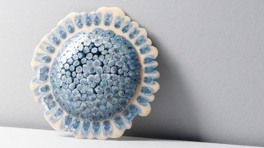
New Designers spotlights ten student design projects
Dezeen School Shows: a jewellery collection utilising discarded plastics and promoting sustainability is included in Dezeen's latest school show by New Designers.
Also included is a project exploring Indo-Portuguese architectural styles and repurposing coconut shells, and compostable food packaging made from mycelium.
New Designers
School: New Designers
Statement:
"New Designers is an annual London showcase of the UK's most innovative emerging design talent.
"Since its inception 39 years ago, New Designers has provided a platform for over 3,000 graduates every year to present their visionary ideas to industry professionals and the public.
"The event takes place over two weeks, with different disciplines highlighted in Week 1 and Week 2, spanning fashion, textiles, furniture, product design, illustration and more."
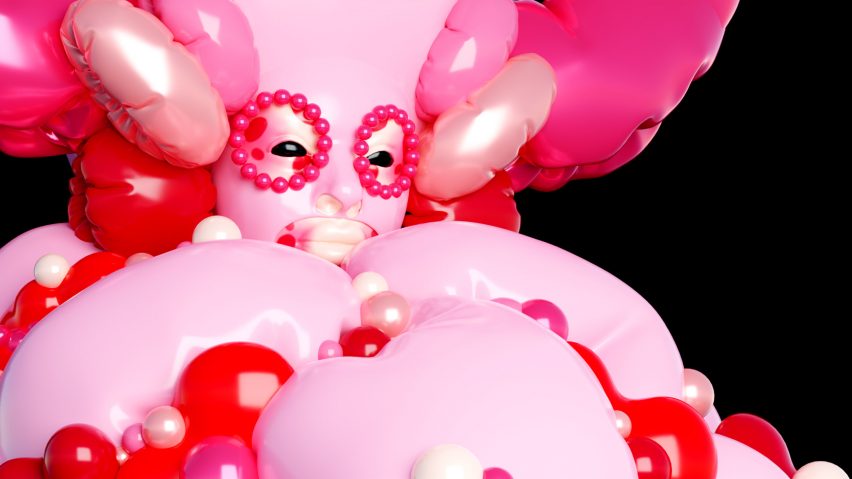
Gluttony by Gabrielle Parker
"Gluttony is Gabrielle Parker's interpretation of the sin of gluttony.
"It is one of four gifs inspired by the seven deadly sins – finding its inspiration in high fashion and sculpture, particularly the sculptures of Angelika Arendt.
"In this piece, Gabrielle Parker wanted to reflect the globular, organic nature of Arendt's work as well as the forms created by inflating latex as seen in Sasha Frovlova's work.
"This piece is entirely created and animated in the 3D software Blender."
Student: Gabrielle Parker
School: Arts University Bournemouth
Course: BA (Hons) Illustration
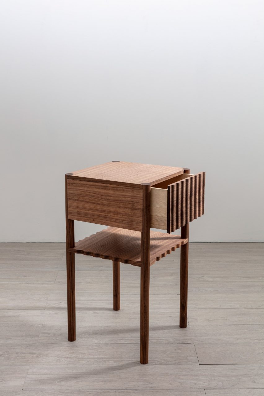
The Walnut Bedside Table by Jonty Scott
"Made from solid and veneered American black walnut and solid English ash, The Walnut Bedside Table features rippled and scalloped edges while the solid drawer front reveals the spectacular grain of the walnut.
"The spacious drawer is made from English ash.
"The shelf is scalloped all the way around, which is perfect when reaching for a book from bed."
Student: Jonty Scott
School: Robinson House Studio Furniture School
Course: 50 Week Furniture Design and Makers’ Course, SCQF, Level 8
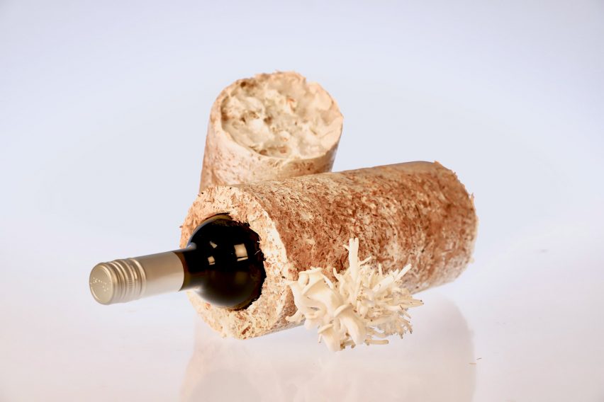
Myco - G by Eugenia Maria Rossi
"Myco - G is a project aiming to tackle the rising problem of non-sustainable packaging solutions.
"By collaborating with nature, Myco - G is mycelium-based packaging for goods shipment and storage – from wine bottle cases to fruit trays and plant pots.
"The development involves utilising the fungal network of the mycelium and its regenerative properties resulting in 100 per cent compostable packaging.
"The outcome is a carbon-positive material presenting strong insulating properties and remarkable impact resistance.
"The project represents a new, exciting way to collaborate with nature to rethink the way we produce packaging."
Student: Eugenia Maria Rossi
School: London South Bank University
Course: BSc (Hons) Product Design
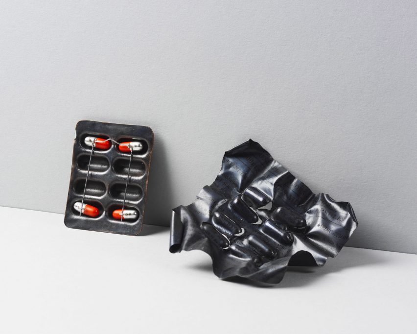
Repeat Prescription by Misha McLean
"Repeat Prescription focuses on our relationship with medicine.
"In the Western world, pharmaceuticals are undoubtedly intertwined in our daily lives – medicine can be a life-saving tool but can equally cause harm to those who take it, resulting in many polarising opinions on this subject.
"Some see medicine as something that significantly improves their quality of life, allowing them to live without pain or discomfort, whereas others only take medicine when it is essential, as they are afraid of adverse side effects.
"But without medicine, some people would not be alive.
"I have created this collection to explore attitudes towards medicine in the Western world and encourage others to think about their relationship with prescription medication."
Student: Misha McLean
School: The Glasgow School of Art
Course: BA (Hons) Silversmithing & Jewellery
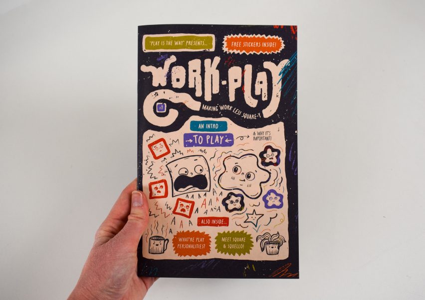
Play is the Way by Sadie Thorpe
"My project Play is the Way is a brand and initiative to bring play to the everyday – designed specifically help overcome workplace stress.
"In the words of the brand: 'Life can be … rough. At Play is the Way, we just want to make it a little better by introducing play into the everyday. Sure, it's not a cure-all, but it's an easy way to reap more joy from life, and be better prepared for what life throws our way'."
Student: Sadie Thorpe
School: University of Huddersfield
Course: BA (Hons) Graphic Design and Animation
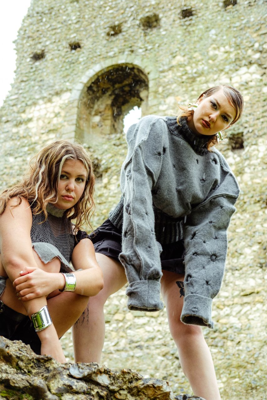
Medieval Knights and the Beasts They Fear by Maeve Grace Taylor
"My project delves into medieval bestiaries and knights' armour, inspired by the absurdity of medieval period imagery and storytelling and the humorous representations of animals, both real and mythical.
"In my collection, I juxtapose the soft warmth of knitwear with the striking protection of armour, symbolising nobility and decadence – this exploration came after noticing parallels between chainmail and lacework, leading me to marry these contrasting subjects.
"I manipulated surfaces to create three-dimensional textures inspired by illustrations of creatures and battle damages, using knitting techniques in a non-typical manner – creating soft, structured garments with locally sourced or dead-stock yarns.
"I aim to evoke the romance of the stories behind them whilst subverting the typical characteristics of knitted garments."
Student: Maeve Grace Taylor
School: University of Brighton
Course: Textiles Design with Business Studies
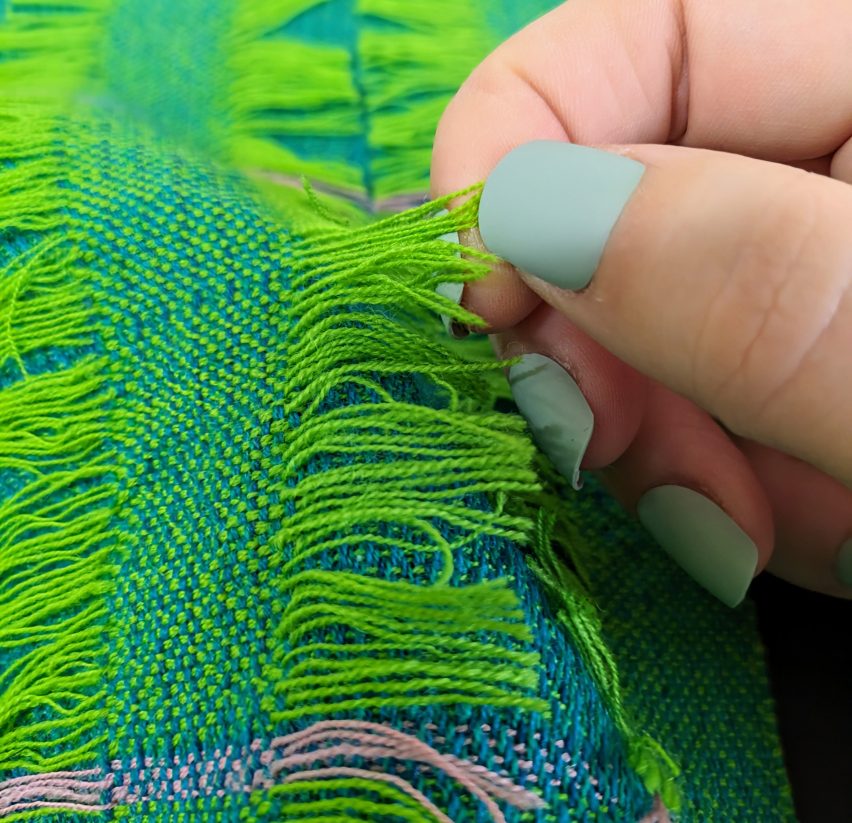
Trichotillomania by Sadie Worrall
"The condition trichotillomania is a stress-related disorder where the person affected pulls out their own hair to cope with stress – it is a condition I have struggled with since I was around ten years old.
"In order to explore the possibility of creating a collection of fabrics that would act as a substitute for hair, Trichotillomania focuses on how colour and texture could help alleviate the symptoms of the condition.
"The blues and greens create a calming environment and encourage the user to destress, while the different textures relieve the habit of pulling hair. The majority of the materials explored used natural fibres.
"By designing fabric with extra yarns, the user can pull them out without affecting the integrity of the fabric, allowing it to be used in a multitude of different ways whilst still functioning as a fabric after the user has pulled out all the extra yarns, ensuring not to waste any materials."
Student: Sadie Worrall
School: Heriot-Watt University
Course: BA (Hons) Design for Textiles
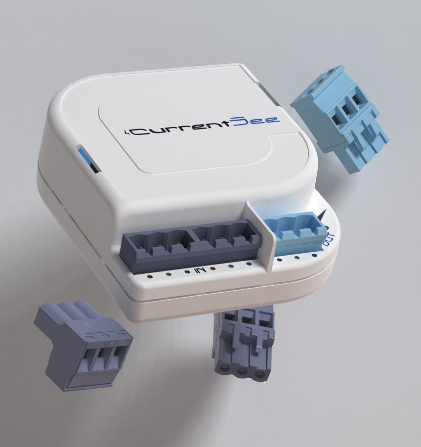
CurrentSee by Luke Handley
"Do you know how much money you spend charging your phone every night? Would you like to?
"CurrentSee empowers consumers with localised and detailed data of their energy usage in real-time, enabling them to be more conscious of their consumption.
"It also gives more control to the user, by enabling smart features via an accompanying app.
"The ability to see usage data per outlet at home, as well as being able to control your plug sockets remotely, will provide a clearer understanding for the user and enable them to reduce their consumption, and subsequent energy bill."
Student: Luke Handley
School: London South Bank University
Course: BSc (Hons) Engineering Product Design
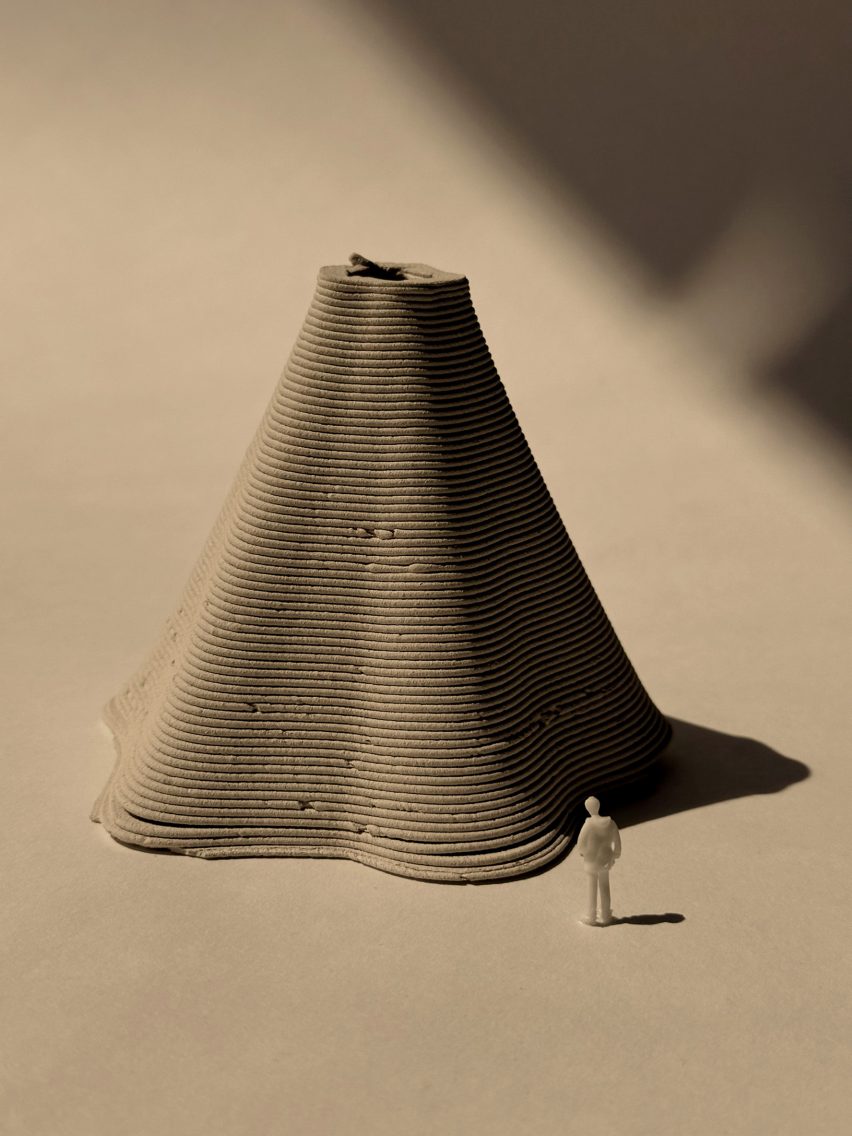
Nārl by Carida Monteiro
"My project celebrates the fusion of traditional Indo-Portuguese architectural styles, intricately crafted from coconut shell by-products sourced from local craftsman in Goa, India.
"These stunning creations not only showcase the rich cultural heritage of the region but also promote sustainability by repurposing natural materials.
"Additionally, I incorporate coconut palm tree sugar into the project, further emphasising the utilisation of locally sourced resources and highlighting the versatility of coconut-based products in art and design."
Student: Carida Monteiro
School: University of the West of England, Bristol
Course: BA Interior Design
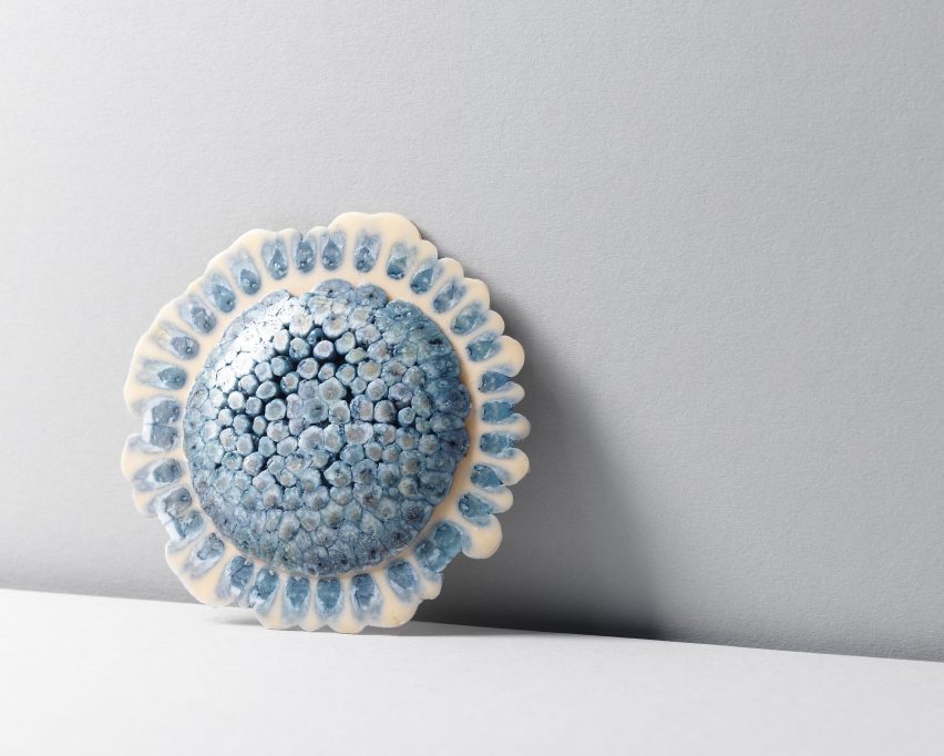
Plastic Metamorphism by Siri Hansen
"Plastic Metamorphism is a collection of wearable pieces that question traditional notions of material value.
"The pieces are made from discarded plastics, playing with the aspect of preciousness – the questioning of material value can be seen in the combining of materials that are traditionally seen as precious with those that are non-precious.
"The waste materials used in the pieces are a mix of discarded jewellery, waste from different departments in the Glasgow School of Art, and everyday waste found in households and on the street.
"The collection is highly motivated by sustainability – what would have become waste is given a new life, inviting the viewer to rethink their perception of waste and their plastic consumption habits.
"The name Plastic Metamorphism hints at rock metamorphism, a process where rocks change form due to high temperature and pressure exposure – similarly, in the making of this collection, discarded plastic was exposed to heat and pressure to be turned into something new."
Student: Siri Hansen
School: The Glasgow School of Art
Course: BA (Hons) Silversmithing & Jewellery
Partnership content
This school show is a partnership between Dezeen and New Designers. Find out more about Dezeen partnership content here.