"Thank God for the sexy cabinets" says commenter
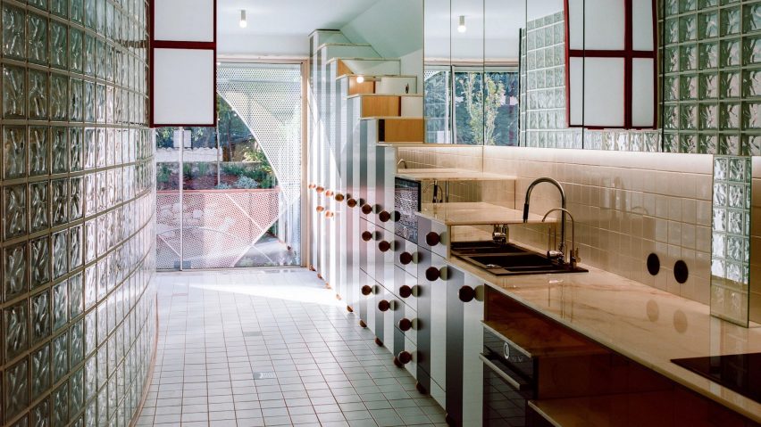
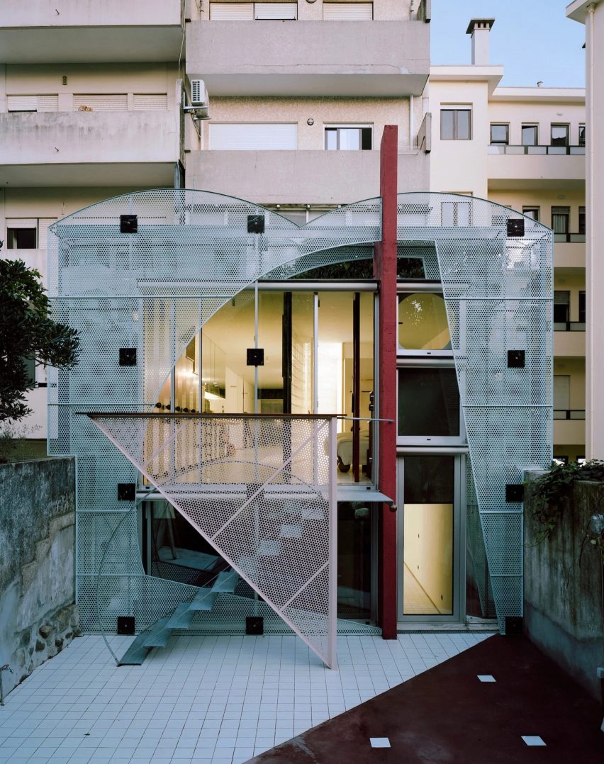
In this week's comments update, readers are discussing an apartment in Porto with graphic metal facades, curving glass-brick walls and bespoke black and white cabinets.
Located in a 1970s housing block, the apartment was converted from a ground-floor shop by local architecture studio Fala Atelier.

"The kitchen is very well timed with the Beetlejuice sequel"
"This project made me overflow with nostalgia," wrote Weetbix.
Meanwhile, Architect Ingognito felt "the kitchen design is very well timed with the release of the Beetlejuice sequel".
Other commenters were less charmed by the design. For Apsco Radiales, the "white tile floor in the kitchen has all the sex appeal of a medical laboratory".
But managed to find appeal elsewhere when they exclaimed "thank God for the sexy cabinets, though".
Although usually a fan of Fala Atelier, this particular project missed the mark for commenter JZ. "Oof, I love this firm's work but this reveals all my prejudices against the early 1980s," they wrote.
"Beyond the fit and finish, I also think the plan is challenged," they reflected, before suggesting "the proportions here are seriously awkward".
Jb, however, celebrated the unusual project, proclaiming "kooky creativity is the way forward".
What do you make of Fala Atelier's latest project? Join the discussion ›

"What a grand gesture from the city of Detroit"
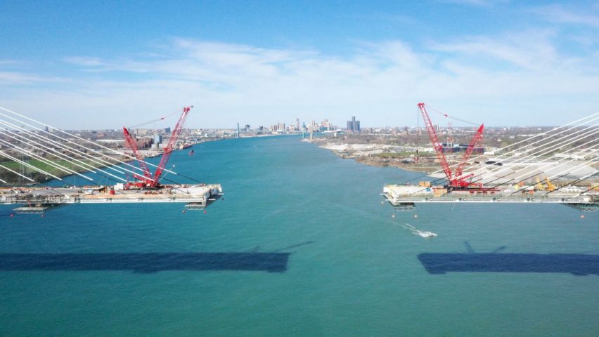
Readers also reacted to news that the Geordie Howe International Bridge is nearing completion. Designed by infrastructure firm AECOM, the bridge will link the USA and Canada over the Detroit River and will become the longest cable-stayed bridge in North America.
"What a grand gesture from the city of Detroit," noted commenter 竜皐一. They continued "[I] hope this will be the tipping point into a great up-turn for the city".
Marius was also optimistic and suggested "this bridge completes the city's revival – really good-looking structure".
However, Ian Byrne wasn't convinced and felt "it would have been nice if they had incorporated a rail deck into the design".
"While bridges like this are welcome, they also lock us into relatively unsustainable transport systems," they continued.
Whateverandeveramen chimed in here to say "it could be argued (and indeed has been) that the entire bridge is a white elephant and should never have been constructed".
White elephant or welcome addition? Join the discussion ›

"Yet another huge ugly glass box"
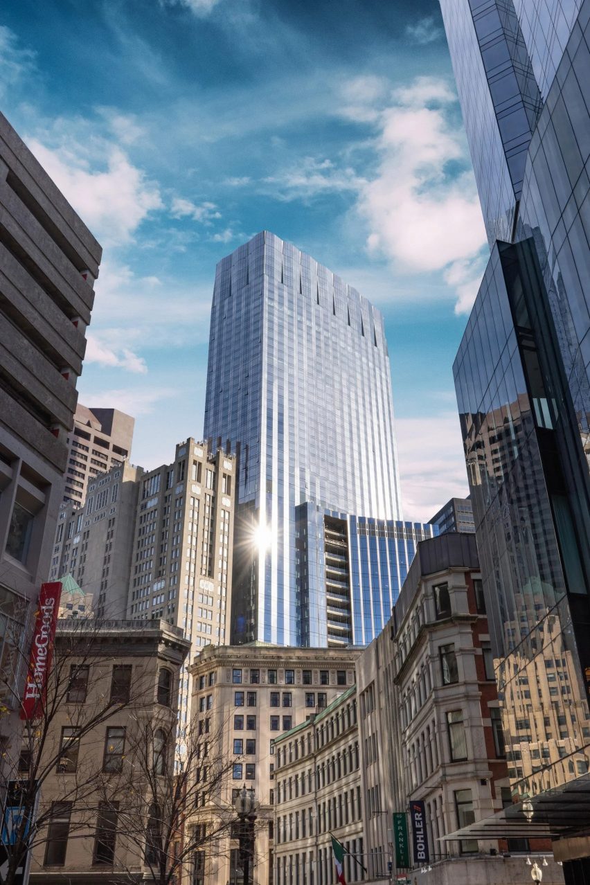
One project which readers could agree on this week was a skyscraper in Boston by Handel Architects which its developers say is the "world's largest Passive House office".
Commenters were sceptical of the Passive House claims. Marius dismissed the project as "another glass box from the school of developers' glass boxes with the incumbent green band-aids".
"Looks passive-aggressive in this context," they quipped.
Rd agreed, finding the tower "so much in the personal space of the buildings next to it that it's awkward".
"Why would a city allow that?" they wondered.
Jack Woodburn despaired at "yet another huge ugly glass box" and Love Me Architecture also described it as a "dreary grey modernist box".
"I gotta say, this looks awful" agreed Souji, before acknowledging "the interiors are nice though".
Do you agree? Join the discussion ›
Comments Update
Dezeen is the world's most commented architecture and design magazine, receiving thousands of comments each month from readers. Keep up to date on the latest discussions on our comments page and subscribe to our weekly Debate newsletter, where we feature the best reader comments from stories in the last seven days.