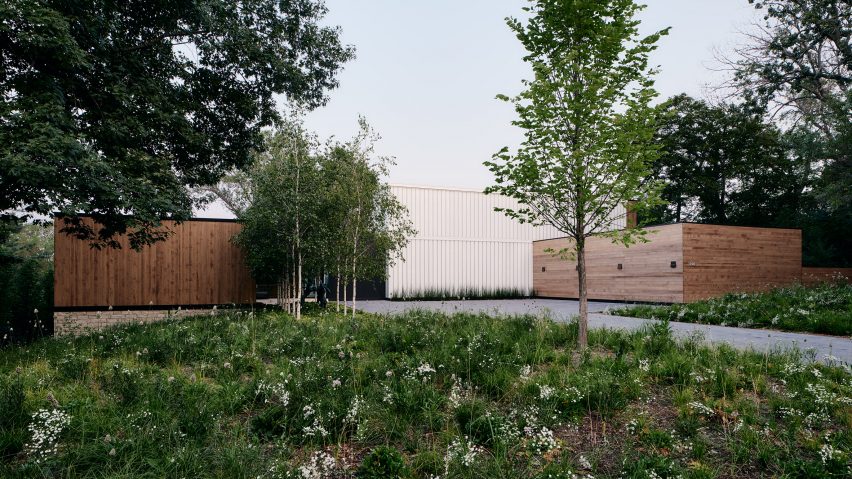
US studios PKA Architecture and Martha Dayton Design have completed a waterfront residence with a glass-clad entry volume designed to "make an architectural statement".
Called Lakeside Modern, the house is located alongside a lake in central Minnesota. It was designed for a couple with grown children who were looking to downsize from their large family home, located nearby.
PKA Architecture and interior design firm Martha Dayton Design – both based in Minnesota – worked closely together to create a dwelling that was private while having a strong connection to the water.
Another priority was the display of artwork, specifically a 10-by-10-foot (three-by-three metre) painting that the clients wanted hung in the dining area.
"The entire house was essentially designed around where the large painting on the wall of the dining room would be located," the team said.
The architects conceived a 7,400-square-foot (687-square-metre) house that consists of rectilinear volumes set around outdoor spaces.
To shield views from the road and an adjacent property, the front facade is relatively opaque. Along the rear elevation, however, the house opens up to views of the lake.
A mix of materials clad the facades, including accoya wood, Wisconsin limestone and dark-hued metal. Channel glass with translucent insulation surrounds a stairwell in the front of the home.
"The clients desired privacy, but also wanted to let it light and make an architectural statement with the entry," the team said.
"The stair hall is illuminated on three sides with translucent glass to create a glowing element at night."
Within the residence, airy rooms are spread across three levels. The main level holds a mix of public and private spaces including entry spaces, the kitchen, living room, dining area and primary bedroom suite. There is also an office, craft room, garage and screened porch.
The top level contains guest accommodation, an office, a sitting room and gym. The bottom floor contains sleeping areas and a family room, along with storage and mechanical space.
The rooms were designed with neutral colours and earthy finishes such as wood and stone, with the aim of creating a calming atmosphere.
The primary bathroom is fitted with limestone flooring, white oak-veneer cabinets and silk carpeting. In the kitchen, the team used high-gloss acrylic, reconstituted oak, and quartzite with a leathery finish.
"The materials were all chosen because of a fine level of detail," the team said.
"Even though there is calm to the interiors, the materials have a presence and refinement that add subtle textures and plays of light."
The clients' children played a key role in the interior design and helped create spaces that are "livable, comfortable and fun".
"The interior design team's biggest consideration was being sensitive to the fact that their clients were moving out of the house where they'd raised their children, who are now grown with children of their own," the team said.
"The clients' most important request was that each child weighed in on elements that would make this new house a home, and they took that to heart throughout the entire process. This design was as much for the children and grandchildren as it was for the clients."
Other houses in Minnesota include a wood-clad residence by Salmela Architect that was informed by Japanese architecture, and a low-lying home by Altus Architecture + Design that has glazed and cedar walls and a detached shed wrapped in mirrored stainless steel.
The photography is by Joe Fletcher.

