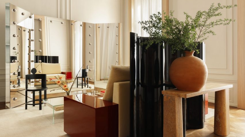
Halleroed contrasts colour and texture inside Boygar's Tbilisi store
Design studio Halleroed has combined rustic, earthy tones with bold colours and glossy finishes for online retailer Boygar's first store in Tbilisi, Georgia.
Set across three floors in a historic building on Tbilisi's Rustaveli Avenue, Halleroed worked within the framework of the building's existing features when designing the store.
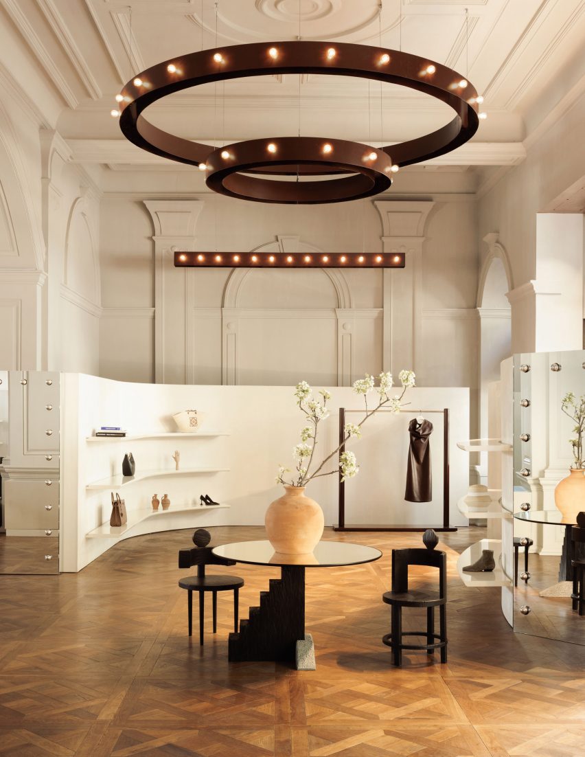
Characterised by a series of tall arched doorways and openings, the ground floor space features circular bronze-toned chandeliers, decorative wall and ceiling elements and Versailles parquet flooring.
To preserve the existing ceiling details, chandeliers designed by Cristian Miola were hung with minimal intervention.
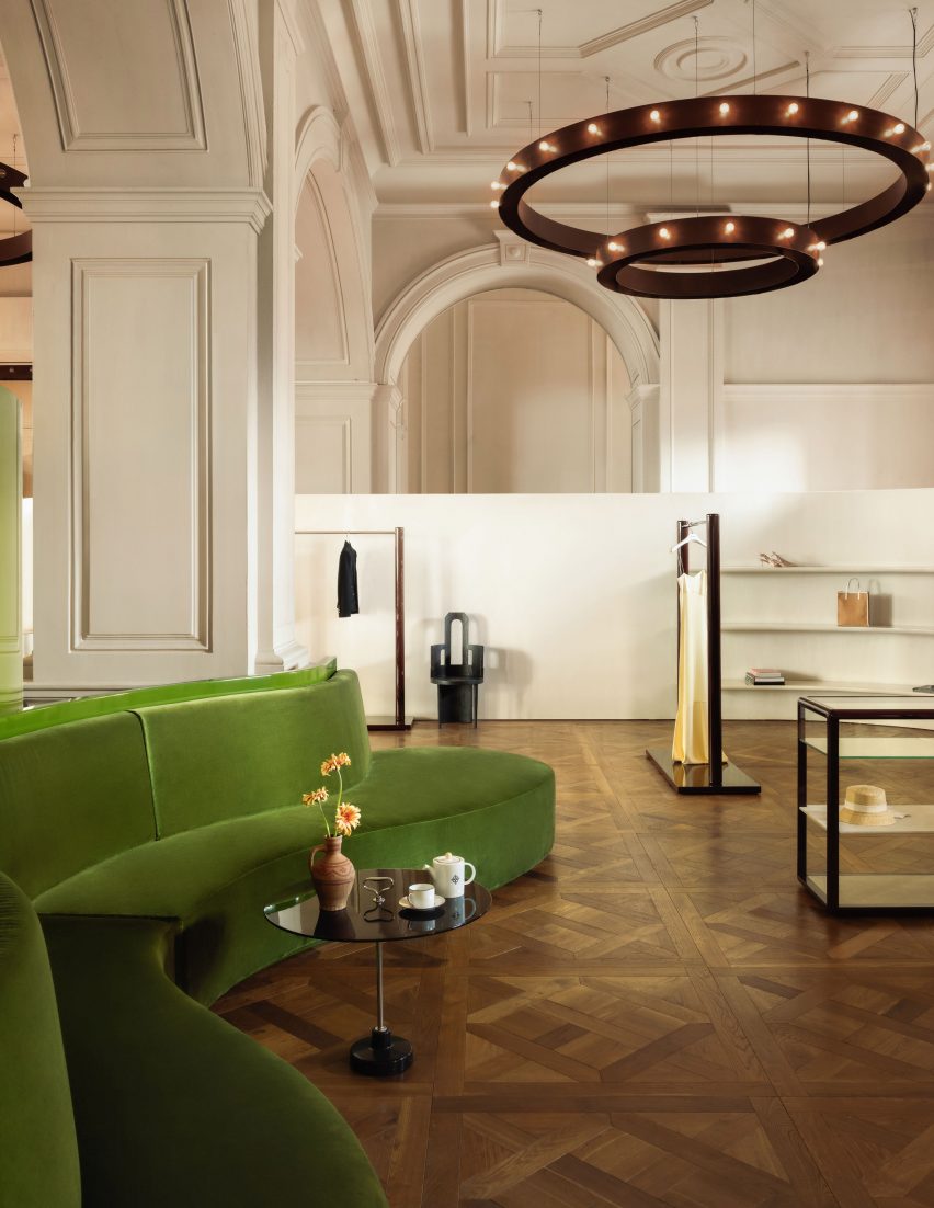
"The inspiration for the chandeliers was from the Greek Orthodox Georgian churches that we visited during our stay in Tbilisi," Halleroed told Dezeen.
To create a striking visual contrast against the more neutral tones and materials, Halleroed added a velvet green sofa and a matching curved green screen with a high-gloss finish.
"For the ground floor and first floor, we had a decorative, old, existing environment which we wanted to be the backdrop to the new additions," Halleroed explained.
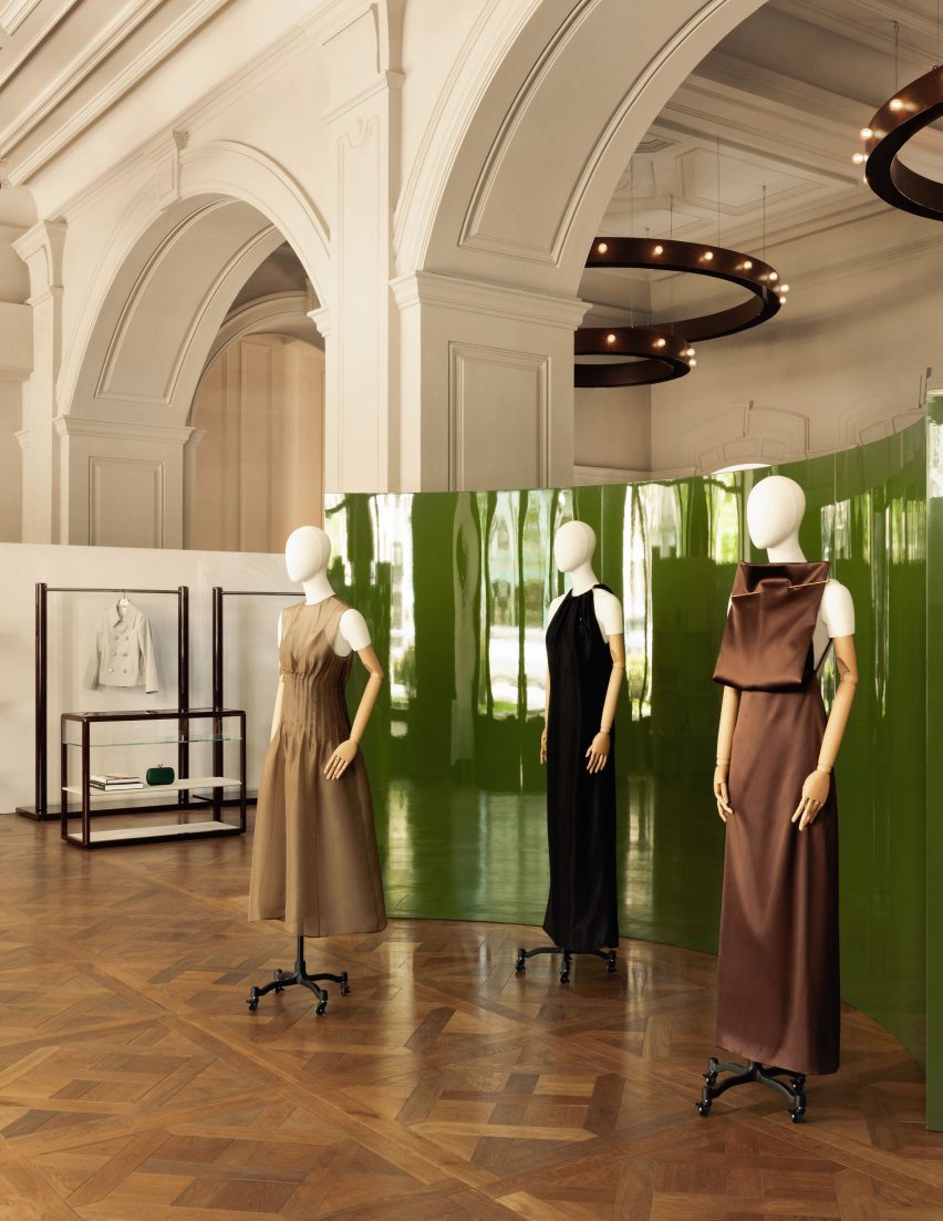
Halleroed also incorporated half-height curved partition walls that weave through the ground floor space. These have integrated mirrors, as well as floating shelves to display Boygar's products.
"The walls and ceiling of the existing building have a darker beige tone while the new, lower, curved walls are in a textured bright wallpaper to create a contrast between old and new," said Halleroed.
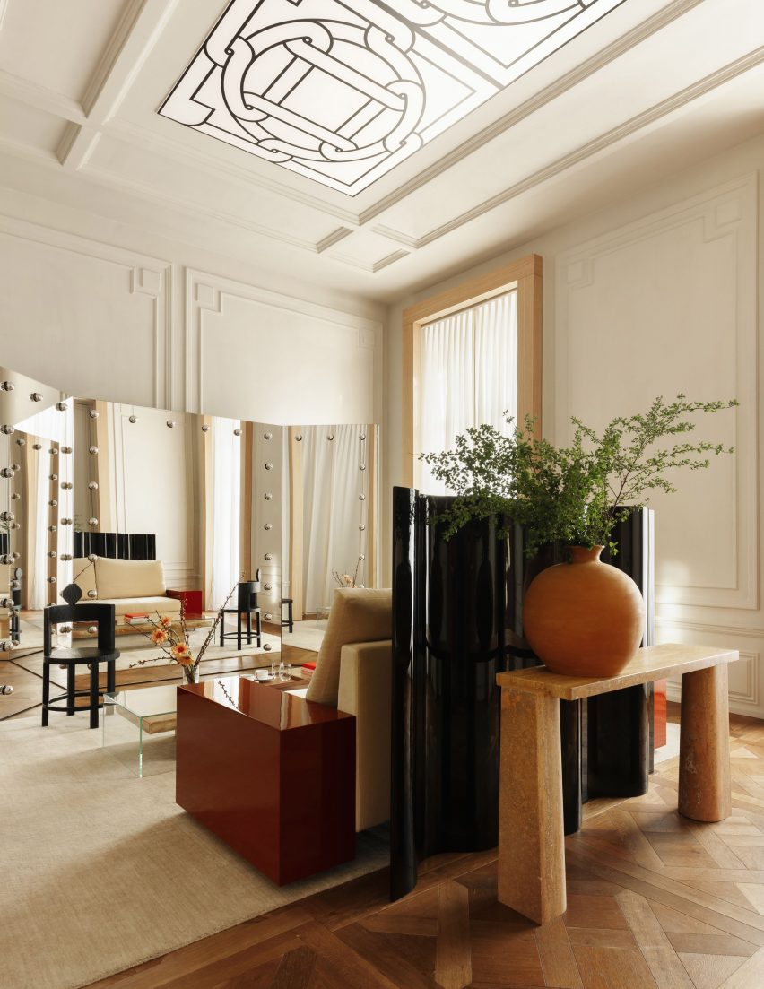
A marble staircase leads up to the first floor, where the material and colour palette echo that of the ground floor.
"The colours and fixtures are from a more earthy, in our eyes, Georgian palette with burgundy, ochre, green and black accents," said Halleroed.
Halleroed juxtaposed elements including oak window and door frames with a burgundy lacquered side table and a curved glossy black screen.
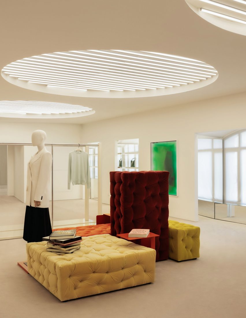
The store's lower level is a "more contemporary area", according to Halleroed.
Here, modular seating by Italian designer Gaetano Pesce stands out in bright pops of solid colour against the neutral palette used for the walls and carpet.
"Downstairs we used a more modern approach since the space didn't contain any decorative elements," Halleroed explained.
Work by contemporary Georgian artists including Ketuta Alexi-Meskhishvili and Shota Aptsiauri line the walls.
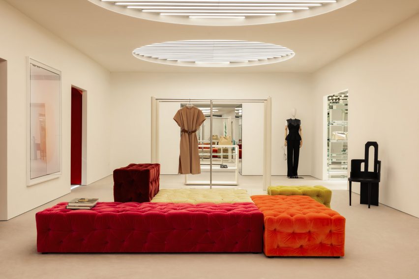
Garments presented on mannequins and minimal clothes rails are illuminated by tubular lighting contained in circular niches in the ceiling.
"Tubular lighting is very typical for art galleries and we wanted that feeling downstairs but in a more interesting, spatial way," said Halleroed.
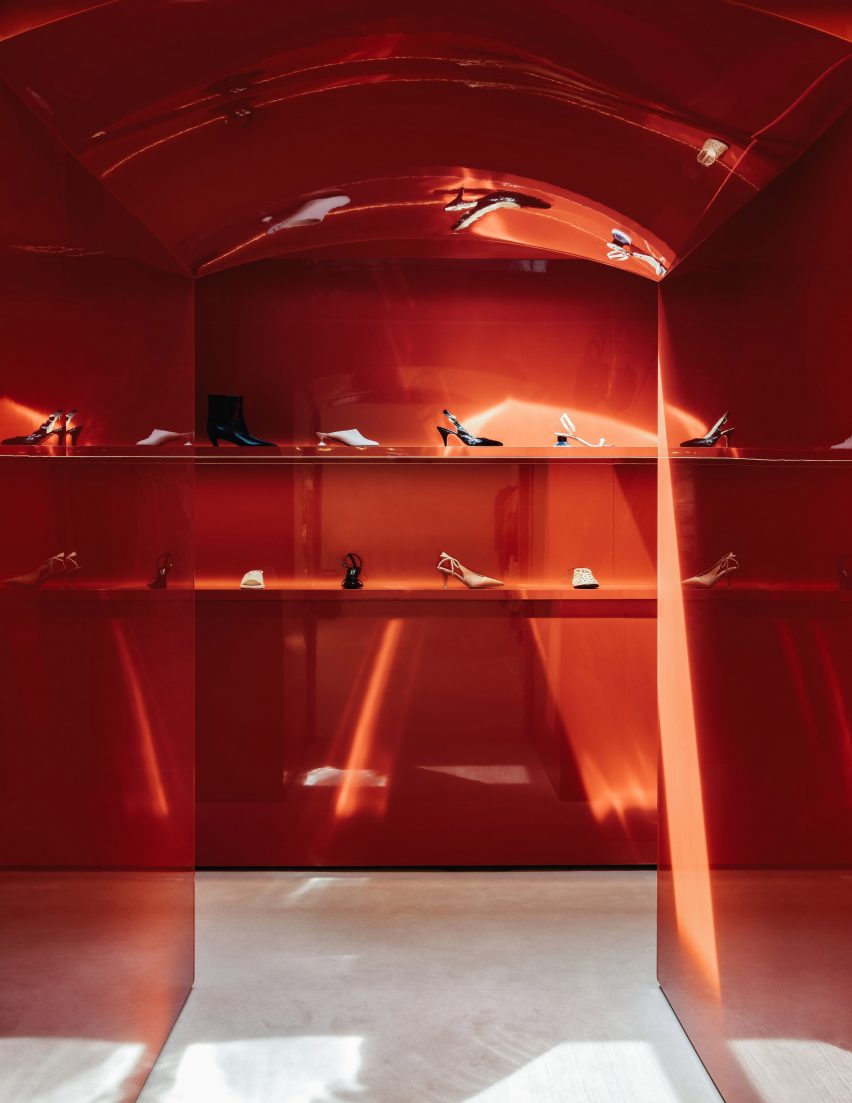
A bright red archway frames a women's shoe display area, with the same gloss finish used elsewhere.
"The strong coral red colour was inspired by the famous Georgian artist Pirosmani's paintings," Halleroed explained.
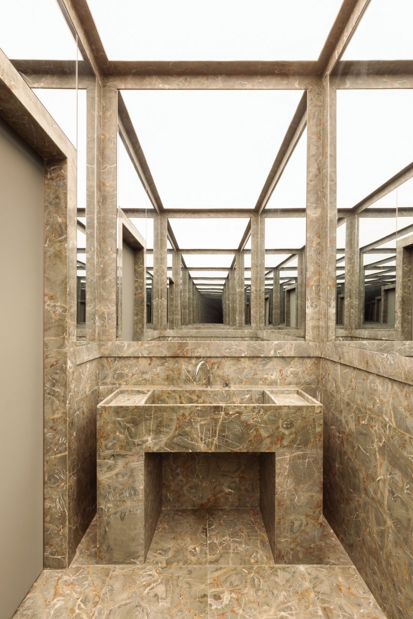
In the bathrooms, a green-hued local Georgian marble was used, which matches the building's facade.
"We always try to work with local materials where possible," Halleroed said. "We played with the stone and illuminated ceiling to create a visually intense, almost scenographical effect."
Other store interior projects recently published on Dezeen include a flagship store for fashion brand Totome in London and a boutique in Paris for French bag brand L/Unifirm.
Photography is by Ludovic Balay.