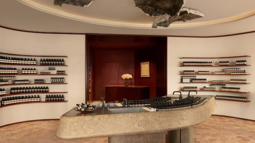
Austrian architect Jakob Sprenger has installed 1920s plaster medallions above a large sculptural sink as the centre of skincare brand Aesop's store in Paris.
Located within a residential neighbourhood in the district of Ternes in Paris' 17th arrondissement, Sprenger designed the store to "create a feeling of simple domesticity".
The space was designed around four 19th-century painted gypsum ceiling medallions that the team found during the initial stages of the project.
The baroque-style medallions were originally made in 1923 for the now-demolished Hotel de la Guilonniere in central Paris.
They were placed directly above a sculptural sink that sits at the centre of the triangular store.
"At first, we weren't sure how to incorporate them, but their artistic quality and provenance immediately caught my attention," Sprenger told Dezeen.
As is typical of most Aesop stores, the sink can be used by customers to trial and test the brand's products.
Above the sink, a large elliptical cut-out in the ceiling was designed as a frame for both the sink and the medallions above.
"The triangular floorplan with a wide south-facing facade has a rather unusual geometry but allows for an impactful arrangement of functions and exciting perspectives," explained Sprenger.
The design team organised the space into two "differently proportioned" sections, with the primary sales area at the front of the store and the billing and checkout nook at the back.
Sprenger explained that the two sections were "flanked by softly rounded geometries, harmonising the visual tension of the triangular room with narrow corners".
Burgundy-toned window bays were created at either end of the space, where there is seating for customers.
Adjacent to one of the windows is a fragrance armoire, where customers can test the brand's perfume range.
The billing and checkout nook was created as an intimate space painted in burgundy red lacquer, featuring visible brush strokes.
Candles and incense are displayed on recessed shelves on one side of the nook.
According to Sprenger, the main design challenge was amending the facade, which was added in the 1990s.
The design team aimed to create an "inviting ambience" by adding textile awnings and lacquered paneling above a plinth clad in lutecian sandstone.
An alabaster-coloured Aesop street sign contrasts the dark background of the facade.
Sprenger previously designed Aesop stores in Rome and Salzburg.
"Our mission is to create lasting values that resonate meaningfully with their surroundings," he explained.
"We approach every project as a unique entity embedded in its historical, architectural and cultural context," Sprenger said.
Aesop stores recently featured on Dezeen include an outpost in Seoul informed by traditional Korean pavilions and another covered in mint green materials in Los Angeles.
The photography is by Ludovic Balay.

