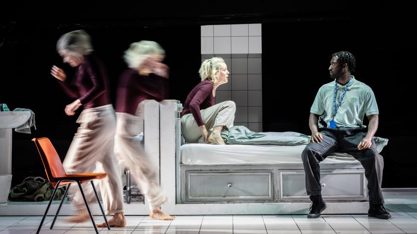
Designer Bunny Christie created an ambiguous, white-tiled structure that could be a swimming pool, the inside of a TV or a jumbo pill as the set for the play People, Places and Things, which tells the story of a recovering addict.
Originally debuting at London's National Theatre in 2015, writer Duncan Macmillan's play has returned to the city's Trafalgar Theatre, with Denise Gough reprising her main role as Emma – a quick-witted but disillusioned actor admitted to rehab for drug and alcohol abuse.
Christie, who has designed productions including London's currently showing Guys and Dolls, created the set to echo the character's "dislocation with reality".
"It's about Emma's process of getting clean," the designer told Dezeen at the West End theatre, where People, Places and Things runs until 10 August.
The play's centrepiece is a large, soft-edged cuboid-like structure clad in gleaming white tiles and framed with LED strip lighting. The particular shape was chosen to reference the familiar, albeit unsettling appearance of pills.
"Jeremy [Herrin, the play's director] and I talked about having a tiled space that felt like you could hose down – like it could just be wiped clean," explained Christie. "There's something metaphorical in that."
"I guess it's also a bit like a TV screen or a swimming pool," added the designer.
The drama follows Emma's experience of rehab, where she questions parallels between the performative nature of acting and group therapy – something Christie was keen to reflect in the set, which was arranged between two separate seating areas so that audience members stare back at each other throughout the play.
"It's that feeling of being in front of people, and what that does to you," said the designer, who sought to create an immersive and scrutinised experience for Emma's character.
"Emma's whole life is about being an actor. Her performative life is almost more important to her than her private life. In fact, that's a problem," she continued.
"I think there's something really intriguing and interesting for the audience to be watching another audience as they're watching. It's a kind of mirrors-within-mirrors feeling."
As the play progresses, the tiled set evolves to depict a range of spaces – from a mock stage to a nightclub to the main rehab centre – via minimal props and lighting changes designed by James Farncombe to be deliberately disorientating.
"Lighting is really crucial," said Christie, who also stressed the importance of the pulsating music by Matthew Herbert that is incorporated into the drama.
At one point, light projections cover the set's walls and fragment to mirror Emma's turmoil.
"The messed up state of Emma's whole physiology means she doesn't know what's real and what's not anymore. And that's really disturbing," explained Christie.
Standout moments in the performance include movement director Polly Bennett's tightly choreographed scenes featuring multiple "Emmas" played by other actors, who writhe and dance across the stage to echo the past selves that haunt the main character.
At one point, the figures emerge from under the duvet cover of Emma's rehab bed via a small hidden section under the stage.
Christie explained that while the original company at the National Theatre entered the bed through a trap door, the actors at the Trafalgar Theatre are confined to waiting in the lower portion of the bed itself before coming on stage through the bed.
"It's very cosy," Christie joked.
"It's as if the Emmas are coming through her bed, through the walls, through the pores of her skin," she added.
Despite these moments of deliberate disorientation, "clear, confident and upfront" design choices were also made to depict various scenes that take place within the brightly-lit rehab centre.
For example, the word "reception" glows in large capital letters on a geometric desk when Emma enters rehab, making the location alarmingly clear to the audience, explained Christie.
"There's a clarity and sharpness to the main set – just like there is in the writing and the acting," considered the designer.
"It's a crystalline moment where it's like waking up or coming to any kind of sharp clarity – like a pinprick," continued Christie.
For the group therapy sessions, the cast sit on recognisable orange plastic stacking chairs, chosen for their "ubiquitous" nature.
The understated costume design by Christina Cunningham also adds a sense of naturalism to the otherwise experimental set, said the designer.
"The costumes really bring the reality onto the stage," she explained.
Christie considered the impact of the play, which first transferred to London's West End at the Wyndham's Theatre in 2016 and then to St Ann's Warehouse in Brooklyn, New York, the following year.
"There are elements of Duncan's writing that apply to all of us – not just actors – but about how we perform to our friends, how we perform at work, what we're like when we're on our own. It's threaded into the piece all the way through," Christie concluded.
"Things about family, things about relationships with mothers, grief, and obviously substance and addiction," she added.
"People are really affected by the play – for all sorts of reasons."
Last summer, designer Es Devlin created an installation for a production of The Crucible in London, while interior designer Pierre Yovanovitch previously conceived a set with moving elements for an opera in Basel, Switzerland.
The photography is by Marc Brenner unless stated otherwise.
Project credits:
Writer: Duncan Macmillan
Director: Jeremy Herrin
Production designer: Bunny Christie
Costume designer: Christina Cunningham
Lighting designer: James Farncombe
Music: Matthew Herbert
Sound designer: Tom Gibbons
Video designer: Andrzej Goulding
Movement: Polly Bennett

