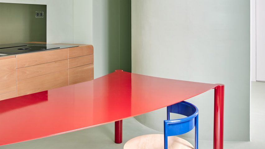
Local studio Lucas y Hernandez Gil has renovated and decorated this 19th-century Madrid apartment with their own colourful furniture.
The studio headed by Cristina Domínguez Lucas and Fernando Hernández-Gil Ruano redesigned the interior of the historic property for a young couple with two babies and two dogs.
The apartment had been renovated previously and had lost its original character, so the studio aimed to add personality while meeting the specific needs of its current owners.
The adapted floor plan organises the spaces into areas that overlook either the street or an internal courtyard at the centre of the apartment block.
A small entrance hall leading to a long corridor was replaced with a large library that forms the new heart of the home. This space was a request from the clients who are keen readers and have a large book collection.
The library provides access to the living room, kitchen and bedrooms, with its location at the centre of the plan with no external windows creating a protective environment for the books.
Large openings leading from the library to the connecting rooms emphasise the transition from one space to the next while removing the need for internal hallways.
The doorways were lined with a bold wood veneer created by designer Ettore Sottsass for ALPI in the 1980s.
According to the studio, the portals playfully reinterpret "the solemnity of the doors of bourgeois houses", with their scale and materiality creating a focal point whilst maintaining an open and fluid connection between the spaces.
"The openings provide a representational element to signify the importance of the space one enters," Lucas told Dezeen. "They also reference palatial houses that gave much importance to the transitions between rooms."
There are a total of five doorways around the library's perimeter, including one that leads to a cloakroom and study by the entrance and two angled openings that connect with a large living and dining room.
Two further doorways at the far end of the space connect with the principal bedroom and with a small hallway that provides access to the children's bedroom, a toilet, bathroom and the kitchen.
The material palette applied throughout most of the house comprises wooden parquet flooring, whitewashed walls and joinery that lends the spaces a traditional feel.
These familiar elements contrast with contemporary details including curved and folding shapes that add visual interest to the interior.
"We used curves to avoid sharp edges in the circulation areas," Lucas explained. "They are friendly shapes that express seclusion and comfort in order to balance small rooms."
Colour is used to differentiate spaces within the home, including the green kitchen and bathrooms featuring pink Portuguese marble set against a render chosen to evoke the colour of skin.
The pale green hue used in the kitchen is described by the architects as "a warm and friendly colour that is balanced by the cabinets".
A bespoke wooden unit topped with a stainless steel worktop is suspended from the wall to give it a lightweight feel, while a curved red dining table and accompanying chairs were chosen from the studio's chosen own furniture brand, Kresta Design.
"The kitchen is designed as a play of opposites between materials and shapes," explained Lucas. "It's as if the whole kitchen were a large cooking utensil, combining a friendly wooden handle with a technical metal finish."
The children's room has an undulating wall and a curved ceiling panel that add character to the space.
Bespoke cabinetry was decorated with a hand-painted wallpaper featuring imagery of the eldest daughter and pineapples and trees.
Lucas and Hernández-Gil Ruano founded their architecture and design practises in 2007 after graduating from Madrid's ETSAM school of architecture. The studio's recently completed projects include a bar with colour-blocked areas designed to create different atmospheres and the transformation of a 1970s bungalow into a kitsch home incorporating a multipurpose greenhouse.
The photography is by José Hevia.

