"We can humanise our existing spaces simply by deploying the radical power of colour"
Making our buildings more colourful would be an easy and effective way to achieve the aims of Thomas Heatherwick's Humanise campaign, writes Laura Guido-Clark.
When Thomas Heatherwick launched his Humanise campaign in 2023, skepticism came fast and furious. Decrying the negative psychological and public-health effects of what the designer calls "boring buildings", the campaign issues a well-meaning cry for interesting, soulful buildings that are better for people.
Heatherwick's campaign has been met with a barrage of criticism, but what if he's onto something? His line of inquiry offers an opportunity to take a step back and look at our built environment, at the places where our communities go to learn, connect, and find care, and ask, are these spaces actually designed to make us feel better?
The trajectory of modernism has often led us away from bright, bold colours and towards a more restrained palette
When we look closely, we might see that our schools, libraries, and community centres in the US often feel like visual deserts – devoid of character, variety and soulful details. Instead of being satisfied with this status quo, we could do well to join Heatherwick's campaign, banding together to create more visually interesting spaces that improve our wellbeing.
One often overlooked yet highly powerful way to create "unboring" buildings is through the use of colour. While the trajectory of modernism has often led us away from bright, bold colours and towards a more restrained palette in our buildings and cities, I believe colour is an accessible and sustainable way to bring new life to old buildings that are failing to serve their users on a psychological, physiological or emotional level.
We know from the emerging field of neuroaesthetics, often referenced by Heatherwick, that being immersed in boring, unspirited, and monotonous environments is bad for our health. Rather than calm or soothe our nervous systems, these bland spaces actually do the exact opposite, stimulating cortisol production to increase stress and anxiety.
We need visual stimuli in order to be and feel our best. If in doubt, simply take a walk in nature and marvel at how the variety of colours, textures, light, and depth of field can immediately lower your heart rate and bring a sense of calm.
However, when we look at the places where children learn, the essential places where families connect and community spaces where people are encouraged to grow and thrive, we find their visual expression pales in comparison to the soulful jobs they are intended to carry out. Stripped of character and personality, these buildings are often bland, colourless, and anything but welcoming, unable to foster a sense of equity and belonging.
Instead of soulless and institutional, why can't these places be colourful and alive? Especially because we know that colour nourishes us, increasing the human capacity for learning and growing.
If we want a more humane built environment, we don't necessarily need to start from scratch
"Research shows that learning benefits from a stimulus-rich environment," says architect and colour researcher Randall Fielding. “[Learning] is not supported by a palette that is dominated by gray, beige, white or off-white." In short, life grows where colour goes.
If we want a more humane built environment, we don't necessarily need to start from scratch with new, visually interesting buildings constructed from the ground up. The truth is, we can do much to humanise our existing spaces simply by deploying the radical power of colour.
It's a more sustainable approach to creating meaningful buildings that doesn't require a huge material or labour investment. Colour is transformational – simply by applying a coat of paint, a composite pigment or a window film, our buildings can change the way we see the world, and by extension, our place within it.
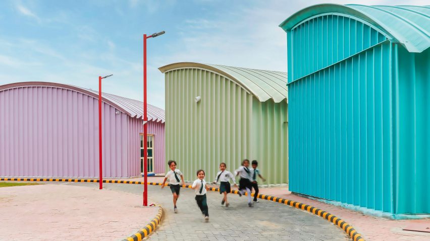
Even buildings that seem resistant to the application of colour can be coaxed into animation. For example, Shreesh Design Studio created a pre-school in Gujurat state, India (pictured) that consists of simple steel structures arranged in a circle, each containing classrooms.
While the structures themselves lack ornamentation and focus on functionality, rendering each building in a different, brightly coloured hue helps the campus come alive with a playful sense of variety. The application of colour also keeps the structures modifiable, with each designed for ease of disassembly and transport.
In Spain, architect Ricardo Bofill was known for applying dazzling colours to functional elements like stairways and columns, and to entire buildings, like his salmon pink La Muralla Roja apartment complex in Manzanera, Spain. For him, colour was a way to bring life and joy to housing projects, which at the time were often drab and focused purely on functionality at the cost of aesthetics.
I often encounter architects who are resistant to using colour
While Bofill and Shreesh demonstrate the possibilities when colour is applied in broad strokes, others reveal the power of a selective application of colour. In Singapore, the Ministry of Information Communications is housed in a 1934 neoclassical building whose 927 windows have been painted in the colours of the rainbow, bringing an instant air of approachability to an otherwise stoic building.
In Portugal, Mezzo Atelier has updated an early-20th-century stable into two guesthouses, introducing a new volume in dusty rose that distinguishes old from new and lends an inviting sensibility. Here, the colour is subtle and contextual enough that the building still fits into its surroundings, showing that the use of colour doesn't have to be about loud gestures or standing out.
I often encounter architects who are resistant to using colour. Usually, their argument against colour has to do with a belief that buildings must be contextual and fit with their surroundings. But designing this way will only perpetuate the trend towards neutral buildings. What if we can break the cycle and use colour the way it is most meaningful: with intention?
Think of designers like Luis Barragán, Ricardo Bofill, and Emmanuelle Moureaux – trailblazers who weren't afraid to inject swaths of colour into their designs. They used colour to make their buildings inviting and engaging, places that make your soul happy. Their buildings have become beloved by their communities and the larger architectural canon alike, and we can learn much from their bravery and willingness to use colour with meaning.
At the same time, we shouldn't strive to create buildings that stand out simply for the sake of being different. Colour should be used intentionally and for a focused impact. It's important to return again to our purpose as designers – our calling is to be of service and to use our skills to create places that nourish people.
Our buildings should inspire joy and connection, make us feel nurtured and valued, and energise us personally and collectively. What better way to achieve that than through colour?
Laura Guido-Clark is the founder of colour-focused design consultancy Love Good Color and the non-profit Project Color Corps.
The photo is by Smit Mehta.
Dezeen In Depth
If you enjoy reading Dezeen's interviews, opinions and features, subscribe to Dezeen In Depth. Sent on the last Friday of each month, this newsletter provides a single place to read about the design and architecture stories behind the headlines.