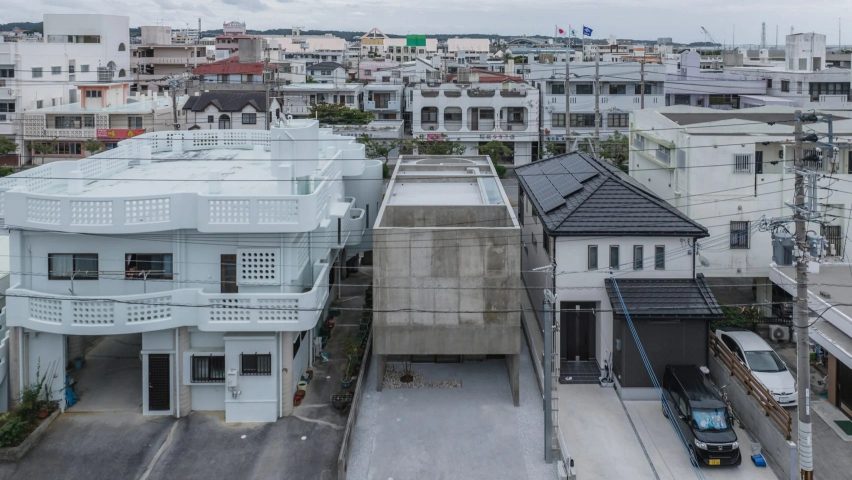
In this week's comments update, readers are discussing a house in Japan with thick walls of exposed concrete, completed by Studio Cochi Architects.
Due to its location in a dense residential area, the clients wanted the house to be an "urban oasis" protected from overlooking neighbouring buildings. Not all commenters were won over by the design.
"That spatial sequence is epic"
"It looks hideous, like a concrete shipping container," wrote Stevie Babes.
Heywood Floyd was more balanced in their assessment, reflecting "there's a lot I'm unsure about here – poorly finished concrete, which seems to be purposeful, lack of natural light, lack of furniture, lack of stuff".
"However, that spatial sequence is epic," they allowed, before describing it as "ambitious work".
"Interesting dramatic spaces," admired MrG. "But all that concrete for a one bedroom home?!" they asked.
Meanwhile, Mark Zudini simply described it as "strong and beautiful".
Hideous or beautiful? Join the discussion ›
"Huge effort with an unclear purpose"
Another concrete structure that got readers talking in the comments section this week was a ring-shaped viewpoint on a Belgian beach completed by local practice Studio Moto.
"Absolutely delightful, and a great fishing spot at high tide," determined Harry Belafonte 3rd.
Daniel C was on the same page, praising it as "wonderful, sublime!"
However, Marius took issue with "a lot of concrete on the fine beach – huge effort with an unclear purpose". They continued "I love my beach walks long and linear without dynamic loopy elements."
Commenter Rd responded "interesting critique – I agree this project seems to lack purpose". Nonetheless, they recognised that "it is however a landmark, quite pretty, resilient, not unfitting along the Atlantikwall, and it does add a dynamic to the walk along the beach promenade."
Are you a fan? Join the discussion ›
"Is this really an example of great architecture?"
Also on commenters' radars was the news that images have been revealed of the first of a pair of high-tech skyscrapers in Bogotá designed by the late Richard Rogers.
Certa Cito felt the skyscraper was "absolutely awe-inspiring".
"Nice – graphic simplicity of detail and honest expression of the structure," wrote Idracula.
Meanwhile, Jacob Volanski felt like "Richard would be slightly disappointed to see how much they downplayed his signature cross-bracing in the final product".
However, commenter APG couldn't pass up on the opportunity for irony, writing "Ooh, a steel and glass skyscraper... how novel". "Is this really an example of great architecture? Seems a bit stuck in the 1980s," they continued.
What do you think? Join the discussion ›
Comments Update
Dezeen is the world's most commented architecture and design magazine, receiving thousands of comments each month from readers. Keep up to date on the latest discussions on our comments page and subscribe to our weekly Debate newsletter, where we feature the best reader comments from stories in the last seven days.

