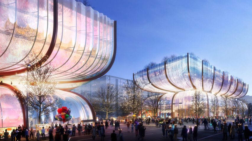
In this week's comments update, readers are discussing plans revealed by Heatherwick Studio for a glass shopping centre in Seoul with volumes that resemble "rippled hourglasses".
According to the proposal, the existing Hanwha Galleria shopping centre on the site will be replaced with two near-identical volumes made of curved glass.
"Gorgeously original"
Readers drew parallels between the design and various decorative household objects. "Giant Baccarat ashtray? Shallow fruit bowl blown up to an enormous scale? Which is it?" asked Name Changer.
Meanwhile, Nadim thought "it looks like a decorative glass vase on the floor".
Other commenters couldn't pass up on the opportunity for irony. "Nothing more contextual than an extremely expensive glass box – climate crisis (check), economic crisis (check)," wrote A guest.
However, Don Bronkema thought it was "gorgeously original", while Jb expressed "thank God for Heatherwick's sparkling creations – long may they vex functionalists".
What do you make of Heatherwick's latest design? Join the discussion ›
"Might just be BIG's best work yet"
A story that found more consensus among commenters this week was the Suzhou Museum of Contemporary Art in China, topped with curved metal roofs designed as a "fifth facade", by Danish studio BIG.
"Beautiful contemporary design solution to traditional Chinese architecture," praised William Worthington, while Design Junkie admired the "great roofline".
"Talk of facades is quaint, but it might just be BIG's best work yet," suggested Jb.
Davie Foster gave BIG a slightly backhanded compliment, writing "I am genuinely surprised by how good it looks built – especially against the latest BIG projects".
Whateverandeveramen was a little less complimentary, suggesting "inoffensive is the best adjective I can find".
Impressive or just inoffensive? Join the discussion ›
"I would live in this house without hesitation"
Another project that got readers talking this week was a family home in London created by 31/44 Architects, featuring a perforated brick screen and a columned entrance.
"The choice of interior and external materials is great – I would live in this house without hesitation", declared Leo.
"Absolutely beautiful!" exclaimed Slutelf.
However, not all commenters were quite so sure. "Beautiful work, as always from this firm, but it's too controlled, "put forward Jb. "It needs more colour and greater contrast of materials," they suggested.
"I like it, but it also looks like every idea this architect has ever had has been thrown into this one building," critiqued Alfred Hitchcock. "A bit too much going on for my taste, but I appreciate the '70s-tastic vibe," they concluded.
What do you think? Join the discussion ›
Comments Update
Dezeen is the world's most commented architecture and design magazine, receiving thousands of comments each month from readers. Keep up to date on the latest discussions on our comments page and subscribe to our weekly Debate newsletter, where we feature the best reader comments from stories in the last seven days.

