HATO creates brutalist-informed brand identity for Barbican community forum
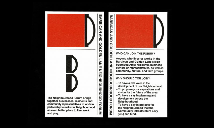
Design studio HATO has developed a brand identity for the Barbican and Golden Lane Neighbourhood Forum that takes cues from the area's distinctive brutalist architecture.
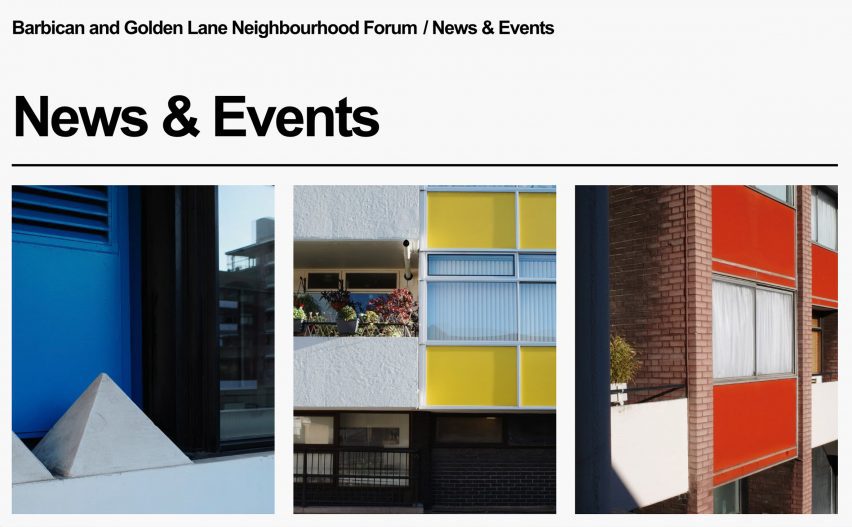
HATO, which is based adjacent to the Barbican complex in the Golden Lane Estate, designed the identity for the Barbican and Golden Lane Neighbourhood Forum (BGLNF) and also created the forum's webpage, which features illustrative photographs of the site's architecture.
The forum was set up in July 2023 to unite local residents within the community and support its future development.
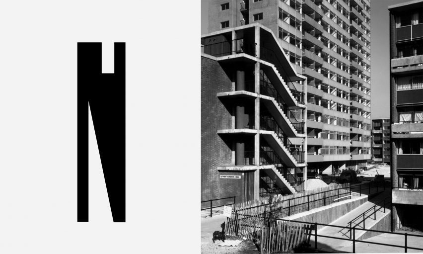
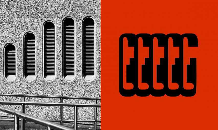
To create an identity that remained unique to the local community and in line with the forum's values, the studio looked to the brutalist architecture of the Barbican itself to inform its design.
"We wanted to celebrate the fabric of both the Barbican and Golden Lane Estate into the forum identity," HATO creative director Ken Kirton told Dezeen.
"It's quite a rare opportunity to design a neighbourhood forum that is so culturally rich from its history through to its architecture," he added.
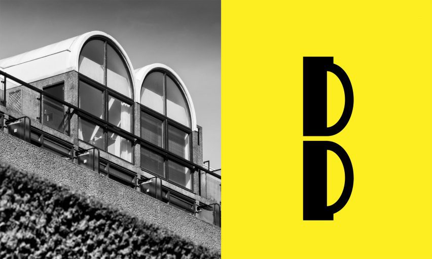
The custom logotype, which has curved forms and bold, clean lines, was designed as a visual representation of and homage to the geometric features found in Barbican's architecture.
"There are really beautiful details and moments all over the estate that go underappreciated as a passerby," said Kirton.
Alongside the lettering, the design studio used a colour palette of bright yellow, red and blue to shape the identity and ensure consistency across the brand.
Kirton explained that the colour choices were also informed by Barbican's architecture, with the palette taken from the coloured panels on the estate buildings.
Archival photographs of the Barbican, selected by the studio to honour the area's heritage, also feature across the BGLNF webpage.
"Using historical images enables us to show the lens and perspective of a point of time, which is something that we can't recreate," Kirton said.
Designing the brand identity offered an opportunity for the studio, which is a founding member of the forum, to underline its roots within the community.
"We moved the studio to the estate a year and a half ago, and going from visitor to a community member of the space has really changed our perspective of the estate and the architecture," said Kirton.
"It is still early days for the forum, but everyone onboard is a critical thinker and doer, with an important perspective on city developments and keeping culture and community at their hearts."
HATO hopes that its branding for the forum will represent its ethos and encourage continued participation from the local community.
"We hope that the community maintains a representative voice within the City of London and that it can be perceived as a strong visual mark that can be applied throughout the estate, that feels as if it is coming from the walls, floors and ceilings of the buildings," Kirton said.
HATO is based in London and Hong Kong. Beyond its studio practice, it functions across disciplines including an independent publishing house and concept store.
Other branding projects featured on Dezeen include Order's rebrand for Herman Miller and a brand identity for The Eames Institute of Infinite Curiosity by Manual.