"There is a tipping point of too much exposed concrete" says commenter
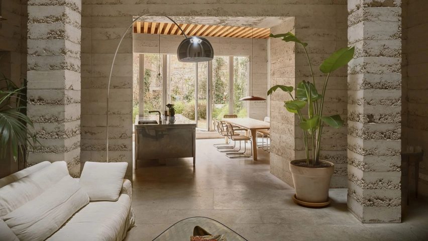
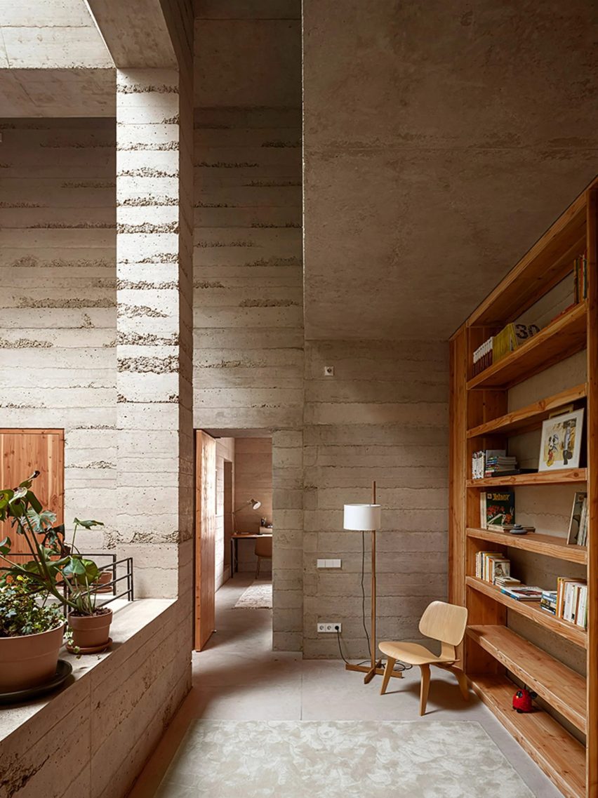
In this week's comments update, readers are discussing a house in Barcelona with "robust and monolithic" walls formed of tactile poured concrete completed by Spanish studio H Arquitectes.
H Arquitectes created a skylit, triple-height atrium at the home's centre that is framed by concrete columns and balconies above.

"There is a tipping point of too much exposed concrete"
Commenters failed to reach a consensus on the project.
"Wow!" exclaimed Trent. "Absolutely stunning," they commended.
Marius was more balanced in their assessment, writing "well-designed house – however, and it is subjective, but there is a tipping point of too much exposed concrete".
"Sorry, but that triple-height living room is just bizarre for a home", argued Jack Woodburn. "Office building or a hotel maybe, but a home?" they asked, before deeming it "hardly inviting or comfy".
Which camp are you in? Join the discussion ›

"A well-planned, elegantly detailed, desirable house"
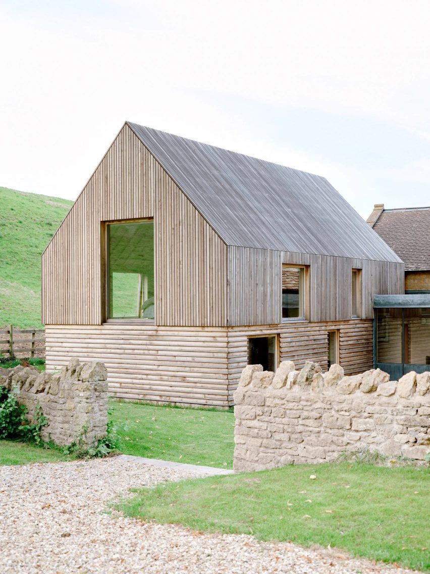
Another story splitting opinions in the comments section this week was a timber extension to a Grade II-listed house in Somerset completed by local studio Bindloss Dawes.
"Seen it done a thousand times over the last twenty years," commented Grant Macdonald.
Souji said they "really appreciate the use of wood and the pitched form, but then it fails in the materiality and detail".
But David Shelley acknowledged it was a "tricky job to make additions to a period building of this scale work" and commended it as "a pretty decent solution".
"A bit of ornamentation wouldn't hurt this addition," added Danny De Jayeff.
Lots of commenters had questions about the gutters, with APG asking "I didn't see anything that manages water flow off the building?"
Meanwhile, John Sergeant thought it was "a well-planned, elegantly detailed, desirable house".
Elegant or needing ornamentation? Join the discussion ›

"Post-apocalyptic chic"
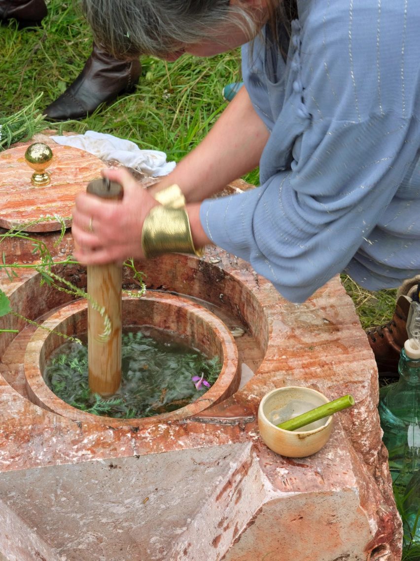
Also on commenters radars' this week was an installation where meals are prepared in a woodland kitchen using fermentation rather than electricity or gas by architect Andrés Jaque's Office for Political Innovation.
"Insert eye-roll here," wrote an unfazed George Panagos, while Reader was "not really convinced on the hygiene of it".
Sherlock Holmes had some technical concerns that "the acids reacting with the stone don't just damage the vessel but also probably disrupt the fermentation process".
However, Ken Steffes thought "it's a kitchen that looks like art".
Jim Angrabright could also see the appeal, describing the installation as "post-apocalyptic chic". "Very nice sculptural objects", they added.
What do you make of it? Join the discussion ›
Comments Update
Dezeen is the world's most commented architecture and design magazine, receiving thousands of comments each month from readers. Keep up to date on the latest discussions on our comments page and subscribe to our weekly Debate newsletter, where we feature the best reader comments from stories in the last seven days.