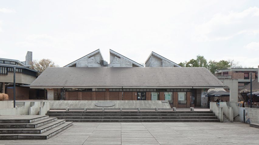
Archipelago converts brutalist post office in Belgium into learning centre
Local architecture studio Archipelago has transformed a former brutalist post office in Belgium into a learning centre, stripping it back to reveal its "spacious, generous and luminous" interiors.
Located in Louvain-la-Neuve, the building was renovated for the Centre d'enseignement supérieur en Brabant wallon (CPFB), an education centre linked to the University of Louvain that focuses on social development.
Originally designed as a post office by André Jacqman and since subject to a series of alterations, Archipelago sought to bring the original spatial and material clarity back to the concrete structure to accommodate its new use.
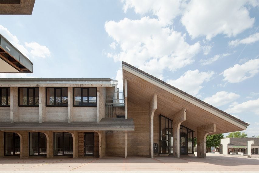
"The building is spacious, generous and luminous," project architect Sophie Laborde told Dezeen. "When we took it over, after numerous alterations, it was over-compartmentalised to accommodate a functional programme to the detriment of the architecture of the site."
"The first task was to strip the building bare, recovering the concrete that could be salvaged, rediscovering the colour of the brick," she continued.
"The aim of the project is to restore the building to its pristine condition as far as possible, while providing it with the technological and thermal comfort it will need for the next 30 years."
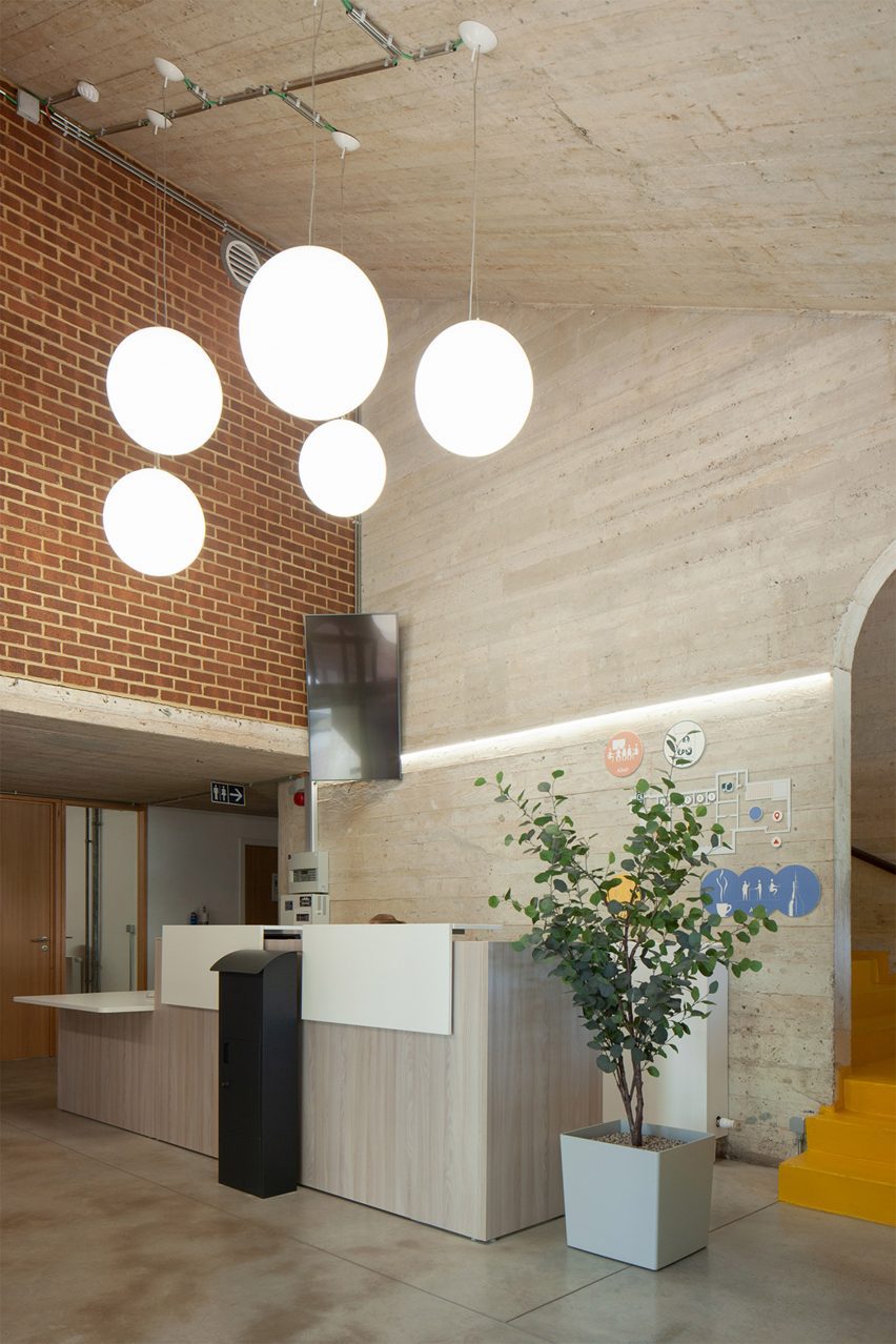
The core concept for the CPFB was to create what Laborde calls a "stimulating and collaborative learning space", which Archipelago looked to achieve through flexible spaces that do not have strict functions.
Entering into a shared social area on the ground floor, a series of multi-purpose spaces including work alcoved and larger rooms open onto the adjacent square.
Above, a collaboration area and auditorium spaces sit alongside the administration area, meeting room and a recording studio.
"To adapt to new learning methods, we propose to do away with the permanent assignment of a place to a function – with the possible exception of certain offices," said Laborde.
"Functions are mobile and people move around depending on the activity they have to carry out in order to find the right place. We are going to define places, strongly characterised, designed to accommodate uses."
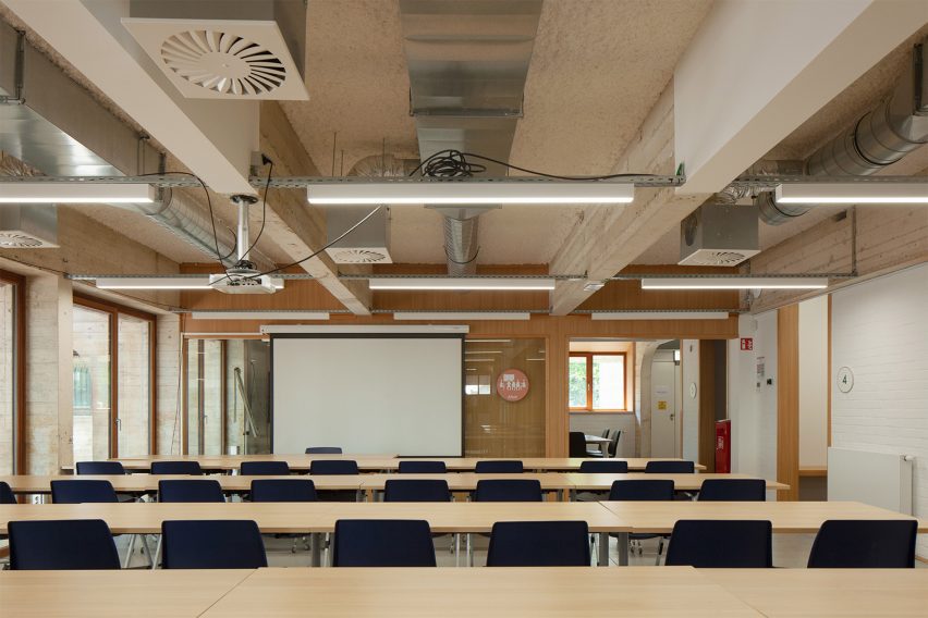
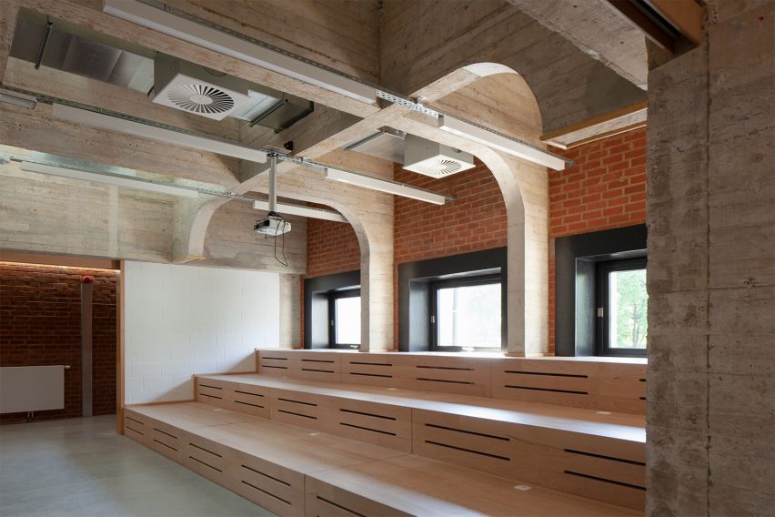
The boardmarked concrete and brickwork finishes of the original structure have been left exposed throughout, with the addition of wood-framed glass partitions, colourful floors and exposed ventilation and lighting.
"Once the original materials have been recovered, a screed of smooth concrete is poured to restore the dominant colour," explained Laborde. "The joinery was lightened to contrast with the existing black, and the yellow of the staircase contrasted with the red of the brick."
"The contrast enhances the existing features and the graphic colours bring them to life," she added.
Another recent project that looked to reassess the value of Belgium's Modernist architecture was the conversion of a 1960s home in Hoeilaart by Mamout, which similarly stripped away later extensions to highlight its original design.
The photography is by Johnny Umans.