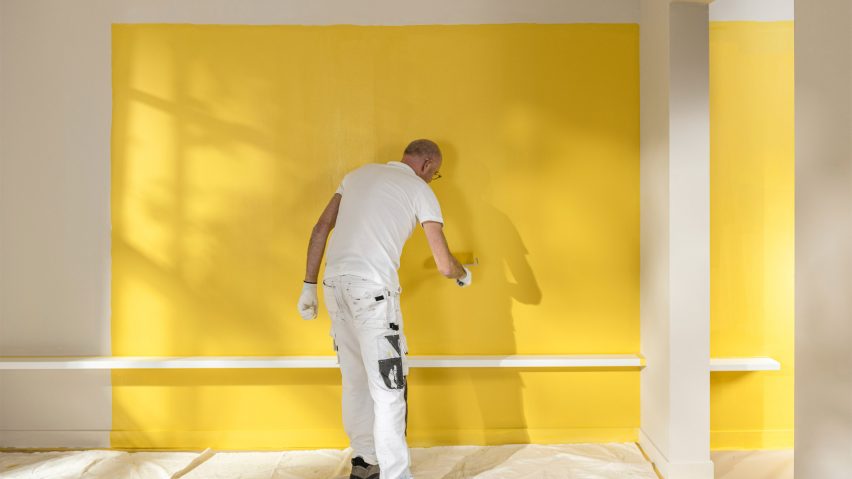
True Joy named Dulux Colour of the Year 2025
Paint brand Dulux has revealed an "uplifting" bright yellow colour called True Joy as its Colour of the Year for 2025.
True Joy was chosen for its bold and sunny disposition that adds a sense of cheerfulness to interiors, according to Dulux.
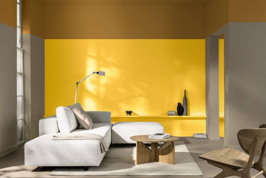
"Dulux Colour of the Year 2025 True Joy is an uplifting yellow – a bright and positive colour that brings optimism, pride and imagination to homes and commercial spaces," the brand's senior colour designer Dawn Scott told Dezeen.
"It was chosen to inspire people to leap out of their comfort zone, to just go for it and feel confident."
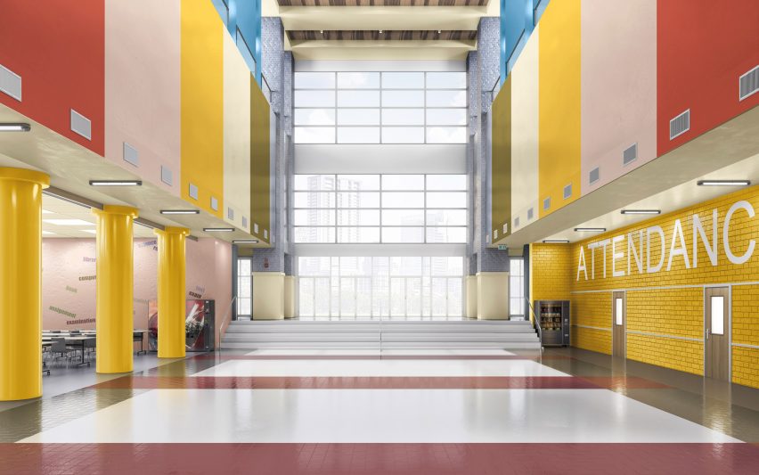
Dulux worked with trend forecast researchers ColourFutures to choose the 2025 Colour of the Year. The company's analysis across design, architecture, journalism and technology found three trends to base the colour selection on.
"This year, our global trend forecast highlighted three major trends: the excitement of making a joyful leap into the unknown, the celebration of handmade craftsmanship and the re-embrace of heritage," said Scott.
"These themes have informed our choice of True Joy, along with the colour yellow more generally, creating a collection that helps you design spaces where people can feel inspired to pursue new horizons, connect with human creativity and feel rooted in their identities."
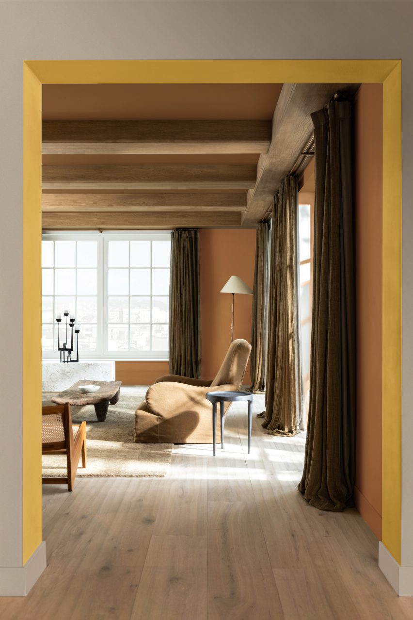
Scott hopes the sunny hue will provoke feelings of human connection and motivate people to make bolder colour choices.
"True Joy will likely define the year by resonating deeply with our collective desire for change and reconnection," she said.
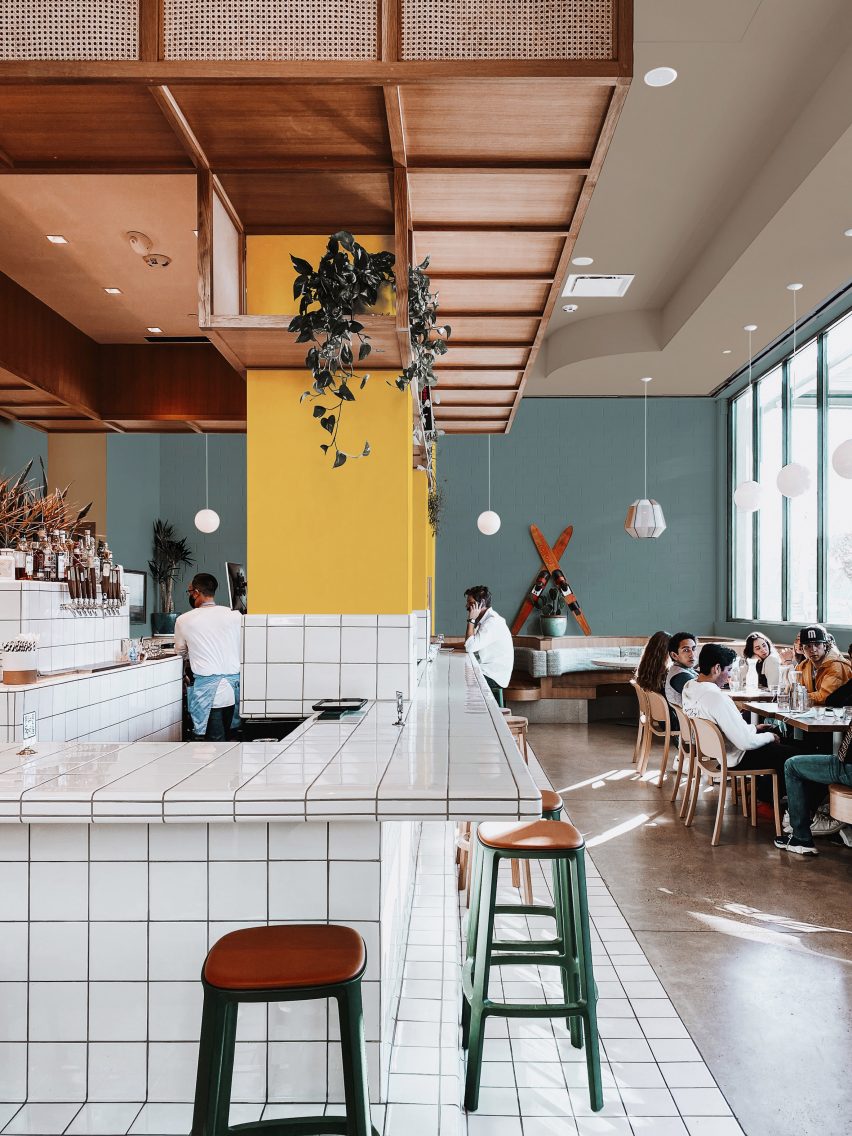
"As we move into an era dominated by technology and AI, this colour will inspire us to embrace new frontiers, encouraging spaces that are both adventurous and spontaneous," Scott added.
"It will also reflect our growing appreciation for human creativity and craftsmanship, grounding us in environments filled with earthy, handmade touches that reconnect us with our humanity."
Three complementary colour palettes were also revealed alongside True Joy to offer suggested colour pairings for interiors.
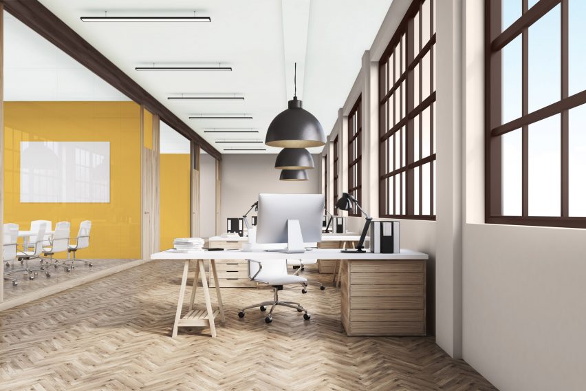
The Bold Colour Story palette contrasts True Joy with bright blues and oranges, designed to be used in education and office interiors to encourage creativity.
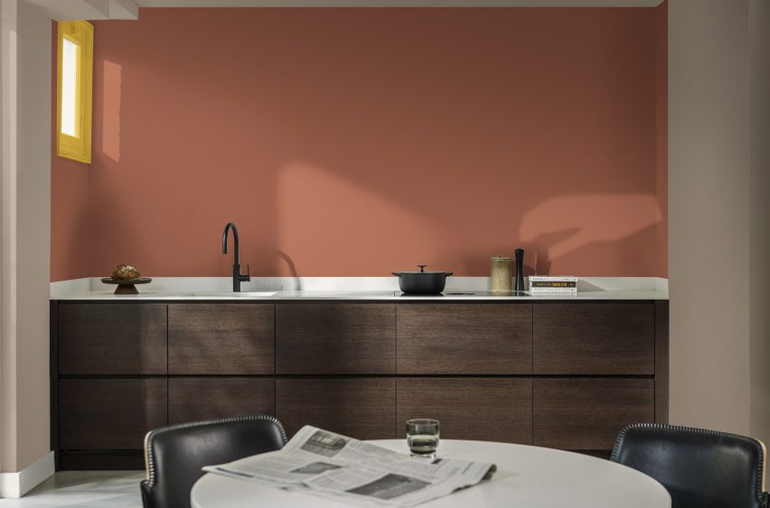
The Human Colour Story features more neutral shades of wood and clay, aiming to reflect raw materials in artisanal craftsmanship and add warmth to education and healthcare settings.
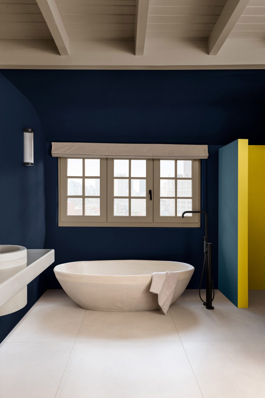
Deep tones of brown and green characterise the Proud Colour Story palette, which was created for hospitality and residential spaces to create a welcoming atmosphere.
Dulux's Colour of the Year for 2023 was a pale yellow named Wild Wonder and for 2024, the brand chose a soft pink colour called Sweet Embrace.
Scott described True Joy as a striking and exciting contrast to the subtler hues that came before it.
"Where Sweet Embrace provided warmth and comfort, creating spaces that made people feel at ease during uncertain times, the yellow of this year encourages a joyful leap into new horizons," Scott explained.
"It's a bold and uplifting colour that reflects a shift from seeking simplicity and calm to embracing adventure and creativity."
The photography is courtesy of Dulux.