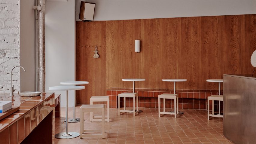
Plantea Estudio creates "frank and efficient German ambience" inside Acid Berlin bakery
Spanish practice Plantea Estudio has completed the interior of Acid bakery in Berlin, which features a palette of austere and functional materials chosen to echo its urban context.
Acid Berlin is located on a corner lot in the city's central Mitte district, with large ground-floor windows looking out onto Rosenthaler Strasse and Auguststrasse.
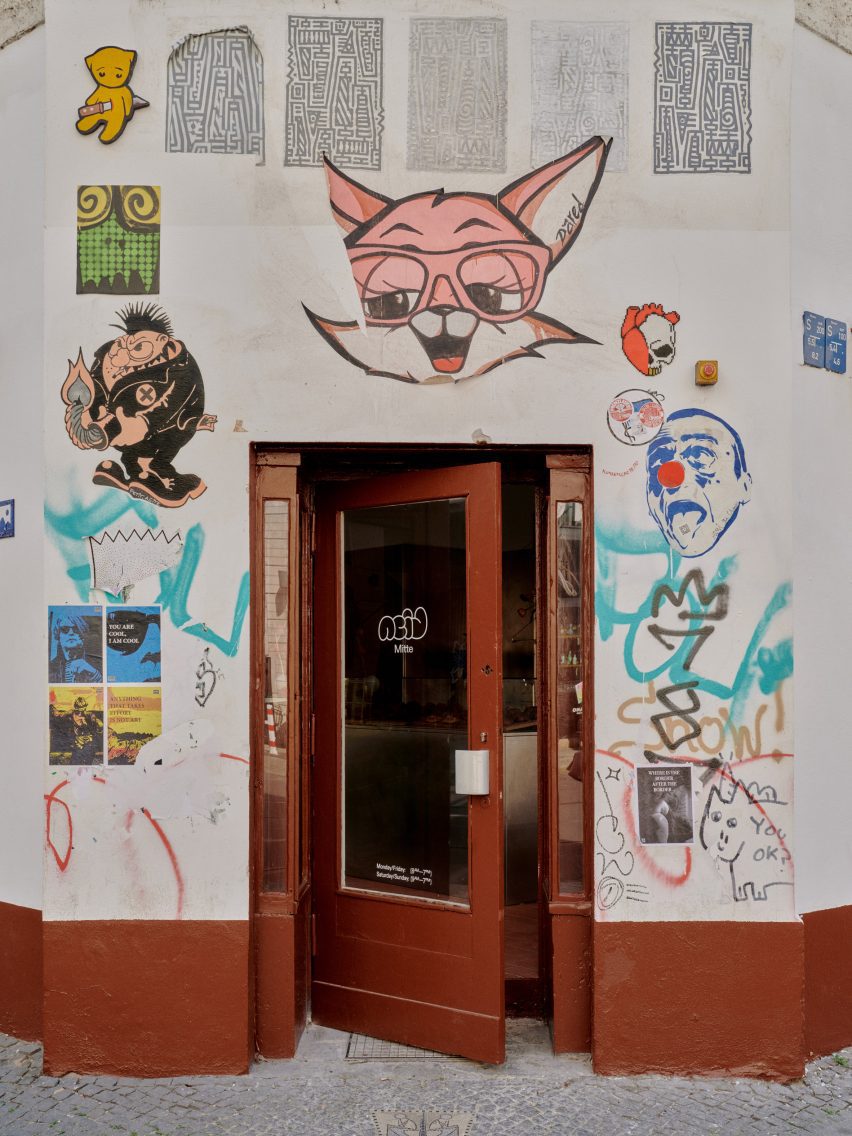
Having previously designed the bakery's original outlet in Madrid, Plantea Estudio opted for a similar pared-back style with nods to Mitte's gritty urban character.
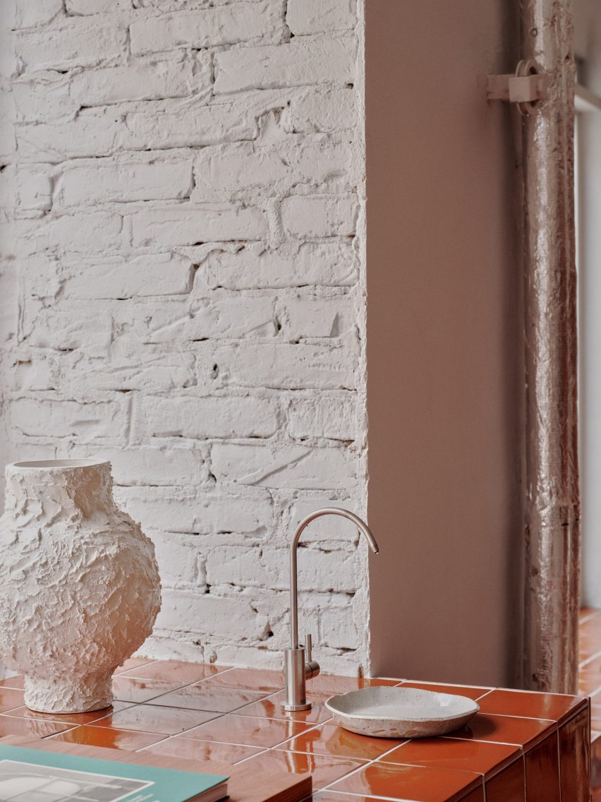
The main materials used throughout the public areas include chestnut wall panelling and red Ferrés tiles, which contrast with the more austere sections finished in stainless steel and grey paint.
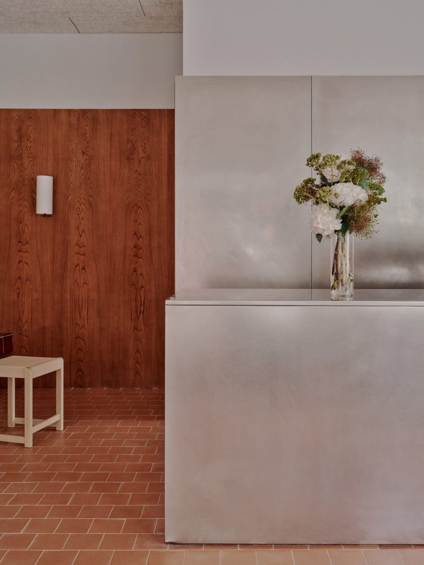
"The aim was to achieve a frank and efficient German ambience and at the same time a temperate refuge, a Mediterranean 'nativity scene' in the harsh urban territory of Berlin's city centre," said the designers.
The premises are located on the ground floor of a residential building, with large wood-framed windows providing a visual connection to the streets outside.
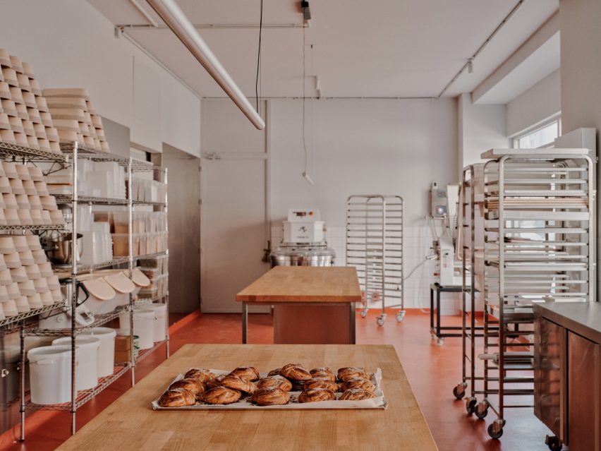
The L-shaped internal plan is organised with the workshop area on the longer side towards Auguststrasse and the cafe space facing Rosenthaler Strasse.
Ovens, fermenters, mixers and office equipment are arranged along the bakery's back wall in front of stainless-steel panels that produce gentle reflections of the goings-on.
Tables for kneading and rolling are positioned in the centre of the room facing the windows, so passers-by can observe the bakers at work.
This space also features a robust orange resin floor that complements the tonality of the tiled public areas and is reflected on the surfaces of the stainless-steel machinery.
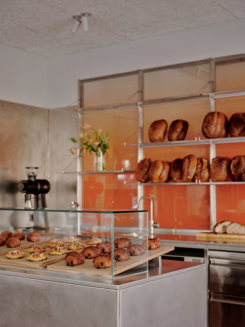
The cafe area is organised around a six-metre-long counter containing a glass display case for pastries and space for coffee-making equipment.
The counter is clad entirely in stainless steel, giving it a utilitarian aesthetic that ties in with the materiality of the bakery.
Behind the counter is a steel worktop and shelving system where bread is displayed in front of semi-opaque panels with a subtle orange-white gradient that allows a partial view through to the work area.
Tables, benches and stools by Copenhagen brand Frama are arranged along the facades and back walls so customers feel immersed in the cityscape.
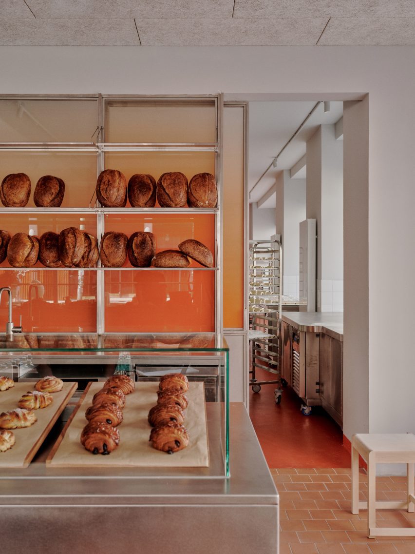
Plantea Estudio drew directly from the restrained forms, materials and tonality of the urban surroundings to design a space that feels raw yet refined.
"It is simple and austere, practical and functional, like the city but in no small measure warm and welcoming, bold and spontaneous like its inhabitants," said the studio.
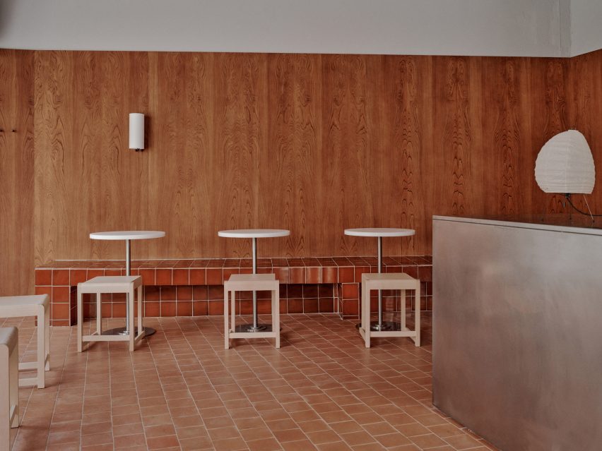
Woodwork, ceiling panels and bare brick walls are painted a unifying shade of light grey that echoes the simplicity and functionality of the adjacent mid-rise apartment buildings.
The panelled walls and red-clay tiles used for the flooring and built-in bench seating introduce warmer tones and bring an expressive touch of handmade quality to the space.
The tables feature white polyethylene tops set on chrome bases that add a further reflective element, while the birch stools provide another natural detail alongside the grain of the chestnut panelling.
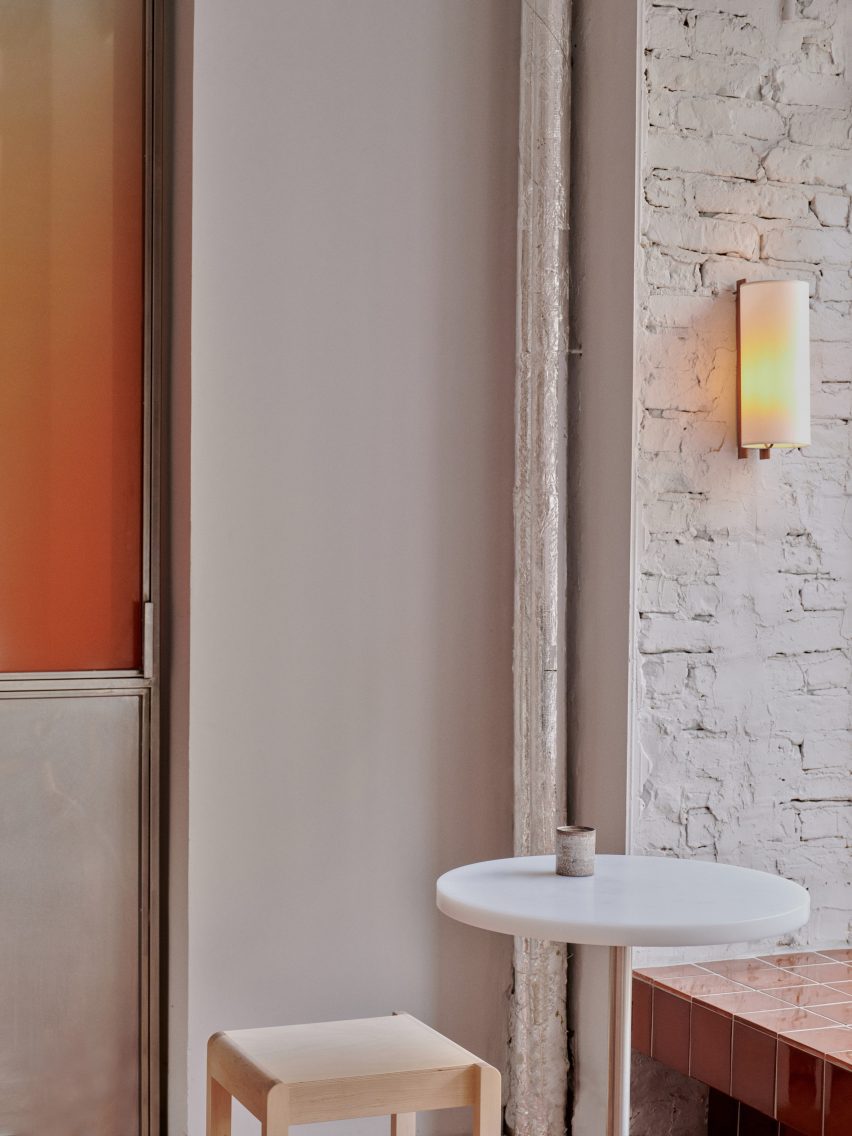
Simple lighting including wall sconces from Spanish brand Santa & Cole and a classic Japanese-style paper lantern provide gentle illumination.
Ceramic works by female artists Raquel Riola, Wendy Taylor and Saeam Kwon were chosen to add textural highlights that complement the character of the interior.
Plantea Estudio was founded by brothers Lorenzo and Luis Gil in 2012, with Carla Morán joining in 2017. Much of the studio's work focuses on smaller projects including hotels, family homes, restaurants, cafes, shops and offices.
The studio's output is characterised by a careful consideration of materials and fabrication, with previous examples including a store for footwear brand Veja featuring raw finishes and brutalist details, and a minimalist restaurant that uses plywood and chipboard to create a light and warm ambiance.
The photography is by Marina Denisova.