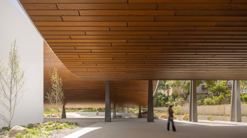
Architecture studio Kengo Kuma & Associates has completed the Centro de Arte Moderna Gulbenkian extension in Lisbon, which is defined by a wood-clad canopy that draws on Japanese architecture.
Originally designed in 1983 by British architect Leslie Martin, the existing 17,174-square-metre art centre was updated to brighten its interiors and help reintegrate it with the city.
Kengo Kuma & Associates has largely retained the existing concrete structure but updated it with an extension defined by a sweeping canopy that references an engawa – a sheltered corridor typical of Japanese architecture.
The expansion also encompasses new gallery spaces, circulation routes and openings that aim to improve visual connections and foster a "new dialogue" between the building and its gardens.
"The main concept [of the project] is engawa – the name of a traditional Japanese in-between space," studio founder Kengo Kuma told Dezeen.
"An engawa can create connection, and connection is really important for the future [of the] museum," he added. "We tried to connect [the garden and building] by adding new engawa spaces."
At the centre's southern edge, a 4.5-metre-high boundary wall has been replaced by a lower wall and gate to help establish a connection with the adjacent street.
This gate leads into a 7,515-square-metre garden landscaped by Vladimir Djurovic Landscape Architecture and populated by native plants.
Here, weaving walkways wrap around the site's existing vegetation, while weathered-steel benches, gates and ornaments are dotted throughout the open space.
Large granite steps lead down from the garden into the extension, which is marked by the 107-metre-long and 15-metre-wide sweeping canopy. Named Engawa Space, it serves as both a social space for visitors and a "transition space" linking the south gardens to the main entrance.
The curved canopy is perched on a series of steel columns that frame views of the garden and rise from two metres in height at the garden edge to 10 metres at the building's facade.
Kengo Kuma & Associates used the canopy's materiality to reference the long history between Portuguese and Japanese cultures – with wooden ash tiles on the underside of the structure and larger overlapping ceramic tiles cloaking the top.
"[Ceramic] is a typical material for Portuguese architecture, traditionally, as is the wood," Kuma said.
"Both materials are very Portuguese, but at the same time by some coincidences, they are also Japanese materials," he added. "[Using these] materials means using local materials, but at the same time is a kind of blend between Japan and Portugal."
Where this canopy ends, it is met by a smaller one that stretches out in the opposite direction to guide visitors towards the entrance.
Some of the existing building's large monolithic walls have been replaced with glazed facades, drawing light into the interior and forming visual and physical connections with the gardens.
Inside, the centre opens up to an airy, double-height foyer off which a new restaurant is located. This contains a spacious dining room with a long concrete bar and bespoke furniture designed by Kengo Kuma & Associates, backed by views of the adjacent garden through large windows.
Access to the building's rear external patio is provided from both the foyer and restaurant through large doors, where large steps lead down to a pond.
Within the spacious ground floor Nave gallery, the studio has added strips of glazing into the roof's existing stepped concrete structure to draw light into the space.
From here is a newly-built gallery leading to a partially subterranean exhibition room, lit by a series of clerestory windows that look out towards the Engawa Space and adjacent south garden.
Above, a mezzanine level of the same size hosts further exhibition space overlooking the ground floor. Repeated use of white mesh walls and wooden detailing feature throughout the updated interior.
Other interventions by the studio included the introduction of a heating, ventilation, and air conditioning (HVAC) system and large structural changes, including the addition of corridors and staircases below ground to improve circulation between the galleries.
One of the staircases has a spiral form and is illuminated by a circular oculus. A glass facade and lightwell were also introduced to provide daylight access to a subterranean gallery that previously had no openings.
Previous projects by the studio include a museum wrapped in layers of suspended aluminium piped in Seoul and a "sculptural and iconic" skyscraper in Vancouver.
The photography is by Fernando Guerra.
Project credits:
Architect: Kengo Kuma and Associates
Associate architect: OODA
Client: Centro de Arte Moderna Gulbenkian
Landscape architect: Vladimir Djurovic Landscape Architecture
Structural engineer: Buro Happold

