"Nothing out of the ordinary here" says commenter
In this week's comments update, readers are discussing a residential skyscraper in Downtown Manhattan created by Rafael Viñoly Architects using an "unconventional approach".
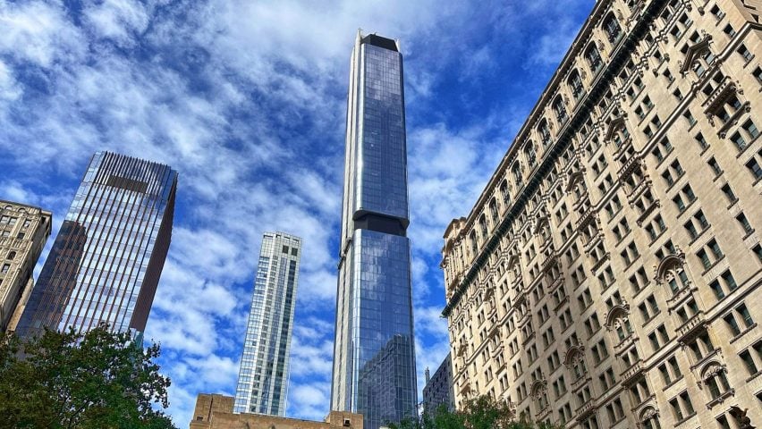
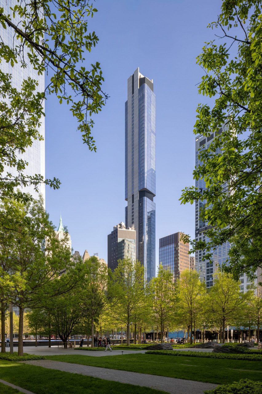
The Greenwich is a 274-metre high, 88-storey skyscraper containing 272 residences, comprised of a glass tower with curved corners with two I-beam-shaped structural supports running through the centre of the tower.

"Did the world really need another slender glass-clad high-rise?"
Commenters weren't convinced by the studio's apparent "unconventional approach" to the design.
"An 'unconventional' approach would be to not build a super tall skyscraper clad largely in glass – nothing out of the ordinary here," declared The Discreet Architect in a comment that was upvoted 10 times.
Ken Steffes put forward that "this building actually looks very conventional and similar to many of the other square mirrored structures around the city".
"Unconventional? They're having us on," agreed Jb.
Souji was less despondent, saying "I gotta give it to them that it looks sleek and has excellent finishes," but pondered "did the world really need another slender glass-clad high-rise?"
Commenter Hvck also gave somewhat of a compliment, writing "I really like it, but it does remind me of a giant flash drive – a very good looking flash drive however".
What do you make of it? Join the discussion ›

"An industrial metal shed – how uplifting for the spirit!"
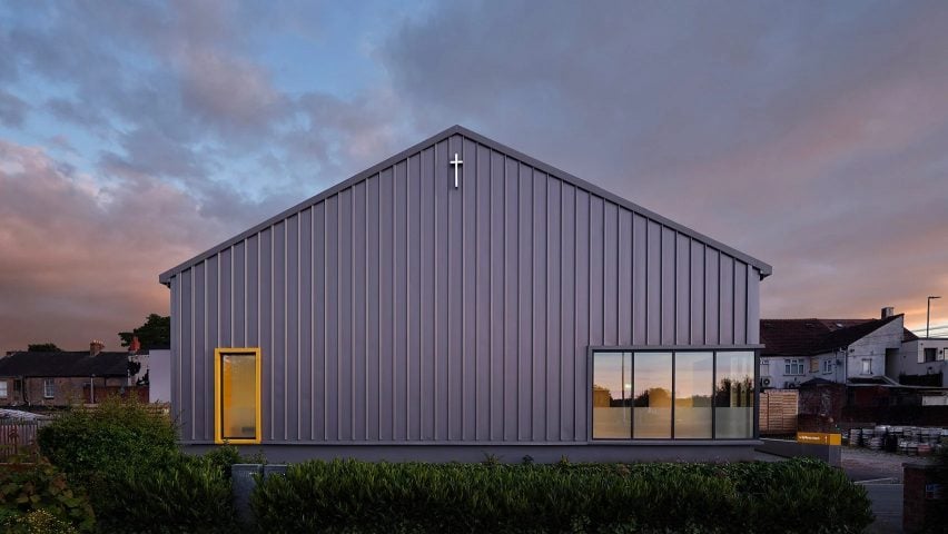
Readers were left uninspired by architecture studio ShedKM's Lighthouse Church in Merseyside, UK, with a transparent facade designed to glow at night. Several commenters thought the structure looked more like a supermarket or industrial warehouse than a church.
"What happened to the time when churches were joyous, mystical, ecclesiastical spaces celebrating the pinnacles of human design and architectural engineering?" reflected Tami. "Looks like a converted Aldi warehouse-cum-supermarket," they continued.
Ken Steffes thought that "this structure looks functional – good design incorporates form and function". They called the church "a warehouse or future grocery store – utilitarian in nature".
"If this was a warehouse, light-industrial unit or cheap supermarket it would be completely average – as a church it is truly depressing," decided The Discreet Architect.
Commenter Ogmb likened it to another popular supermarket chain, writing "this looks like a Tesco". Meanwhile, Whateverandeveramen quipped "an industrial metal shed – how uplifting for the spirit!"
However, Dougal weighed in to defend the church, writing "I've been there and I quite liked it – not sad at all but really quite a happy place!"
Which camp are you in? Join the discussion ›

"Very nice house using simple materials and Eames-esque construction"
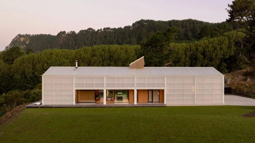
Also stoking plenty of debate in the comments section this week was a holiday lodge in New Zealand, which DCA Architects of Transformation wrapped in a translucent skin of polycarbonate panels.
The Discreet Architect admired "the simplicity of the shape and the use of industrial/agricultural structure and materials which feel appropriate in this rural context – bravo!"
"Very nice house using simple materials and Eames-esque construction," praised Joaquin.
However, not all commenters were quite so keen. "Am I missing something?" wondered Skitter, before asking "why on earth would anyone build in such a heavenly location, and then screen out the views?"
"The house just feels like a windowless storage unit with no charm," concurred Souji, suggesting it "feels alien in that context".
Appropriate or alien? Join the discussion ›
Comments Update
Dezeen is the world's most commented architecture and design magazine, receiving thousands of comments each month from readers. Keep up to date on the latest discussions on our comments page and subscribe to our weekly Debate newsletter, where we feature the best reader comments from stories in the last seven days.