Spread designs abstract covers for the Journal of Architecture and Building Science
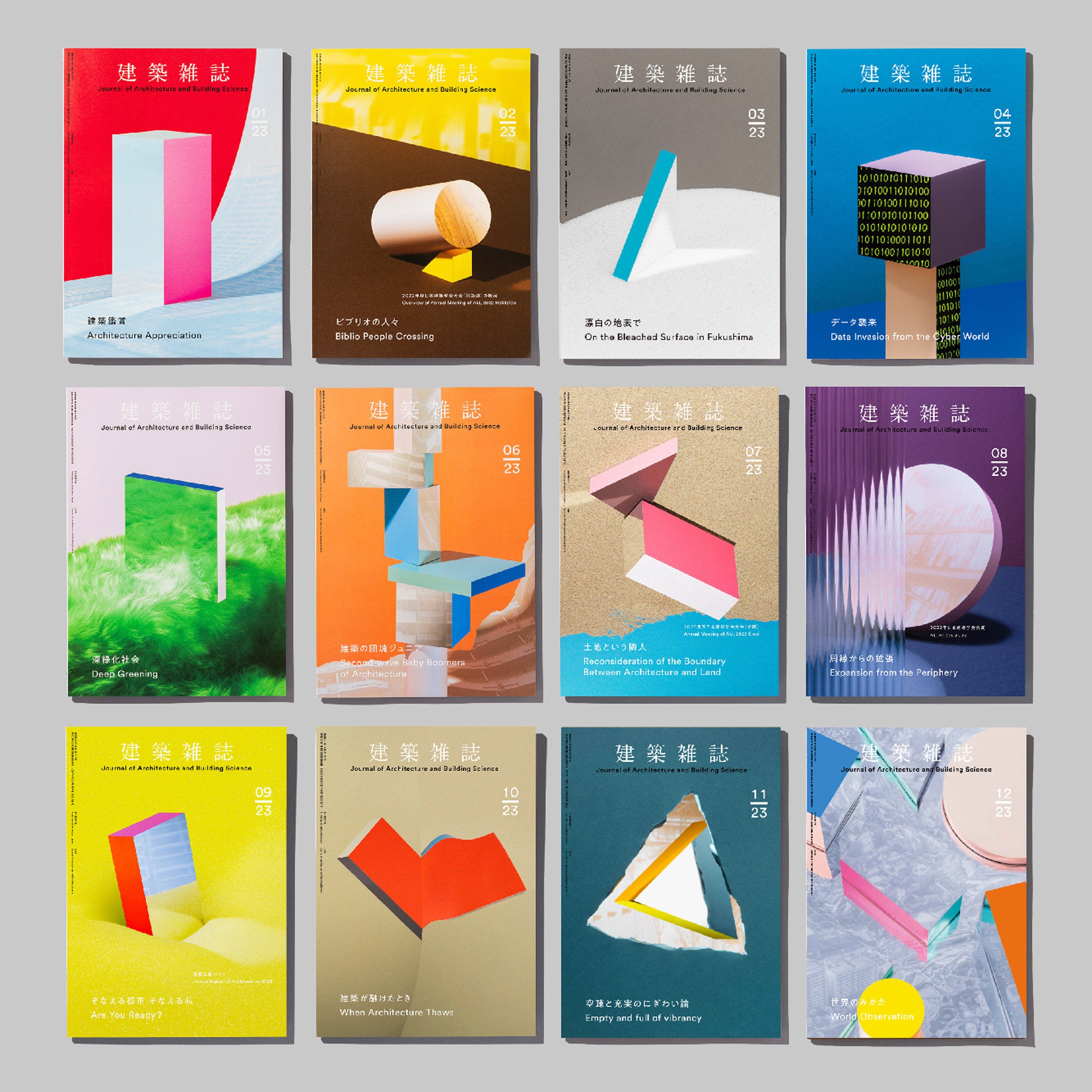
Design studio Spread has produced a series of colourful covers with geometric designs for Japan's Journal of Architecture and Building Science that have been shortlisted in the graphic design project category of Dezeen Awards 2024.
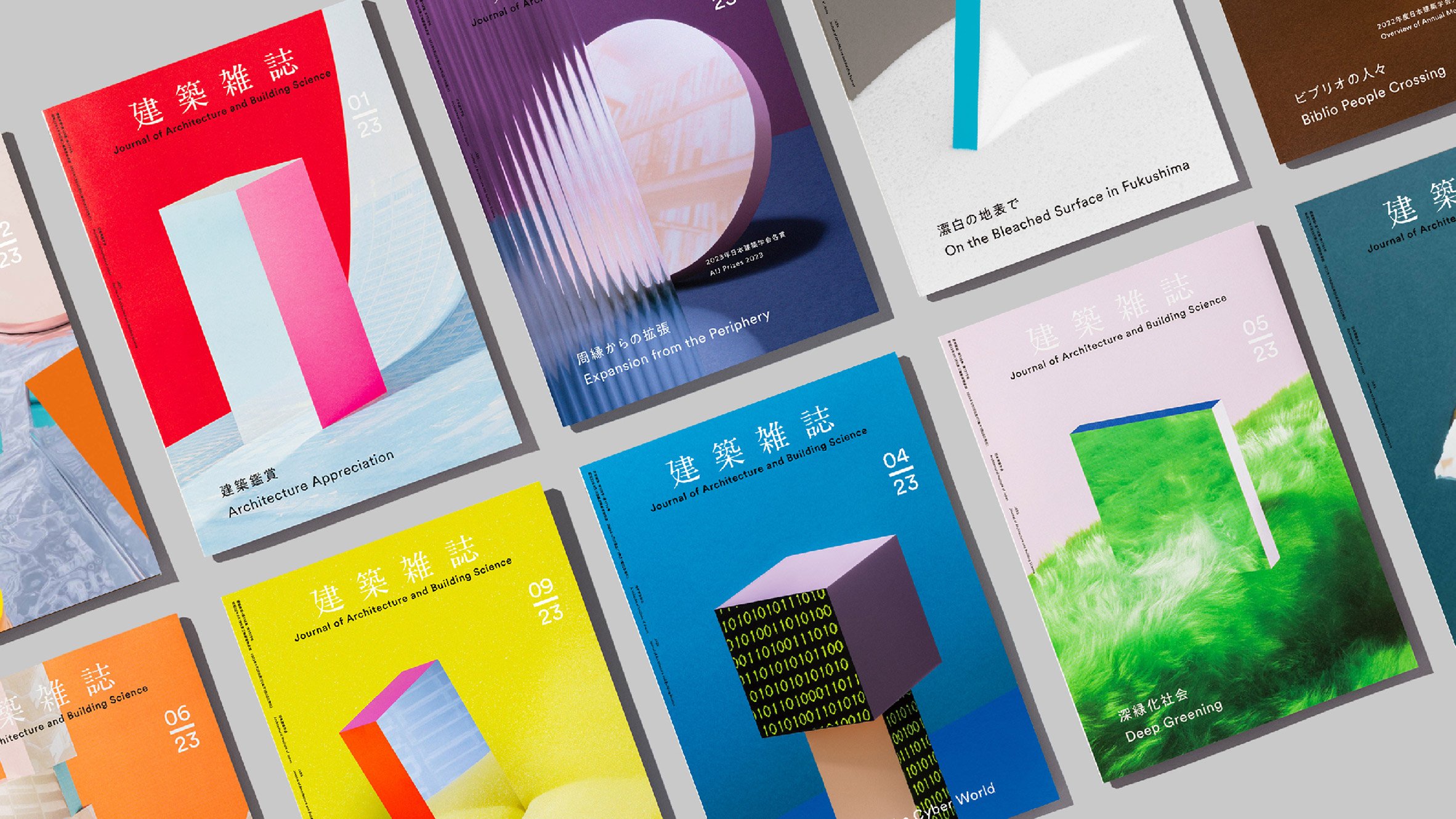
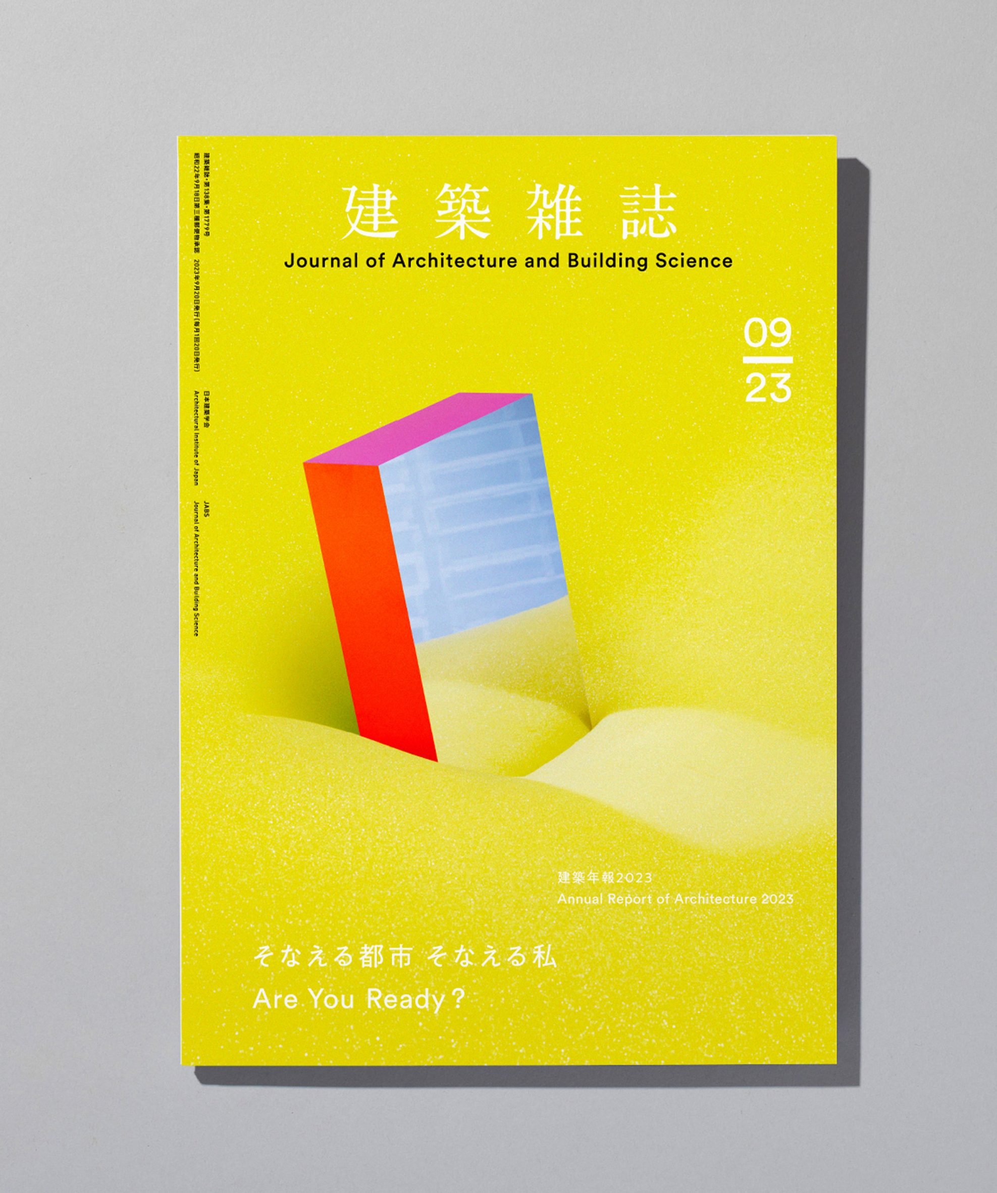
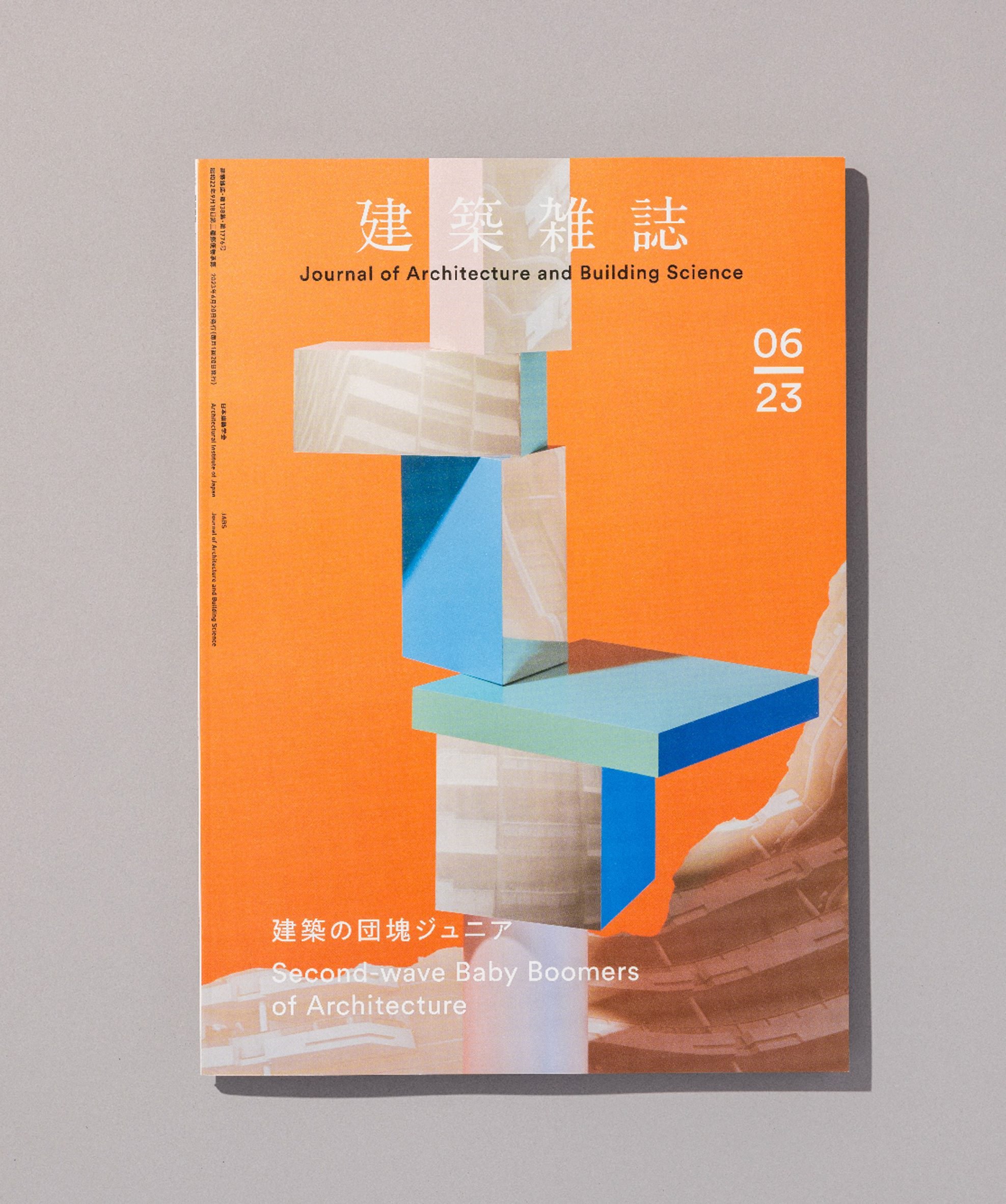
Spread's covers depict abstract representations of real-life architecture, with the studio using mirrors to photograph three-dimensional objects among playful reflections in colourful settings.
The images for each magazine cover, which were designed for the journal in 2023, were all created by photographing a built set instead of using a computer to create digital images.
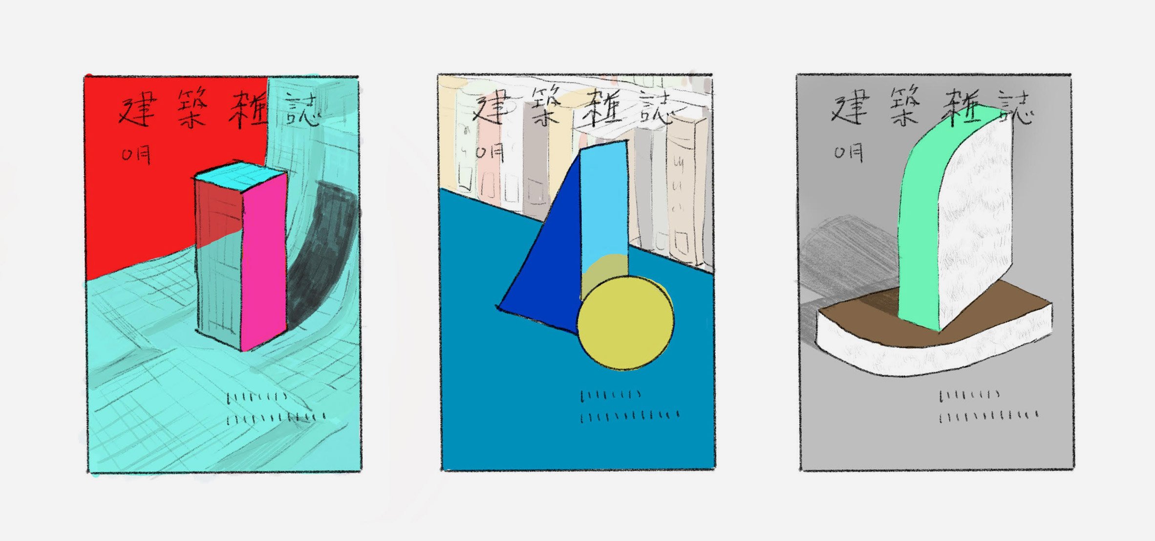
"The setup started with a base shape, on which paper and mirrors were attached," Spread designer Hirokazu Kobayashi told Dezeen.
"Then the set was built with extra items like paper sheets for the background.Due to the way it is shot there isn't much sense of scale. However, the objects in reality are about 20 centimetres in size."
As the studio paid close attention to detail during the shoot, it said the photographs did not require much editing.
"In some cases during the shoot, some small tweaks were made to the layout if it would improve the final composition," Kobayashi said.
"Overall there was a minimal amount of retouch involved, focusing on small details and the colours staying the same as they were prepared."
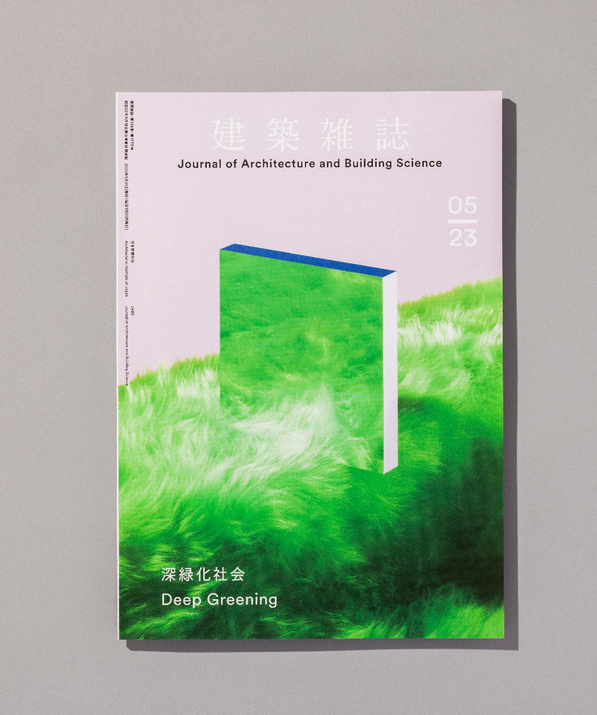
The materials used in the shoots, including salt, faux fur foam and torn paper, were also chosen to create specific effects.
Each cover's colours were directly inspired by the topic of each issue, represented by a combination of contrasting tones that were selected through careful testing.
"A lot of colour variations were selected from Pantone colour chips, and we then checked which colours would work best together," explained Kobayashi. "During the shoot, these were used as a target for the final result."
"Besides the actual selection of the colours, an essential element to the final design was their volume – how much of each colour is visible," he added.
"Establishing a good balance between each colour's volume would have a significant effect on the communication to the audience, so this balance was decided before the shooting started."
Spread made the decision to create analogue images for the covers after it noticed a considerable use of digital imagery within architecture practices.
The studio hoped to produce visuals that readers of the journal could relate to, saying that it felt that digital images can lack warmth or humanity.
"When the audiences are looking at the cover design we wanted them to think and wonder 'what could this be?' triggering curiosity and making them excited to explore this professional journal," Kobayashi said.
The mirror reflections were also central to the process beyond their ability to distort appearances.
The studio derived the concept of "architecture mirroring society" in a conversation with the magazine's chief.
"From this conversation, we decided to use mirrors as one of the main elements," said Kobayashi. "Together with simple forms that represent architecture to establish an abstract image."
Spread was inspired to work with the publication to help it evolve from a formal tone to one that was more creative.
"They wanted to move from something formal – that people feel like they have to read to learn about architecture – to something people want to read because the content looks interesting and informative," Kobayashi said.
The publication's 2023 issues were also launched at an event at Japanese book retailer Tsutaya Books, with the aim of ensuring a wider audience was reached beyond the architecture industry.
Working on the cover designs also allowed the studio to reflect on the significance of architecture in society.
"If there was a book about the Earth, we believe 'architecture' is one of its chapters, with its pages representing the history of people, aesthetics and culture," said Kobayashi.
"But it also highlights change. Buildings age, they transform or get demolished; people from the future will be able to read architecture like pages of a history book or a visual archive of society."
Other magazine cover designs that have been featured on Dezeen include covers for ES magazine by artists including Wolfgang Tillmans and Anish Kapoor and a showcase of Gay Times covers from Jack Rowe.
