Tranluscent chiffon enshrouds demountable "temple" by AB + AC Architects
Lebanese-Italian studio AB + AC Architects has hidden a space for quiet contemplation inside two nesting boxes in Dubai's busy design district as part of a pavilion commissioned by BMW Middle East.
Created for Dubai Design Week, the Luxury of Less pavilion was designed to be entirely demountable and consists of a cube within a cube, both based on the same modular timber framing system.
Arianna Bavuso and Andre Chedid of AB + AC Architects designed the mindfulness "temple" as a space for rest and reflection, drawing on research about how our brain responds to pleasurable stimuli.
"When you think about all these rapid technological changes and climate change disasters, I feel like everything is making us way more detached and disconnected from our environment," Bavuso told Dezeen.
"So we thought it could be a great idea to develop a project, in which we help the audience to be a bit grounded for once, a bit present," she continued.
"BMW Middle Eeast gave us this massive platform to do this pavilion but the goal for us is really to be able to tackle this in residential spaces, in office spaces, in schools, basically in our daily spaces."
The Luxury of Less pavilion is part of AB + AC Architects' ongoing investigation into the psychological impact of architecture and how spaces can be manipulated to improve the wellbeing of their inhabitants.
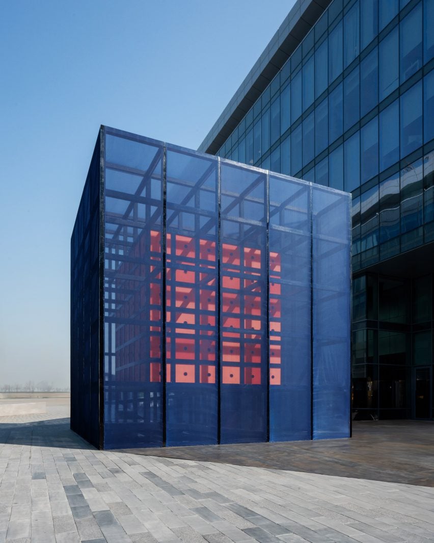
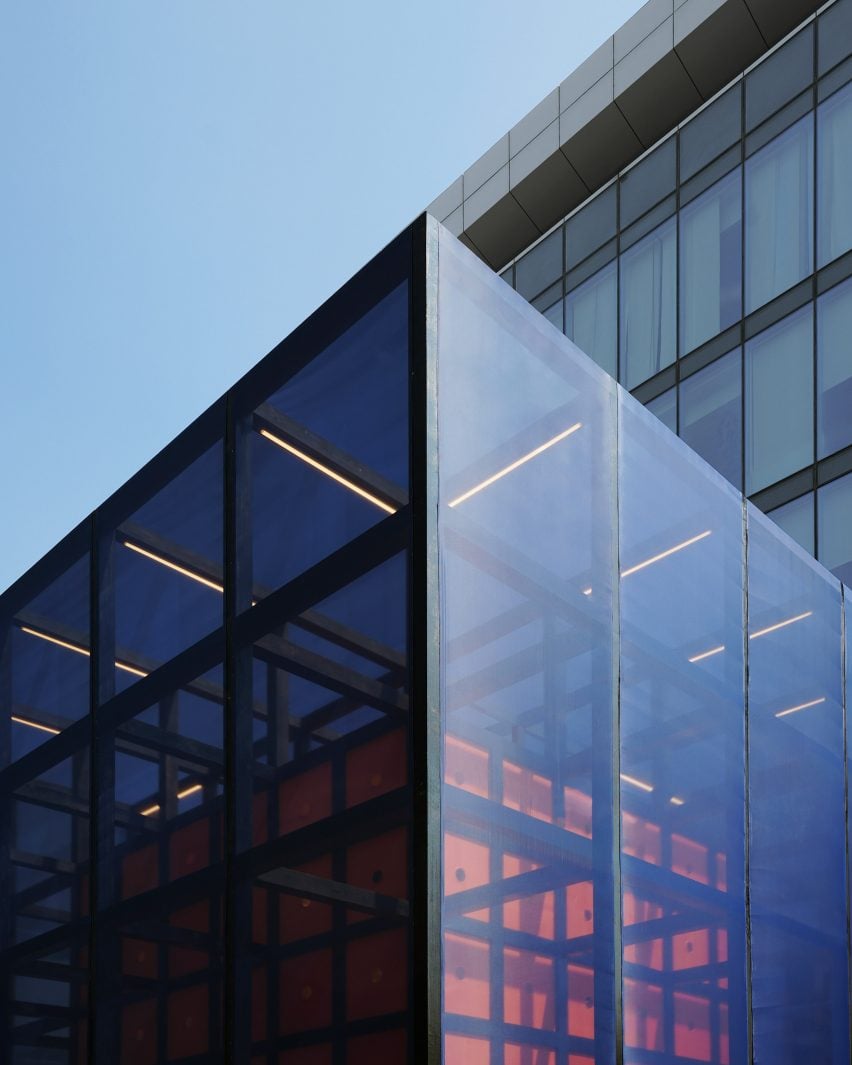
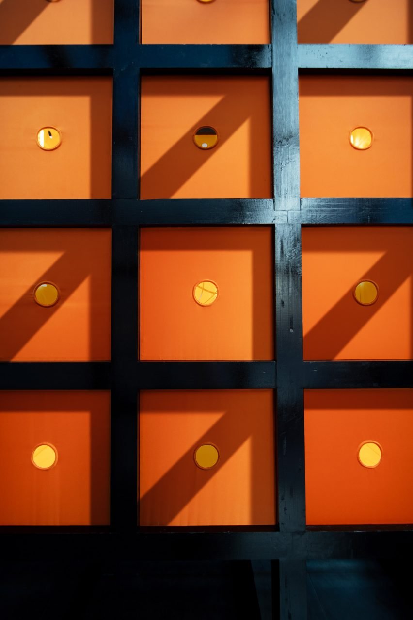
In this case, the studio used gossamer-thin midnight blue chiffon to clad the structure's outermost box, partially obscuring the smaller orange box within to elicit feelings of intrigue from passersby.
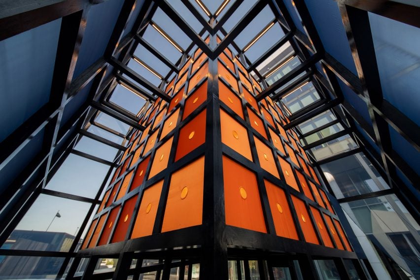
"We wanted, from afar, to evoke curiosity and pique people's interest," said Bavuso, who teaches a post-graduate course on architecture and neuroscience at the Gritnova Global Campus.
"Then immediately, what happens in our brain is there is a sense of wanting to discover more."
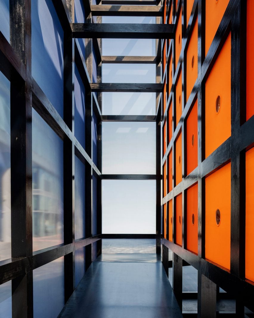
To reach the quiet sanctuary hidden inside the smaller box, which seems to float at the centre of the pavilion, guests have to ascend a long ramp that wraps all the way around its perimeter.
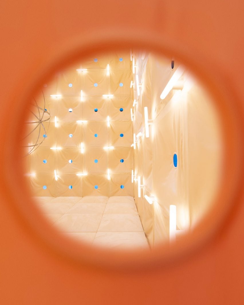
Along the way, visitors can catch glimpses of the inner sanctum through small peepholes in the silky, sunset-orange wall tiles, to build a sense of anticipation before the final reveal.
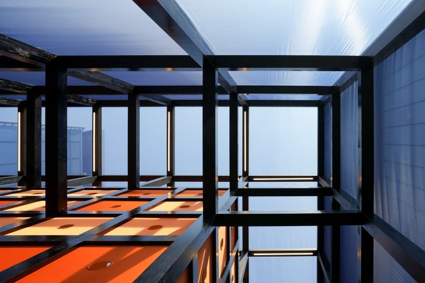
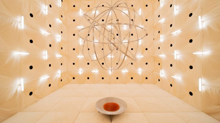
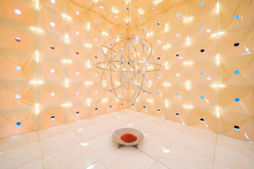
The journey culminates in a pared-back, monochromatic space enveloped in sandy-hued faux suede, where guests can sit and rest on plush pillows reminiscent of desert dunes.
Composed of identically sized wall and floor tiles, the interior surrounds visitors in a subtle grid that is emphasised through intermittently placed tubular lights.
"It's not only a way to bring in light but also a way to create some kind of pattern," Bavuso said. "This sense of repetition reassures the nervous system that there is nothing unexpected, everything is just calm and safe and under control."
"A lot of visitors have been expressing the fact that it's so curious to have such a calming and grounding space in the middle of an open-air fair with so much activation and excitement, just because of the design, the way it was made."
In the absence of proper government funding for mental healthcare, Bavuso believes that architecture and interior design interventions like this have a role to play in helping people feel better in their daily lives.
"Of course, there are ways to tackle that through the pharmaceutical industry," Bavuso said. "But I also believe strongly that we, as architects and designers, have the tools to really help people ground themselves."
"Because sure, you can go do your mindfulness session at the yoga studio, you can put in your 10,000 steps every day, you can have organic food and be mindful about vitamins," she continued. "But then if we spend the whole rest of the time in an unhealthy environment, sitting eight to 10 hours a day, that's not going to help right?"
Designed, manufactured and assembled in only 10 weeks, the pavilion is entirely modular and held together without any glue.
This allows it to be easily mended, disassembled and its components repurposed in a nod to BMW's efforts to become more circular in its material use.
"It has already been assembled twice," Bavuso said, referencing a previous trial assembly the team attempted in a warehouse. "Therefore, we know it could be reused and readapted for future use."
"We're just looking for different locations for an afterlife," she added.
AB + AC Architects is based in Lisbon but also works between Milan and Beirut, where its founders hail from.
This year's Dubai Design Week featured a number of standout pavilions including a parametric cardboard structure from Ross Lovegrove's new Emirates-based studio Deond and an emergency shelter for Gaza.
The photography is by Matteo Viti.
Dezeen was a media partner of Dubai Design Week 2024, which took place from 5 to 10 November. See Dezeen Events Guide for an up-to-date list of architecture and design events taking place around the world.