From car companies unveiling new identities as part the shift to electric vehicles to a kitchen-cupboard favourite getting its first new look in more than a century, here are the top seven rebrands and logo redesigns of 2024.
British car brand Jaguar unveiled a new logo and wordmark as part of the company's shift away from making petrol-powered cars towards electric only. The new branding centres around an uppercase J and lowercase r, both of which feature prominently in the wordmark and logo.
"New Jaguar is a brand built around exuberant modernism," said Jaguar chief creative officer Gerry McGovern. "It is imaginative, bold and artistic at every touchpoint. It is unique and fearless."
The new design attracted significant controversy, and Jaguar's accompanying reveal of a new concept car also divided opinion.
Find out more about the Jaguar rebrand ›
New York design studio Order delivered furniture brand Herman Miller's first rebrand since the 1990s, centring the design around the company's mid-century modern heritage.
Order removed the distinct swooping M symbol from a red circle and placed it next to the brand's name, which is rendered in the Söhne typeface by Klim Type Foundry, "to again celebrate the symbol in its simplest form".
Find out more about the Herman Miller rebrand ›
Mountain Dew's first rebrand since 2009 aimed to place the "mountain" front and centre, featuring a landscape background, as well as restoring the word "mountain" to the logo.
According to PepsiCo, the new identity aims to emphasise the soft drink is "synonymous with adventure" and showcases a calmer, more nature-invoking appearance compared to the energetic green shards of the 2009 iteration.
Find out more about the Mountain Dew rebrand ›
Italian automaker Lamborghini unveiled a new, flattened logo as part of an overall brand strategy towards sustainability and decarbonisation, including introducing the brand's first fully electrified model.
The new logo was simplified into a 2D expression, while its signature bull symbol will exist independently from the surrounding shield across the brand's digital assets for the first time.
Find out more about the Lamborghini logo ›
The New York Jets NFL team reintroduced a jet symbol back into its logo as a nod to its origins during the team's New York Sack Exchange era, although the franchise made sure to modernise the branding as well.
"It's italicised, the plane is moving. So you get this notion of a forward-thinking logo as much as it's something from our history," New York Jets vice president of fan commerce Chris Pierce told Dezeen.
Find out more about the New York Jets rebrand ›
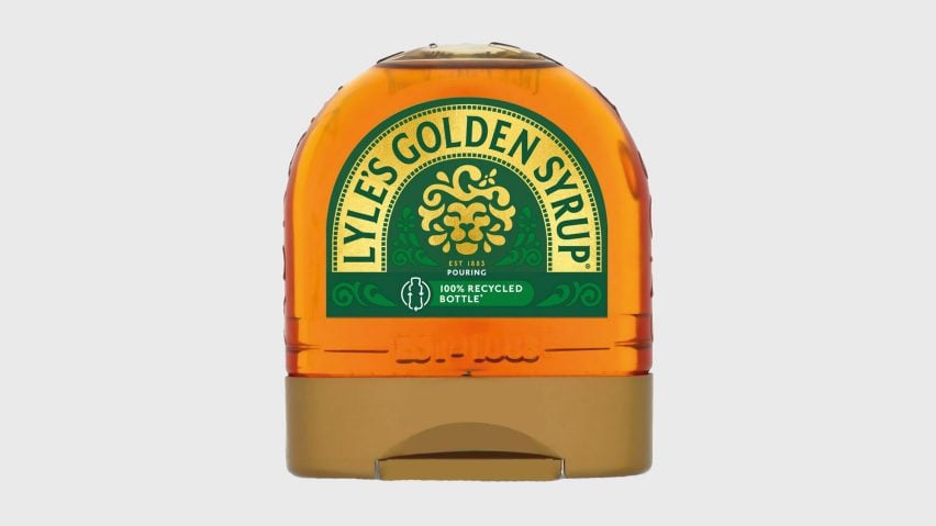
Lyle's Golden Syrup is confirmed by Guinness World Records as the oldest unchanged brand packaging, but Tate & Lyle Sugars this year updated the logo for the first time since its origins in the late 19th century.
To some pushback from commentators, the company removed the logo's dead lion at its centre and religious tagline, replacing both with a flattened, simplified lion head and its established date.
Find out more about the Lyle's Golden Syrup redesign ›
Like Jaguar and Lamborghini, German car maker Audi also unveiled a new visual identity as part of the move towards electrified vehicles.
The new logo, rolled out only for the Chinese market, does away with the brand's four-ring logo, opting instead for the brand's Audi wordmark in an uppercase, Tron-style sans serif.
Find out more about the Audi logo ›

