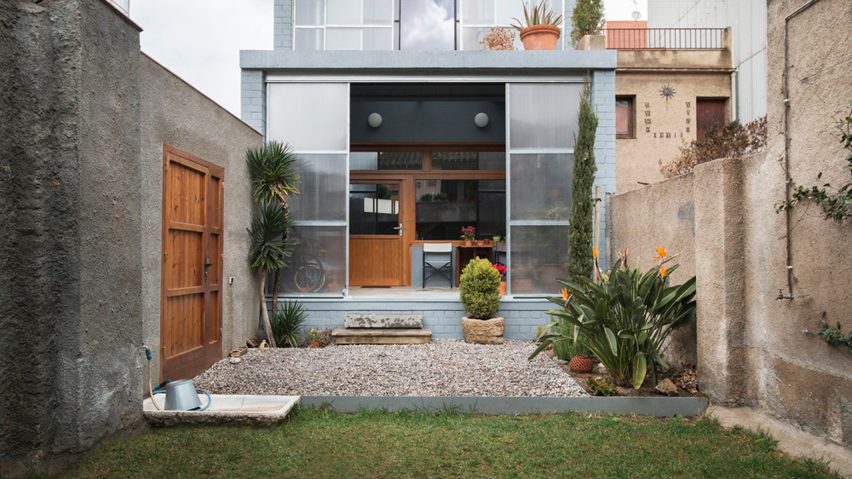
Sliding polycarbonate panels open up facade of Catalan house by H Arquitectes
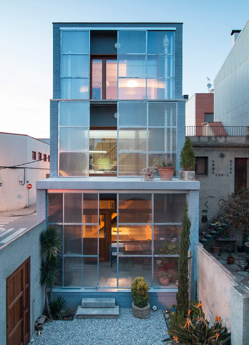
Sliding polycarbonate screens are set in front of the windows covering the stepped facade of this Catalan house by Spanish studio H Arquitectes.
The property was designed by H Arquitectes for a plot on a street corner in the Cerdanyola del Vallès district, north of the city centre.
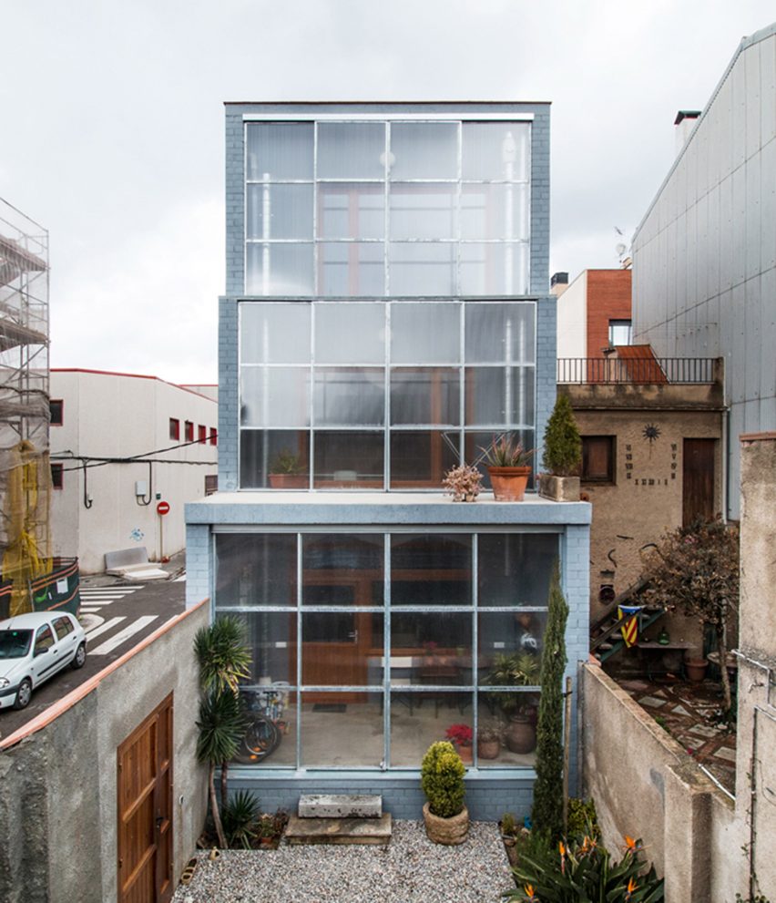
The small site previously formed part of the garden of a house occupied by the clients' parents. The design of the new building was intended to minimise its impact on this existing house, both during and after its construction.
The site's proportions and its position between two party walls determined the footprint of the property, while the height and number of floors are the maximum permitted by local planning regulations.
A chamfered corner was required to retain the existing public space at the intersection of two roads. The facades looking onto this intersection are largely closed, with narrow windows arranged above the eyeline of passers by.
A desire to maintain a connection with the parents' house also informed the decision to keep as much of the existing garden area as possible, and to position the entrance to the new house so it opens onto this space.
"The strategy defines a tall house with a low occupation, opened through a gallery in its south facade," explained the architects.
"The orientation explains how the south facade is the main source of light and views; it does so without any limit, using a set of large recycled windows."
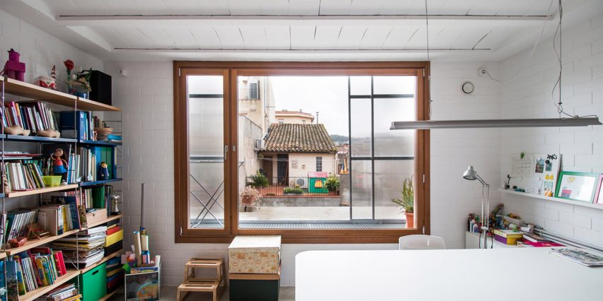
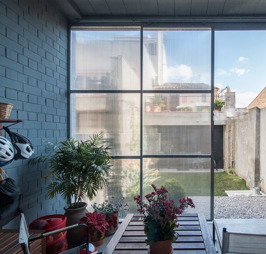
Windows on each of the three main levels are set behind sliding polycarbonate screens that help to trap heat and allow sunlight to filter through to the interior. The small windows of the opposite facade provide an opportunity for natural cross ventilation.
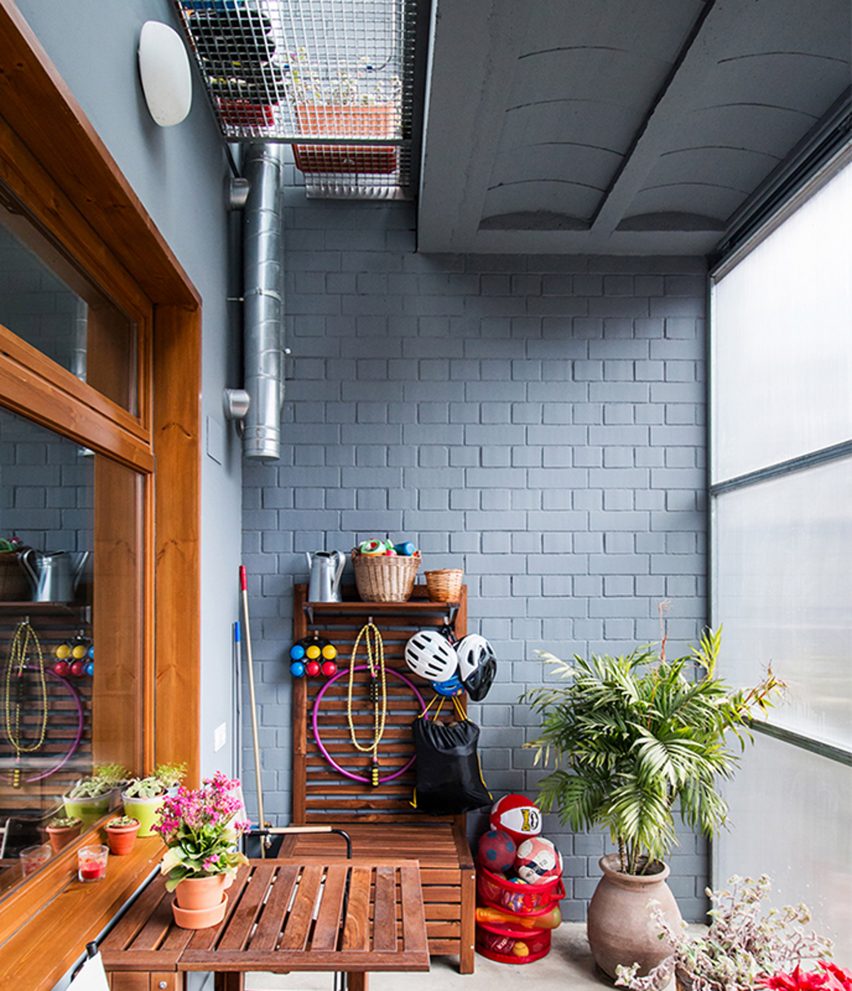
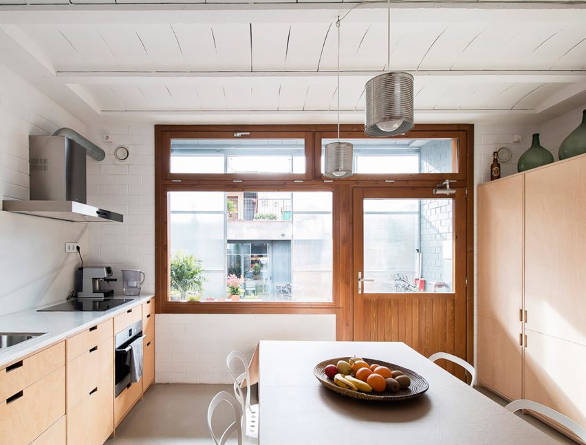
On the ground floor, the space between the main facade and the sliding shutters is widened to form a porch that extends the kitchen and dining area towards the garden.
On the upper storeys, the width of the void is reduced to enhance the warming affect in winter and enable the screens to be opened more easily to achieve cross ventilation in summer.
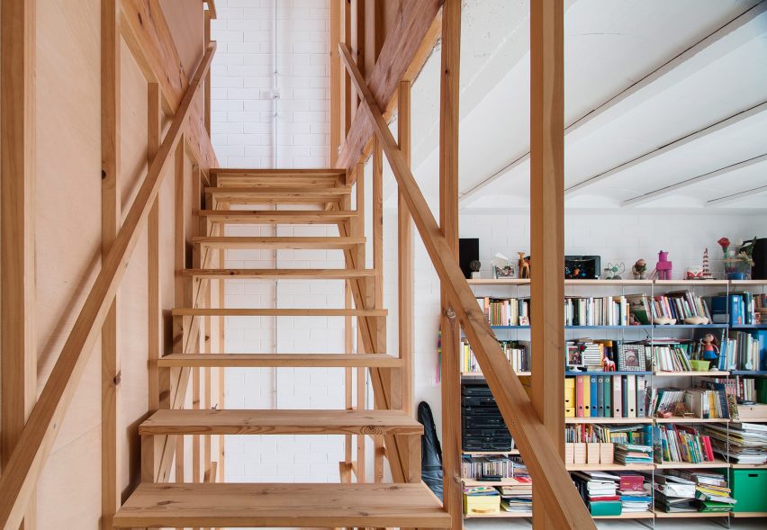
A staircase connecting the three levels is positioned at the centre of the building, perpendicular to the party walls. This orientation creates a vertical void that divides the internal plan into front and rear sections.
Each of the resulting spaces has a distinctive character resulting from the varying dimensions, but only the bathroom and laundry are prescribed specific functions. The remaining areas are flexible and can be used in different ways.
The kitchen and dining space at the front of the ground floor connects with a living area at the rear.
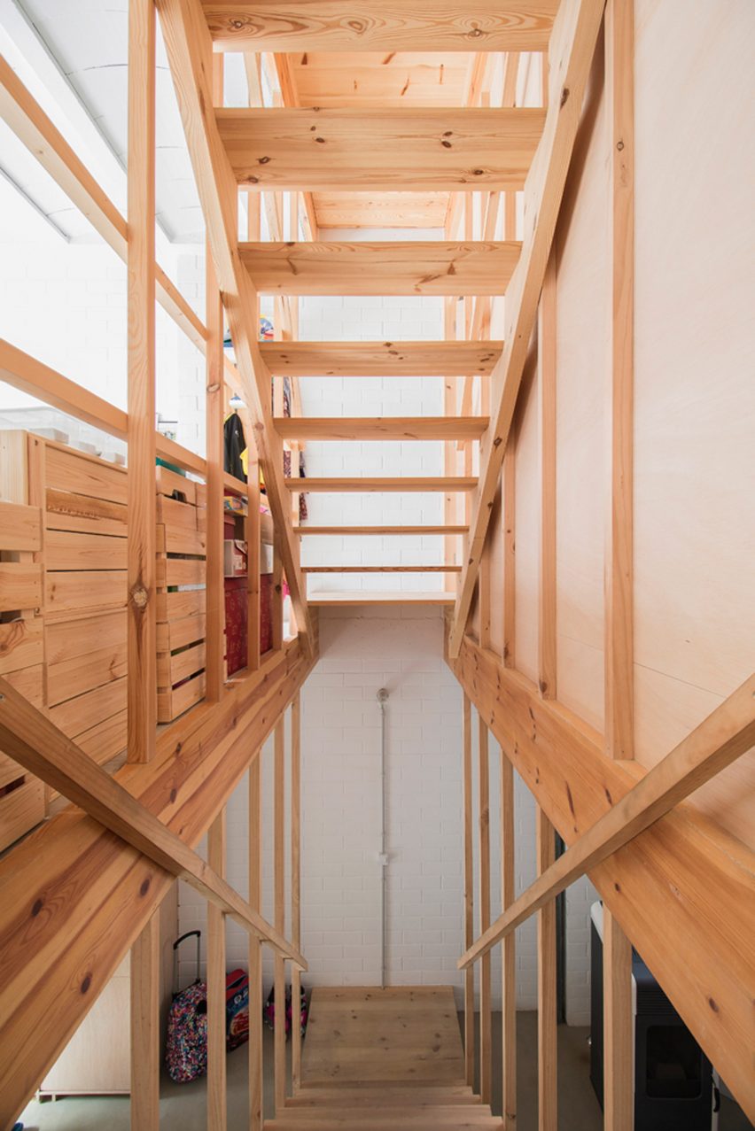
The level above contains a study overlooking the garden, with the laundry and bathroom situated behind a plywood wall on the opposite side of the stairs.
The top floor accommodates the bedrooms, with the children's room on the south side and the parents' room facing north.
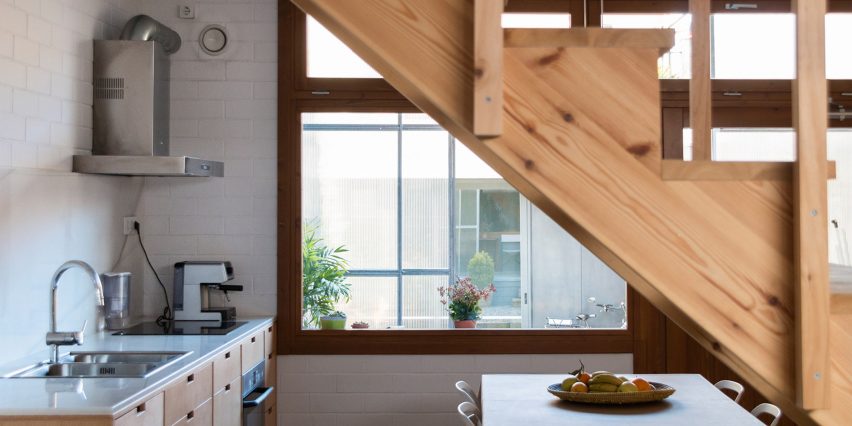
Throughout the building, materials are used in their raw state and left exposed to express their utilitarian character. The walls are made from whitewashed brick, while timber studwork supporting the walls and framing the staircase is also uncovered.
Previous homes by H Arquitectes include a courtyard house slotted between its two neighbours and a property comprising three brick boxes arranged around spaces that can be inside or outside.
Photography is by Didac Guxens.