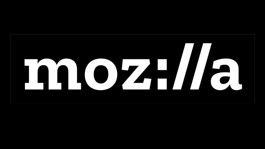
Mozilla reveals new logo developed through open design process
After seven months of public scrutiny, London studio Johnson Banks has revealed the new Mozilla logo it created through an open design process.
The rebranding process for Mozilla, the software community best known for developing the Firefox browser, began in June 2016.
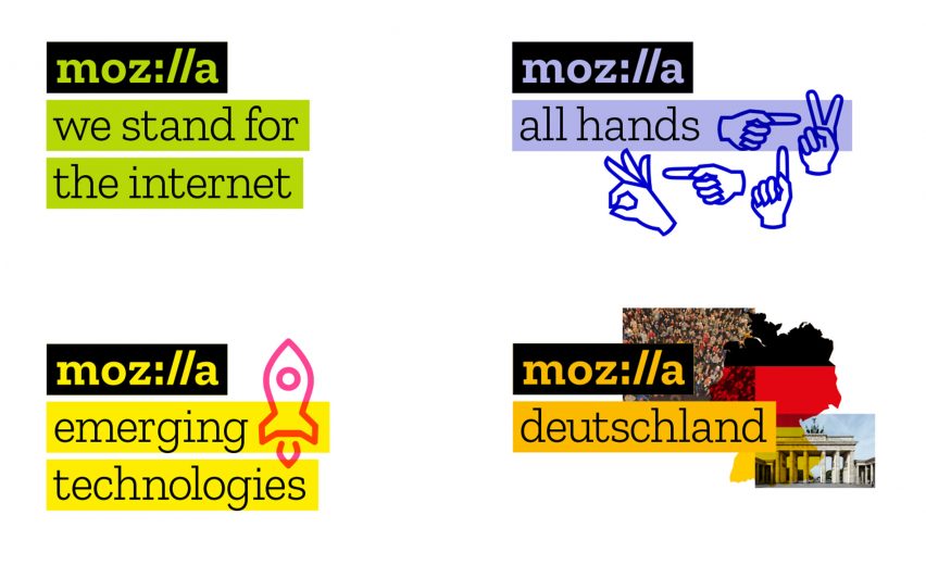
Prompted by Mozilla, which prides itself on its open-source approach, Johnson Banks carried out the rebranding project "in the open", setting up a blog through which it shared ideas and invited feedback.
The final logo closely resembles one of November's final four concept designs, Protocol, which references coding language and style.
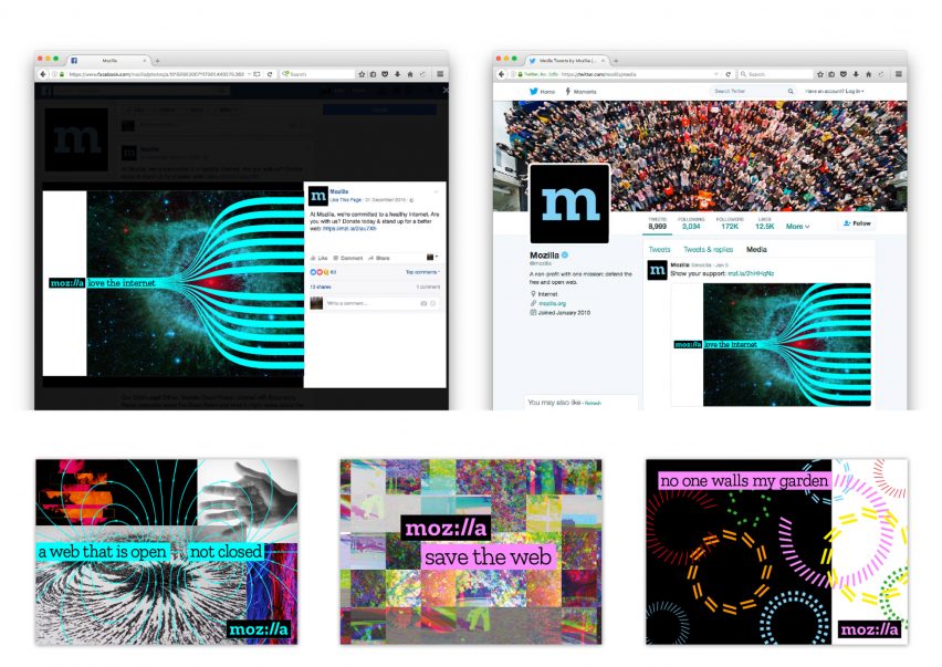
It features the company name spelled out in a Courier-like font, with the "I" and "L"s represented by a colon and two forward slashes – as would appear after the HTTP in a URL.
"Our logo, with its nod to URL, language reinforces that the internet is at the heart of Mozilla," said the company's creative director Tim Murray.
"We are committed to the original intent of the link as the beginning of an unfiltered, unmediated experience into the rich content of the internet."
The flat design – bolder than Mozilla's previous plain wordmark – also borrows elements from the other concept designs.
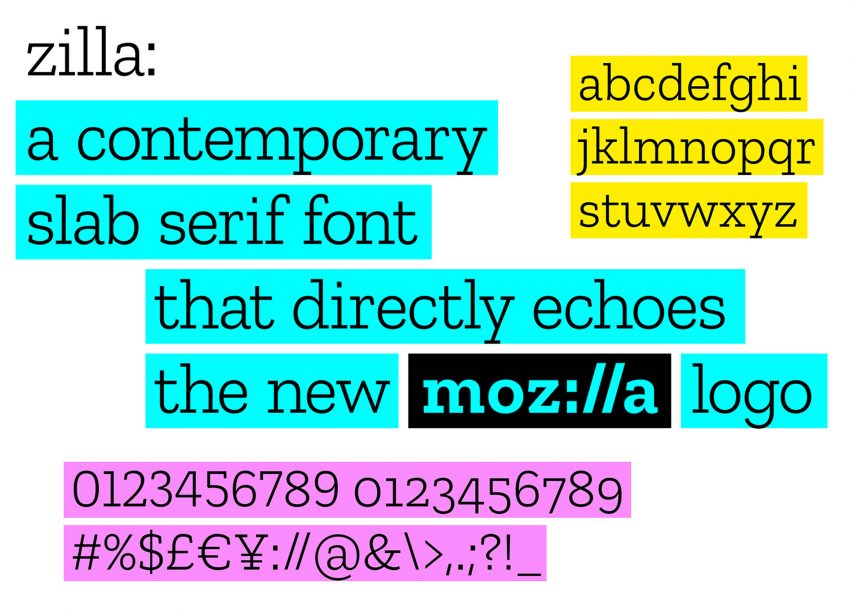
The "openness" prioritised in the design process carries through to other aspects of the finished identity. The Zilla font, by Dutch type foundry Typotheque, is being made available for use for free.
Mozilla also plans to invite designers to continue developing the visual identity by contributing to a gallery of evolving imagery used by the brand.
"We intend to invite artists, designers, and technologists to contribute to an imagery collective, and we'll code curated GIFs, animations and still images to flow into mozilla.org and other digital experiences," said Murray.
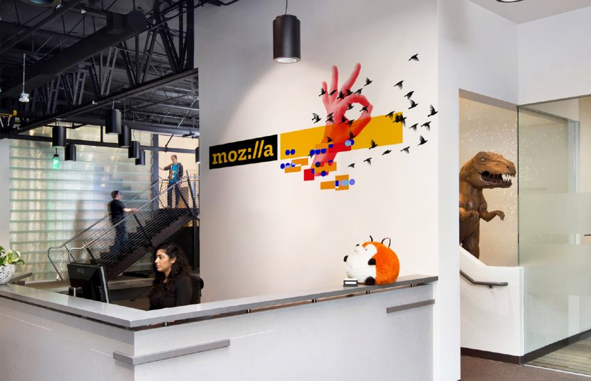
"Through this open design approach, we will engage new design contributors and communities, and make more imagery available to all under Creative Commons. We're looking for input from creative communities to help shape and expand this idea."
Blog comments, live crit sessions and Mozilla's strategic goals all factored into the final design.
Initially, Mozilla posted a series of articles detailing seven possible concepts for its new direction.
Having gathered the public feedback from the blog and from a conference in London, they enlisted Johnson Banks to narrow the themes down to five.
These designs were reworked and narrowed down again to seven and then four final selections. Protocol appeared from an early stage and was joined by the cartoonish Dino, pixellated Flame and data-based Burst in the final round.
Although the logo can be adapted to complex imagery, in its basic form it is an example of flat design, which has gained dominance in web design since Apple's iOS7 in 2013 and Google's Material Design manifesto in 2014.
As well as ridding graphics of drop shadows and textures, the trend has seen skeumorphic logos – which aim to emulate real-world objects – replaced with more simple icons.