New UK passport "likely to become a defining symbol of Britain's new identity"
How do you design a passport? How do you prevent forgeries? And why do they all look the same? Following the launch of our Brexit passport design competition we spoke to Julian Payne, creative director at the world's biggest producer of passports and banknotes.
Payne heads a design team of 22 people at De La Rue, a UK-based company that manufactures over 12 million passports a year. It also produces 40 per cent of all banknotes in circulation globally, including the UK's new plastic £5 note.
De La Rue also designed the current UK passport – which was described as a "very British mess" by Guardian design critic Oliver Wainwright when it was unveiled two years ago.
"Passports carry enormous emotional currency," Payne responded diplomatically. "Governments must walk a bit of a tightrope to balance design and security, and sometimes will not please everyone."
De La Rue is also pitching to design and produce the new UK passport, which was put out to tender by the government last October – ironically, via the European Union's electronic tendering journal.
"The term of the current [passport] book design and manufacture is a 10-year cycle and the tender's timing with our exit from the European Union is quite coincidental," said Payne.
"The passport is a unique symbol of national identity and a critical piece of national infrastructure," he added. "As such, there will be huge expectation on the development of this design, which is likely to become a defining symbol of Britain's new identity and relationship with the world."
We spoke to Payne about his job and about the future of passport design, and asked him to give entrants to our competition some tips. Here's an edited transcript of the conversation:
Marcus Fairs: Tell me about De La Rue.
Julian Payne: De La Rue is a British company with a 200-year heritage. We design passports, banknotes and other secure documents such as birth certificates, tax stamps and brand protection labels.
We're the world's largest commercial banknote printer. We have designed 40 per cent of the worlds' banknote denominations presently in circulation.
We are also the leading commercial passport printer, designing and producing over 25 different passports (and passport components, such as paper) including the current UK passport. We operate facilities across the UK and around the world, including manufacturing locations in Malta, Kenya and Sri Lanka.
Marcus Fairs: You're the creative director. What does your job involve?
Julian Payne: I joined the De La Rue design team in September 2016. I have a background in product management and product design and came to De La Rue after working in the technology and telecommunications industry.
I manage a creative team of 22 designers. The team encompasses skills including substrate (paper and polymer) design, holography, and security features such as threads and specialist inks.
We design and manufacture products that have to perform in the field for long periods of time and often in some pretty unusual environments.
We aim to deliver iconic designs that are symbols of national pride. That means the team and I will have daily interaction with customers or De La Rue project teams as well as a fair bit or travel.
Marcus Fairs: What projects have you worked on recently?
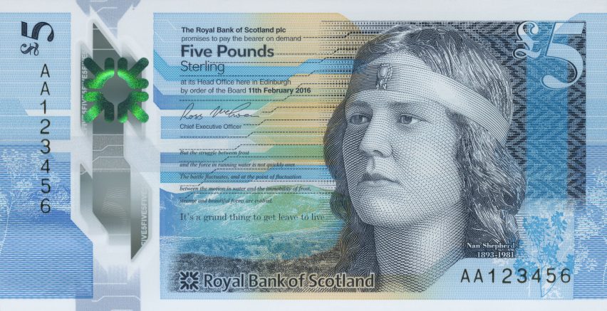
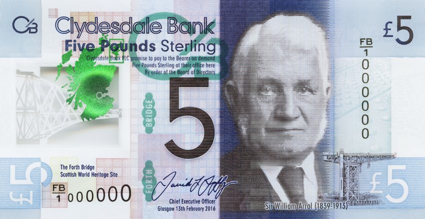
Julian Payne: In the last six months we launched designs for the new Bank of England polymer £5 note, the Royal Bank of Scotland polymer £5 note as well as new notes for Macedonia and the Solomon Islands.
We also recently won the Rwanda passport contract and are working closely with the customer on a new design that embodies the nation's values and keeps their citizens secure.
Marcus Fairs: Which project are you most proud of?
Julian Payne: I think all the new UK polymer notes look great. I also like it when De La Rue is able to work in partnership with other designers. The Royal Bank of Scotland £5 note was created with the design house O Street following a broad public consultation by the Royal Bank of Scotland team.
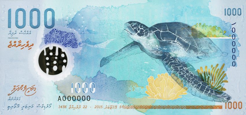
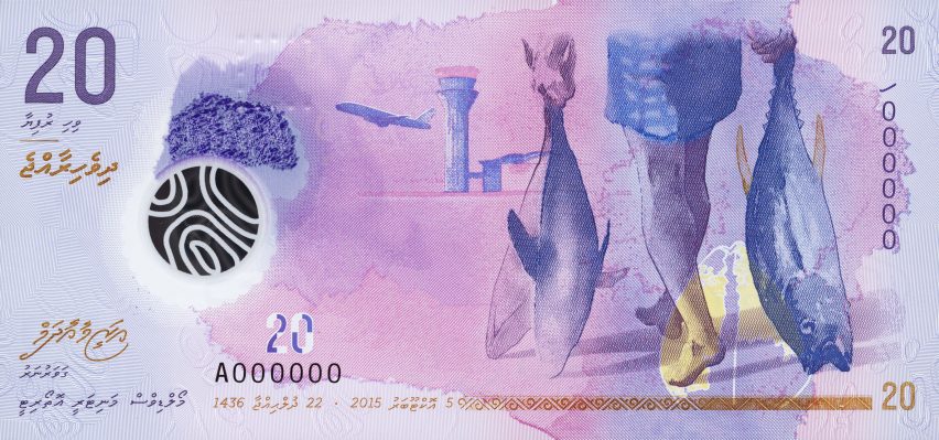
For the Maldives we worked with a local watercolour artist, and converted his brilliant wash designs into fine line work - no mean feat - to create really outstanding and secure notes.
That last point is important. We aren't just producing something that is beautiful – it needs to be both beautiful and secure.
Marcus Fairs: The most recent UK passport got a luke-warm reception from the design press. What is your response to that?
Julian Payne: Passports carry enormous emotional currency. Governments must walk a bit of a tightrope to balance design and security, and sometimes will not please everyone.
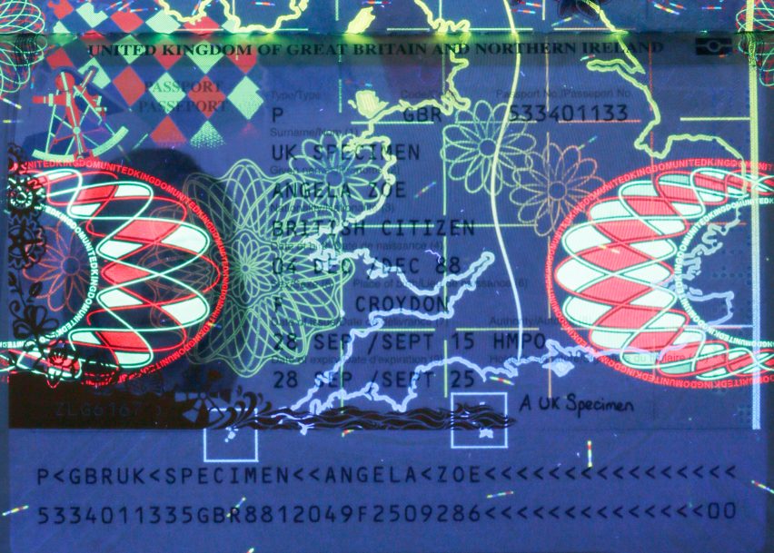
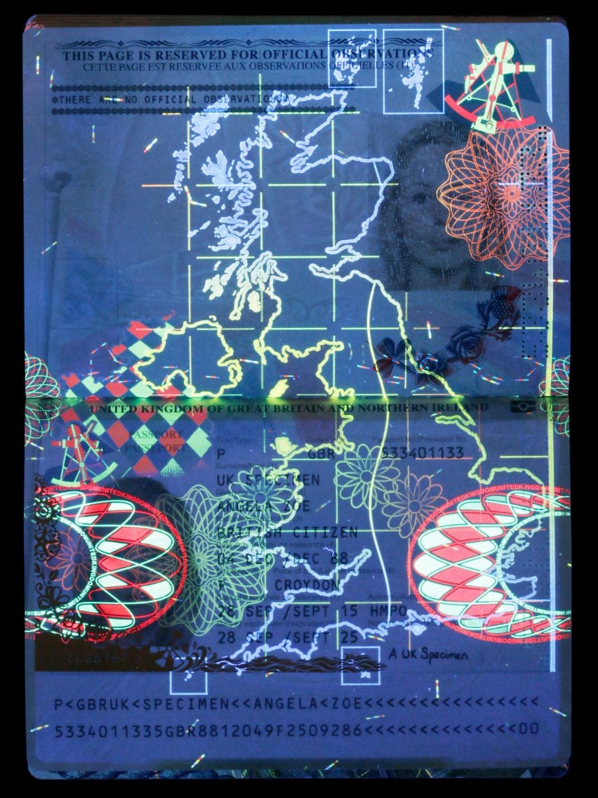
Our latest UK passport design brought together a number of exceptionally innovative elements within the books' construction including bio-data page and print innovation around both visible and invisible workings. These were world firsts.
Personally, I took one small measure of success when a Ugandan border agent first looked at my new passport a few months' after the launch, was able to identify it as a genuine doc and said they really liked the new design. That told me the product was doing its job, for me as a traveller and for HMPO [Her Majesty's Passport Office].
Marcus Fairs: How did the current UK passport design come about? What was the thinking behind it?
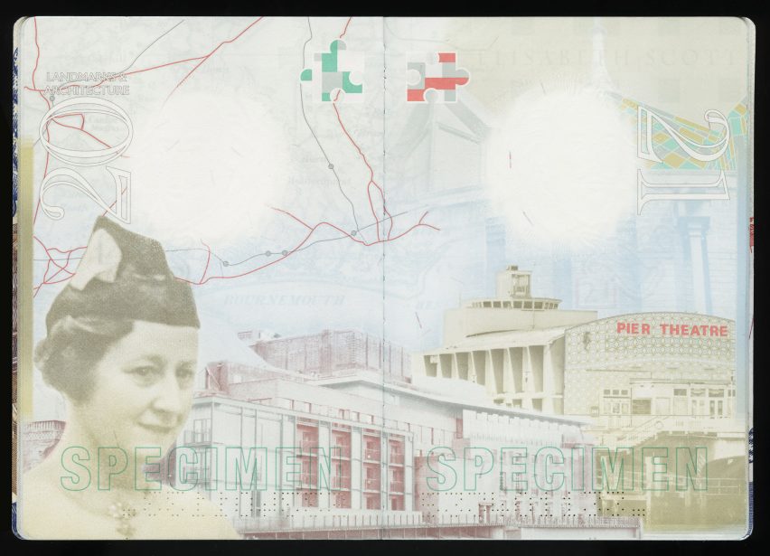
Julian Payne: For most passport briefs the customer sets the theme. In this instance, HMPO chose the theme of creative Britain as a way to showcase artists, inventors and innovators past and present.
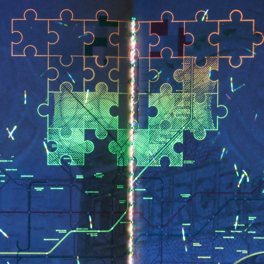
My creative team then began to generate visual stimulus and concept designs for the customer. This involves a great deal of research. The initial four subjects were selected by HMPO were the Penny Black, John Constable, Elisabeth Scott and London Underground based on De La Rue concept designs – and then work began in earnest.
After deciding on a central concept, we then began to convey a sense of narrative through the pages. Drafts and mood boards were presented with fortnightly reviews with the customer as we entered an iterative design process that would continue throughout the project.
Meeting the challenge of ensuring every aspect of the project works effectively together as a total design demands a balance of creative flair and practical application.
For example, in order to ensure that the British invention of the jigsaw puzzle could work as a see-through feature in the book, and also register with UV and extend into an entire evolving puzzle across two pages, we had to use a systematic and complex layering of each element.
Marcus Fairs: The UK government is already tendering for a new passport for after Brexit. What more can you tell us about that?
Julian Payne: The term of the current book design and manufacture is a 10-year cycle and the tender's timing with our exit from the European Union is quite coincidental.
The passport is a unique symbol of national identity and a critical piece of national infrastructure. As such, there will be huge expectation on the development of this design, which is likely to become a defining symbol of Britain's new identity and relationship with the world.
There has been lots of speculation on the colour of the next passport and we have been exploring design concepts. The exciting thing is that, within international guidelines, it's very much back to the drawing board allowing our designers free rein to explore the latest in design and security technology.
Marcus Fairs: How do you go about designing a passport?
Julian Payne: In some ways it's very similar to the commercial world: we work with the customer to understand the key questions they are trying to answer with a new design: who are you designing for? What use cases and threats are you designing for? This tackles the feature set we need to build in.
In terms of aesthetics, the customer will often have a number of ideas. Some are very visually literate and will send us visual stimuli they have developed. Others ask for a theme and we provide a number of concept designs, typically three-four full-page spreads to stimulate the discussion and agree the design principles under which the project can progress.
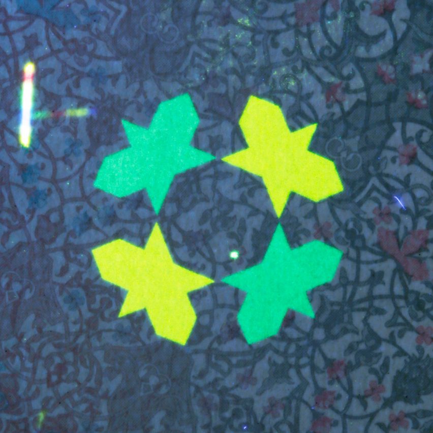
Other times inspiration thrusts its way into the process – a Middle Eastern customer rolled out a carpet and said “I want this”. It was duly designed into a book, which is a personal favourite for both its colour choices and design.
A trend in banknotes, which has not yet fully translated to passports, has been to run a design competition for the aesthetic elements of a note. This is an interesting and exciting development: it can create some arresting designs that really push our manufacturing techniques, but result in amazing looking products (for example the banknote series we delivered for the Maldives which used watercolours as one such example). If anything, artist-driven design demands more work from specialists such as De La Rue, to ensure operable, functional products.
Marcus Fairs: Why do most passports look so similar?
Julian Payne: There are a couple of ways to answer that question. The first is regulation. Passport sizes and the layouts are set by the ICAO [International Civil Aviation Organisation]. This is why all passports are the same shape and size, and why a data-page layout in an Afghan book is pretty much the same as a UK or Qatari book.
Some regional economic blocks also impose design rules to a lesser or greater degree. The EU only stipulates a common cover colour and gold block, whereas the EAC (East African Community) requests common end page design, internal colours and watermark placement.
Ostensibly these demands are driven by border forces around the world, faced with a myriad of identity documents, and the need to quickly assess the authenticity of a document. The knocked back page colours are of course to accommodate visa stamps.
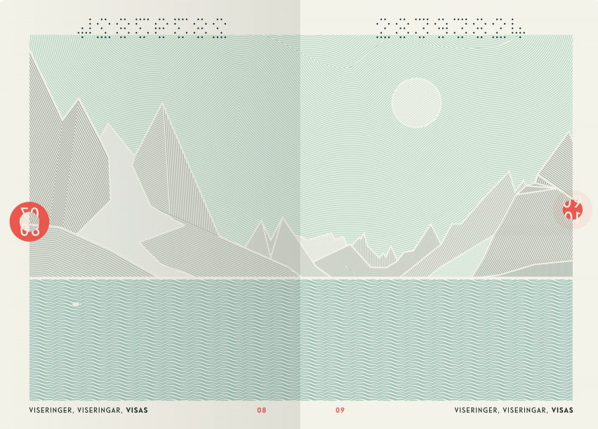
In recent years there has been a marked move away from the "traditional" interior of pattern and guilloche work. The UK started this trend with the 2009 "scenic Britain" book designed by De La Rue. This adopted cross-page designs and a collage graphics style. Canada has followed suit, but the designs from Australia, Sweden, Switzerland and most recently Norway (which incidentally was a design competition), all offer new spins on the traditional design within the book.
In terms of the exterior, this still remains very conservative, despite there being no real impediment to the range of cover materials, embossing or foil blocking one can use. Switzerland have embossed their cover, Sweden bled off the gold block. I think we will see more design innovation in this area and we are keen to lead the way here.
Marcus Fairs: Do you think passports could be more imaginative – either visually or technically? For example why can't the biometric data be on the back cover so you don't have to open your passport to scan it or show it?
Julian Payne: ICAO have a lot to do with what one and one cannot do with the product design. Biometric data is not on the back cover, as covers are unstitched. Placing it within the folio, protected by a holographic laminate or laser etched on a polycarbonate page is far more secure. The chip is ostensibly an NFC chip, but is quite restricted in regard to what it can be used for. The regulations are in the process of being updated, so the idea of an e-visa on a chip (not stuck in the book) in the next few years is conceivable.
Governments are also naturally conservative when it comes to design. This is not because they lack visual literacy, but their objectives are to design a book that is representative of a nation and by extension each citizen. Also it is quite usual for every design to iterate through a series of committees, expert reviews as well as sign off by a minister, and in many countries, the head of state.
Marcus Fairs: What about the technical spec of a passport?
Julian Payne: A UK passport has to last 10 years. ICAO offer a number of tests that books have to pass. Some governments see these as a minimum and set tougher requirements. De La Rue operates its own R&D facility where we develop materials and can test them for heat, humidity, light fastness, water (we have a washing machine), as well as tests that simulate tearing, extreme bending and sitting (we also have a mechanical backside).
As I mentioned earlier the dimensions and the layout of the data page (the page with your photo) are also set by ICAO. Beyond this there is freedom to operate. The number of pages is up to a government, 32 is the accepted standard, but we have made 25-, 68-, and 72-page books as well as five-page "emergency travel documents" for those that lose their passport when partying too hard in Magaluf.
Marcus Fairs: Presumably forgeries get more sophisticated every year. What kind of security measures do passports contain these days? How might these improve in future?
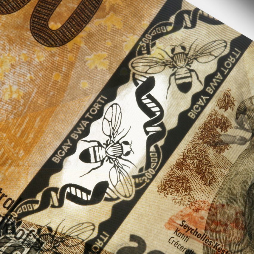
Julian Payne: Features are typically graded for public recognition (you and me), for government officers (eg border force or police), or for forensic authentication. Having a banknote heritage with design skills in paper, plastics, holography and print means De La Rue can look at the passport book in all dimensions.
Governments set their own requirements in terms of security features from watermarks to print features such as UV and microtext, as well as the use of holography. It is the bio-data page that attracts the most anti-counterfeit measures. Therefore the number of features and how the pages are stitched into the book are key.
We work closely with national fraud units to keep up to date with the latest threats and offer our solutions or co-develop approaches to them. For the current UK book the adoption of a continuous bio-data page (the rear endpaper) is one example, as well as advanced watermarking for anti-tamper are examples of this kind of collaboration.
It is a design cliché, but we strive to create "simple complexity". The ideal feature is one that is instantly recognisable by you and me, but is exceptionally difficult to make, this is why cylinder-made watermarks still form a core part of banknote and passport security over 100 years after their invention. We invest in our own own materials R&D as well as working with universities and partners to create new secure devices and features.
Marcus Fairs: What might the passport of the future look like? Will it always be a book-type document?
Julian Payne: A passport is about enabling travel. I think the number of travel documents will proliferate. The Irish recently launched a passport card, which gives their citizens access to the EU with no need to take the book. Other EU countries use their national ID cards to travel (the East African Community do the same). In these economic blocs, the idea of using a mobile device to travel in the next 10-20 years is conceivable, but the standards around mobile device protection, authentication and personal data privacy need to be solved, and that will not be easy.
Then there's the rest of the world. Passports will remain relevant until the last country moves to a new form factor. And that is a slow process. Whilst the UK and EU have had e-passports since the mid-2000s, there are still around 80 countries that do not. Many countries still stamp a passport upon entry and exit.
That said, books may get thinner as more data, such as visas or entry and exit data are stored and accessed on the book chip. There is not, however quite the same emotional resonance when flicking back through the stamped and visa-ed pages of a well-worn book.
Marcus Fairs: What do you think of our Brexit passport design competition?
Julian Payne: I think this kind of competition can be really thought-provoking. We work with art colleges such as Winchester School of Art for the same reason. It brings freshness, experimentation and challenge. Designers outside of one field of expertise will look at the problem from a wholly different perspective. In our case at De La Rue, even if the concepts designed are impossible to manufacture or we suspect are difficult to incorporate into a secure design, there is always something that one can use, adopt and experiment with.
Marcus Fairs: What advice would you give people entering the competition?
Julian Payne: Passport design is a complicated business, even setting aside the need to factor in complex security features. For the next British passport, the design needs to capture our national identity the way we are now, but also signal something about our future, the way we are seeking to reposition ourselves in the world.
I would say to anyone entering to bear that in mind. The passport is a powerful symbol and as a nation, whatever your views on Brexit, we are about to embark on a new chapter in our history – you need to seek to capture and reflect that. I look forward to seeing the entries.
Dezeen's Brexit passport design competition is free to enter and has a top prize of £1,000. Closing date is 24 March 2017. More details at www.dezeen.com/passport