"Like an armadillo trying to cross the road during rush hour"
Underwhelmed by BIG and Heatherwick's latest plans for Google's new California headquarters, readers are describing the design as "dystopian" and "oppressive" in this week's comments update.
Raise the roof: commenters are getting creative with their put-downs of BIG and Heatherwick's latest design for Google's new Mountain View office campus.
"Slightly dystopian. It has a strange flea market vibe," wrote Sancho, chiming in with comments dismissing the structure's tent-like roof.
"The roof feels really heavy handed and oppressive, like working under a turtle shell," said Peter, while H-J described the structure being "like an armadillo trying to cross the road during rush hour".
Others compared it to Foster + Partners' ring-shaped Apple Park. "Vividly illustrates the wisdom of Apple and immaturity of Google when it comes to making important design decisions," wrote user Flytoget.
This reader isn't a fan of either campus:
Read the comments on this story ›

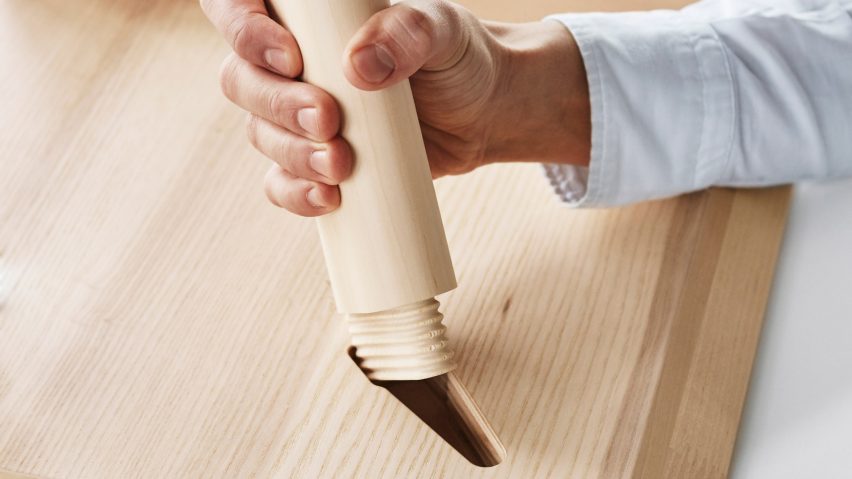
Snap decision: some commenters are joyously putting away their Allen keys in anticipation of IKEA's new snap-together furniture, designed to fit together like a jigsaw puzzle.
"I'm all for it! Great idea and smart move for the future," said Natalia.
"That's great, those metal Allen key connections always make their furniture look so shabby and cheap," wrote H-J.
But not everyone took the news well. "It will be so sad to lose the sense of achievement one gets after a successful Allen key assembly," said Geoofbob.
"Hopefully, diagram-only instructions will be maintained, or the world order will really have been changed."
One reader prefers the old-fashioned method:
Read the comments on this story ›

Spell it out: Dutch firm MVRDV has pushed the boundaries of form in its latest project. Letter-shaped housing blocks will spell out HOME across old army barracks, but is it a step too far?
"MVRDV can get away with almost anything," said Awyrish.
"The firm should seriously consider closing up shop, restructuring, or rebranding," wrote Jon. "There's only so much coasting by you can do on your name."
One reader felt the design was amateur:
Read the comments on this story ›

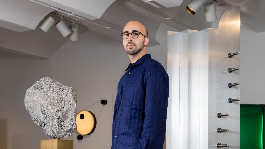
Red card: founder of New York design gallery Chamber has described the "dehumanising and degrading" ordeal of being turned away by US border patrol – leading commenters to question the reasons behind his treatment.
"Depends upon whether he has a valid green card, or a valid visa," wrote user DBC. "As inelegant as the recent restrictions might be, bureaucracy is global."
"Why is Donald Trump blamed? His immigration program was cancelled by the court," said a guest user called Commoncenz. "It appears this incident has nothing to do with Trump's immigration ban, and besides, Argentina is not one of the seven countries."
"Border patrol agents have taken Trump's cue to be aggressive," replied Jon.
Readers continued to debate over whether Trumps' proposed travel ban had impacted the turn of events:
Read the comments on this story ›