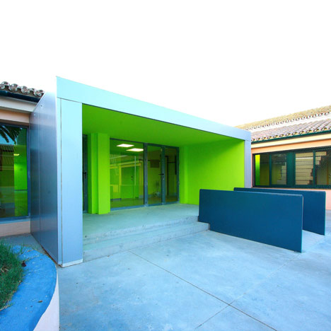
Azahar School by Julio Barreno
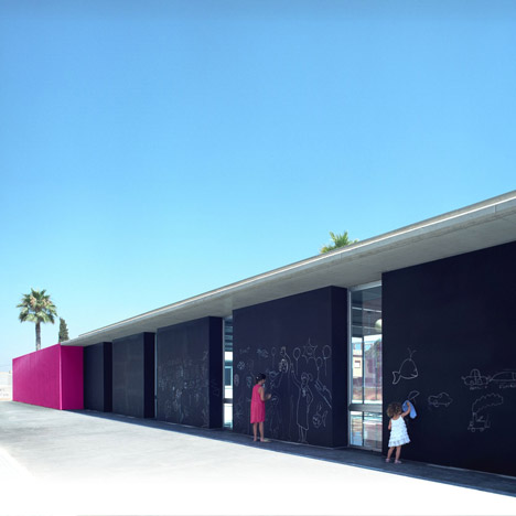
Spanish architect Julio Barreno has completed an extension to a school in Cádiz, Spain.
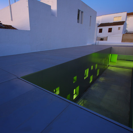
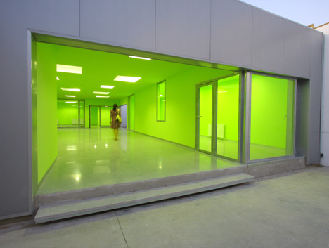
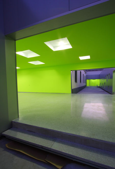
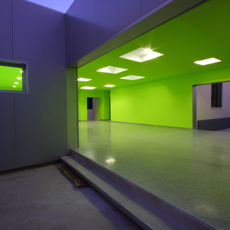
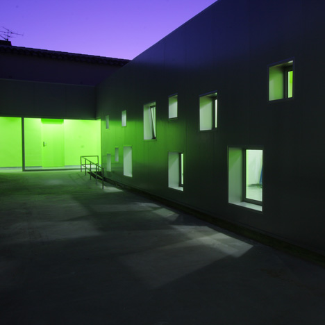
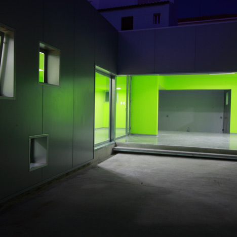
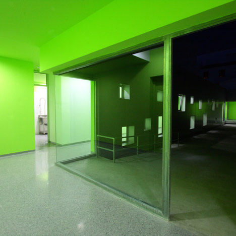
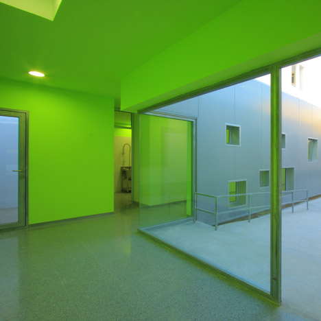
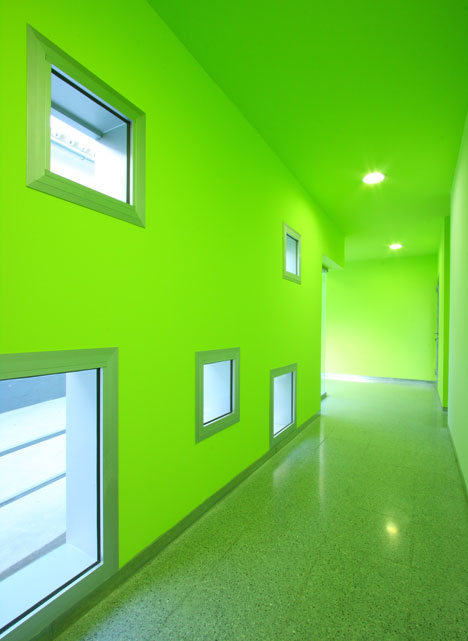
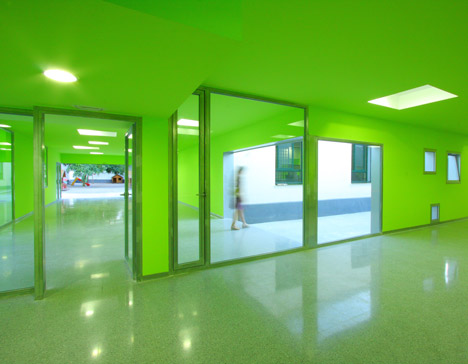
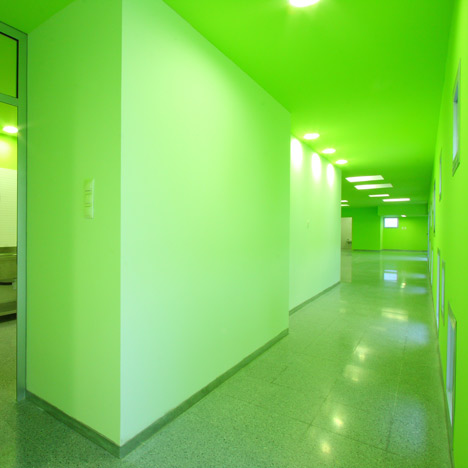
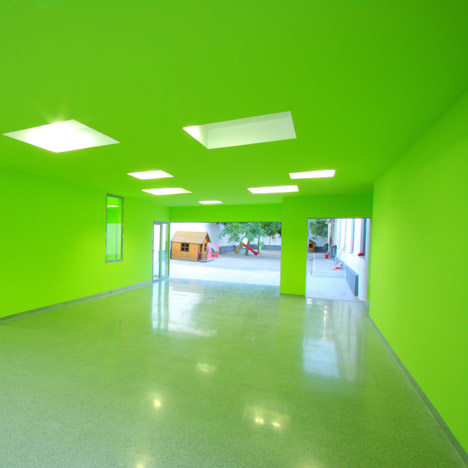
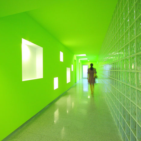
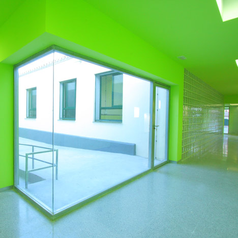
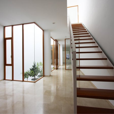
Barreno has incorporated a new building into the Azahar school, which has been painted bright green on the interior, with an array of windows of varying sizes punctuating the walls and ceiling.
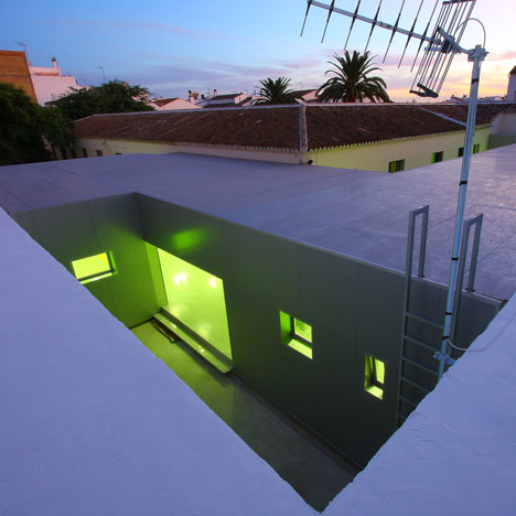
The new intervention connects to the existing building through a series of interlocking corridors.
The extension comprises an office, staff room, canteen, toilets, a service room and a covered outdoor area.
See all our stories on buildings for education in our Dezeen archive »
The following information is from the architect:
Azahar children’s school in the Prado del Rey, Cádiz.
The original building of this children’s school was located in the centre of the plot which had, at that time, a U- shaped layout; its concave side organizes the main entrance from the street, and between the convex side and the rest of the limits of the plot, it generates the playground for the students' breaks.
Basically, that was a normal way to put together some classrooms around a court.
The constructive conditions of this building were those of a traditional one.
Thick structural walls made of stones that support a light wooden made roof structure nowadays replaced by a steel one; an insubstantial building.
We had to incorporate a new program that consisted in a secretary’s office, a staff room, a lunch room and a kitchen, toilets and a heating installation room, and also a covered space for the breaks in rainy days.
Given that the new program had to be developed on the ground floor and the only option to make it was using the court behind, that, due to its shape and dimensions, made it difficult to work.
The goal was how to improve the condition of that back court.
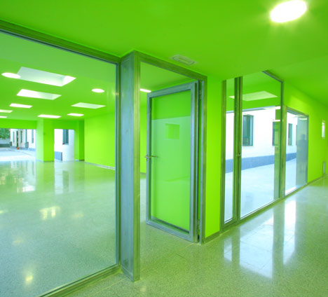
In the end, the program is was conceived as wrapped elements or volumes that generate a piece of larger magnitude with a clear continuity from the beginning to the end, trying not to exhaust the available space and giving enough architectural quality to be lived to all the programme.
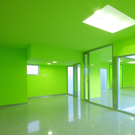
The new path is a kind of hybrid prosthesis-bypass that, starting in the main entrance, connects the entire new programme arriving to the second corridor.
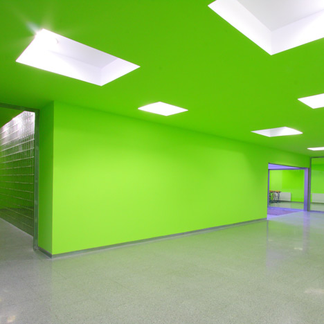
A new element that is connected to the main artery gets blood irrigation or circulation for this new area.
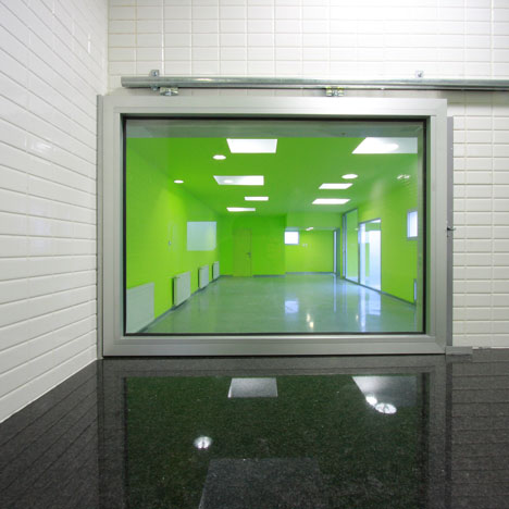
For that we started doing some previous interventions that prepared the patient to receive the new organ:
Locate the heating room in a central part of the building; organize the definitive entrance from the front schoolyard and make the path lead to the entrance again as a loop, using what we call 'the second corridor'.
The main handicap was how this concept could be tangibly experienced by the people when the work had finished. That is why the constructive decisions became really important.
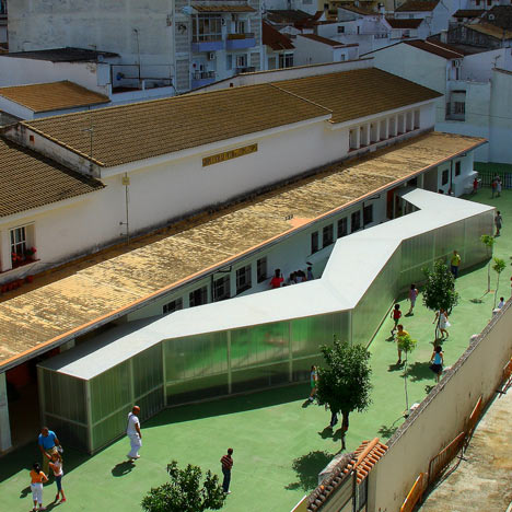
The difficulty of working in that back yard made us plan the design as an assembly construction instead of a traditional brick one. It consists of a steel structure coated with enamelled metal plates for the exterior, and pre-made gypsum sheets for the interiors.
These materials are easy to transport and place, they speed up the work at the same time as configuring the construction as a light element with an easy assembly appearance. Rather than built, assembled.
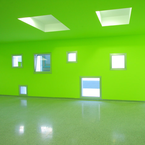
The exterior is designed with a clear and probably hard definition; the interior strives to be a pleasant walk full of different experiences.
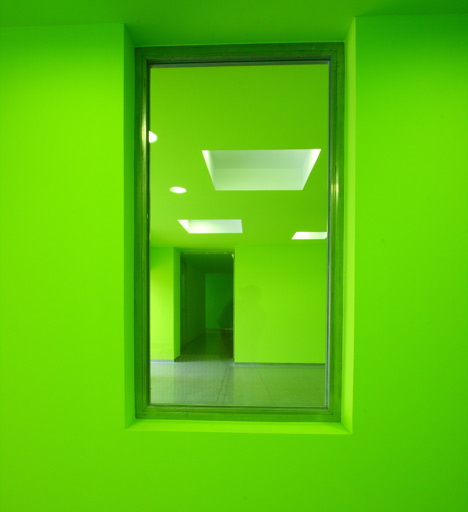
Something occurs in every metre intentionally. How the floor and ceiling are manipulated, the layout of the lights and windows and the attractive green coloured walls, make this programmatic optional path a unique architectural experience.
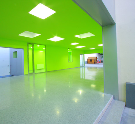
This case of architecture from the past with certain malfunctions that forced us to improve them using our best tool: the Architecture.
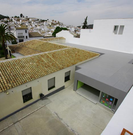
On one hand, the surgery-architecture to prepare the body first, and after that the prosthesis-bypass-architecture as a complement and extension; what we obtained is a kind of synergic architecture, something where the interaction between the two elements is more than the sum of the individual effects.
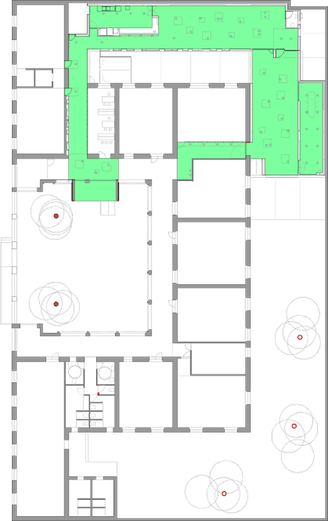
This artificial element is made so as to adapt to the body where they are installed, understanding the context and their purpose, without producing any rejection; in this case it is conceived as an alien in the patient, with a different constructive skill and a specific technique that generates specific identity.
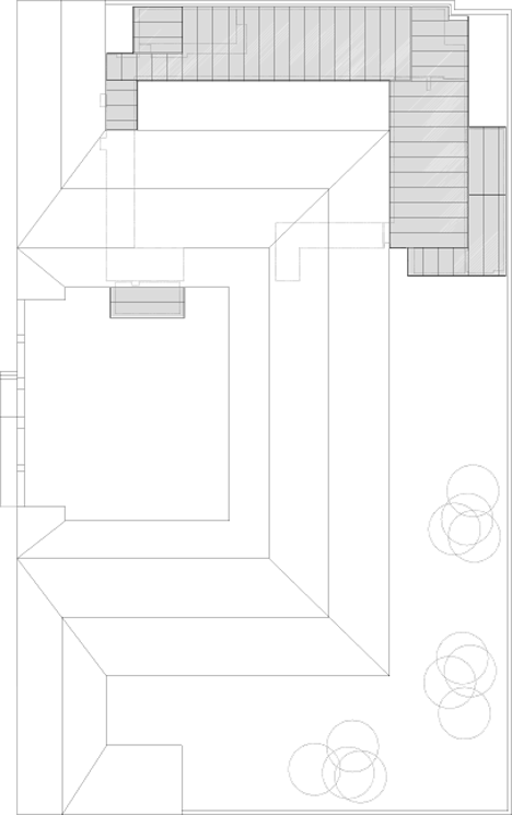
A quality of lightness, transportable, assembly, almost machines…, generated by the constructive systems that distinguish them from the existing body.

Click for larger image
In the end, we have an example where architecture and its techniques save the patient from its illness far from mummifying or letting it die, and all that using strange and untransferable machines, but at the same time, understandable, handy and stimulating.

Click for larger image
Beautiful contemporary prosthesis, said once Manuel Gausa referring to the human prosthesis.
JULIO BARRENO GUTIÉRREZ,
ARCHITECT.

Click for larger image
See also:
.
 |
 |
 |
| Víctor de la Serna y Espina by Julio Barreno | Living Around a Patio by Julio Barreno |
More buildings for education on Dezeen |