Edmonds + Lee breaks tradition for gallery-like Remember House in San Francisco
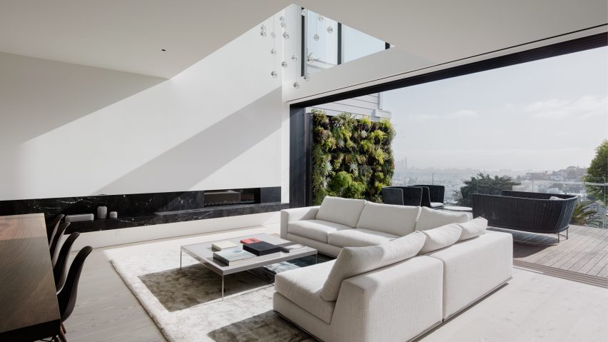
US studio Edmonds + Lee Architects has used voids, large windows and white-washed interiors to open up this San Francisco property, breaking away from the tightly packed "pancake-style" layout of its neighbours.
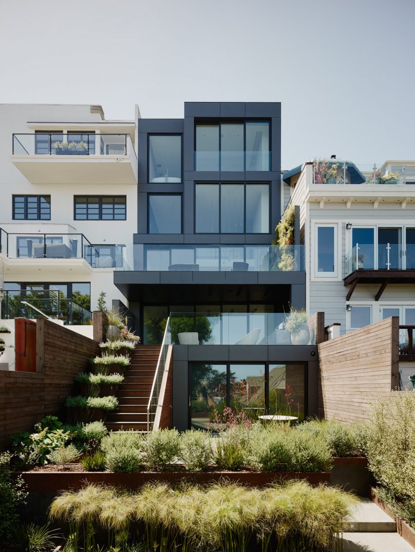
The Remember House is located on sloped road in San Francisco's Noe Valley.
The team at Edmonds + Lee Architects describes the regular layout of the neighbourhood's four-storey houses – which feature stacked floors to occupy as much of the available space as possible – as "tight or repetitive".
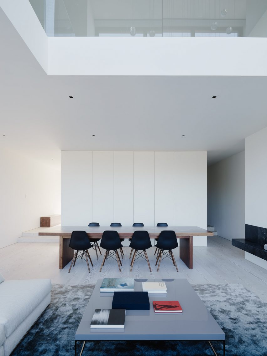
The local studio chose an alternative approach for the renovation of a residence for a family of three, removing floors to create a double-height living and dining room.
The staircase is placed in the centre of the house to allow for a more flexible layout of interiors.
"[We] worked to make the vertical circulation both evocative and valuable, forgoing the pancake-style San Francisco house where everything is maximised in terms of square footage, and instead opening the house in section, maximising a feeling of spaciousness and a sense of architectural adventure," the studio said.
"That meant a small sacrifice in terms of physically usable space, but a huge gain in terms of enjoyable architecture."
Married founders Vivian Lee and Robert Edmonds took a similar approach when designing themselves an urban dwelling in the same neighbourhood, placing on emphasis on quality over quantity.
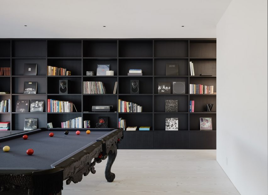
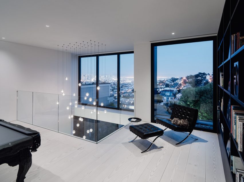
By breaking up the traditional layout, the void creates for views from spaces on different levels like the games room, which is set above the dining room and overlooks the lounge.
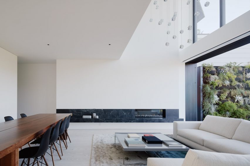
It also helps to bring in plenty of daylight through both a set of windows on the upper level, and the large sliding glass doors along the lounge.
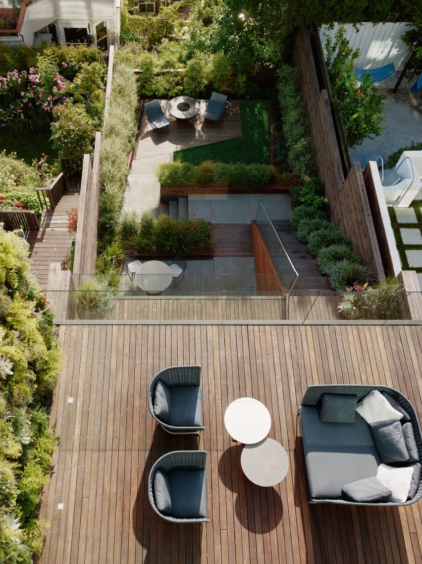
These open to a decked terrace at the rear – one of a series that stagger down to a garden.
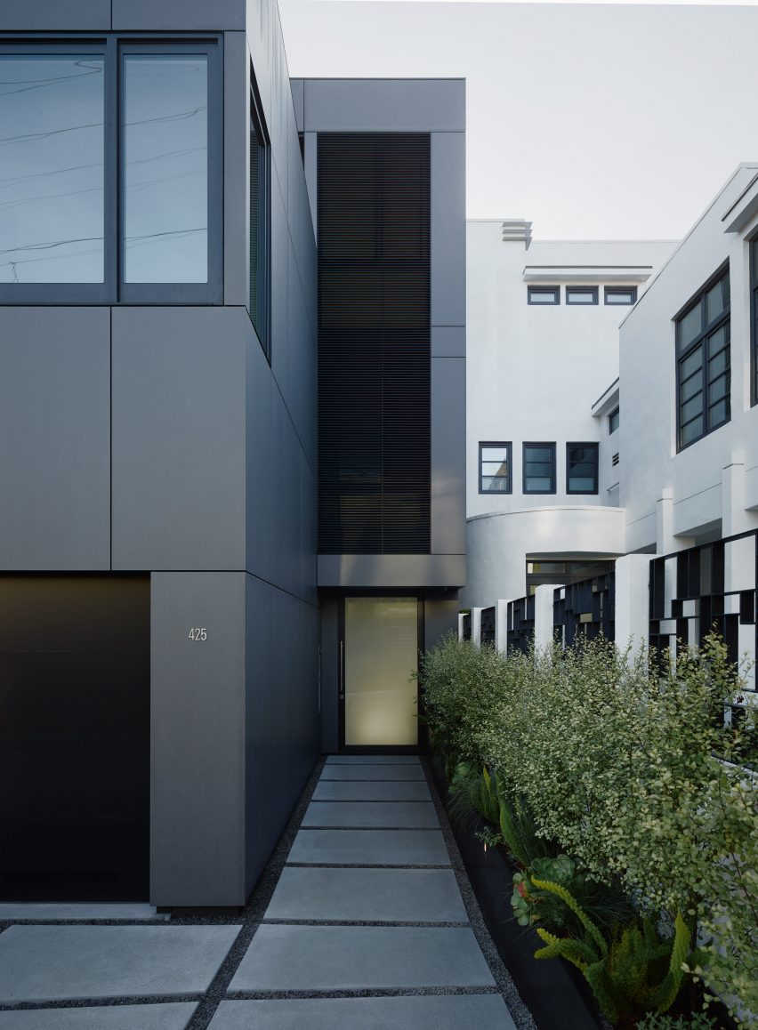
The residence is covered in dark cladding, which is intended to mark its different style from the white neighbours on either side.
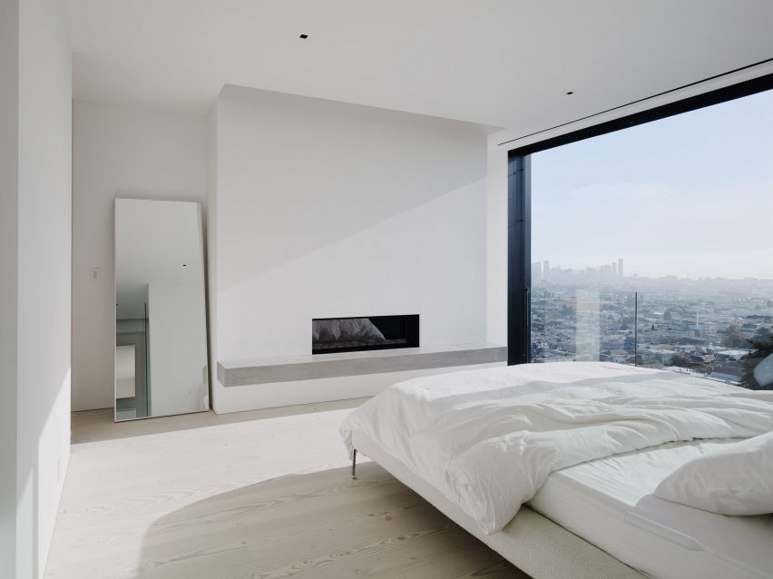
It also provides a contrast to the all-white palette that features throughout the residence, including white-painted walls and white-washed Douglas fir floors.
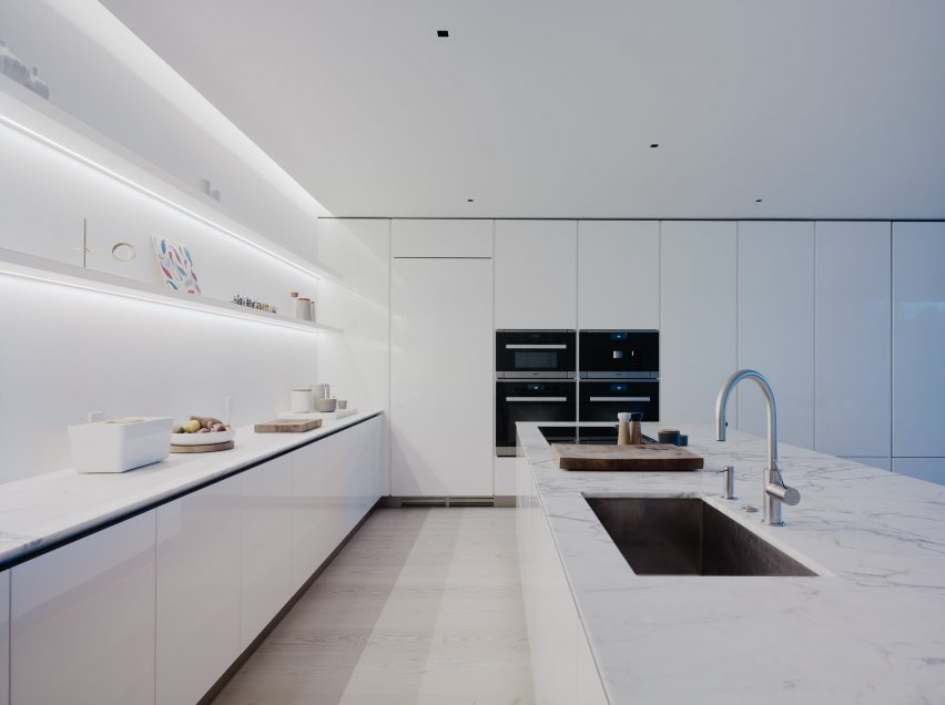
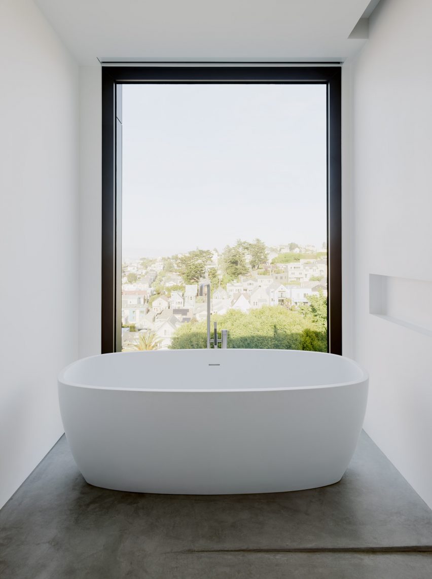
The kitchen features a white island topped with a white marble counter, while in the bathroom there is a white tub with a window to the garden and a shelf cut into the wall.
Edmonds + Lee chose the pared-back style to offer a backdrop for the resident's artwork, like the walls of a gallery, as well as furnishings designed by the architects.
"We were designing a neutral canvas onto which they project their own artefacts," said studio founder Robert Edmonds.
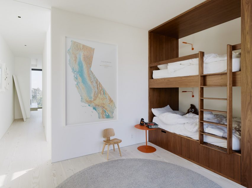
Decorative features include a long strip of black marble that forms the fire place in the living room, black wooden shelving in the games rood that matches the black pool table, and dark wooden bunk beds in the children's bedrooms.
Other homes in San Francisco include a single-family home on a steep and narrow site that Schwartz and Architecture lifted to add a storey beneath, a residence by IwamotoScott that has an angular, wooden facade, and a zinc-clad duplex by Stephen Phillips Architects that aims "to challenge the normative San Francisco housing typologies".
Photography is by Joe Fletcher Photography.