Studio Morison installs origami-like "pineapple" in Berrington Hall's 18th-century garden
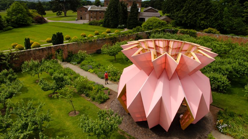
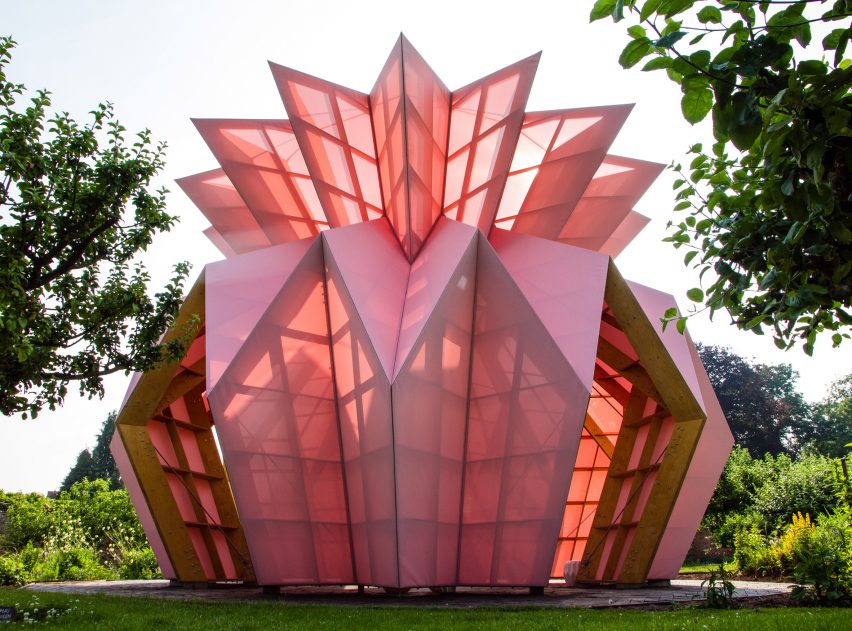
Artistic duo Studio Morison has erected a pink pavilion shaped like an origami pineapple in the centre of the 18th-century walled garden of the Berrington Hall country estate in Herefordshire, England.
Local artists Heather and Ivan Morison were asked to design a contemporary structure that would attract visitors and kickstart fundraising for the restoration of Berrington Hall's walled garden.
The construction called Look! Look! Look! is enclosed within a walled garden originally designed by Georgian landscape designer Lancelot 'Capability' Brown. This was Brown's last completed landscape project, and his only walled garden.
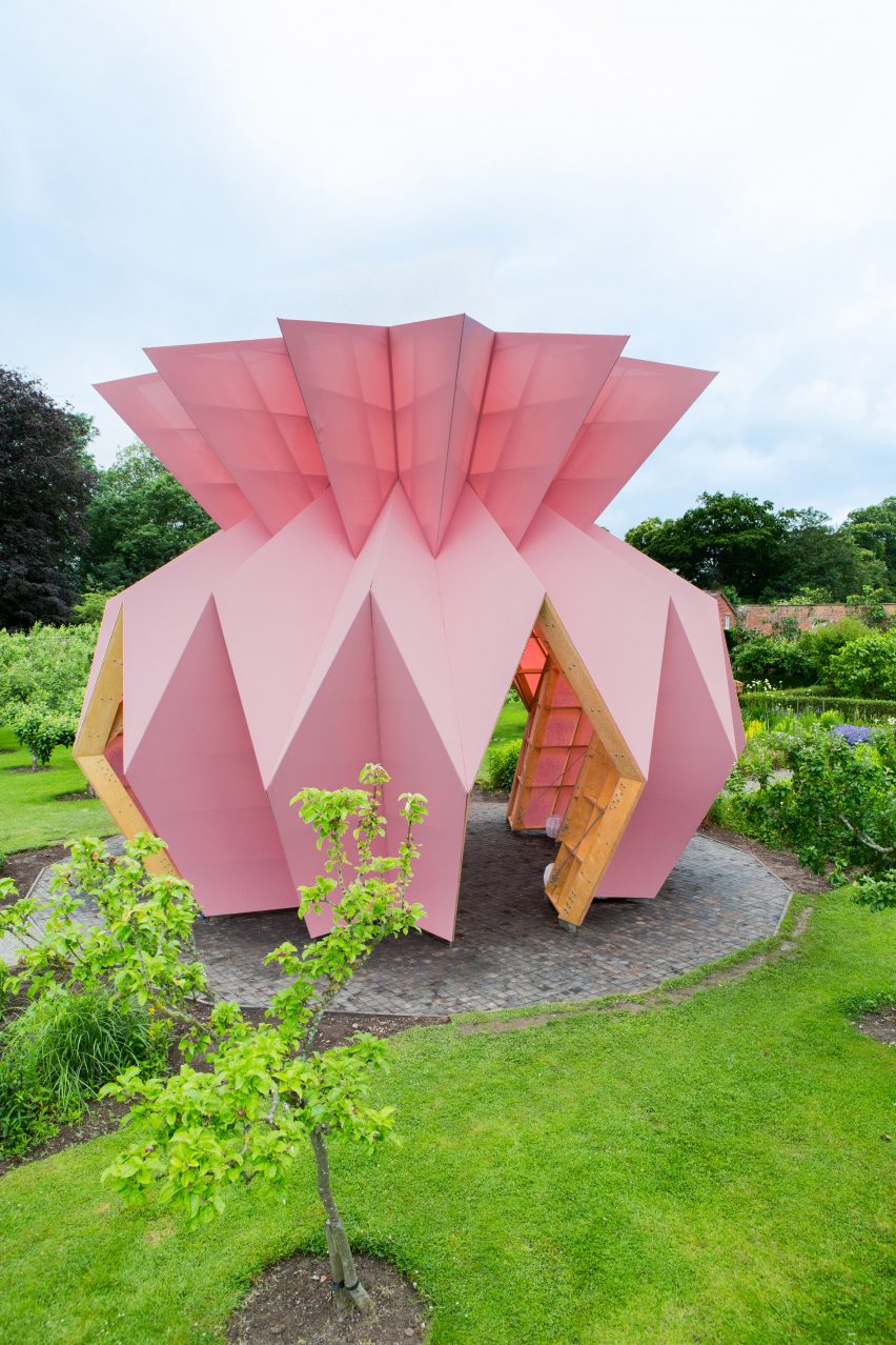
The two artists wanted to create a contemporary version of the follies or "eye-catchers" that often featured in 18th- and 19th-century landscaping.
"We chose to make a pavilion, very much along the lines of the Georgian tented summer garden structures, to create a new temporary focus within the gardens, and provide a space where new possible future activities and events can be held, tried and tested," the artists told Dezeen.
"We wanted to take something as fundamental and simple as a rectangle of paper, and fold it in such a way as to not just give it structural stability, but also to make a sculptural form that created a notional sense of shelter, that is fanciful and frivolous, something that feels contemporary but also chimes with its Georgian surroundings," they added.
Studio Morison first designed the structure using origami, and then worked with structural engineers Artura to bring the design to life.
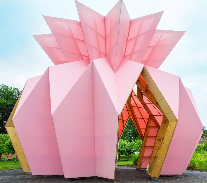
The pair created an eight-metre-tall by eight-metre-wide pavilion. The metal foundation and timber structure is encased in a pink shell, the body of which appears to have been folded into shape.
The dusty pink finish of the structure is achieved from a white waft and a red weave, which stands out against its green surroundings, and is made from a coated fibreglass fabric engineered by UK company Mermet.
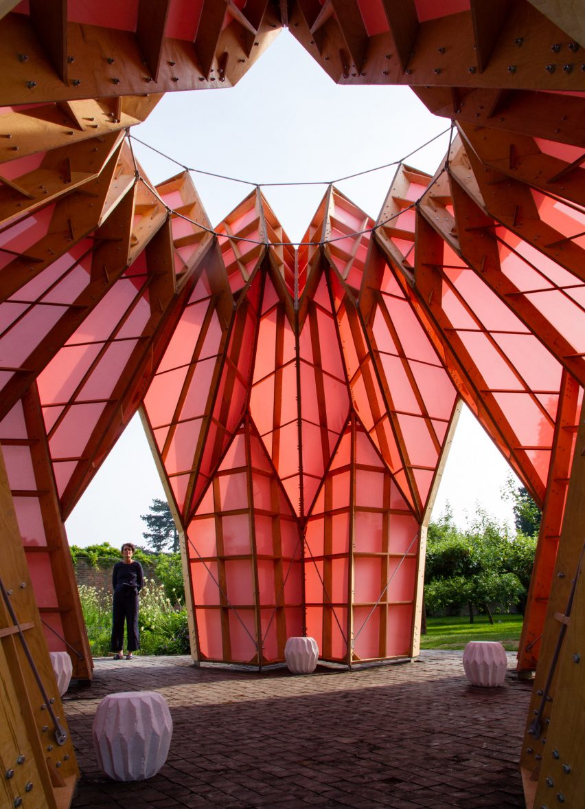
The structure is made of 90 sections and assembled like a jigsaw, with the fabric then pulled over and fixed to each rhomboid, and assembled on site in the walled garden, ultimately taking around six months to construct.
"Our challenge was to achieve an exterior finish that had the perfect flatness of facets, and the crispiness of fold edges, that are present in the original paper model," said the artists.
Able to withstand all weathers, the special woven fabric is also semi-translucent, allowing light to shine through to the space inside.
Heather and Ivan Morison chose the striking pink colour from a traditionally Georgian palette, also found in the interior decor of the Hall itself. The 'gaudy yellow scagliola' and the 'dusty pinks' present in the ceramics of the interior and its door surrounds provided the colour inspiration.
The artists also drew their influence for the structural formation from the geometric shapes found in the mansion's interior design – the repeated circular patterning on the stone floor and the same repeats on the scalloped ceiling details – as well as the flowers within the walled garden.
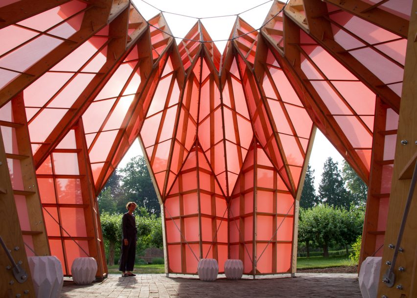
While referencing the hall's interior geometric shapes, the shape also alludes to a pineapple – a result that Studio Morison told Dezeen was a happy accident, given that the estate was known to have grown pineapples on its grounds during the Georgian period. The exotic fruit would have been used to indicate the wealth and good taste of the owners.
Studio Morison wanted Look! Look! Look! to echo the Georgians' decadent social lives, and how they would have used their gardens. Among drinking and entertainment, this use would have included displaying the latest horticultural developments and scientific advances.
To reflect this historic use, the pavilion will host a catalogue of events and activities throughout the summer, including music, yoga, and performances.
"What struck us the most was that the zeitgeisty themes present within the Georgian period – one of gaudy displays of wealth and taste, bought at the expense of a hugely exploited underclass, that cover up a more fundamental rot within society at the end of its time – is very similar to themes we find ourselves struggling with today," said the artists.
"We therefore wanted to create a form that sat within its Georgian surrounds, that spoke of all those ideas and possibilities, but was also eminently contemporary, that connected the two worlds."
The pink pavilion is part of the National Trust programme Trust New Art, launched to introduce more contemporary arts into their heritage sites to reflect the increasing diversity of their audiences.
"The programme makes contemporary arts available in National Trust properties; builds new and diverse audiences; and offers new opportunities for artists to work in different contexts," a spokesperson for the National Trust told Dezeen. "Contemporary art can also connect people to places in ways beyond a conventional heritage experience."
Look! Look! Look! is open to the public until December 2019.
The origami-like form follows a pattern similar to Studio Morison's other projects, including a temporary pavilion of scorched timber in Bristol, England, and a 3D cube designed to fly like a kite.