Carbuncle Cup shortlists six contenders for worst building of 2017
Six buildings have been shortlisted for architecture's least illustrious prize – the Carbuncle Cup for the UK's worst new building from the last year.
The projects nominated range from a new entrance to a rail station in Peston, Lancashire, to a student halls of residence in Portsmouth, Hampshire, and the redevelopment of Battersea Power Station in London. The annual Carbuncle Cup is organised by architecture website Building Design (BD).
"Our six-strong shortlist contains a mix of buildings types of differing scales and demonstrates that buildings don't have to be big to be bad and that poor-quality architecture touches all building types," wrote BD magazine editor Thomas Lane in an article revealing the shortlist today.
Half of this year's contenders are in London, as several key areas of the city including Victoria and Battersea undergo drastic regeneration. But a house extension in Malvern, Worcestershire, also makes the list.
The shortlist was drawn up by a jury comprising Lane and BD assistant editor Elizabeth Hopkirk, as well as Twentieth Century Society director Catherine Croft and urbanist David Rudlin, the director if Urbed and chair of the Academy of Urbanism. Reader comments were also taken into consideration.
The six projects have been published on BD ahead of the full shortlist reveal today, with the winner of the Carbuncle Cup 2017 to be announced next week.
Past recipients of the prize have included Rafael Viñoly's Walkie Talkie skyscraper in London and a student housing scheme, also in London, that was deemed "prison-like" by the 2013 jury.
See the full shortlist below:
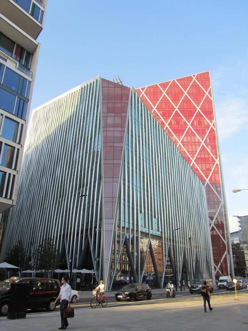
Nova Victoria, London, by PLP Architecture
PLP Architects' mixed-use scheme near Victoria station in London was nominated for its lurid and angular towers, which aim to break up the bulk of the development.
"Pity poor Victoria. Rebuilt in the 1960s after world war two bombing, the area is now being extensively redeveloped by Land Securities but sadly not for the better," said Lane.
"The architect, PLP, has attempted to break up the monolithic nature of the scheme by expressing it as a pair of sliced and chamfered towers and jazzing it up with several bright red prows presumably to give it that 'landmark' quality."
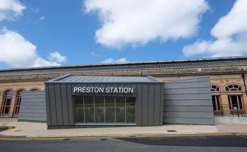
Preston Railway Station Butler Street Entrance, Preston, by AHR
The new entrance to Preston Railway station by London firm AHR made the list for the negative attention is garnered from residents on social media, with Twitter users calling it an "eyesore".
"The residents of Preston took to Twitter in droves to denounce Preston Railway Station's new entrance which replaced a 1980s building that mimicked the station's Victorian style," noted Lane.
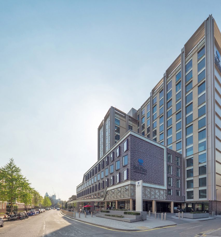
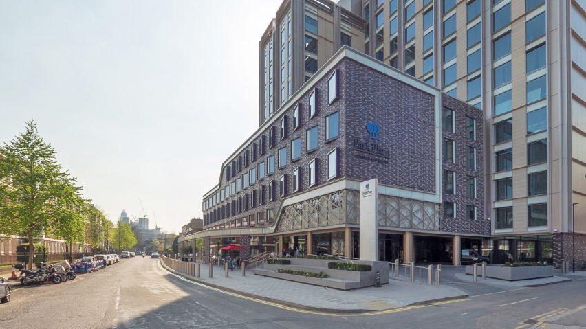
Park Plaza London Waterloo, London, by ESA Architecture
ESA Architecture's conversion of a former 1950s government building in London's Waterloo into a hotel offended jurors with its newly patterned facade.
"The lower storeys are swathed in tiles whose pattern would cause havoc on a TV screen, and whose colours manage to be both gaudy and drab at the same time," said Lane.
"To draw attention to the entrance, the architects lifted the cornice at one corner and wrapped a weird screen around it. It looks like the skin has been peeled from someone's torso, exposing a spaghetti of blood vessels and veins beneath."
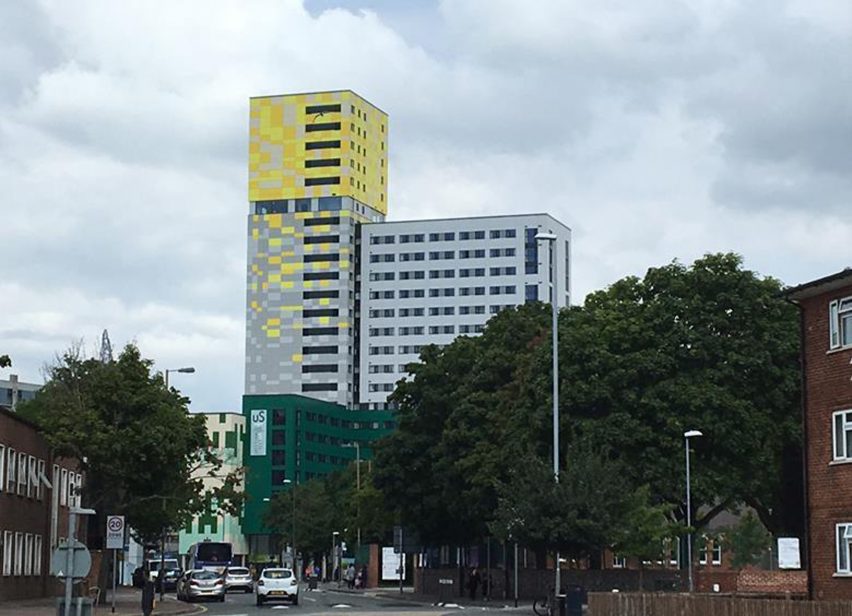
Greetham Street Student Halls, Portsmouth, by Cooley Architects
This student halls of residence in Portsmouth by London-based Cooley Architects made the list for the questionable colouring of its facade.
In addition to the pixel-like pattern of the cladding, Lane also commented that the building's form is a "discordant jumble of multi-coloured rectilinear blocks".
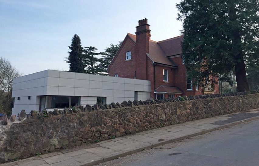
8 Somers Road, Malvern, by Vivid Architects
An extension to a home in Malvern by Worcester-based Vivid Architects was shortlisted for its "Lego brick" aesthetic, which the jury and BD readers believe is out of kilter with the "crisp modern aesthetic" described on its planning application.
"I am aware that planning guidelines today are to keep a clear boundary between new and old structures, but the architect has made no attempt to unify the house and now most people assume this family home to be a medical centre," said nominator Robert Smith.
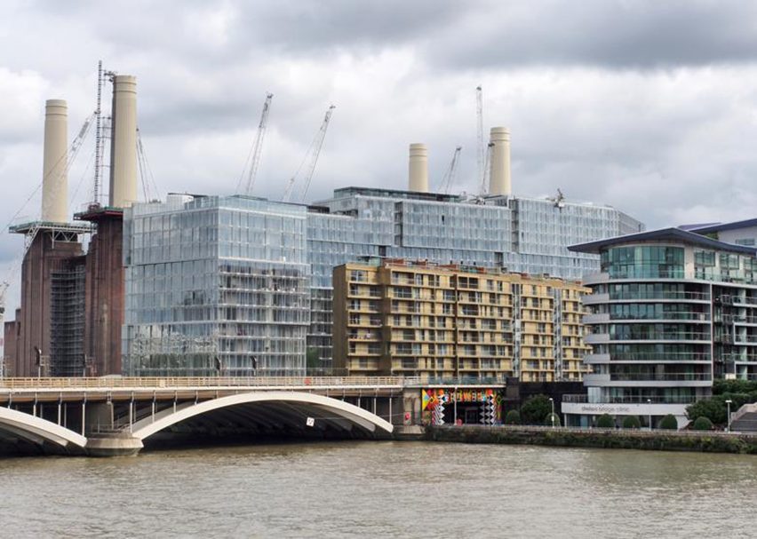
Circus West, Battersea Power Station, London, by Simpson Haugh
Part of the redevelopment of Battersea Power Station, this scheme by London studio Simpson Haugh was nominated in part for its scale.
"Circus West pulls off the feat of making Europe's largest brick building look small and was a very popular nomination with the BD readership," said Lane.
"Unfortunately, this scale of overdevelopment has been forced on the power station because of a series of bad deals made by a series of owners needing to recoup their investments."