"Now tell me, where's the Bauhaus?"
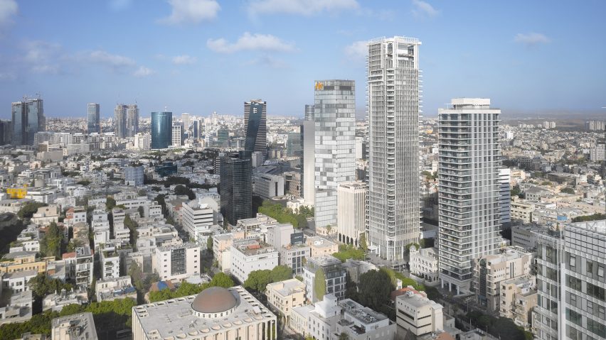
Architect Richard Meier completed his first project in Israel last week – a white residential tower with a double layered facade – and readers are struggling with the project's design influences in this week's comments update.
Keyboard warriors: Richard Meier's newly finished 42-storey tower in Tel Aviv simultaneously sparked a debate amongst commenters about the legitimacy of the building's Bauhaus influences.
The building was a match made in heaven for H-J: "Makes total sense to me that Meier is building in the White City, what took them so long?"
"I'm greatly looking forward to seeing this along with the other Bauhaus-inspired buildings when I finally make it to Tel Aviv. White buildings function so much better in such climates." wrote a welcoming Guest commenter.
But wasn't convinced by the pairing: "Most of it looks like it could be anything in Miami. The top is pure Meier. Now tell me, where's the Bauhaus?"
The tower caused Dieter to cast his mind further back: "At first, it's strange to find German influences in Israel but it makes sense to know that Nazism almost killed Bauhaus had Gropius, Breuer, and Mies not moved to the US, escaping the fascist regime."
One reader was reading the story inside their Delorean:
Is Richard Meier's first Israel project a strong addition to Tel Aviv? Have your say in the comments section ›

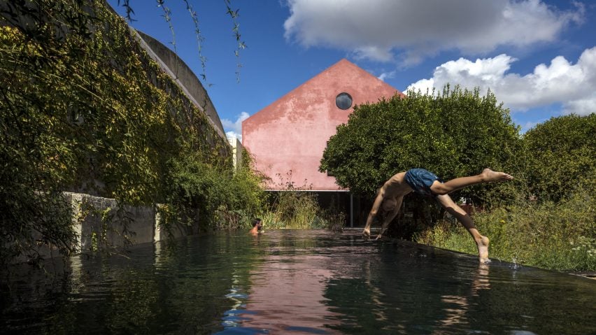
Murky waters: a Portuguese winery converted into a family home, featuring red-pigmented walls and a black-bottomed swimming pool, caught the eyes of readers this week, who had some disagreements about technicalities surrounding the project.
Sim was enamoured with the project:"Clever and sharp. I love that wall in the garden, especially with the pool. I also love seeing an old IKEA TV cart in the living room."
Arc* was calling dibs: "I'll take that swimming pool! It is beautifully set against the backdrop of the house."
"Really beautiful project but I'm not sure whether the neo-gothic style is appropriate in this region of Portugal," wrote The Secret Bean, who was not totally sold.
"I live in Portugal and I disagree. Over and out," wrote Munkeh, defiantly.
This reader took time out from the argument to impart some wisdom:
Read the comments on this story ›

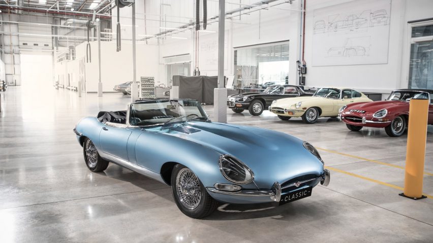
Modern classic: news that British car manufacturer Jaguar is to release a zero-emissions version of its iconic E-type model split seemed to split readers down the middle.
Bloodyfedup lived up to their name when offering opinion: "A tasteless toy to cash in. The E Type was a driver's car, this is posey and pastiche, pure and simple."
"I don't foresee this being extremely successful. The majority of classic car enthusiasts are after the smells, sounds, and experience of driving a classic car. Having a car that looks like a classic is not enough," agreed Joel K, indicating that Jaguar may have overlooked the emotion attached to driving the original E-type.
But Jon wasn't ready to write off the idea just yet: "It all depends on how it performs, but let's not underestimate the possibility of electric cars potentially being an object of desire, similar to high-end Teslas. I'm curious to hear the enthusiasts' reactions."
One reader was keen to point out that there was still a more agile method of sustainable travel yet to be mentioned.
Read the comments on this story ›

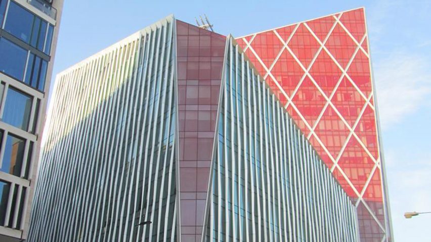
And the winner is: following last week's debate about the shortlist for the UK's worst building, readers still had plenty to say about this year's Carbuncle Cup, after Nova Victoria by PLP Architecture was awarded the "prize".
Ali B applauded the panel's decision: "Well deserved. Such an ugly lump and such an opportunity wasted. The fake cross bracing is particularly weak."
But some readers, like MWnyc, felt the award should have gone to someone else: "Oh, Preston Station is far worse than the Nova Victoria. With Preston Station, it's hard to believe that a professional architect was even involved."
This reader seemingly cracked the design formula behind the project:
Read the comments on this story ›