Cosy corners and muted colours make house by Norm Architects the "epitome of hygge"
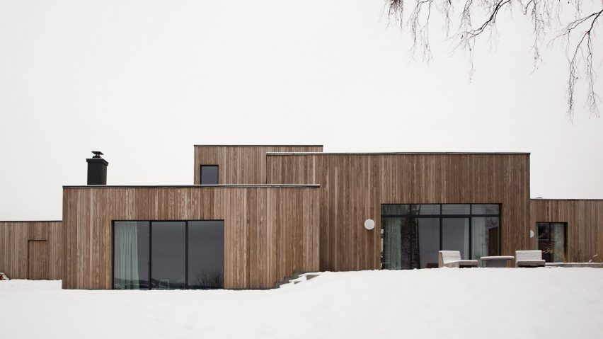
This family home in Norway by Danish practice Norm Architects is filled with cosy nooks and open living areas lined with generous windows, which look out on to picturesque woodland and a lake.
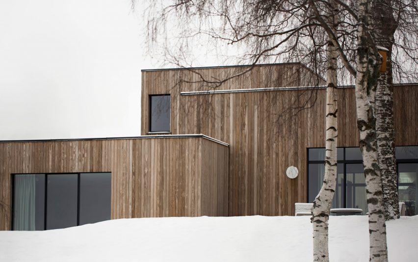
The Gjøvik House is located around an hour's drive north of Oslo. The property is made up of six interconnected blocks that create a "broken-plan" layout of nooks and level changes that loosely define areas.
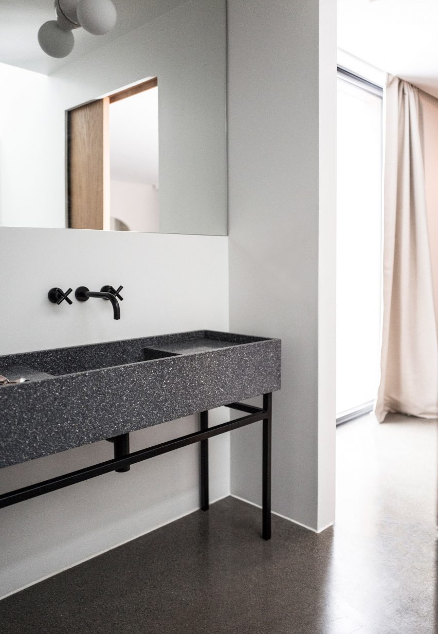
Throughout, Norm Architects employed a simple scheme of mottled grey walls, earthen textiles and warm wooden panelling to get a simple yet cosy ambience for the interior – a key characteristic of the Scandinavian concept hygge.
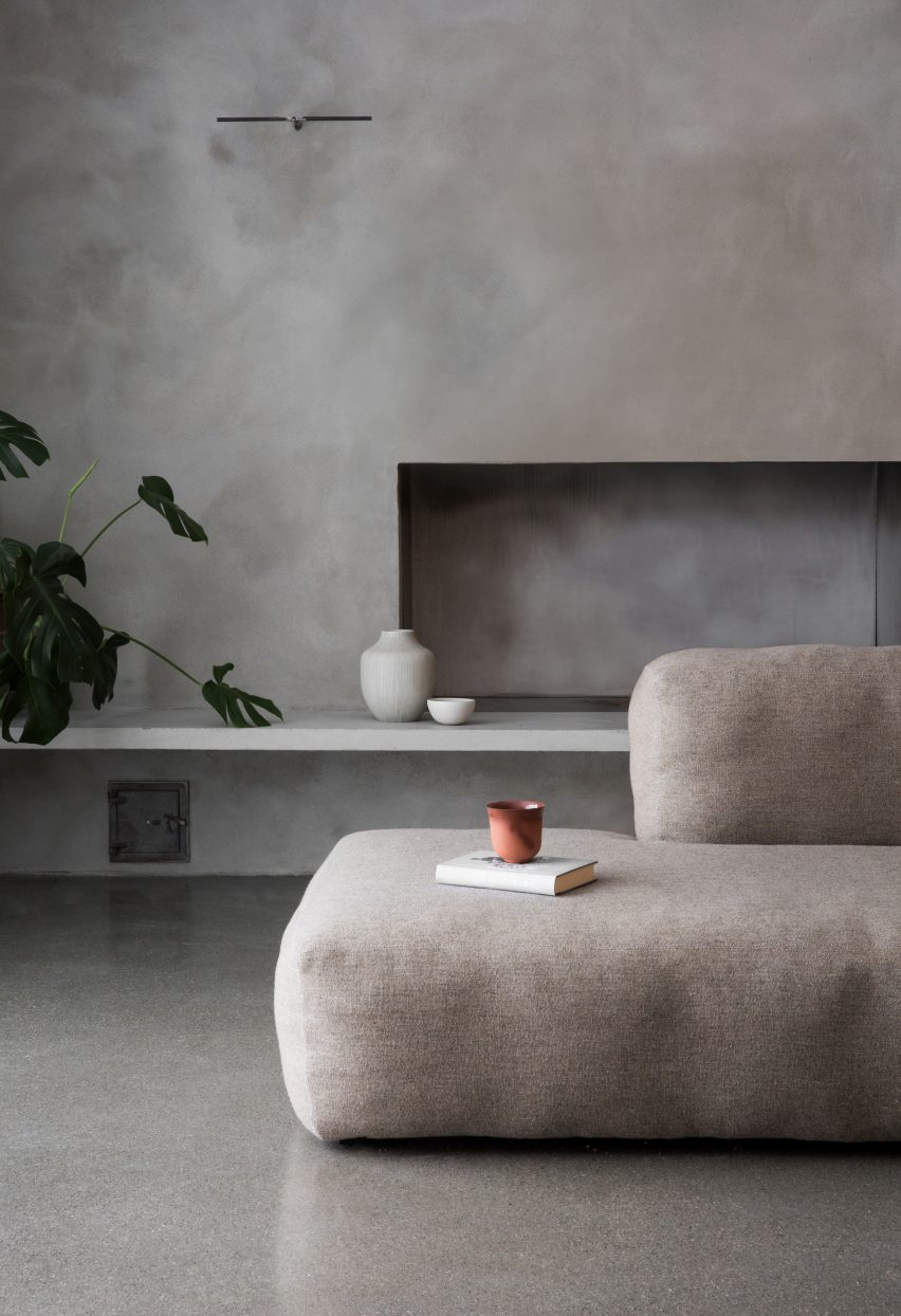
"Having thoroughly considered the climate in the process of designing the house, the idea behind the cluster style house was to give the home a cosy and inviting feel, where you can truly hibernate while taking shelter from the frigid days of Nordic winter," explained the architects.
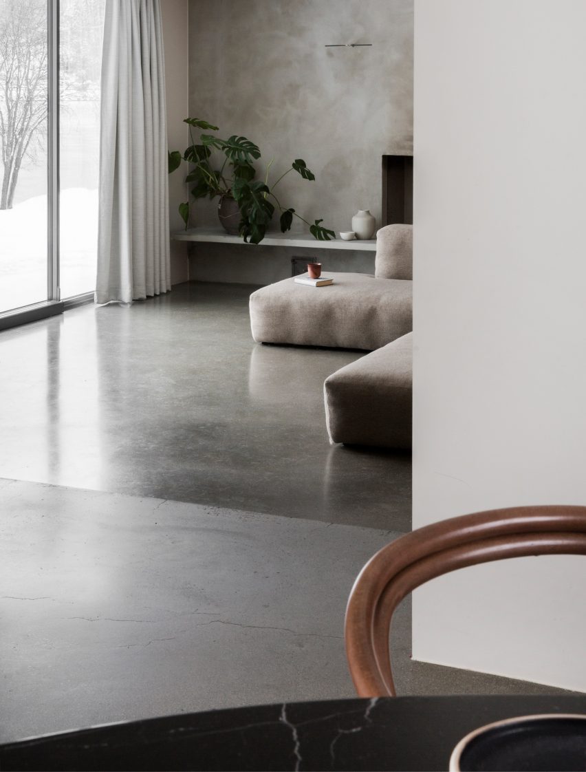
"The modern cluster house gives you the sensation of being together, when not necessarily being in the same room, with thresholds defined by switching levels and materials," they added.
"Beautifully blending in with its harsh yet peaceful surroundings – with its humble structure and cosy cubes – the house showcases the epitome of hygge."
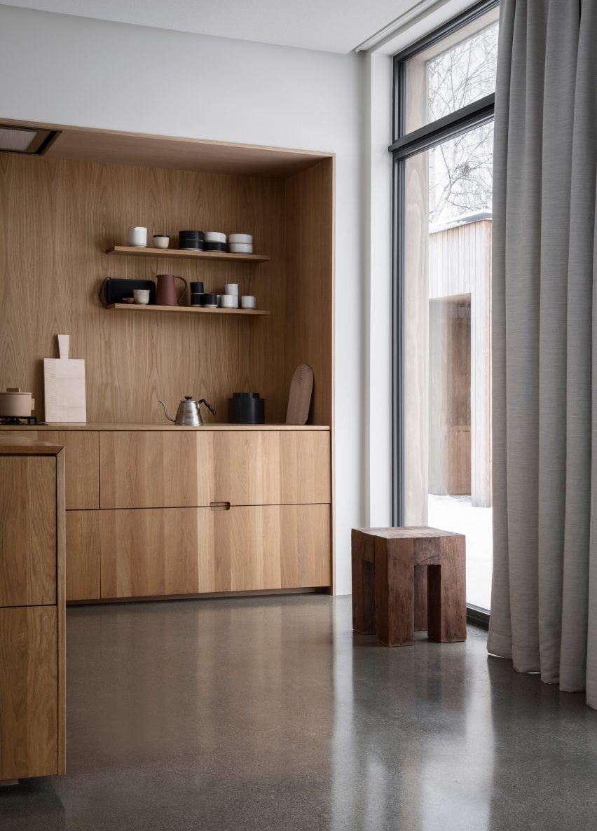
The aesthetic is in keeping with the Copenhagen practice's past projects, including a pared-back workspace for lifestyle magazine Kinfolk and a minimalist showroom for the Danish brand Menu that doubles as a co-working space.
The 155-square-metre residence is arranged on a hillside, and large windows in the main living spaces permit views of the woodland surrounding the town of Gjøvik and to Norway's biggest lake, Mjøsa.
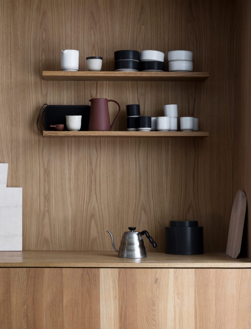
There are subtle material and level changes between the blocks – polished flooring in the lounge and matt in the dining room – that mark a change in function where doors have been omitted.
The kitchen is the hub of the home and set in the centre of the plan, with adjoining blocks around it used to house the lounge, utility room, bathroom and bedroom.
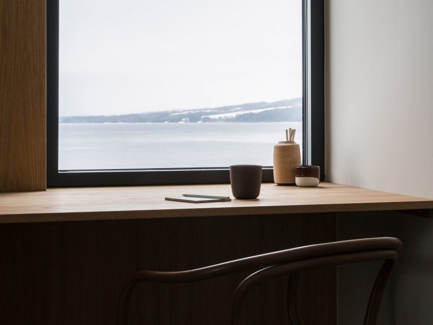
Floor-to-ceiling windows set at either side of the kitchen flood it with light, while peripheral blocks have fewer windows to create a cosier feel.
London-based architects Deborah Saunt and Mary Duggan spoke to Dezeen about the recent move away from open-plan layouts towards the broken-plan, with clients increasingly opting to include nooks and partitions to provide a degree of seclusion for smartphone use, study or television watching.
Outside, the facades of each flat-roofed block is clad uniformly in thin vertical planks of wood, designed to silver with age and help embed the building in its natural setting.
"The purpose of the facade cladding as well as the general structure of the house was to avoid having the house be on pompous display on the hillside, but instead be in subdued balance with its surroundings," said the architects.