A+I designs New York City school with colourful panels and tiered seating
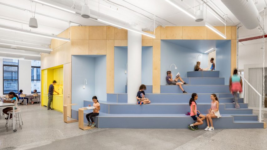
New York studio Architecture + Information aimed to create an environment that is "playful, not childish" for this school in Manhattan.
AltSchool is an educational startup that was founded in 2014 with locations in New York and San Francisco. Its teaching methodology is intended to respond to individual student's needs and integrate technology into their course structure.
Architecture + Information (A+I) therefore designed the interiors to accommodate these requirements.
"Just as each student at AltSchool has the unique opportunity to be taught based on their own learning style, each space was designed to be flexible enough to accommodate many students' individual needs as well as myriad unique learning styles and uses," said the architecture firm.
The school's newest outpost occupies the entire floor plate of an existing building near Manhattan's Union Square. Located at 90 5th Avenue, it is housed in an 11-storey stone building built in 1903.
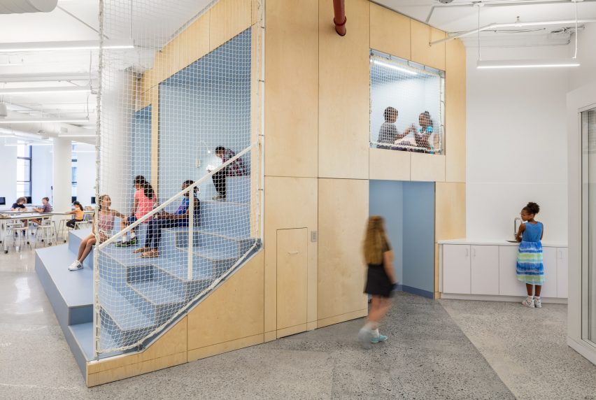
At the centre of the school is the Agora – a stepped seating area that allows all the students to gather for presentations or events. The blue structure also integrates small nooks in which children can spend time alone.
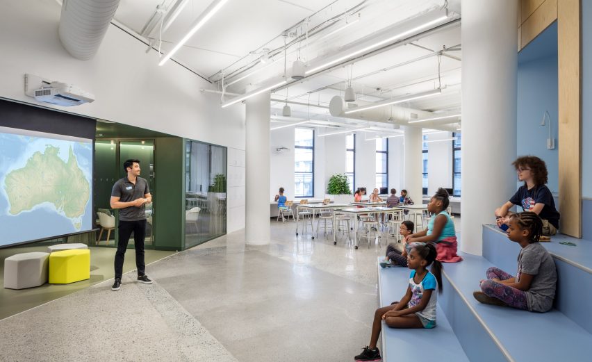
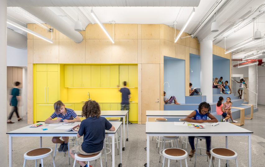
Off this space is the Design Lab, an open-ended area with movable tables and chairs. "The Design Lab is the most flexible space, primarily used as maker-space of all kinds, (arts and crafts, large-scale science experiments)," said A+I.
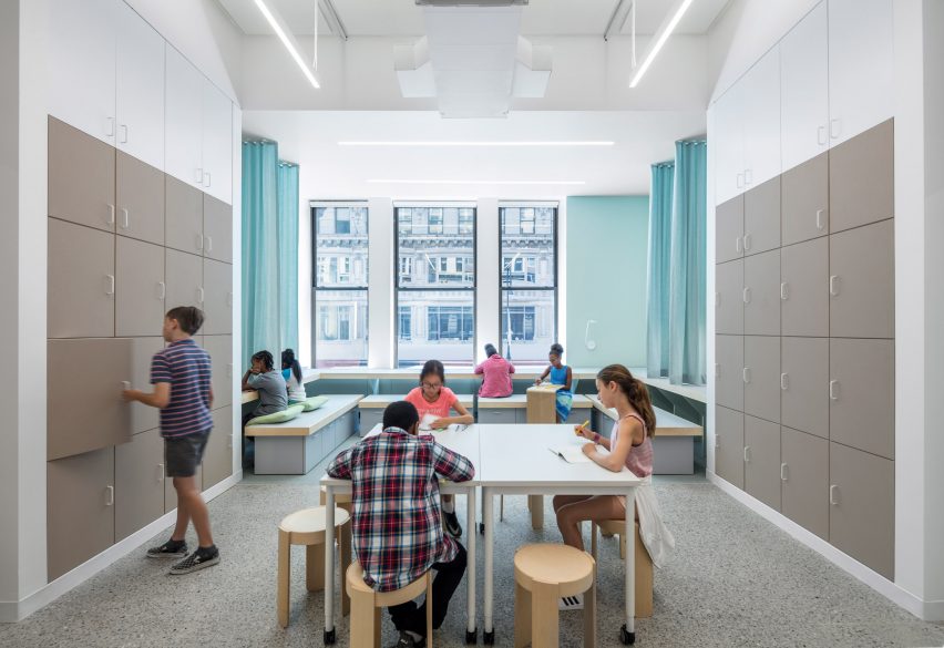
"It is also a computer lab, event space, lunch hall and is flexible enough to serve as an indoor playground on rainy days."
The rooms that line the outside of the building were designed as classrooms that link with one another to create larger or smaller spaces according to the school's needs.
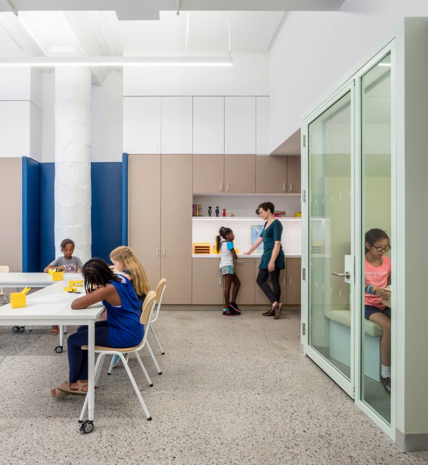
"A 'flex room' lies in between two classrooms and is used as a breakout classroom to accommodate independent and small group study facilitated in their lesson plans," the architects said.
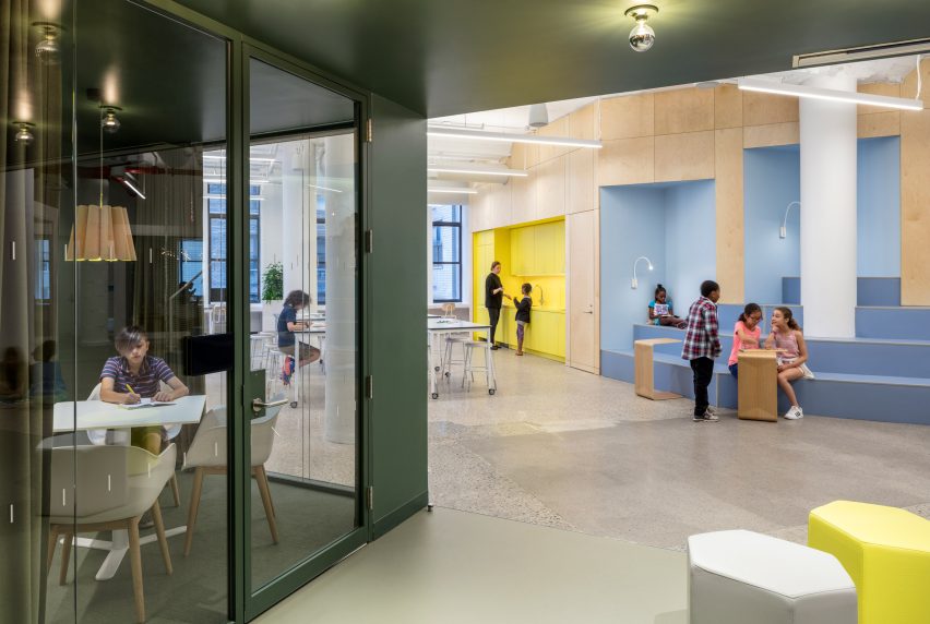
Even smaller booths in certain areas allow teachers to meet with parents, or individual work and concentration. These cubbies are soundproofed to encourage privacy and focus.
Throughout AltSchool, the architects used colour to indicate which spaces are for different activities. These accents contrast the concrete flooring, and wooden panels that cover the walls.
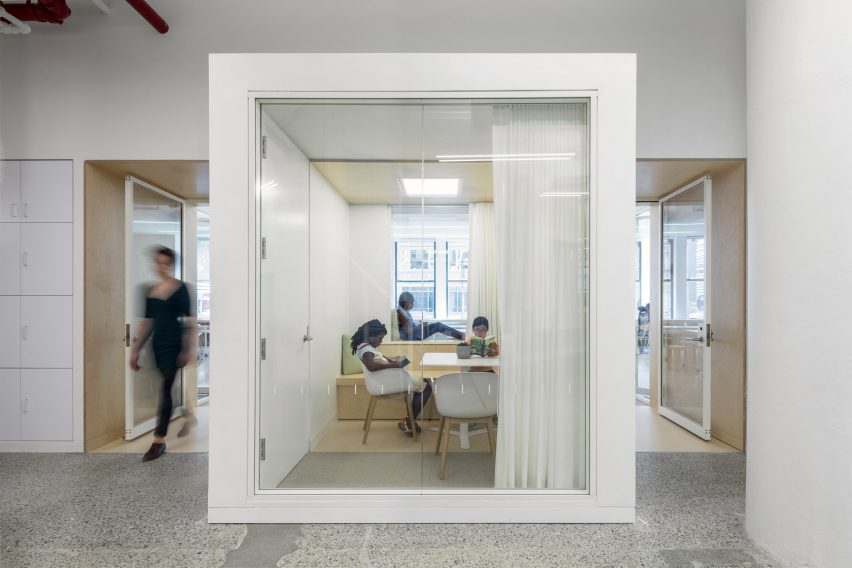
"The colour palette doubly acts to code the space: with darker colours indicating quiet, reflective spaces, lighter pastels for gathering spaces that still remain quiet and focused, and bolder, louder colours to encourage collaboration and synergy," A+I said.
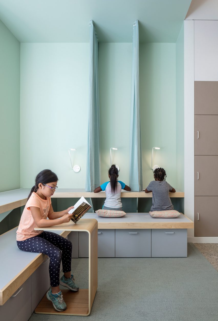
The firm wanted to avoid using design tropes such as bright primary colours or murals that are typically found in classrooms. "In designing, the constant refrain was 'playful, not childish'," the team said.
Led by Brad Zizmor and Dag Folger, A+I has also designed several office spaces for tech and media companies. These include the New York City offices of Squarespace, and new interiors for Los Angeles ad agency Canvas.
Photography is by Magda Biernat.