Vincent Van Duysen creates contemporary "palazzo" for Molteni Group's New York showroom
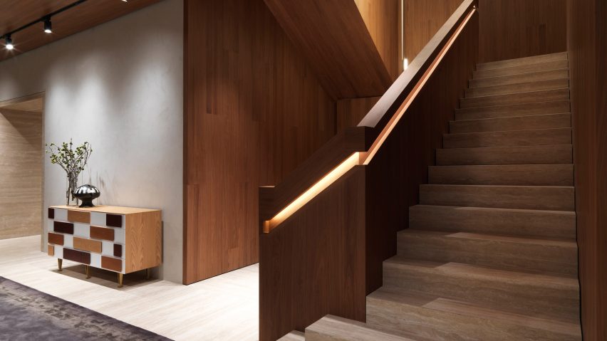
Italian design company Molteni Group has moved into a new home in New York, designed by Belgian architect Vincent Van Duysen and featuring a grand walnut staircase.
The Molteni Group Flagship Store at 160 Madison Avenue, close to several design showrooms, opened last week to coincide with the city's NYCxDesign festival. It marks a major upgrade for the company, which previously occupied a much smaller space in Soho.
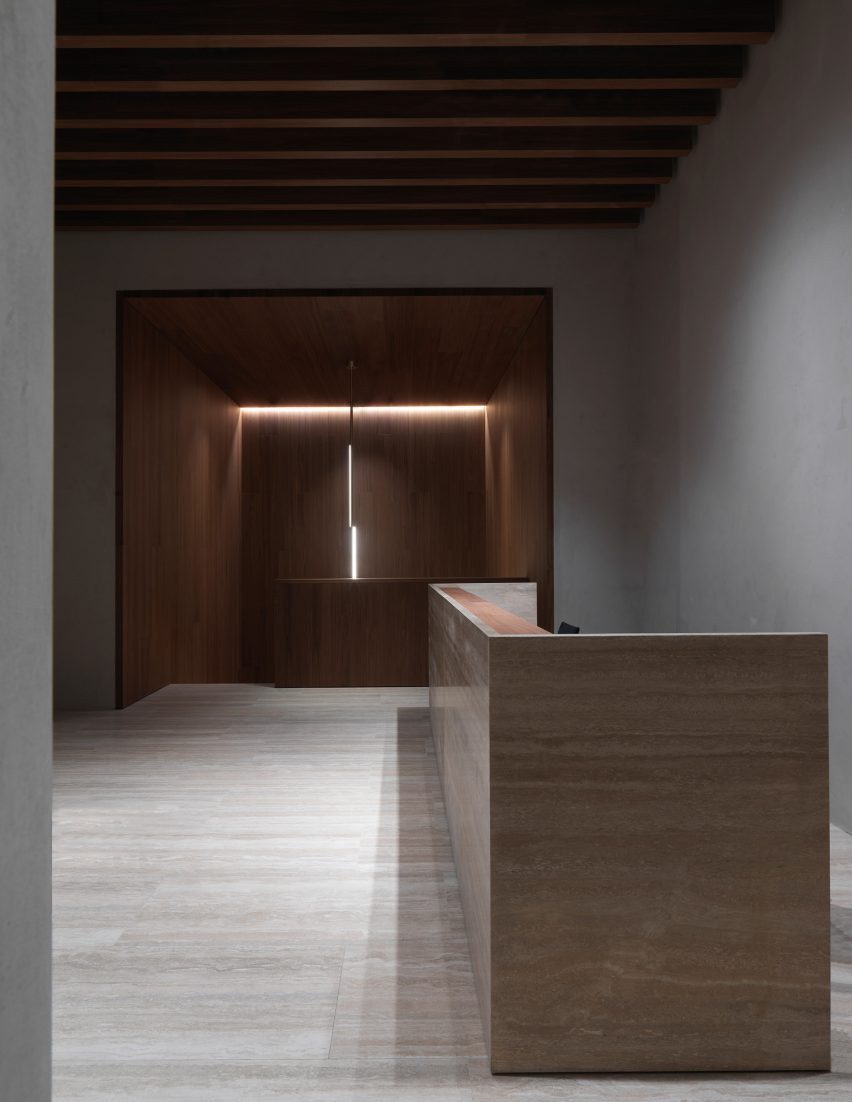
Van Duysen – who serves as creative director for the family of brands that includes Molteni&C, Dada and Unifor – designed the interior with a nod to the company's Italian heritage while following his usual pared-back aesthetic.
Starting with a "soulless box", he transformed the two-storey space into a series of rooms that he described as a contemporary interpretation of a historic grand palazzo.
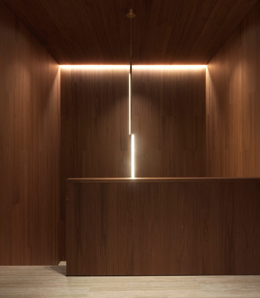
"When you come in the shop, you feel like you are not in New York any more; that you are in an Italian environment," Van Duysen told Dezeen. "You can see that in the use of materials, the travertine on the floors and the monumental arcades."
One of the challenges was how to incorporate the building's huge structural columns into the design. Rather than try to fit them into the partitions, the architect turned them into statement features.
"The columns were very obstructive when we started to work on the plan, because we didn't know how we could incorporate them in an aesthetic way," said Van Duysen. "But all of a sudden they become grand and protagonist elements within the design, which actually we like."
"In monumental architecture and palazzos, columns always have a powerful meaning," he added.
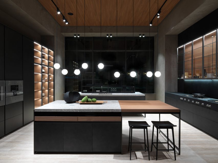
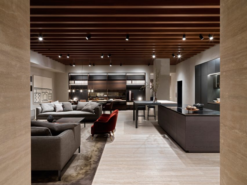
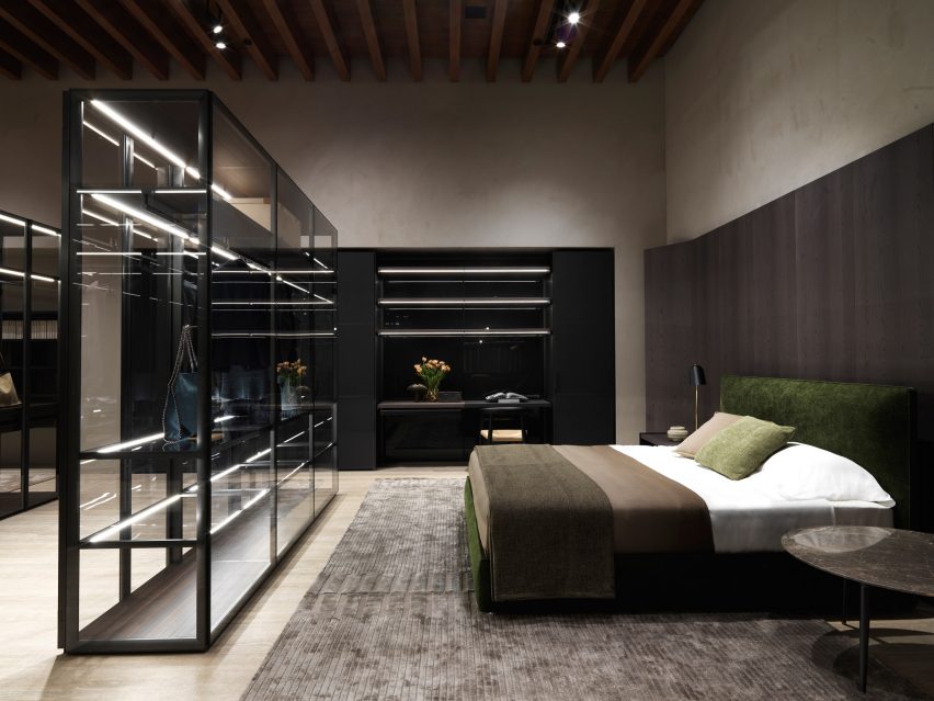
The layout allows the Molteni&C products, Dada kitchens and Unifor office furniture to be displayed as a series of vignettes similar to a real home, offering visitors suggestions as to how items could be used together.
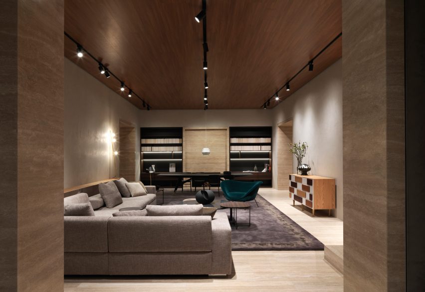
They enter into a large foyer with surfaces of travertine stone – a material which carries through several of the spaces – and are then able to explore the various set-ups.
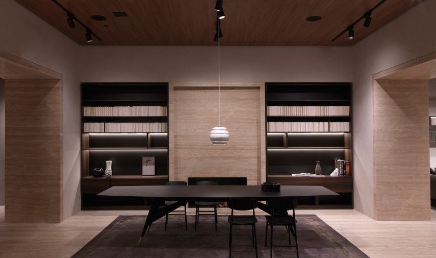
"The mixture of the textiles and materials adds this extra flavour of how Italian palazzos are, and how we could do it in a very rigorous, very architectural way," Van Duysen said. "It's a very warm, welcoming environment."
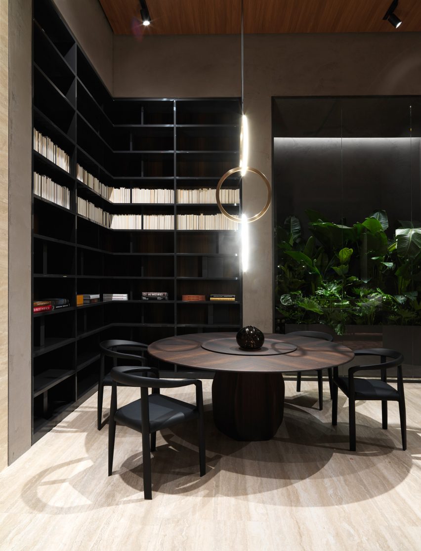
Among the displays are a kitchen with black lava stone counters and splashbacks, a library with tall bookshelves, and a study that marks the first time Unifor's office furniture has been included in the same space as Molteni&C and Dada products.
The store's most prominent architectural statement is a grand American walnut staircase that Van Duysen described as "a bit of a masterpiece, and the epicentre of the whole shop".
It descends in several flights to the basement level, with lighting hidden in the handrails and a custom fixture by London designer Michael Anastassiades – a close friend of Van Duysen's – suspended in the centre of the stairwell.
"It really highlights the verticality of the staircase," the architect said of Anastassiades' design.
The basement has the same tall ceiling height as the level above, a rarity New York, giving both storeys a feeling of openness and grandeur.
At the bottom of the staircase is a teal-coloured chair by late Italian architect Gio Ponti – one of several of his designs produced by Molteni, which has access to his archive of work in order to continue updating his oeuvre.
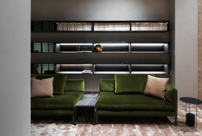
Many of Van Duysen's designs for the brand are also on display across the store, including a collection of sofas that debuted in Milan last month.
Throughout the space, the colour palette is neutral and the detailing is minimalist – much like Van Duysen's other projects.
The desaturated hues, including light grey and soft pastels, reference the old frescos found in houses across Italy's Lombardy region.
"It's very Italian," Van Duysen said. "We're really away from trends and aim for a consistency, craftsmanship. There's a lot of modernity, a lot of technology – not visible – but with the Italian heritage mixed with my aesthetics."
"In this kind of architecture – in the colours and the spaces – you can feel it's me for sure," the architect added.
As part of a concept that the brand calls Collector's House, art pieces decorate the showroom walls and can also be purchased from the store. The idea is to create a more homey atmosphere while promoting the work of both Italian and American artists.

"Living with art gives an extra personal touch to a house," said Van Duysen. "It takes you a little bit out of your comfort zone, and gives extra value to the rooms."
Van Duysen began working with the Molteni Group as creative director in April 2016, and has since overhauled the showrooms for the brand in central Milan and at its corporate headquarters in Giussano. Work is currently taking place on spaces in Tokyo, London and Los Angeles, with plans for more. "The brand is really expanding," he said.