Galleria Centercity by UNStudio
Amsterdam architects UNStudio have completed this department store in Cheonan, South Korea.
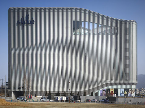
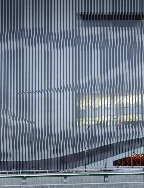
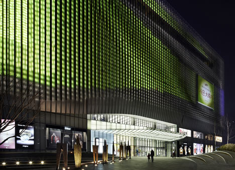
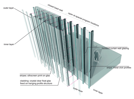
Called Galleria Centercity, the building has facade comprising two layers of lamellas, which create a moiré effect.
Above photograph is by Kim Yong-kwan
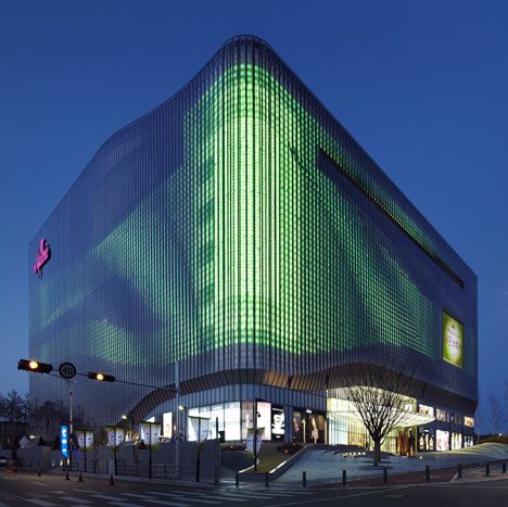
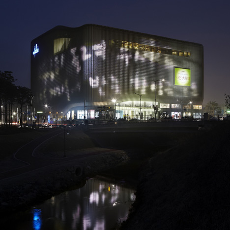
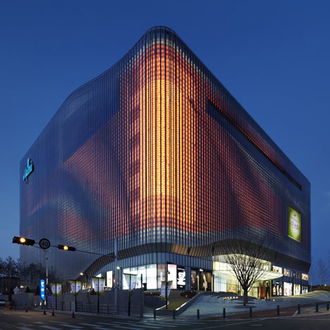
Animations and light patterns are projected from this skin at night.
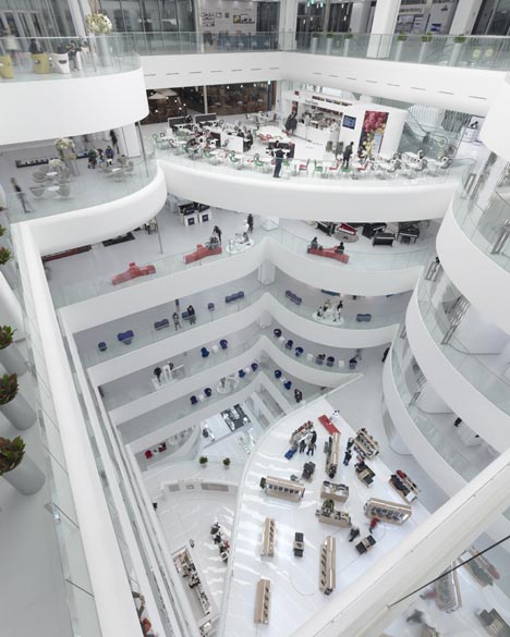
Daylight is admitted through the facade and reflected around the all-white interior to reduct the need for artificial lighting.
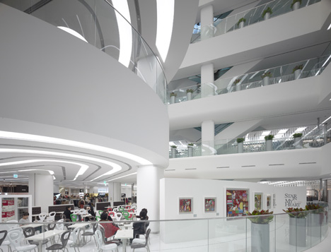
Areas of the department store are set aside for cultural programming, including exhibitions and fashion shows.
More about UNStudio on Dezeen »
Above photograph is by Kim Yong-kwan
Photographs are by Christian Richters/View unless stated otherwise.
The information below is from UNStudio:
Ben van Berkel / UNStudio's Galleria Centercity in Cheonan – “If museums are turning into supermarkets, why then should department stores not turn into museums?”
"The Galleria Cheonan responds to the current retail climate in Asia, where department stores also operate as social and semi-cultural meeting places. Because of this, the quality of the public spaces within the building was treated as an integral aspect of the design." Ben van Berkel
Above photograph is by Kim Yong-kwan
Eye Shopping – Re-conquering the public domain within a commercial destination
UNStudio's Galleria Centercity Department Store in the Korean city of Cheonan reclaims the social and cultural space within the private, commercial large scale department store.
Rather than being the outcome of a prescriptive, standard-critical approach, the design of the Galleria Centercity is based on observations of current behavioural tendencies in large commercial spaces. Particularly in South East Asia, department stores serve a highly social function; people meet, gather, eat, drink and both shop and window shop in these venues. The department store is no longer solely a commercial space, it now offers the architect the opportunity to build upon and expand the social and cultural experience of the visitor. If today we are seeing the museum as a supermarket, then we are also now seeing the department store as a museum.
An expanded interpretation of utility beyond efficiency and profitability is at the heart of the design. In view of this, along with a more varied programme, UNStudio’s design seeks to provide a stimulating experience for the visitor.
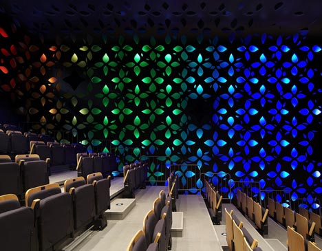
Above photograph is by Kim Yong-kwan
On the outside, this is translated into an appearance that is almost impossible to fix. The double layered facades are articulated in a trompe l’oeuil pattern of vertical mullions. The vertical lines on the façade make the scale of the building unreadable; does it contain three floor levels, or fifteen? On the inside, this play with scale and dimension is continued in a way that is at least as radical as the outside. Upon entering, the department store is revealed as a layered and varied space which encourages investigation and unfolds as you move through and up the building.
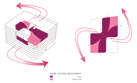
Programmatically, the Galleria Cheonan incorporates a number of cultural and public spaces, including an art and cultural centre and a vip room. In the basement, a food court and specialty supermarket constitute another distinct destination within the building, which is simultaneously integrated with the overall design strategy.
Above photograph is by Kim Yong-kwan
Cheonan –New city development as platform for innovation
Situated some 80km south of Seoul, Cheonan is well connected to the capital by railway and road, with a new high speed rail link having recently been completed. The area around the new high speed terminal is under development and - prominently visible from the main road - the Galleria Centercity marks the entrance to this new development area.
"The most interesting thing to me about the effect of the Galleria Cheonan is that, because of the organisation of the atrium and the moiré treatment of the facade, Illusions are created which result in the seeming alteration of scales and the creation of double images. No image is permanent in this building." Ben van Berkel
Dynamic Flow and optical illusion on a grand scale
The main architectural theme for the Galleria Cheonan is that of dynamic flow. This is found both inside and outside. The architecture of the 66,000 m ² building responds to its central position by presenting a deliberately changeable aspect all-around. Moiré effects, special lighting and animations ensure that the outside changes appearance constantly.
The double layered facade encloses the building, with a number of strategic openings incorporated into the inner facade layer. These openings provide daylight to the interior. At the same time, the lamellas of the outer façade prevent direct sunlight from entering the building, ensuring a cooler environment, while the use of white finishes throughout the interior minimises the need for artificial lighting.
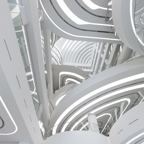
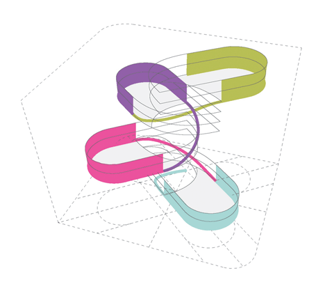
The interior derives its character from the accumulation of rounded plateaus on long columns. The repetition of curves, enhanced by coiled strip lighting in the ceilings of the platforms, gives the interior its distinctive character. Four stacked programme clusters, each encompassing three storeys and containing public plateaus, are linked to the central void. This organisation propels a fluent upstream flow of people through the building, from the ground floor atrium to the roof terrace. As the plateaus are positioned in a rotational manner in space, they enable the central space to encompass way finding, vertical circulation, orientation and act as main attractor of the department store. The spatial and visual connections within the space are designed to generate a lively and stimulating environment, in which the user is central.
Media facade - The largest illuminated surface of its kind in the world
The strategy for the building enclosure consists of creating an optical illusion. During the day the building has a monochrome reflective appearance, whilst at night soft colours are used to generate waves of coloured light across the large scale illuminated surface. The lighting design was developed in parallel with the architecture and capitalises on the double layered facade structure. Computer generated animations specially designed by UNStudio are incorporated into the lighting design and refer to themes related to the department store, such as fashion, events, art and public life.
Place branding – not name branding
Rather than creating a platform for a multiple billboard effect made up of individual brand identities, the thematic animated content of the fully integrated media façade facilitates a more holistic and site-oriented urban approach to branding.
UNStudio
Design team: Ben van Berkel, Astrid Piber with Ger Gijzen, Marc Herschel and Marianthi Tatari, Sander Versluis, Albert Gnodde, Jorg Lonkwitz, Tom Minderhoud, Lee Jae-young, Woo Jun-seung, Constantin Boincean, Yu-chen Lin
Interior: Ben van Berkel, Astrid Piber with Ger Gijzen, Cristina Bolis and Veronica Baraldi, Lee Jae-young, Felix Lohrmann, Kirsten Hollmann, Albert Gnodde, Martijn Prins, Joerg Lonkwitz, Malaica Cimenti, Florian Licht, William de Boer, Grete Veskiväli, Eelco Grootjes, Alexia Koch.
EXECUTIVE ARCHITECT/ SITE SUPERVISION/ LANDSCAPE ARCHITECT
GANSAM Architects & Partners, Seoul, KoreaI
See also:
.
 |
 |
 |
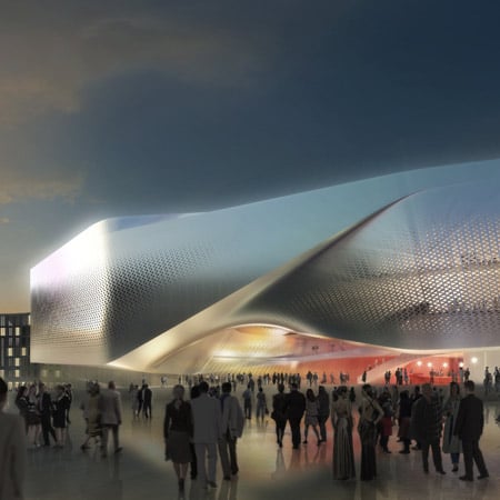
| Dance Palace by UNStudio |
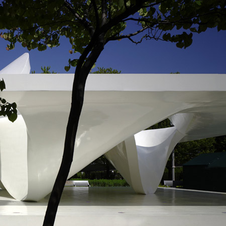
Burnham Pavilion by UNStudio |
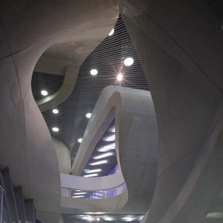
MUMUTH by UNStudio |