Ciszak Dalmas integrates materials from fashion label's accessories into Madrid store
The pink-tinged interiors and natural stone fixtures that Ciszak Dalmas has created for this store in Madrid, Spain were influenced by the brand's jewellery and leather accessories.
The Malababa flagship is situated along Serrano Eight, a street in Madrid's city centre that's populated by a host of other high-end fashion shops.
While the brand already has a handful of branches dotted across Spain, for this affluent location they wanted a more luxurious retail space, which still reflected their passion for traditional Spanish craftsmanship.
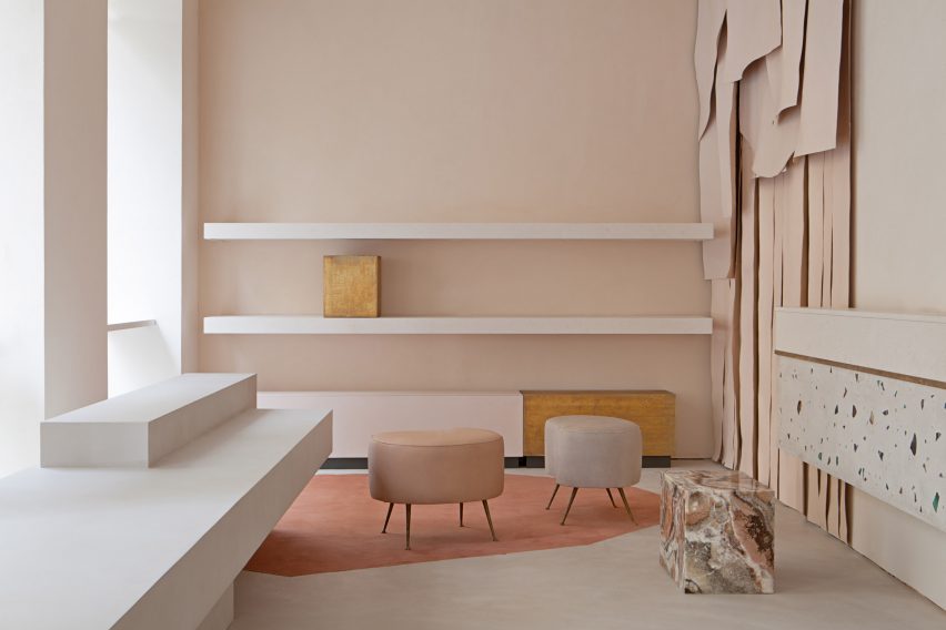
They tasked local architecture studio Ciszak Dalmas with the project, specifying that the interiors should play on colour, shape, light, and texture – elements that were key to Malababa's product design process.
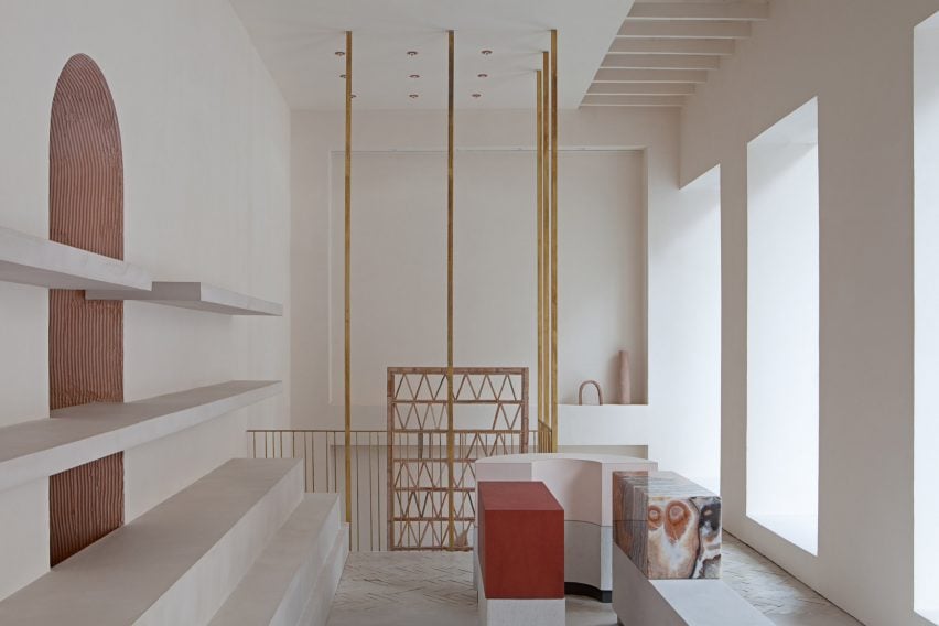
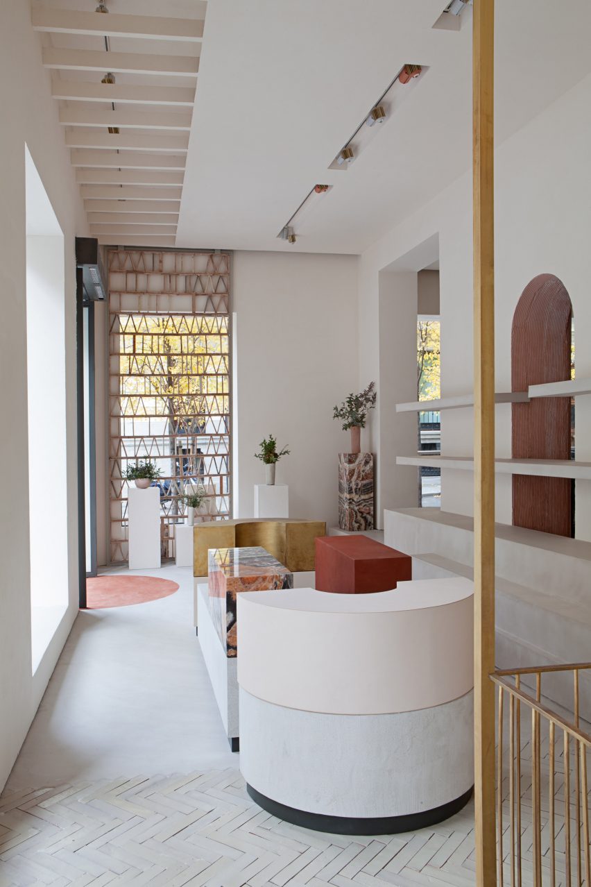
Working alongside Matteo Ferrari Studio, the Ciszak Dalmas team first decided that the 160 square-metre shop should be a singular, open-plan space in order to optimise natural light coming from the seven large windows that punctuate the building's front facade. Some of these are partially screened by latticed partition screens composed of mud bricks.
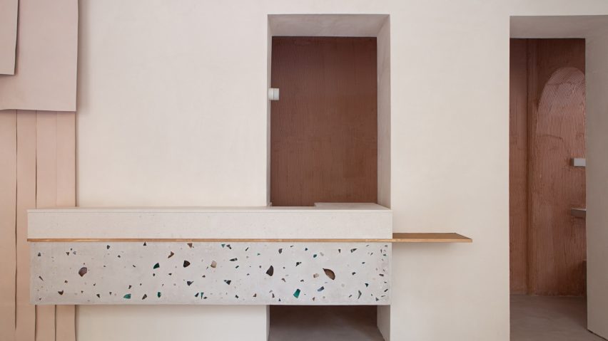
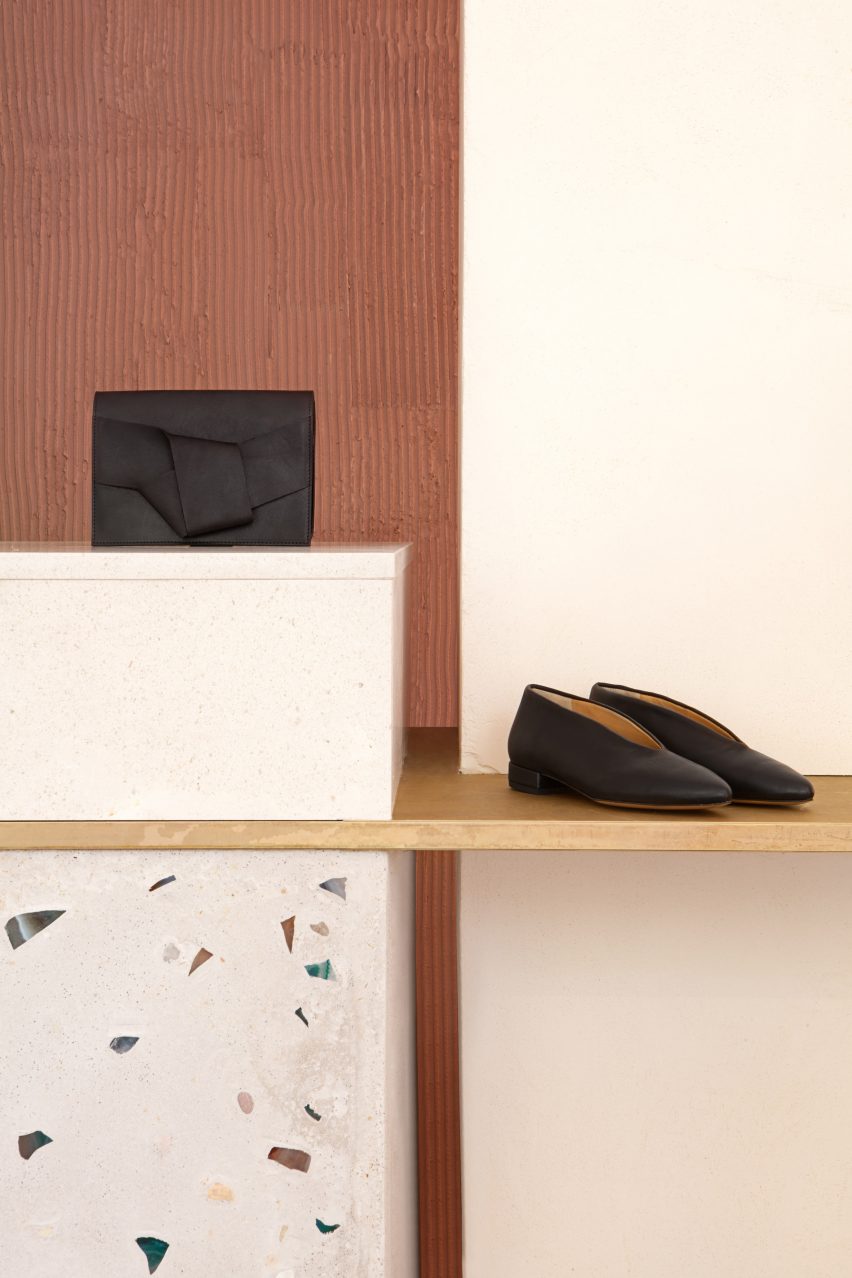
A majority of the walls have then been rendered in white marble powder sourced from the southeastern Spanish city of Almería, intended to create an overall "imperfect finish". An arched doorway and the rear rooms of the store have been completed in rusty-hued Galician clay that mimics the hue of naturally tanned cowhide.
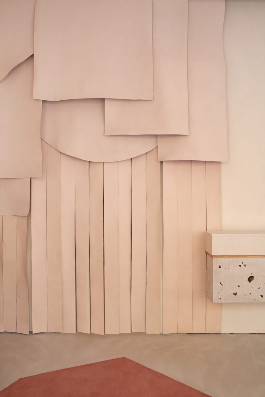
Pale pink-coloured leather has also been used to craft a wall hanging that separates the shop floor from a private staff office. It is comprised of several geometric offcuts from Malababa's production site.
"The result is a curtain that subtly reminds how Malababa's products are produced with natural materials and are all unique," studio co-founder Alberto Gobbino Ciszak told Dezeen.
Marble powder has also been utilised to form a series of display blocks that can be assembled or moved around the store to suit any future collections – some have been made from the same reddish agate crystal that the brand uses within their jewellery pieces.
One fixed counter has been made from a pale terrazzo with oversized aggregate.
Norwegian practice Snøhetta used a similar colour palette for the design of an Aesop shop in London's Chelsea, to which they introduced 12 rose-tinted clay arches.
US designers Bower and Lotte Van Velzen also created russet-coloured interiors for the pop-up stores of minimal fashion label The Arrivals.
Photography is by Asier Rua.