Wim Crouwel - A Graphic Odyssey at the Design Museum by 6a Architects
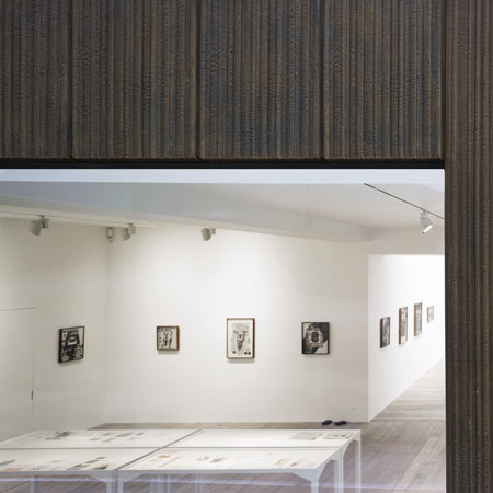
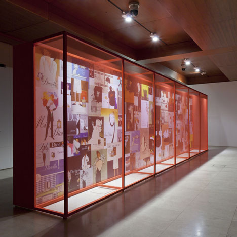
Dezeen interviewed Dutch graphic designer Wim Crouwel last week on the eve of the opening of the exhibition Wim Crouwel – A Graphic Design Odyssey at the Design Museum in London. Here are some pictures of 6a Architects' exhibition design for Wim Crouwel - A Graphic Odyssey.
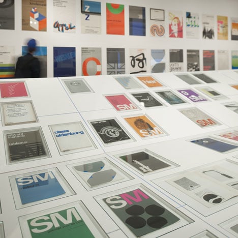
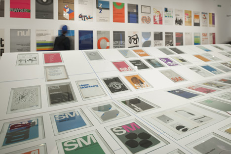
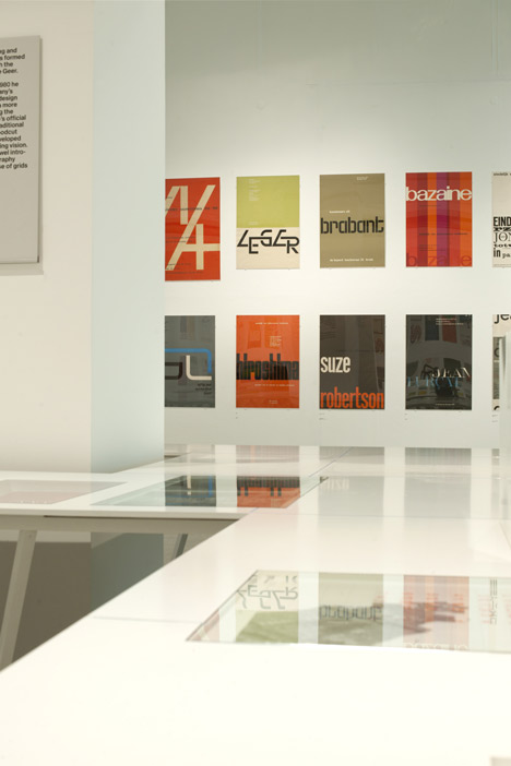
Original sketches, posters, catalogues and archive photography plus film and video are displayed along a 20 meter-long white table.
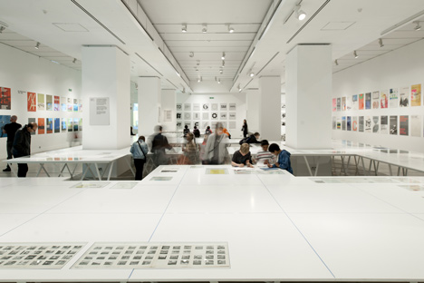
The show presents work spanning 60 years of the Dutch graphic designer's career including the identity he created for the Stedelijk Museum from 1967 onwards, the New Alphabet typeface from 1967 and Dutch postal stamps that were in circulation 1976–2002.
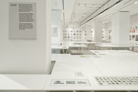
The exhibition continues until 3 July.
More about 6a Architects on Dezeen »
More about the Design Museum on Dezeen »
Here are some more details from the architects:
Wim Crouwel A graphic odyssey Design Museum
The Design Museum celebrates the prolific career of the Dutch graphic designer Wim Crouwel in this his first UK retrospective. Regarded as one of the leading designers of the twentieth century, Crouwel embraced a new modernity to produce typographic designs that captured the essence of the emerging computer and space age of the early 1960s. This exhibition, spanning over 60 years, will cover Crouwelʼs rigorous design approach and key moments in his career including his work for design practice ʻTotal Designʼ, the identity for the Stedelijk Museum, Amsterdam, as well as his iconic poster, print, typography and lesser known exhibition design. The exhibition will also highlight Crouwelʼs rigorous design approach exploring his innovative use of grid-based layouts and typographic systems to produce consistently striking asymmetric visuals.

Original sketches, posters, catalogues and archive photography will be on display alongside films and audio commentary. In addition to celebrating Crouwelʼs career this exhibition will also explore his legacy and influence on contemporary graphic design with commentary from leading industry figures including Peter Saville and Stefan Sagmeister.
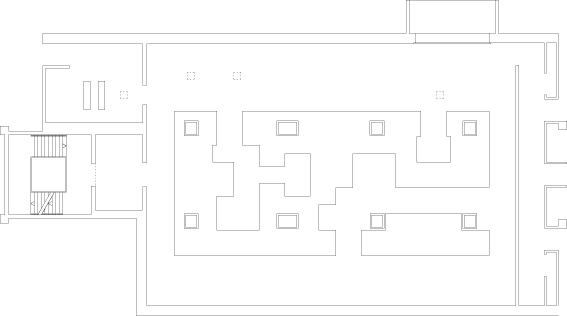
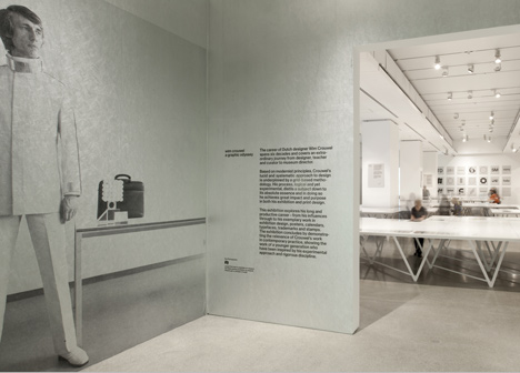
Designed by 6a Architects, in collaboration with graphic designers Spin, the exhibition creates a subtle backdrop to Crouwelʼs vivid works. The gallery was stripped back and opened up, allowing a twenty-metre long white table into the space. Exhibits are arranged across its surface, a figurative white page to the exhibitsʼ colourful intensity. Visitors move around, through and in-between its openings, reminiscent of Crouwelʼs fondness for three dimensional space in a two dimensional design. Crouwelʼs own commentaries explain the works, punctuated with striking portraits of the designer across the decades. The simple, paired down design reveals Crouwelʼs surprising tactility, a digital designer working in the analogue age.
Exhibition Design by 6a Architects. Exhibition graphics by Spin.
See also:
.
 |
 |
 |
| South London Gallery extension by 6A Architects | Raven Row by 6a Architects |
More Exhibitions |