Renovated 1950s São Paulo apartment is arranged around planted lightwells
Brazilian studio Cupertino Arquitetura has renovated this mid-century apartment in São Paulo for the grandchild of its former owner, turning a pair of disused outdoor spaces into gardens in the process.
The Tucumã Apartment is a 100-square-metre residence on the ground floor of a building completed in the city in 1953. The new owner inherited the property from their grandmother.
Prior to the overhaul, the apartment was arranged around two outdoor pockets that formed ventilation pits for the bathroom and kitchens of the residence above. Locally based Cupertino Arquitetura transformed the neglected spaces into gardens to bring in greenery during the renovation.
Each is now filled with trees and plants, which are yet to grow to full height.
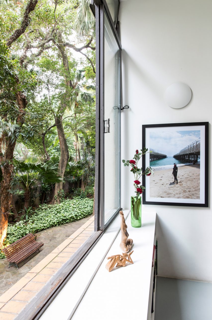
One is slotted between the living area, and the bedrooms and bathrooms, and can be viewed through a large window. A hallway to the sleeping spaces runs between this courtyard and the second, which can be seen from the slender kitchen.
"These two spaces were incorporated into the apartment as small gardens, as in a house," said Cupertino Arquitetura in a project description. "They help bring natural light and cross ventilation to the innermost part of the plan, in addition to open visual lines and bring the green of the external garden into the apartment."
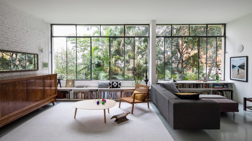
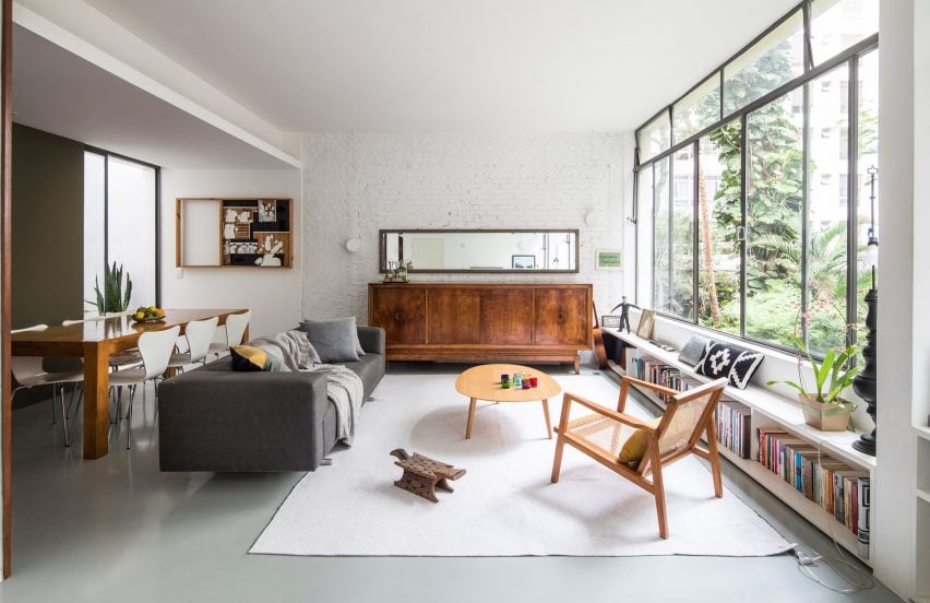
The studio aimed to preserve much of the apartment's original aesthetic during the renovation. The walls were stripped to reveal the existing brickwork behind, which is now painted white. Existing steel window frames were restored to continue the industrial style.
Furnishings are intended to be contemporary as a contrast to these rough finishes, and the items leftover from the grandmother's collection. These include a large, solid wood buffet and mirror, which run along one wall in the lounge.
The combination of styles helps to establish a "connection between the past and the present of the family", according to the studio.
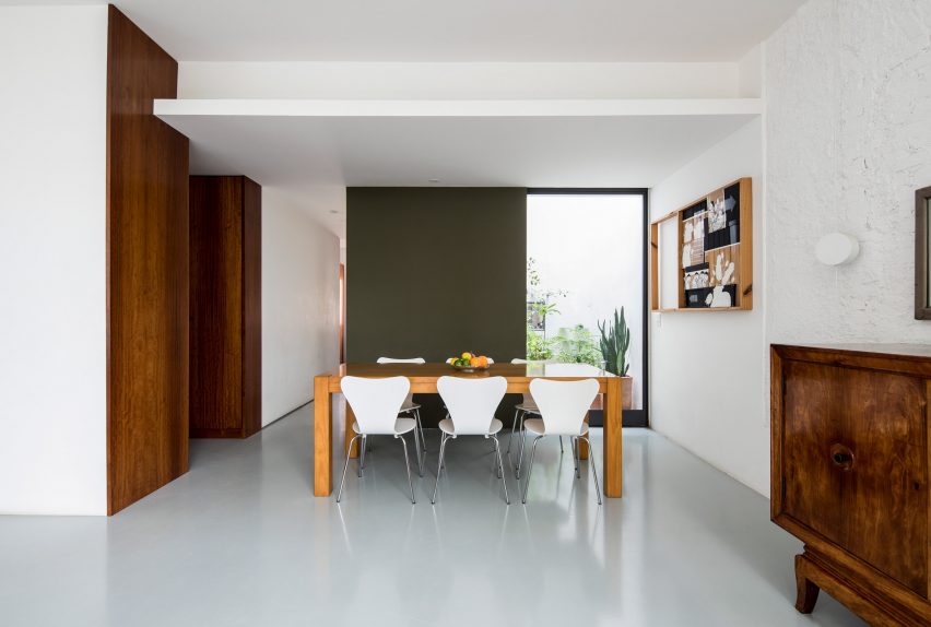
Cupertino Arquitetura removed several partition walls to reorganise the previously "compartmentalised" residence as a more open layout, creating a single space for living and dining room. Resin flooring runs throughout the home to create continuity between all spaces.
"This helps to visually enlarge the spaces and blur divisions between rooms," said the firm.
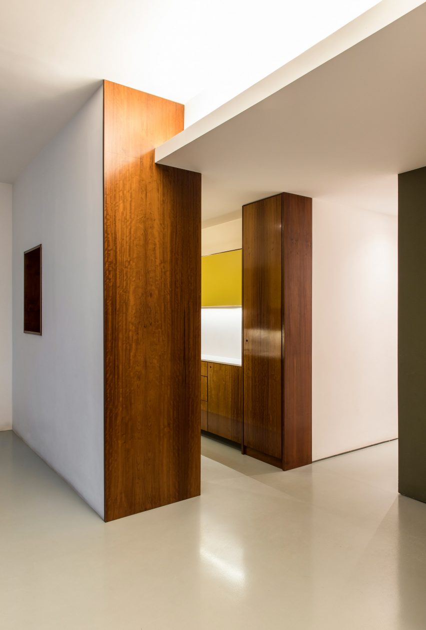
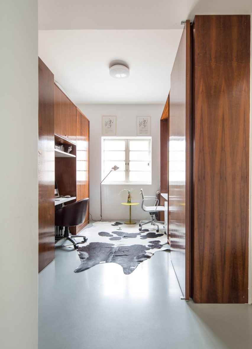
Rather than walls, dark cabinets made from imbuia wood provide separation between different areas. These are designed to suit the functions of the spaces they face. For example, a bedroom closet on one side and storage for the home office on the other.
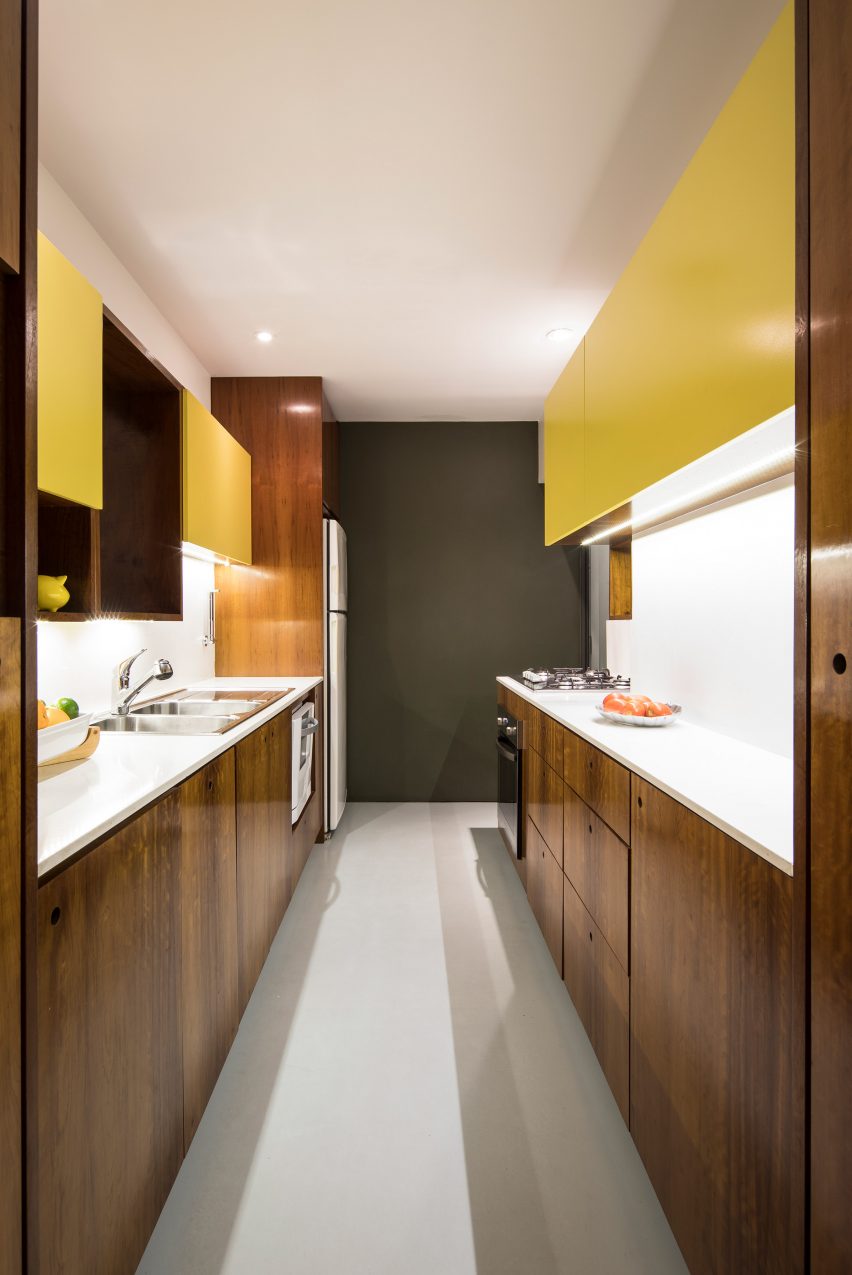
The dark woodwork also forms the walls of the galley kitchen, with plenty of storage and facilities fitted inside.
Yellow cabinet doors provide hints of colour in the kitchen, while the end wall is painted dark green as a nod to the planting outside. These two hues are then continued throughout the apartment, found in textiles and furniture.
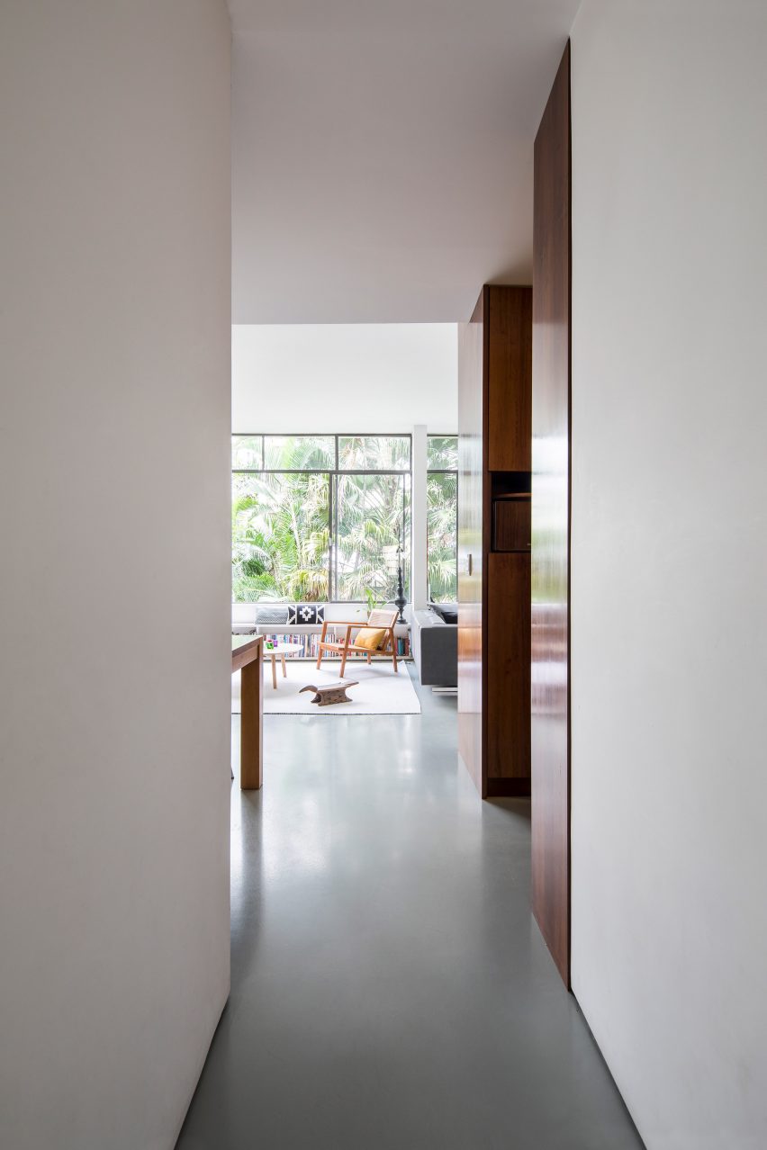
An opening in the cabinetry that separates the kitchen from the lounge next door offers views between the two spaces.
Furnishings in the living area include a caned wooden chair, a white table and grey sofa. These match the tones of the wooden table and white chairs in the dining room.
Also in the living room, the studio installed a bookshelf-cum-bench underneath a large window, which is topped with patterned cushions.
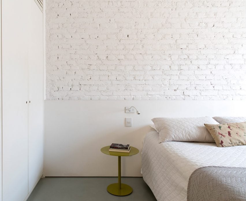
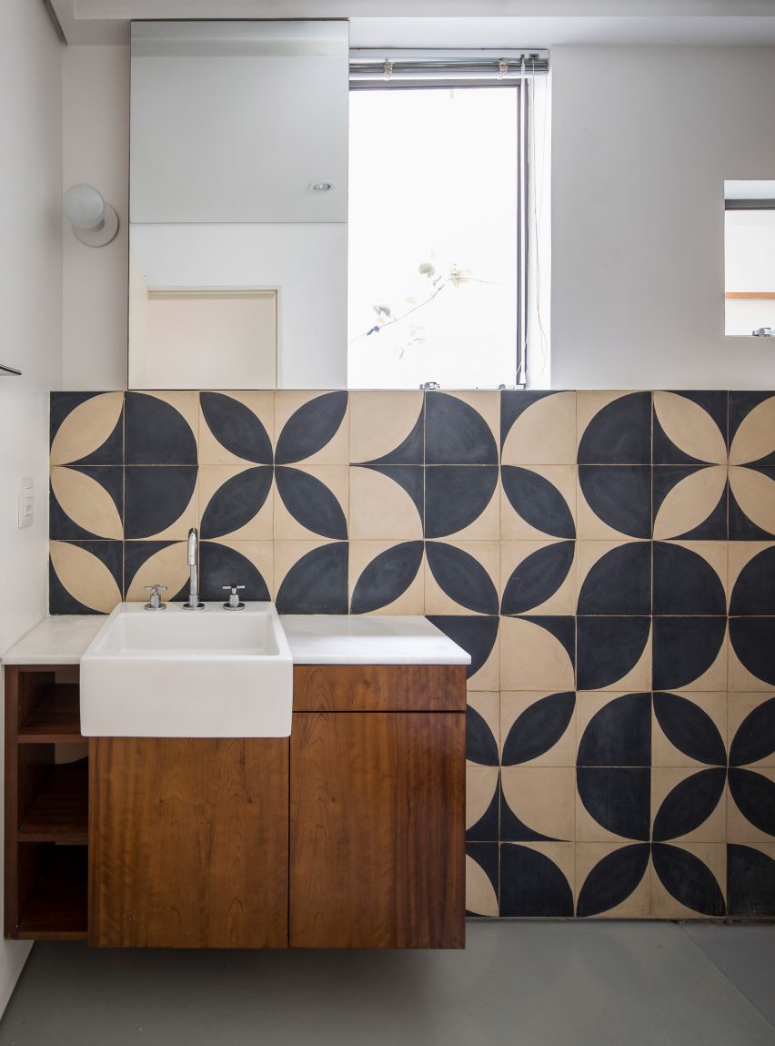
Similar motifs can be found on the cement tiles that line the bathroom walls, by designer Teo Menna.
"It is an old material that refers back to the time of the construction of the building, but was used with a more contemporary language," said the firm.
Other apartment renovations in the Brazilian city include a compact apartment that measures 24 square metres, home and studio for an illustrator featuring a translucent fold-up doorway and a flat finished with traditional ceramic blocks.
Photography is by Maíra Acayaba.