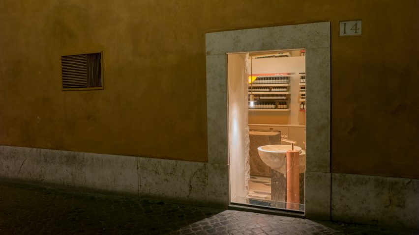
Aesop teams up with film director Luca Guadagnino for interior of Rome store
Studio Luca Guadagnino has used roughened stone, rosy marble and bundles of straw throughout Aesop's store in Rome, which is meant to visually echo the city's ancient buildings.
The store is set within Piazza di San Lorenzo in central Rome, just a short distance from a fifth-century church and the city's famous Pantheon.
This is the first retail project to be completed by Luca Guadagnino's eponymous studio, which recently made its debut in the field of interior design with the revamp of a private home on Italy's Lake Como.
Guadagnino is more widely known as a film director and screenwriter, recognised for his works including I Am Love, A Bigger Splash, and Call Me By Your Name.
On a trip to Los Angeles, Guadagnino happened to be staying in the same hotel as Aesop's founder, Dennis Paphitis, who tasked him with giving the skincare brand's new Rome location "a sense of monastic order and tranquility".
"In our conversations we became captivated by the idea of a lost Roma, the fifties, the juxtapositions between the city's ancient buildings and the surrounding countryside," explained Guadagnino.
The space – which had formerly been a cramped lighting shop – has had its false ceiling knocked through and a large window unblocked. Guadagnino and his team looked to the material and colour palette of the city's aged buildings to develop an aesthetic for the interior.
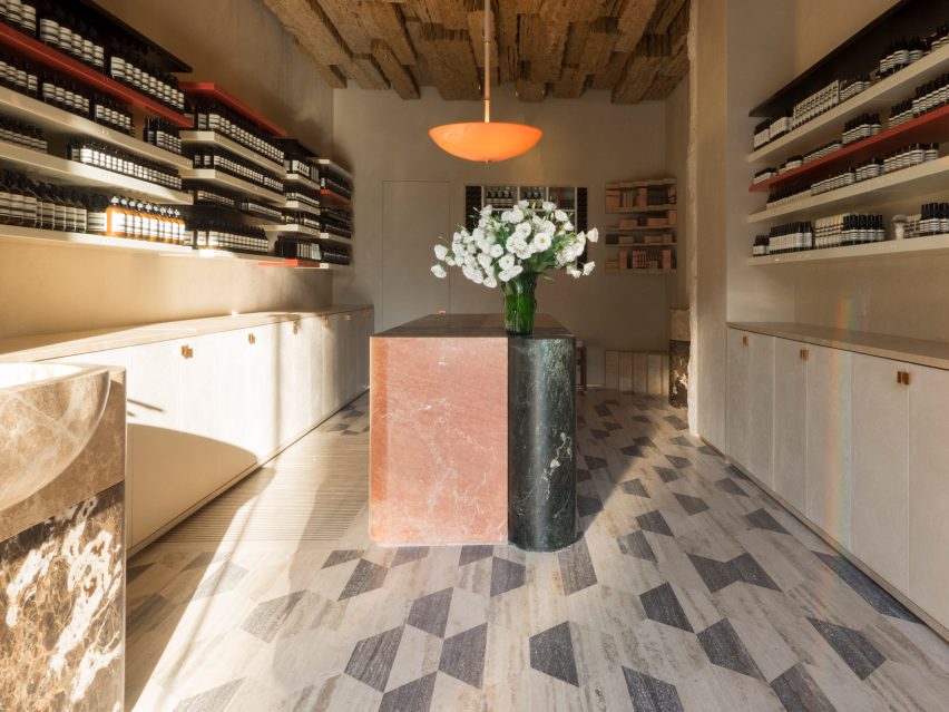
Rhombus-shaped travertine floor tiles in dark grey and off-white have been used to clad the shop floor, akin to the design of the nearby San Lorenzo church.
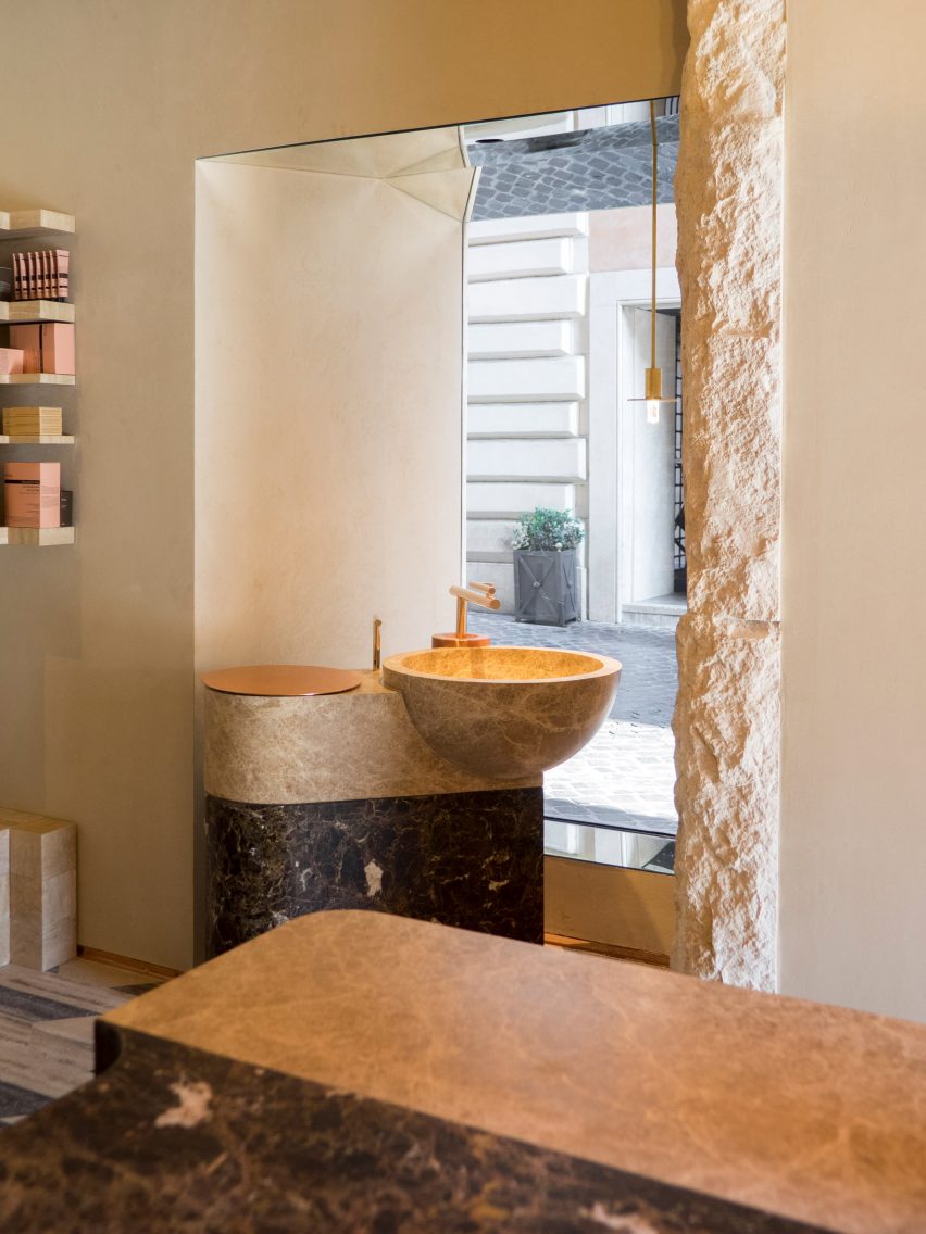
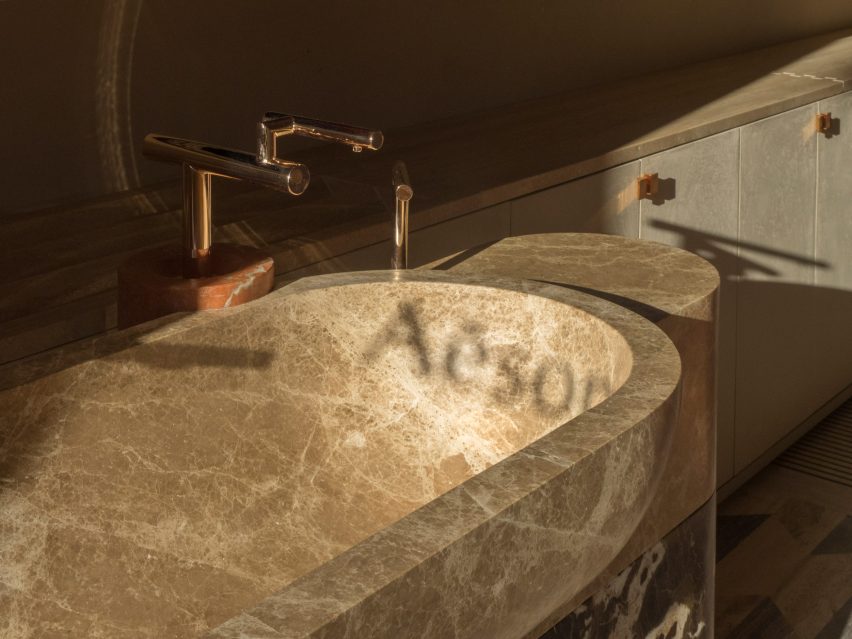
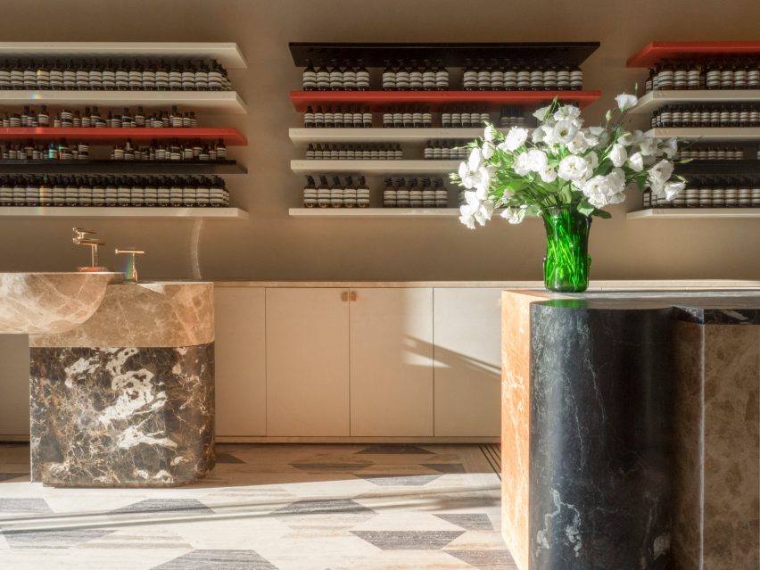
A huge block of dark green and rosy pink marble forms a central counter, overlooked by a singular pendant lamp thats emits a deep orange glow. Sandy-hued marble has then been used to form two standalone basins, complete with copper faucets, where customers can sample products.
Peripheral surfaces of the store feature cream-coloured lacquered wood shelves, while the edge of one wall has been overplayed with roughly-hewn stone.
Bricks of straw have then been used to cover the ceiling to emulate the thatched roofs seen in early settlements on the Pontine Marshlands outside Rome.
Aesop aim to fashion a unique aesthetic within each of their stores – their Snohetta-designed branch in London's affluent Chelsea neighbourhood is centred by twelve rose-tinged clay arches, while their outpost in Washington DC created by Tacklebox has walls lined with 30,000 sticks.