i29 revamps interiors of Princessehof ceramics museum in Leeuwarden
Dutch interior architecture firm i29 has completed a contemporary renovation of the 18th-century buildings of the Princessehof National Museum of Ceramics in the Dutch city of Leeuwarden.
Unveiled to coincide with the Princesshof museum's 100th birthday, and the city of Leeuwarden being named as the European Capital of Culture 2018, the museum has undergone a major renovation of its entrance and exhibition spaces.
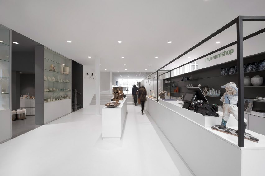
i29 has designed the interiors of the entrance hall, which include a shop and a tearoom, as well as all the exhibition rooms that house the museum's vast collections.
"The main challenge was to create a welcoming and contemporary entrance area in the rather closed monumental buildings," said the studio. "A timeless interior that matches the museum as a place for inspiration and surprise."
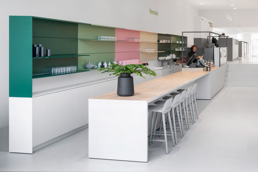
A bright and spacious open-plan layout in the entrance area allows visitors to access the museum from both the front and back entrance, and also gives them a chance to peruse the tearoom and museum store on their way in and out.
Laid out in a horizontal line on varying different floor levels, the tearoom, store and ticket desk subtly reference layers of earth used to make ceramics.
Integrated ramps slotted in behind the counters of each area provide disabled access while a large garden adjacent to the tearoom has also been made accessible.
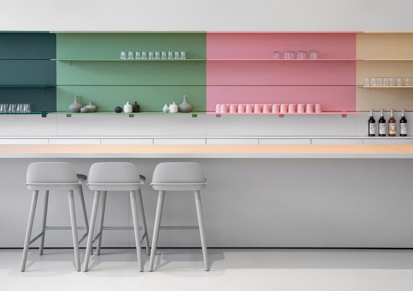
"To create an intensive experience throughout the various spaces we added clear contrasts, which is most visible on the passage areas," explained the studio. "For example, the tearoom features vibrant fresh colours, while the museum store, in contrast, has tranquil grey tones so that all of the attention is focused on the products."
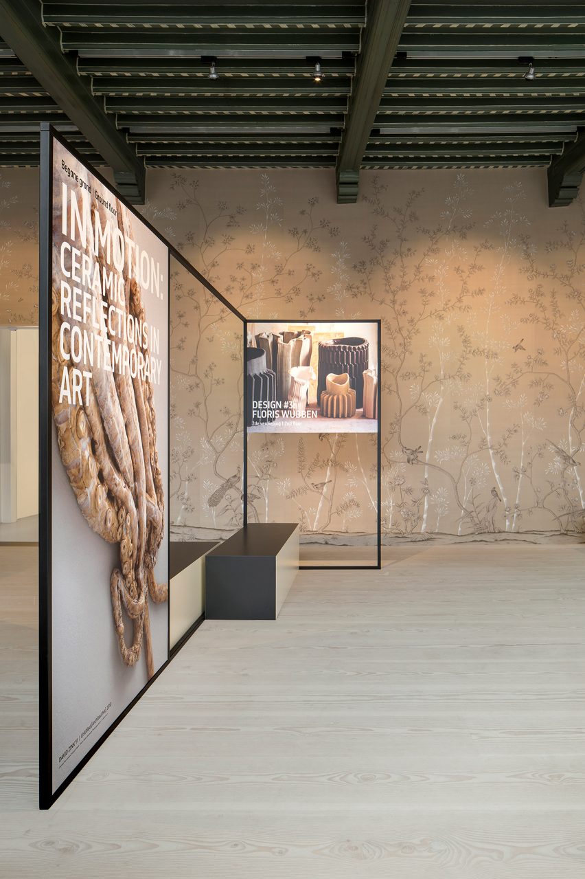
Other notable areas of contrast include the transition from the contemporary entrance area to the monumental museum square where the walls are lined with hand-painted wallpaper.
Here visitors can view a sleek graphical installation that incorporates benches and information screens.
In the exhibition areas, the firm worked in collaboration with agency The Ambassadors of Aesthetics to create a new layout for the museum's collections that could provide a clear and stimulating experience for visitors.
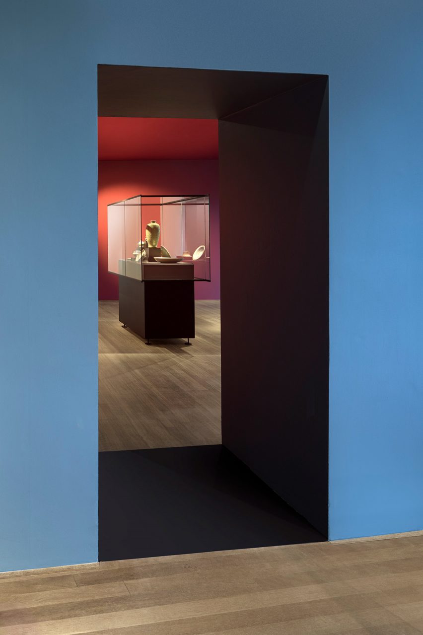
The Ambassadors of Aesthetics researched the original 18th century colours used in the building which were restored in the exhibition rooms.
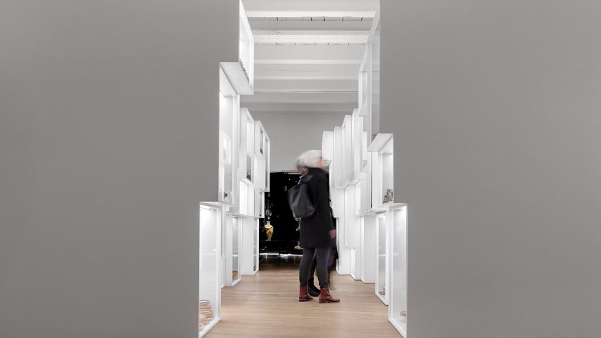
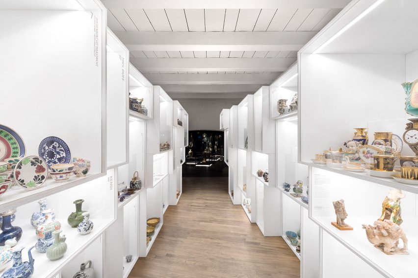
For the museum's Mass Production room, the designers created an installation made of simply stacked, brightly lit white boxes where visitors are fully encircled by ceramics.
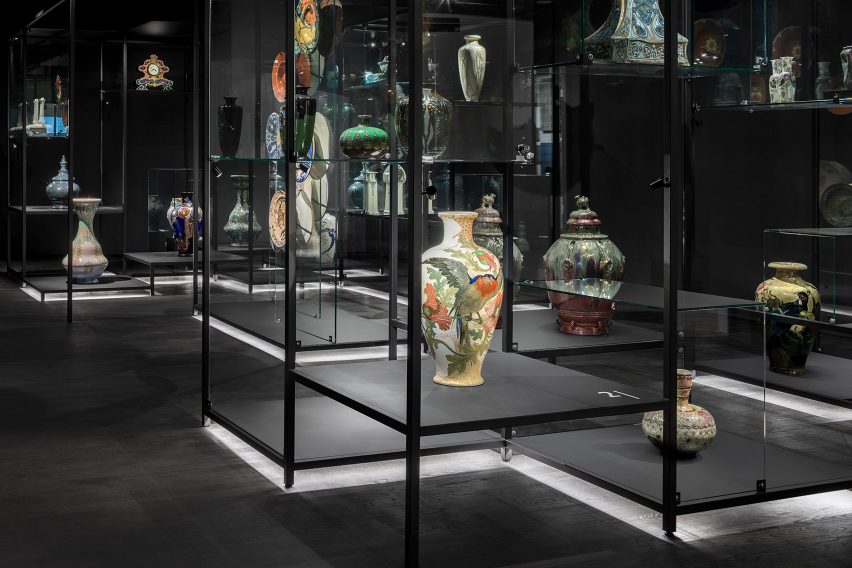
This installation leads to the Art Nouveau room, where the opposite effect has been created. The room has been completely darkened, isolating the exhibited objects and making them appear as if they are "floating in the air".
"The pronounced simplicity of the design interventions contrasts with the monumental shell," said the designers.
"The contrast between old/new and monumental/contemporary complements each other, and together they form a powerful and surprising whole. It places the monument back into the here and now, not only in a functional sense."
From a subterranean Roman temple to a restored textile factory, you can read about other institutions with impressive interiors in our round-up of museums that are worth a visit for the interiors alone.
Photography is by Ewout Huibers.

