Beza Projekt creates aquamarine co-working space in Warsaw
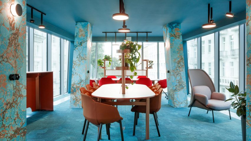
Polish design studio Beza Projekt has created an aquamarine shared working space in Warsaw, designed to look more like a club than an office.
To cater to the flexible working habits of its occupants, the studio set out to design a space that sits somewhere between a work space and a leisure space.
"We were commissioned to design interiors for the Nest - a modern co-working space," explained Beza Projekt.
"What is the real meaning of the co-working space, how do we work nowadays? We tend to spend more and more time at work, or actually the border between work and leisure is being blurred. You may fight with that or just adapt."
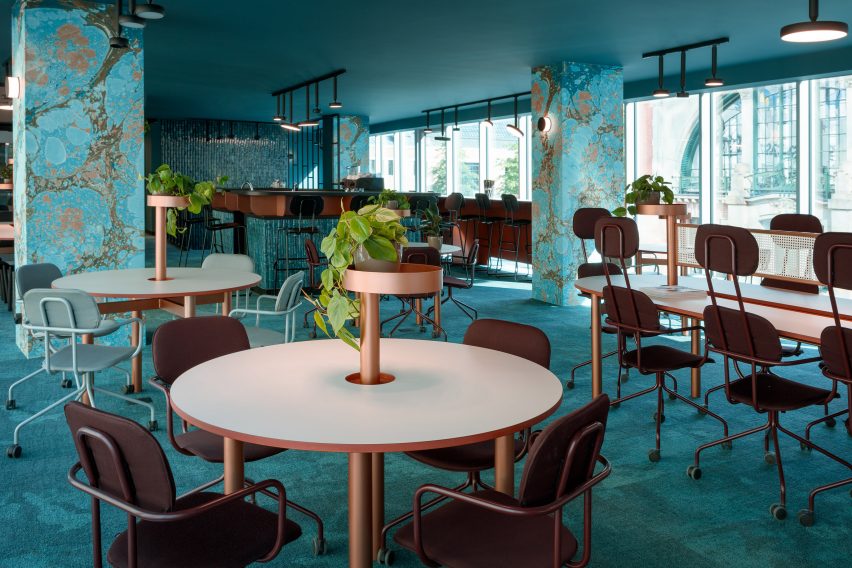
"The Nest is a place for a modern self-confident person who values their time – they may work only few hours a day or maybe the whole week-end," continued Beza Projekt.
"Our main goal was to create spaces that aren't office like, they are more like a club, where you should feel comfy and cosy."
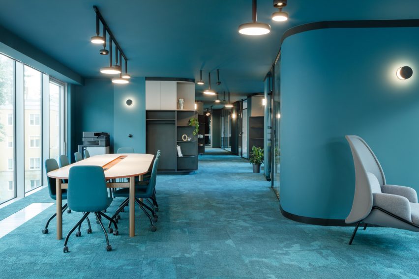
Located in a building designed by Polish architects G5 Architekci, the office has a largely open-plan layout. However in contrast with very graphic and angular architecture of the building, the studio wanted to create a space with warmth that featured rich details.
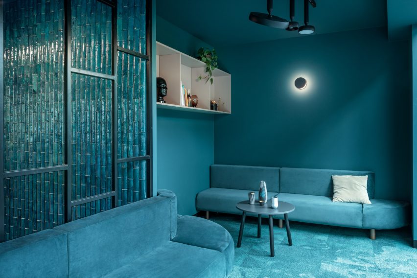
Saturated in an aquamarine hue to match the Nest's branding, the office features round corners that balance out the building's hard lines.
The studio took a marbled texture designed by Kasia Korzeniecka that feature's on the co-working space's branding, and turned it into a Wallpaper, which they used on columns throughout the interior.
Custom materials such as ceramic tiles, wallpapers and carpets were specified in a vivid aquamarine hue to match. To make the project more economical, materials like coloured MDF were combined with real veneer.
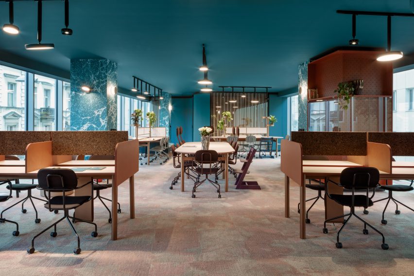
"Based on design brief delivered by Futu design agency, which created the Nest's branding, we have decided to create our own language of colours, patterns, textures and materials that would be very organic and vivid," said Beza Projekt.
"We have looked for materials that fit our colour pallete but on the other hand they should not be mono-coloured or boring."
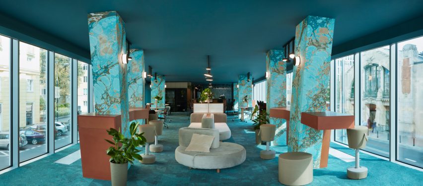
The studio also custom designed two systems of furniture especially for the Nest. The first is a table and sofa system that is used in the office's open-plan spaces.
These elements can be combined together in various different configurations to make multifunctional furniture islands that can be used for casual working, meetings or socialising.
The second system consists of desk, cabinets and two sided bookstands and is designed for office areas. This more traditional system can be used by those who need to work for longer periods of time.
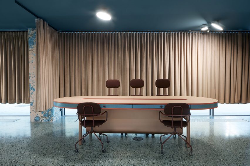
"Our goal was to give the users a spectrum of work-places places to choose from," explained Beza Projekt.
In order to do this, the design team created a different layout and approach on each floor. The reception is connected to a showroom, the first floor has a coffee bar and a big lounge with hot desk places, while the second floor is a child-friendly area with a day care room where you can leave your child with a qualified nanny, and work for a while.
The third floor has a mix of open space and office space, the fourth floor is dedicated to events, the fifth is divided into office spaces, and the sixth floor also has offices but also a conference room at the very top of the building.
Photography is by Jacek Kołodziejski and Beza Projekt.
Project credits:
Interior design: Beza Projekt
Lead interior designers: Anna Łoskiewicz-Zakrzewsk and Zofia Strumiłło-Sukiennik
Art direction: Anna Łoskiewicz-Zakrzewska
Interior designers: Ksymena Kucharska,Weronika Jarońska and Katarzyna Sobolewska
Designers: Tomasz Korzewski and Krzysztof Benke
Production manager: Justyna Ciurzyńska
Brand design: Futu
Concept leader: Wojciech Ponikowski
Design management: Joanna Trytek
Graphic design: Piotr Najar and Kaisu Almonkari
Marbling designer: Katarzyna Korzeniecka